Difference between revisions of "SMT201 AY2019-20T1 EX1 Jaslyn Wong"
| Line 2: | Line 2: | ||
===Distribution of public education institution=== | ===Distribution of public education institution=== | ||
| − | [[File:Public Education Institution in Singapore.png|center]] | + | [[File:Public Education Institution in Singapore.png|thumb|center]] |
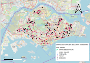
Different symbols were used for the different public institutes. The institutes that are using the same symbols are distinguish by the different colour and size. This is so that users can have a clearer visualisation of the different public institutions. | Different symbols were used for the different public institutes. The institutes that are using the same symbols are distinguish by the different colour and size. This is so that users can have a clearer visualisation of the different public institutions. | ||
Revision as of 21:52, 15 September 2019
Part 1 : Thematic maps
Distribution of public education institution
Different symbols were used for the different public institutes. The institutes that are using the same symbols are distinguish by the different colour and size. This is so that users can have a clearer visualisation of the different public institutions.
Hierarchy of road network system of Singapore
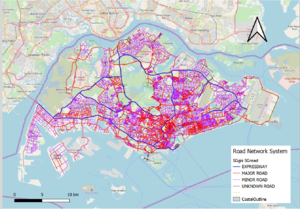
A new column “category” was added to the dataset to classify the different roads types (e.g. Expressway, major, minor and unknown roads etc.). Different colours and different thickness of the line symbols represents the different type of roads(e.g. expressways are thicker compared to the other roads) This helps user to have have an easier and clearer visualization of Singapore's road network.
2014 Master Plan Landuse
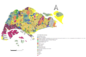
In the 2014 Master Plan, some of the landuse were categorised together. Example will be the business sector(Business1, Business2 etc.). Reason for merging some of the sectors is to reduce the number of colours shown on the map so that the different Landuse are easier to visualize.


