Difference between revisions of "SMT201 AY2019-20G1 Ex1 Luo Junru"
| Line 7: | Line 7: | ||
[[File:Schinfo.png|600px|center]] | [[File:Schinfo.png|600px|center]] | ||
| − | + | Dot density map is presented. It indicates the presence of the respective types of public education institutions here. | |
| − | I filtered out only the public education institutions and then the various school types with the query builder. Afterwards, I arranged them from according to the levels of institutions. The symbols then follow from green to blue (darker as going down the categories). The colours are also distinguishable, and the size of the symbols are 3mm so they can be seen easily. Hence we can tell which category of schools make up the largest percentage of public education institutions in Singapore, which is Primary Schools. | + | I filtered out only the public education institutions (GOVERNMENT and GOVERNMENT-AIDED SCH) and then the various school types with the query builder. Afterwards, I arranged them from according to the levels of institutions. The symbols then follow from green to blue (darker as going down the categories). The colours are also distinguishable, and the size of the symbols are 3mm so they can be seen easily. Hence we can tell which category of schools make up the largest percentage of public education institutions in Singapore, which is Primary Schools. |
• Road network system | • Road network system | ||
| Line 15: | Line 15: | ||
| − | + | I categorized the data according to SYMBOLID, because this field contains numbers which represent different roads systems and from there we can categorise them. There are different coloured lines to represent the different types of roads. The widths of the lines are adjusted to 1mm so that they can be easily seen. | |
• Master plan landuse | • Master plan landuse | ||
| Line 65: | Line 65: | ||
| − | Generally there is an increase in | + | Generally there is an increase in aged population from 2010 to 2018. The area with the highest change (increase) is the Northern part of Singapore. Most of the areas experience similar changes (increase). |
Latest revision as of 20:33, 15 September 2019
Part 1
1. For each of the thematic map above, explain why your cartographic technique makes sense, your choice of classification and visual variable. Please limit your discussion to a maximum of not more than 100 words per map.
• Distribution of public education institutions
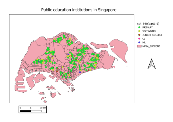
Dot density map is presented. It indicates the presence of the respective types of public education institutions here. I filtered out only the public education institutions (GOVERNMENT and GOVERNMENT-AIDED SCH) and then the various school types with the query builder. Afterwards, I arranged them from according to the levels of institutions. The symbols then follow from green to blue (darker as going down the categories). The colours are also distinguishable, and the size of the symbols are 3mm so they can be seen easily. Hence we can tell which category of schools make up the largest percentage of public education institutions in Singapore, which is Primary Schools.
• Road network system
I categorized the data according to SYMBOLID, because this field contains numbers which represent different roads systems and from there we can categorise them. There are different coloured lines to represent the different types of roads. The widths of the lines are adjusted to 1mm so that they can be easily seen.
• Master plan landuse
I categorized the data according to LU_DESC because this field specifies the different landuse types and hence by assigning different colours to the various landuse types, we will be able to draw insights as to which part of Singapore is used for what purpose. By looking at the map as a whole, we can also see what majority of Singapore’s land is used for.
Part 2
a) In separate text describe the spatial patterns, if any, reveals by each of the choropleth maps prepared.
PART2-1
The darker the colour shade on the map, the higher the number of aged population are located there.
For the 2010 aged population, most of the aged population are located in the Southern areas of Singapore. Some areas have very few aged people living there, such as the central and extreme east of Singapore.
For the 2018 aged population, most of the aged population are located in the central-north and Southern part of Singapore. Similar to 2010, there are very aged population in the extreme East and Central of Singapore. However, in 2010 there are some aged population in the extreme West of Singapore, but in 2018 there is a decrease in aged population there.
PART2-2
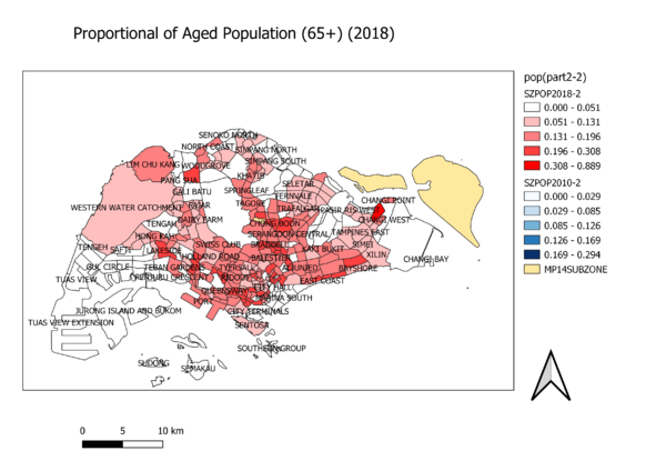
The darker the colour shade on the map, the higher the proportional of aged population in the area.
For the 2010 map, there is a relative high density of aged population in mainly the Southern part of Singapore. The areas with less density of aged population are mainly the extreme Western and Southern area as well as the Central.
For the 2018 map, there is an increase in density of aged population from 2010 as seen from the increase in shaded areas from 2010 to 2018. The Central area and extreme Eastern areas remain low in terms of density of aged population in 2018.
PART2-3
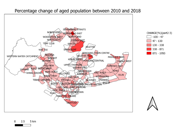
Generally there is an increase in aged population from 2010 to 2018. The area with the highest change (increase) is the Northern part of Singapore. Most of the areas experience similar changes (increase).
b) Explain the reasoning behind your classification choices, how you derived the new variables and handled missing values, and any other relevant judgments and assumptions. Please limit this discussion to a maximum of not more than 500 words.
For this section, I created two separate csv from the Singstat population data (2010 and 2018). From there, I added them in as text delimiter layers.
PART2-1
I classified the data according to the total aged population of each subzone.
This is done by creating a new field from the respective population text delimiter attribute table where I added all the aged population together for each row (all the columns starting from age groups of 65 and above). The field type is double. I created another field of upper letters of subzone so that I can use it to join with SUBZONE_N from the subzone layer. Afterwards, I selected graduated classification by the new field of aged population (>65 years old) and natural breaks in case there are skewed data. I treat the missing values as 0.
This is the same for both the 2010 and 2018 maps, except the colour of the maps are different.
PART2-2
I classified the data according to the proportion of aged population for each subzone.
I created a new field from the respective population text delimiter layer which is the proportion of aged population in the year. This is done by dividing the total aged population in the subzone by the total population in the subzone. The field type is double. I created another field of upper letters of subzone so that I can use it to join with SUBZONE_N from the subzone layer. Afterwards, I selected graduated classification by the new variable of the proportion of aged population and natural breaks in case there are skewed data. I treat the missing values as 0.
This is the same for both the 2010 and 2018 maps, except the colour of the maps are different.
PART2-3
I classified the data according to the percentage change of aged population for each subzone.
I created a new field from the respective population text delimiter layer which is the percentage change of aged population in the year. This is done by taking the total aged population in 2018 minus that of 2010 over the total aged population in 2010 and multiply by 100 to convert to percentage. The field type is double. I created another field of upper letters of subzone so that I can use it to join with SUBZONE_N from the subzone layer. Afterwards, I selected graduated classification by the new variable of the percentage change of aged population and natural breaks in case there are skewed data. I treat the missing values as 0.


