Difference between revisions of "SMT201 AY2019-20G1 EX1 Lee Jayin"
m (Jayin.lee.2018 moved page SMT201 AY2018-19T1 EX1 Kum Rui Xian Amelia to SMT201 AY2019-20G1 EX1 Lee Jayin) |
|||
| (2 intermediate revisions by the same user not shown) | |||
| Line 3: | Line 3: | ||
=== 2014 Master Plan Landuse === | === 2014 Master Plan Landuse === | ||
| − | [File:TakeHomeEx1 Masterplan.png] | + | [[File: TakeHomeEx1 Masterplan.png|800px|center]] |
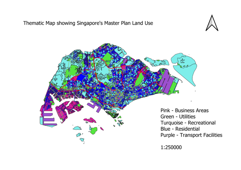
Upon classifying the data using categorized symbology method (as the data was discrete), there were 20 over categories. Classes should be optimally kept under 6, thus I chose to group them into 5 categories under residential, utilities, recreational, business areas and others. The categories are grouped this way as these are the main categories needed in a city. Different colours are used to differentiate the different categories clearly. | Upon classifying the data using categorized symbology method (as the data was discrete), there were 20 over categories. Classes should be optimally kept under 6, thus I chose to group them into 5 categories under residential, utilities, recreational, business areas and others. The categories are grouped this way as these are the main categories needed in a city. Different colours are used to differentiate the different categories clearly. | ||
| − | + | ||
=== Level of Schools === | === Level of Schools === | ||
| − | + | ||
| + | [[File: TakeHomeEx1 SchoolEx.png|800px|center]] | ||
| + | |||
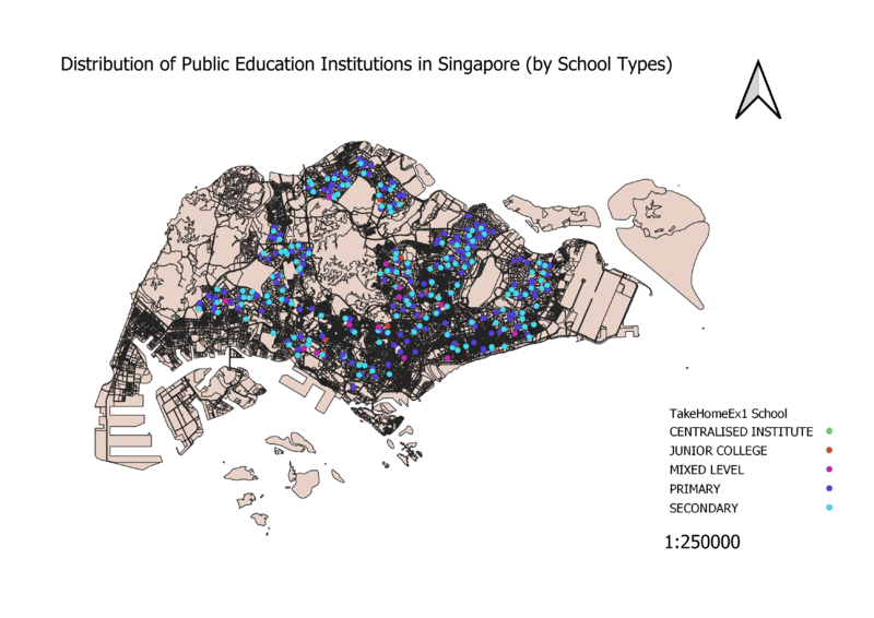
As data of educational institutes in Singapore are discrete, the categorized symbology method was used. When classified, this allows for 5 clear-cut categories of educational institutes to be seen. Different colours were used to differentiate the different categories more clearly. Also, as only ZIP codes were provided in the dataset, python had to be used to geocode the institutes data onto the GIS. | As data of educational institutes in Singapore are discrete, the categorized symbology method was used. When classified, this allows for 5 clear-cut categories of educational institutes to be seen. Different colours were used to differentiate the different categories more clearly. Also, as only ZIP codes were provided in the dataset, python had to be used to geocode the institutes data onto the GIS. | ||
=== Road Network System === | === Road Network System === | ||
| + | |||
| + | [[File: TakeHomeEx1 Road.jpg|800px|center]] | ||
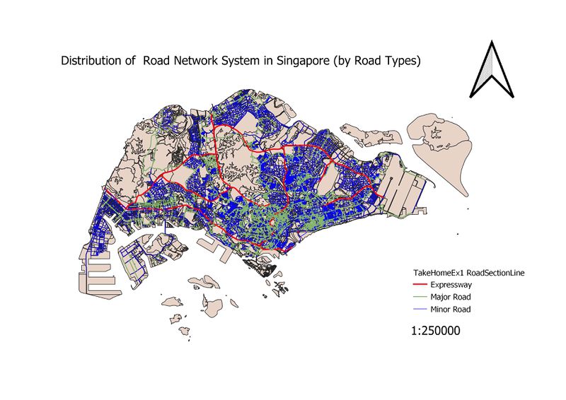
When classified, 3 road categories were produced – the expressway, major roads and minor roads. Different colours and widths were used for each category. Red for expressway as red is a sign of urgency, and the width is 3x the size of minor roads. This is to clearly indicate the more “crucial” roads. Major roads are set to be 2x the size of minor roads. | When classified, 3 road categories were produced – the expressway, major roads and minor roads. Different colours and widths were used for each category. Red for expressway as red is a sign of urgency, and the width is 3x the size of minor roads. This is to clearly indicate the more “crucial” roads. Major roads are set to be 2x the size of minor roads. | ||
Latest revision as of 17:39, 15 September 2019
Contents
Part One: Thematic Mapping
2014 Master Plan Landuse
Upon classifying the data using categorized symbology method (as the data was discrete), there were 20 over categories. Classes should be optimally kept under 6, thus I chose to group them into 5 categories under residential, utilities, recreational, business areas and others. The categories are grouped this way as these are the main categories needed in a city. Different colours are used to differentiate the different categories clearly.
Level of Schools
As data of educational institutes in Singapore are discrete, the categorized symbology method was used. When classified, this allows for 5 clear-cut categories of educational institutes to be seen. Different colours were used to differentiate the different categories more clearly. Also, as only ZIP codes were provided in the dataset, python had to be used to geocode the institutes data onto the GIS.
Road Network System
When classified, 3 road categories were produced – the expressway, major roads and minor roads. Different colours and widths were used for each category. Red for expressway as red is a sign of urgency, and the width is 3x the size of minor roads. This is to clearly indicate the more “crucial” roads. Major roads are set to be 2x the size of minor roads.
Part Two: Choropleth Mapping
5 main groupings of the numbers plus 1 more grouping for subzones in which data was not available (labelled white) were used as too many groupings would result in too many shades of the same colour that is difficult to differentiate. From the dataset of demographics grouped by subzone and gender, I cleaned the file and used Excel’s “Replace” function to replace all the dashes with 0s for the cells with no data as QGIS was importing columns as a text field when it was imported. I then exported the sheet containing data for 2010 and 2018 in separate .csv files and added them into geopackage. Data was joined using Subzone names with 2014 Subzone layer data and calculated the new fields required before adding into the geopackage and then adding a .qgs file to work from.
2010 % 2018 Population Aged 65+
For the 2 choropleths of the number of old people by subzone in 2010 and 2018, quantile (equal count) classification was used, due to the high number of outliers resulting in a right skew. This means more variation in colours in the map, thus being a better mode of classification in order to show the distribution. I calculated the total number of old people (age 65+) using the field calculator to sum up the fields of age groups above 65 years old and labelled them Old2010 and Old2018. From the 2 maps, we can see that there is a higher number of elderly people living in the Eastern and North-Eastern parts of Singapore. There are lesser elderly people living in the central part of Singapore, and no elderly at all in the industrial Western and Eastern parts and the Central Water Catchment.
2010 & 2018 Proportion Aged 65+
Quantile (equal count) classification was used for the 2 choropleths of the proportions of old people by subzone in 2010 and 2018 as it was the method which produced the largest number of variation in the colouring of the subzones, allowing for a clearer visualisation of the proportion. Using the Old2010 and Old2018 fields, I divided those fields with the field for the total number of people in each subzone to calculate PropOld10 and PropOld18 to derive the choropleths. There is the highest proportion of elderly people in the central part of Singapore, while the industrial areas in the West and the East have no elderly due to the fact that there is no one residing in those subzones.
Percentage Change From 2010 and 2018
For the choropleth of difference in % of old people by subzone between 2010 and 2018, quantile (equal count) was used again due the left skew, resulting in more variation in colours and a clearer visualisation of the distribution. A little bit of modification was done, such that the subzones with a negative % change were classified into a separate grouping. I used the formula (Old2018-Old2010)/Old2010 to arrive at the % change in old people. Only Western water catchment and Queenstown had a decrease in %change while Sentosa, the Northern and Western parts had a large % increase.


