Difference between revisions of "SMT201 AY2018-19T1 EX1 Khong Lee Han"
Jump to navigation
Jump to search
Lhkhong.2018 (talk | contribs) |
Lhkhong.2018 (talk | contribs) |
||
| Line 9: | Line 9: | ||
== '''Part 2''' == | == '''Part 2''' == | ||
| − | + | In separate text describe the spatial patterns, if any, reveals by each of the choropleth maps prepared.<br> | |
{| class="wikitable" | {| class="wikitable" | ||
Revision as of 17:13, 15 September 2019
Contents
Part 1
testing
Part 2
In separate text describe the spatial patterns, if any, reveals by each of the choropleth maps prepared.
| Map Type | Description |
|---|---|
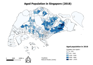
| 2010 Aged population Age65+ |
|
| 2018 Aged population Age65+ |
|
| 2010 Aged Population Proportion |
|
| 2018 Aged Population Proportion |
|
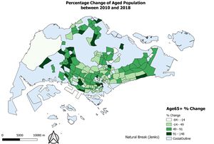
| % Change in Aged Population between 2010 and 2018 |
|
Reasoning behind classification choices, how you derived the new variables and handles missing values, and any other relevant judgements and assumptions.
Aged population (+65) in 2010 & 2018:
- Reason for use of choice of Natural Breaks (Jenks), for both Aged Population (+65) in 2010 and 2018 is because it produces the most natural grouping type for both years of 2010 and 2018. Natural breaks will minimize the variance within the classes and maximize between-class differences.
- Locations with missing values, I considered the values as ‘0’ as we have no clue of what the possible values of those Age65+ may be.
- I used graduated colours to represent the choropleth map as the aged population is a range of numerical values that cannot be classified into distinct groups.
Proportion of Aged Population in 2010 and 2018:
- To get the proportion values, I created a new field called “Total” which is the total sum of all ages in each subzone.
- Proportion of those Age65+ = (Age 65+)/(Total population)
- I used standard deviation as a classification choice as when plotting the graphs, I realised the graph was a normal distribution curve and hence, using a standard deviation classification method would be better. Furthermore, with an outlier for the 2018 Age65+ proportion, it would not be right to use equal interval.
- I classified the data into classes of 4 classes as stated below such that I can see the specific groupings of those above and below the standard deviation range as this will give me a better idea when looking at the proportion graphs of the groupings of those within the
# 1) Between 0 to x-σ : includes subzones with either very little proportion of elderly or high proportion of youths
# 2) between x-σ to x : below average population of elderly
# 3) between x to  x+ σ : above average proportion of elderly
# 4) above x+ σ : includes subzones with high proportion of elderly, signalling it is an ageing population in that subzone area
Percentage % Change between 2010 and 2018 in Age65+ Population:
- I deleted the values with percentage changes of 150% and above, as well as 0% changes in values.
- Hence, it’s either that the joining of tables did not work well for certain areas and caused loss of results, or that insufficient data was collected and result in anomaly values and hence, I changed the % change of those locations to NULL.
- As for the classification choice, I used natural jenks as there are no longer anymore outliers and would be more useful to categorize the data.


