Difference between revisions of "SMT201 AY2019-20G1 Ex1 Jeremy Chong Zhen Long"
(Created page with "'''Part 1''' '''Distribution of Public Education''' Thematic map of school distribution in Singapore, classified by “Mainlevel” under layer properties, symbology and choo...") |
|||
| Line 1: | Line 1: | ||
'''Part 1''' | '''Part 1''' | ||
| + | |||
'''Distribution of Public Education''' | '''Distribution of Public Education''' | ||
| + | [[File:Schools Jeremy.png|thumb|left]] | ||
| + | |||
| + | |||
| + | |||
| + | |||
| + | |||
| + | |||
| + | |||
| + | |||
| + | |||
| + | |||
| + | |||
| + | |||
| + | |||
| + | |||
| + | |||
| + | |||
| + | |||
| + | |||
| + | |||
| + | |||
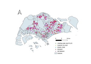
Thematic map of school distribution in Singapore, classified by “Mainlevel” under layer properties, symbology and choosing categorized. | Thematic map of school distribution in Singapore, classified by “Mainlevel” under layer properties, symbology and choosing categorized. | ||
'''Road Network''' | '''Road Network''' | ||
| + | [[File:Road Jeremy.png|thumb|left]] | ||
| + | |||
| + | |||
| + | |||
| + | |||
| + | |||
| + | |||
| + | |||
| + | |||
| + | |||
| + | |||
| + | |||
| + | |||
| + | |||
| + | |||
| + | |||
| + | |||
| + | |||
| + | |||
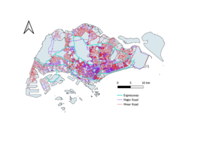
Using LTA’s RoadSectionLine, I classified the roads into expressways, minor road and major road by creating a new field called “Road Type”. Major roads have the word roads contained in their name. I categorized them using the same method as above. | Using LTA’s RoadSectionLine, I classified the roads into expressways, minor road and major road by creating a new field called “Road Type”. Major roads have the word roads contained in their name. I categorized them using the same method as above. | ||
| + | |||
'''Masterplan Landuse''' | '''Masterplan Landuse''' | ||
| + | [[File:Landuse Jeremy.png|thumb|left]] | ||
| + | |||
| + | |||
| + | |||
| + | |||
| + | |||
| + | |||
| + | |||
| + | |||
| + | |||
| + | |||
| + | |||
| + | |||
| + | |||
| + | |||
| + | |||
| + | |||
| + | |||
| + | |||
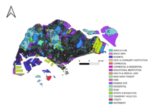
Thematic map of masterplan landuse 2014, categorized according to the legend. | Thematic map of masterplan landuse 2014, categorized according to the legend. | ||
| Line 14: | Line 75: | ||
'''Part 2''' | '''Part 2''' | ||
| + | |||
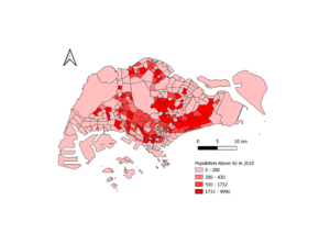
After downloading the csv file by age group, I cleaned the data on excel to remain the relevant fields and named it as “Population by age and subzone”, which I imported into QGIS. I then joined subzone and the aforementioned csv file together and formed the relevant choropleth maps. | After downloading the csv file by age group, I cleaned the data on excel to remain the relevant fields and named it as “Population by age and subzone”, which I imported into QGIS. I then joined subzone and the aforementioned csv file together and formed the relevant choropleth maps. | ||
'''Choropleth Map for Population Above 65 2018''' | '''Choropleth Map for Population Above 65 2018''' | ||
| + | [[File:Population Above 65.png|thumb|left]] | ||
| + | |||
| + | |||
| + | |||
| + | |||
| + | |||
| + | |||
| + | |||
| + | |||
| + | |||
| + | |||
| + | |||
| + | |||
| + | |||
| + | |||
| + | |||
| + | |||
| + | |||
| + | |||
'''Choropleth Map for Population Above 65 in 2010''' | '''Choropleth Map for Population Above 65 in 2010''' | ||
| + | [[File:Above 65 2010.png|thumb|left]] | ||
| + | |||
| + | |||
| + | |||
| + | |||
| + | |||
| + | |||
| + | |||
| + | |||
| + | |||
| + | |||
| + | |||
| + | |||
| + | |||
| + | |||
| + | |||
| + | |||
| + | |||
| + | |||
| + | |||
Based on the choropleth maps, we see that there are a lot more subzones with aging population in 2018 as compared to 2010. The highest number of ageing population in a subzone has also increased. | Based on the choropleth maps, we see that there are a lot more subzones with aging population in 2018 as compared to 2010. The highest number of ageing population in a subzone has also increased. | ||
'''Choropleth Map for Proportion of Population above 65 in 2018 | '''Choropleth Map for Proportion of Population above 65 in 2018 | ||
| + | |||
| + | [[File:Propoertion 2018.png|thumb|left]] | ||
| + | |||
| + | |||
| + | |||
| + | |||
| + | |||
| + | |||
| + | |||
| + | |||
| + | |||
| + | |||
| + | |||
| + | |||
| + | |||
| + | |||
| + | |||
| + | |||
| + | |||
| + | |||
| − | Choropleth Map for Proportion of Population above 65 in 2010''' | + | '''Choropleth Map for Proportion of Population above 65 in 2010''' |
| + | [[File:Porportion 2010.png|thumb|left]] | ||
| + | |||
| + | |||
| + | |||
| + | |||
| + | |||
| + | |||
| + | |||
| + | |||
| + | |||
| + | |||
| + | |||
| + | |||
| + | |||
| + | |||
| + | |||
| + | |||
| + | |||
| + | |||
For proportion of population above 65, the same conclusion can be made based on the choropleth map. | For proportion of population above 65, the same conclusion can be made based on the choropleth map. | ||
'''Changes in Population above 65''' | '''Changes in Population above 65''' | ||
| + | [[File:Change in Aged.png|thumb|left]] | ||
| + | |||
| + | |||
| + | |||
| + | |||
| + | |||
| + | |||
| + | |||
| + | |||
| + | |||
| + | |||
| + | |||
| + | |||
| + | |||
| + | |||
| + | |||
| + | |||
| + | |||
| + | |||
| + | |||
This map mainly summarizes the before choropleth maps. We see that there are many subzones with increases in aging populations. | This map mainly summarizes the before choropleth maps. We see that there are many subzones with increases in aging populations. | ||
Latest revision as of 08:55, 6 December 2019
Part 1
Distribution of Public Education
Thematic map of school distribution in Singapore, classified by “Mainlevel” under layer properties, symbology and choosing categorized.
Road Network
Using LTA’s RoadSectionLine, I classified the roads into expressways, minor road and major road by creating a new field called “Road Type”. Major roads have the word roads contained in their name. I categorized them using the same method as above.
Masterplan Landuse
Thematic map of masterplan landuse 2014, categorized according to the legend.
Part 2
After downloading the csv file by age group, I cleaned the data on excel to remain the relevant fields and named it as “Population by age and subzone”, which I imported into QGIS. I then joined subzone and the aforementioned csv file together and formed the relevant choropleth maps.
Choropleth Map for Population Above 65 2018
Choropleth Map for Population Above 65 in 2010
Based on the choropleth maps, we see that there are a lot more subzones with aging population in 2018 as compared to 2010. The highest number of ageing population in a subzone has also increased.
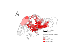
Choropleth Map for Proportion of Population above 65 in 2018
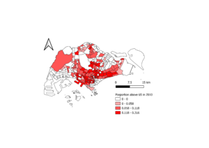
Choropleth Map for Proportion of Population above 65 in 2010
For proportion of population above 65, the same conclusion can be made based on the choropleth map.
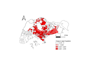
Changes in Population above 65
This map mainly summarizes the before choropleth maps. We see that there are many subzones with increases in aging populations.
