Difference between revisions of "SMT201 AY2019-20G1 EX2 Nigel Poon Wei Chun"
(Created page with "== Thematic Mapping == === Level of Schools === 800px|center This map shows the distribution of schools in Singapore. The Geographical locations wer...") |
|||
| (14 intermediate revisions by the same user not shown) | |||
| Line 1: | Line 1: | ||
| − | == | + | == Part 1 == |
| − | === | + | === Study area (Gombak) with it's elevation and its infrastructure ( Target roads, Buildings , Natural Features ) === |
| − | [[File: | + | [[File:NIGEL_Layout_1.png|800px|center]] |
| − | + | Using the selected infrastructures, we hope to find a suitable area to build the next National Communicable Disease Quarantine Centre within Gombak. We will have various factors in mind while deciding the location such as Economic, Accessibility, Health Risk and Natural Conservation which will be talked further in detail later through using proximity and an AHP table. | |
| − | |||
| − | |||
| − | |||
| − | |||
| − | |||
| − | |||
| − | + | With the above layouts, we can have a rough understanding of locations of buildings, natural features as well as service and track roads which will be our target roads of this insight report. The bottom right map layout shows the elevation of Gombak with the redder values being higher elevation | |
| + | |||
| + | == Part 2 == | ||
| − | |||
| − | |||
| − | + | === Proximity to Natural Features, Buildings , Target Roads and Slope === | |
| + | [[File:NIGEL_Layout_2.png|800px|center]] | ||
| − | |||
| − | The colours | + | The above layout seeks to represent proximity of the various features through the colours white to red. The whiter an area signals that the closer to the selected variable feature of each map. For example, in the case for buildings proximity map, the white area means that the area is relatively close to a building. |
| − | |||
| − | |||
| − | |||
| + | == Part 3 == | ||
| + | ===AHP Table=== | ||
| + | [[File:Nigel_AHP_Values.jpg]] | ||
| + | [[File:Nigel_AHP_calculation.jpg]] | ||
| − | + | We will be using an AHP table To derive ratio scales from paired comparisons for choosing the importance of each variable in decision making. In which, the health risk is valued the highest followed by accessibility and economic and finally natural Features. | |
| − | |||
| − | ==== | + | ===Normalize proximity for decision making=== |
| − | |||
| + | To ensure that the large range of values in the proximity of the features do not cause false results, which proximity layer is normalized through the Min-Max method with the various equations below | ||
| + | |||
| + | [[File:Nigel_zScore.jpg]] | ||
| + | ====PROXIMITY TO NATURAL==== | ||
| + | ("PROXIMITY_TO_NATURAL@1" - 0) / (863.669 - 0) | ||
| − | ==== | + | ====PROXIMITY TO BUILDINGS==== |
| − | + | ("PROXIMITY_TO_BUILDINGS@1" - 0) / (866.271 - 0) | |
| − | + | ====PROXIMITY TO TO_SERVICE AND TRACKS==== | |
| + | 1 - (("PROXIMITY_TO_SERVICE_AND_TRACKS@1" - 0) / (772.01 - 0)) | ||
| − | + | ====SLOPE==== | |
| + | 1 - (("GOMBAK_RASTER_SLOPE@1" - 0) / (36.8795 - 0)) | ||
| − | |||
| + | In this case, "service and tracks " and slope factor are special in which lower values are valued higher hence we minus 1 to the z score to invert the value as a form of standardization. | ||
| − | |||
| − | ==== | + | ===Selecting a plot === |
| − | |||
| − | + | We will then apply the weights attained from the AHP table and use the standardization to form a raster layer to identify the suitable location by applying this formula | |
| − | |||
| − | + | ("GOMBAK_RASTER_SLOPE_NORMALIZE@1"*0.140)+ ( "PROXIMITY_TO_SERVICE_AND_TRACKS_NORMALIZE@1"*0.169) + ("PROXIMITY_TO_BUILDINGS_NORMALIZE@1"*0.557) + ("PROXIMITY_TO_NATURAL_NORMALIZE@1"*0.135) | |
| − | |||
| − | This | + | This raster layout shows the higher values being a more suitable area, however, to make a clear distinction this raster layer is then converted to a vector layer. |
| + | [[File:Nigel_Raster_suit.png|800px|center]] | ||
| − | + | By the conversion, we have found areas to be fit our factors which are in green. | |
| − | [[File: | + | [[File:Nigel_Poly_suit.png|800px|center]] |
| − | |||
| − | + | However only one has passed the space test hence this area will be our recommendation. | |
| − | + | [[File:size.JPG]] | |
| − | |||
Latest revision as of 00:56, 11 November 2019
Part 1
Study area (Gombak) with it's elevation and its infrastructure ( Target roads, Buildings , Natural Features )
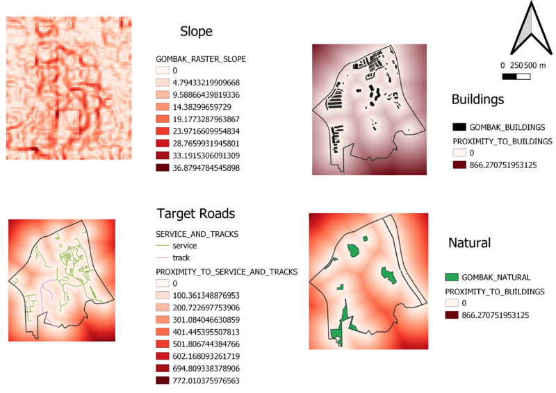
Using the selected infrastructures, we hope to find a suitable area to build the next National Communicable Disease Quarantine Centre within Gombak. We will have various factors in mind while deciding the location such as Economic, Accessibility, Health Risk and Natural Conservation which will be talked further in detail later through using proximity and an AHP table.
With the above layouts, we can have a rough understanding of locations of buildings, natural features as well as service and track roads which will be our target roads of this insight report. The bottom right map layout shows the elevation of Gombak with the redder values being higher elevation
Part 2
Proximity to Natural Features, Buildings , Target Roads and Slope
The above layout seeks to represent proximity of the various features through the colours white to red. The whiter an area signals that the closer to the selected variable feature of each map. For example, in the case for buildings proximity map, the white area means that the area is relatively close to a building.
Part 3
AHP Table
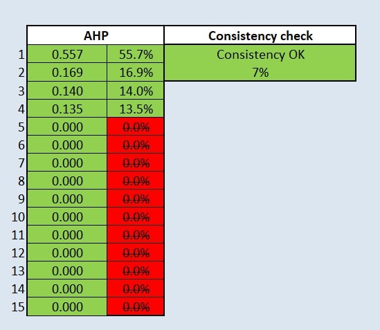
We will be using an AHP table To derive ratio scales from paired comparisons for choosing the importance of each variable in decision making. In which, the health risk is valued the highest followed by accessibility and economic and finally natural Features.
Normalize proximity for decision making
To ensure that the large range of values in the proximity of the features do not cause false results, which proximity layer is normalized through the Min-Max method with the various equations below
PROXIMITY TO NATURAL
("PROXIMITY_TO_NATURAL@1" - 0) / (863.669 - 0)
PROXIMITY TO BUILDINGS
("PROXIMITY_TO_BUILDINGS@1" - 0) / (866.271 - 0)
PROXIMITY TO TO_SERVICE AND TRACKS
1 - (("PROXIMITY_TO_SERVICE_AND_TRACKS@1" - 0) / (772.01 - 0))
SLOPE
1 - (("GOMBAK_RASTER_SLOPE@1" - 0) / (36.8795 - 0))
In this case, "service and tracks " and slope factor are special in which lower values are valued higher hence we minus 1 to the z score to invert the value as a form of standardization.
Selecting a plot
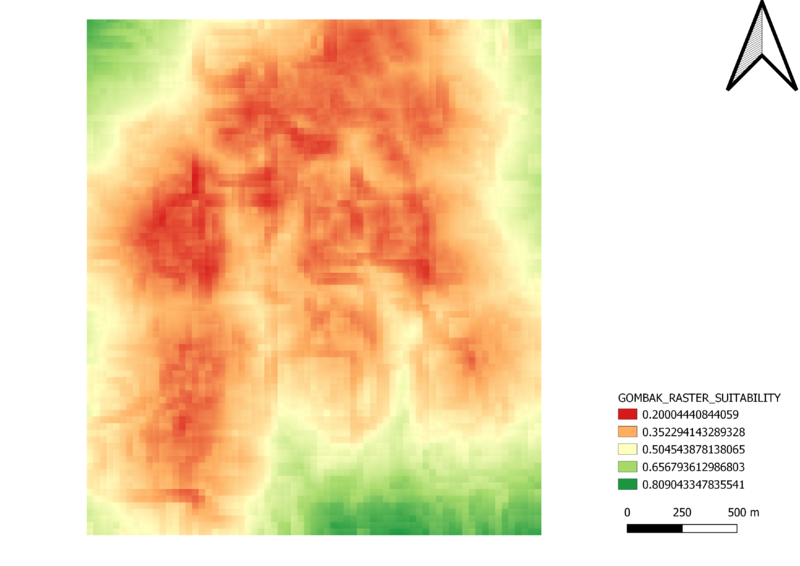
We will then apply the weights attained from the AHP table and use the standardization to form a raster layer to identify the suitable location by applying this formula
("GOMBAK_RASTER_SLOPE_NORMALIZE@1"*0.140)+ ( "PROXIMITY_TO_SERVICE_AND_TRACKS_NORMALIZE@1"*0.169) + ("PROXIMITY_TO_BUILDINGS_NORMALIZE@1"*0.557) + ("PROXIMITY_TO_NATURAL_NORMALIZE@1"*0.135)
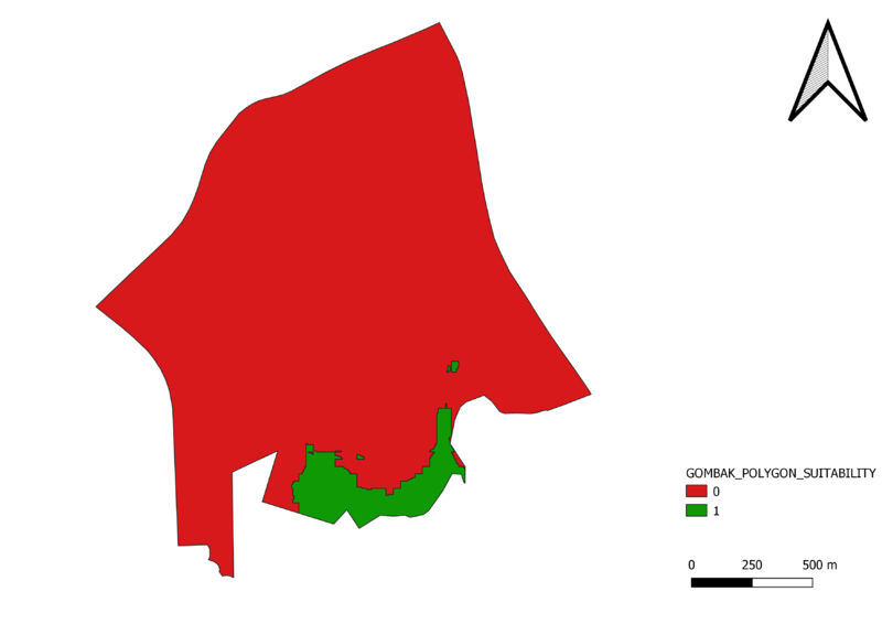
This raster layout shows the higher values being a more suitable area, however, to make a clear distinction this raster layer is then converted to a vector layer.
By the conversion, we have found areas to be fit our factors which are in green.
However only one has passed the space test hence this area will be our recommendation.
File:Size.JPG


