Difference between revisions of "SMT201 AY2019-20G1 EX2 Lin Xing"
| (33 intermediate revisions by the same user not shown) | |||
| Line 1: | Line 1: | ||
| − | == | + | == Objective == |
| − | + | To identify a suitable location for building a National Communicable Disease Quarantine Centre, by using of analytical hierarchy process.</br> | |
| − | |||
| − | |||
| − | == | + | ==Part 1: Visual Analysis on Map View == |
| − | [[File: | + | [[File:Visual analysis natural.jpg|400px]] |
| − | + | [[File:Visual analysis health risk factor.jpg|400px]] | |
| + | [[File:Visual analysis accessibility factor.jpg|400px]] | ||
| + | [[File:Visual analysis Elevation.jpg|400px]] <br /> | ||
| − | === | + | === Natural Factor === |
| − | + | Ultimately, "water" and "park" are locating near to residents area and they are represented by blue and green color respectively. And "forest" is located at the right side of the graph, and it is represented by orange color. Due to majority of the natural features are near to residential area. Thus, natural factor should be considered together with residential area. | |
| − | |||
| − | + | === Health Risk Factor === | |
| + | Avoiding residential area is a most important factor to consider. Due to the possibility of leakage of dangerous virus from building and cause disaster. From the generated graph, we can easily notice that, after exclude residential area (Green color polygon the graph). It still has quite large of the space for us to consider while propose (mainly bottom and right part of the graph). As mentioned in natural factor part, natural features are near to residential area. Thus, natural factor is weighted as 1 (least important), but health risk factor is weighted as 9 (most important). | ||
| − | === | + | === Accessibility Factor === |
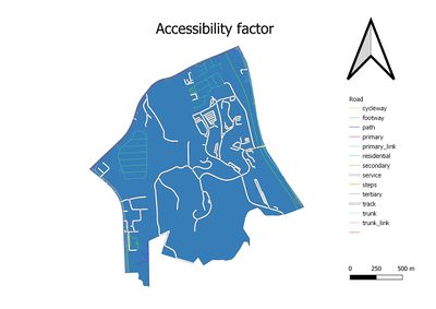
| − | + | Finding areas that near to service and track roads will ensure the transportation of construction material, and lead to earlier TOP of the building.and As mentioned above, after removing of natural features and residential area, we will only have bottom part of the Gombak to consider. However, as the service road (White pipe line) and track road (white pipe line) is not reaching to every corner of Gombak. Therefore, we should try to consider the area that beside service roads and track road. | |
| − | |||
| − | === | + | === Economic Factor === |
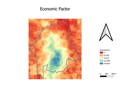
| − | + | From fourth graph. the high elevated area are indicated in blue and light green color, and more flat area re indicated in orange and red color. However, those flat areas are more or less been developed. Thus we may have to consider high elevation areas. And due to there are not much changes we can do, economic factor is weighted as 4 in this case. | |
| − | |||
| − | |||
| − | |||
| − | == | + | ==Part 2: Proximity == |
| − | [[File: | + | [[File:Prox natural1.jpg|400px]] |
| + | [[File:Prox building.jpg|400px]] | ||
| + | [[File:Prox road.jpg|400px]] | ||
| + | [[File:Prox slope1.jpg|400px]] | ||
| − | + | Proximity measures the distance to different layers. It provides us the summarized information regarding the layers. | |
| + | === Natural Factor === | ||
| + | Maximum = 852.76 <br /> | ||
| + | Mean = 257.74 <br /> | ||
| + | Minimum = 0 | ||
| − | === | + | === Health Risk Factor === |
| − | + | Maximum = 1146.30 <br /> | |
| + | Mean = 358.62 <br /> | ||
| + | Minimum = 0 | ||
| − | + | === Accessibility Factor === | |
| + | Maximum = 750 <br /> | ||
| + | Mean = 146.20 <br /> | ||
| + | Minimum = 0 | ||
| − | === | + | === Economic Factor === |
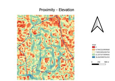
| − | + | Maximum = 36.88 <br /> | |
| + | Mean = 9.06 <br /> | ||
| + | Minimum = 0 <br /> | ||
| − | + | Apparently, four proximity layers are providing measurements in different scale. In order to use AHP calculation, we need to standardize four different layers. | |
| + | Beside that, we may need to bear in mind, the propose location should be far away from natural features and residential area. | ||
| + | |||
| + | == Part 3: Standardization == | ||
| + | [[File:S natural.jpg|400px]] | ||
| + | [[File:S buildings.jpg|400px]] | ||
| + | [[File:S road.jpg |400px]] | ||
| + | [[File:S elevation.jpg|400px]] <br /> | ||
| + | |||
| + | Due to we have observed the measurements are in different unit from proximity layers. Thus, the Min-Max method is used The Min-Max method is used to standardize the four proximity layers. | ||
| + | As the result. The first and second graphs in part three are oppositely against part two's layer. and the reason has been mentioned above. Thus, the formula was used to standardize for natural features and residential areas are: 1-"natural"/(Max"natural"-Min"natural") and 1-"residential"/(Max"residential"-Min"residential"). | ||
| + | The third and fourth graph are similar to part two's third and fourth graph. Hence, formula: "accessibility"/(Max"accessibility" - Min"accessibility") and "economic"/(Max"econmic" - Min"economic") will be used | ||
| + | Generally, for four standardized graphs. The blue or light green color is not recommended. As contrary, The red and orange color is more recommended. | ||
| + | |||
| + | |||
| + | |||
| + | == Part 4: AHP Calculation == | ||
| + | |||
| + | [[File:Calculated weightage.png|600px|centre]] | ||
| + | [[File:AHP calculation.png|600px|centre]] | ||
| + | |||
| + | AHP: as explained in part one. I had weighted four factors differently. And eventually, four factors have four different scores. | ||
| + | The scored is further used to calculate by raster calculator and the formula is: <br /> | ||
| + | ("s_natural@1"*0.625)+("s_buildings@1"*0.111)+("s_road@1"*0.185)+("s_slope@1"*0.079) <br /> | ||
| + | |||
| + | == Conclusion == | ||
| + | [[File:Output.jpg |600px|centre]] | ||
| + | [[File:Recommendation.jpg|600px|centre]] | ||
| + | Ultimately, The area is highlighted in brown in graph recommendation is suitable. And it is indicated by QGiS software that area in brown color has more than 10,000m2. However, I will still recommend the area that near to the road. So that we can save more cost. | ||
Latest revision as of 23:32, 10 November 2019
Contents
Objective
To identify a suitable location for building a National Communicable Disease Quarantine Centre, by using of analytical hierarchy process.
Part 1: Visual Analysis on Map View
Natural Factor
Ultimately, "water" and "park" are locating near to residents area and they are represented by blue and green color respectively. And "forest" is located at the right side of the graph, and it is represented by orange color. Due to majority of the natural features are near to residential area. Thus, natural factor should be considered together with residential area.
Health Risk Factor
Avoiding residential area is a most important factor to consider. Due to the possibility of leakage of dangerous virus from building and cause disaster. From the generated graph, we can easily notice that, after exclude residential area (Green color polygon the graph). It still has quite large of the space for us to consider while propose (mainly bottom and right part of the graph). As mentioned in natural factor part, natural features are near to residential area. Thus, natural factor is weighted as 1 (least important), but health risk factor is weighted as 9 (most important).
Accessibility Factor
Finding areas that near to service and track roads will ensure the transportation of construction material, and lead to earlier TOP of the building.and As mentioned above, after removing of natural features and residential area, we will only have bottom part of the Gombak to consider. However, as the service road (White pipe line) and track road (white pipe line) is not reaching to every corner of Gombak. Therefore, we should try to consider the area that beside service roads and track road.
Economic Factor
From fourth graph. the high elevated area are indicated in blue and light green color, and more flat area re indicated in orange and red color. However, those flat areas are more or less been developed. Thus we may have to consider high elevation areas. And due to there are not much changes we can do, economic factor is weighted as 4 in this case.
Part 2: Proximity
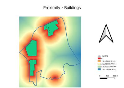
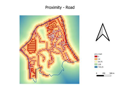
Proximity measures the distance to different layers. It provides us the summarized information regarding the layers.
Natural Factor
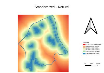
Maximum = 852.76
Mean = 257.74
Minimum = 0
Health Risk Factor
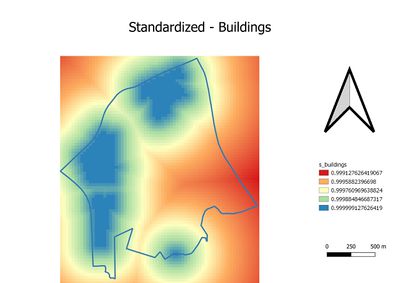
Maximum = 1146.30
Mean = 358.62
Minimum = 0
Accessibility Factor
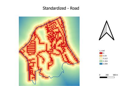
Maximum = 750
Mean = 146.20
Minimum = 0
Economic Factor
Maximum = 36.88
Mean = 9.06
Minimum = 0
Apparently, four proximity layers are providing measurements in different scale. In order to use AHP calculation, we need to standardize four different layers. Beside that, we may need to bear in mind, the propose location should be far away from natural features and residential area.
Part 3: Standardization
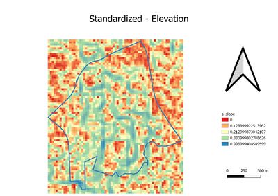
Due to we have observed the measurements are in different unit from proximity layers. Thus, the Min-Max method is used The Min-Max method is used to standardize the four proximity layers. As the result. The first and second graphs in part three are oppositely against part two's layer. and the reason has been mentioned above. Thus, the formula was used to standardize for natural features and residential areas are: 1-"natural"/(Max"natural"-Min"natural") and 1-"residential"/(Max"residential"-Min"residential"). The third and fourth graph are similar to part two's third and fourth graph. Hence, formula: "accessibility"/(Max"accessibility" - Min"accessibility") and "economic"/(Max"econmic" - Min"economic") will be used Generally, for four standardized graphs. The blue or light green color is not recommended. As contrary, The red and orange color is more recommended.
Part 4: AHP Calculation
AHP: as explained in part one. I had weighted four factors differently. And eventually, four factors have four different scores.
The scored is further used to calculate by raster calculator and the formula is:
("s_natural@1"*0.625)+("s_buildings@1"*0.111)+("s_road@1"*0.185)+("s_slope@1"*0.079)
Conclusion
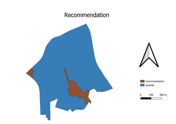
Ultimately, The area is highlighted in brown in graph recommendation is suitable. And it is indicated by QGiS software that area in brown color has more than 10,000m2. However, I will still recommend the area that near to the road. So that we can save more cost.


