G1-Group01
Contents
Proposal
Project Motivation
In the 1960s, Singapore was a third world country, there were slums and housing was one of the biggest challenges to urban planners. The population back then was only around 1.6 million and Singapore was lacking the expertise of urban planning. Hence, they approached the United Nations for help and adopted the idea of having a long term plan which is known as concept plan. Before, they had masterplan which is more for short term planning.
Today, Singapore being recognised as one of the safest cities to live in is home to approximately 5.8 million people. The biggest issue pose to urban planners now is –
Given the rate of population growth, climate changes and limited land size of 721.5 square kilometers, how can the process of urban planning be refined to meet the needs of the future?
Currently, the urban planning process approach is considered to be top-notch and frankly speaking, there are not any overarching issues that need immediate attention like back in the 1960s. However, if we were to take this for granted and not seek to improve, Singapore will risk facing issues that are as grave as back in the 1960s.
Remembering the hard times that Singapore faces and with the skills we have acquired through this module, we aspire to be better urban planners.
Project Objective
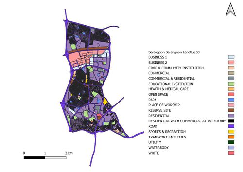
Before making any recommendations to the current land use of Serangoon, its essential for us to compare the changes. On top of this, we will need to take into consideration several factors, from the residents needs to current facilities in the area itself, before we are able to begin making changes to the area. Therefore, our project aims to be a mini model of the correct method of carrying out urban planning.
In this project, we will be analysing the following areas:
- Transportation
- Child-care Centres
- Eldercare Centres
We will also be studying 3 main groups of population:
- The elderly (aged 65 and above)
- The young (aged 0-4)
- The economic active (aged 25-64)
About Serangoon
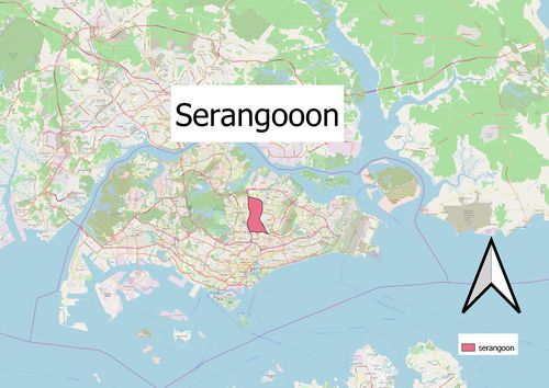
Serangoon is named after a bird commonly found in the riverine swamps around the Serangoon River and is located in the central part of Singapore, within the North-eastern region. It mainly consists of residential buildings with a total land area of 10.1km² and total population size of 116,310 as of June 2019. The area attracted more people after Nex, a shopping mall connected to a bus interchange, and the Serangoon Circle Line MRT station were built in 2010.
Data Source
Project Timeline & Scope of Work
Project Reference
Data.gov.sg. (2017, updated November 21,2019). Total Land Area of Singapore. Retrieved from
https://data.gov.sg/dataset/total-land-area-of-singapore?resource_id=f4bbfac9-c3ed-4f71-9b9a-238517b214ef
Singapore Department of Statistics. (2019, updated October 01, 2019). Retrieved from
https://www.singstat.gov.sg/modules/infographics/population
Singapore Department of Statistics. (2019, updated September 25, 2019). Retrieved from
https://www.singstat.gov.sg/find-data/search-by-theme/population/population-and-population-structure/visualising-data/population-trends


