SMT201 AY2019-20G1 Ex1 Lim Shen Jie
Contents
Part 1: Thematic Mapping
Schools
Description
The cartographic technique used to categorize the schools by their main_level was hue. That is because the main_level attribute is a nominal data. Point symbols are the best for schools because it would be able to pinpoint their exact location.
Sources
1. Master Plan 2014 Land Use 2. School Directory and Information
Roads
Description
As the roads were not categorized by their road type, a calculated field was needed to generate the road type for the roads based on the name of the road. The cartographic technique used to categorize the roads by the RD_DESC was hue. That is because the RD_DESC data is nominal. To represent the roads on the map, lines are the best way to pinpoint the exact location of the roads.
Sources
1. Road Section Line from DataMall 2. Master Plan 2014 Land Use
Land Usage
Description
The cartographic technique used to categorize the land usage was hue. That is because the land use attribute is a nominal. Areas is the best way to to pinpoint their exact location, because every piece of land has a unique shape.
Part 2 Choropleth Mapping
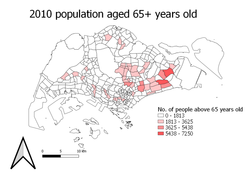
2010 Aged population 65+ years old
2018 Aged population 65+ years old
Description
The number of people that were older than 65 years increased from 2010 to 2018
2010 Proportion of aged population 65+ years old
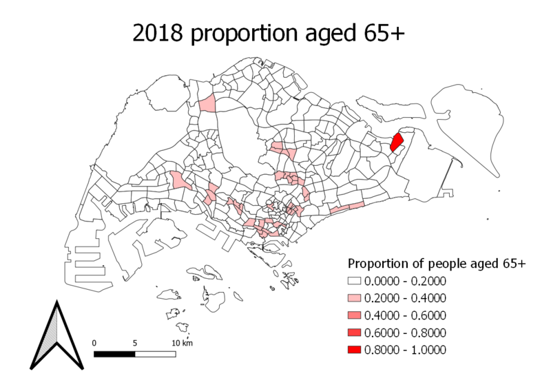
2018 Proportion of aged population 65+ years old
The proportion of people that were older than 65 years old as compared to the rest of the population increased in some areas of Singapore from 2010 to 2018.
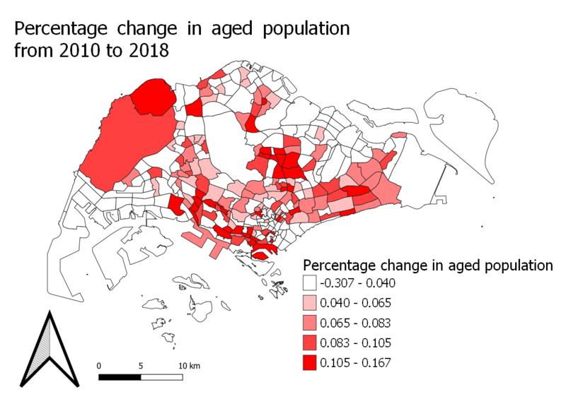
Percentage of aged population change from 2010 to 2018
Overal, majority of the subzones in Singapore had an increase in the aged people.
Discussion
Classification
To prepare a choropleth map for Aged population (+65) in 2010 and 2018, I had to calculate the number of people that were aged over 65 and summed them up together. I created two csv files, one containing the no. of people aged 65 and below, and the other containing the no. of people aged above 65 classified into their respective subzones. I joined these csv. files with the subzones based on the subzone names. In the process of joining, any null values that were obtained were treated as 0. Then, as shown in the picture, area shading was used to classify the subzones by the number of aged people. While classifying the subzones, I tried to keep the classes at an equal interval of approximately 2000 people.
To prepare a choropleth map for proportional of aged population in 2010 and 2018, I duplicated the previous two layers and used them as a base to create my map. I calculated a new field in each of the maps to obtain the proportion of aged population in 2010 and 2018. In the calculation process, I converted any null values into 0. Then, as shown in the picture, area shading was used to classify the subzones by the proportion of aged people. I distributed the classes based on quantile because the data is skewed left.
To prepare a choropleth map for percentage change of aged population between 2010 and 2018, I created a new subzone and joined it with two csv files. The two csv files were 2010 aged population and 2018 aged population. From there, I calculated a new field that contained the percentage change in population from 2010 to 2018. Any null values were treated as 0. Then, as shown in the picture, area shading was used to classify the subzones by the change in percentage of aged people. I tried to keep the class sizes at an equal interval of approximately 4 per cent.
Sources
1. Master Plan 2008 Subzone Boundary (No Sea) 2. Master Plan 2014 Subzone Boundary (No Sea) 3. Singapore Residents by Planning Area/Subzone, Age Group and Sex, June 2000 - 2018


