IS428 AY2019-20T1 Assign Ng Kai Ling Bernice
Contents
Problem & Motivation
After major events like earthquakes hits St. Himark, Always Safe nuclear power plant suffers damage resulting in a leak of radioactive contamination. Further, a coolant leak sprayed employees’ cars and contaminated them at varying levels. Therefore, the need to help St. Himark’s emergency management team combine data from the government-operated stationary monitors with data from citizen-operated mobile sensors and data visualizations to help them better understand conditions in the city and identify likely locations that will require further monitoring, cleanup, or even evacuation.
With data visualization in place, it can help analyze the following:
- Gives users an overview of radiation levels in the area over a period of time.
- Identifying uncertainties and anomalies in the dataset provided.
- Allow users to identify location of concern and car contamination.
Dataset Transformation
Before proceeding to explain how data is transformed to prepare for data visualization, we were given 3 datasets in csv format as follows:
- MobileSensorReadings.csv: contains radiation level measurements from various mobile sensors over a period of time.
- StaticSensorReadings.csv: contains radiation level measurements from various static sensors placed in specific locations over a period of time.
- StaticSensorLocations.csv: contains location information on where the static sensors are placed at.
In addition to that, shapefiles which are used for creating custom choropleth map were provided.
Removing Redundant Data
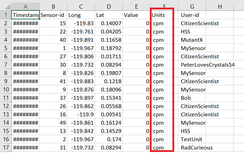
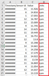
However, in the given data (both MobileSensorReadings and StaticSensorReadings), the "Units" column has "cpm" for all the values as shown below which is not in use.
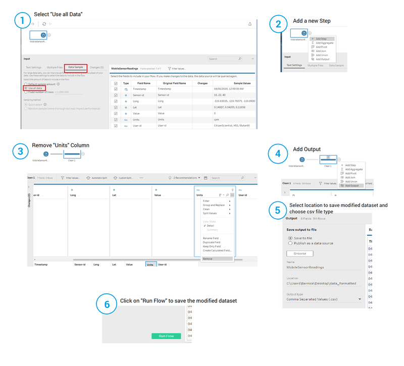
Solution: Hence, by using Tableau Prep Builder, the "Units" column are removed by following the steps shown below.
Dataset Import Structure & Process
With the dataset analysis and transformation phase completed, the following files will have to be imported into Tableau for analysis:
- MobileSensorReadings.csv (formatted from data Transformation)
- StaticSensorReadings.csv (formatted from data Transformation)
- StaticSensorLocations.csv (formatted from data Transformation)
- StHimark.shp (shapefile)
Data Connections
- MobileSensorReadings.csv
MobileSensorReadings.csv is added as a data connection without any further processing.
- MobileSensorReadings.csv
- StaticSensorLocations.csv
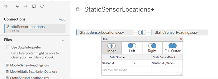
StaticSensorLocations.csv is added as another source inner joined with StaticSensorReadings.csv. Below are the steps to further process the data (refer to the image show below):
- StaticSensorLocations.csv
- Import StaticSensorLocations.csv as a data source.
- Drag StaticSensorReadings.csv from the left panel to th top right panel.
- Add inner join between these 2 data, mapping "Sensor-id" from StaticSensorLocations.csv connection to "=" with "Sensor-id" from StaticSensorReadings.csv connection
- StHimark.shp
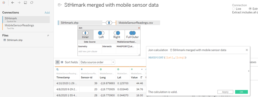
StHimark.shp is added as another data source inner joined with the MobileSensorReadings.csv. Below are the steps to further process the data (refer to the image show below):
- StHimark.shp
- Import StHimark.shp as a data source.
- Import another connection using MobileSensorReadings.csv file.
- Add inner join between these 2 data source, mapping "Geometry" from StHimark.shp connection to "Intersects" with "MAKEPOINT([Lat],[Long])" from MobileSensorReadings.csv connection.
Interactive Visualization
The Interactive Radiation Assessment System (IRAS) can be accessed here: https://public.tableau.com/views/MiniCase2Assignment-Bernice/Introduction?:embed=y&:display_count=yes&publish=yes&:origin=viz_share_link
The following sections are divided into individual dashboard pages to elaborate on the interactivity.
Introduction Page
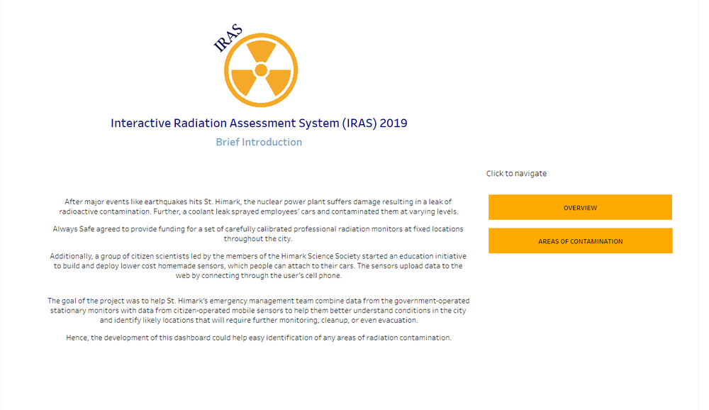
There is a large amount of data captured in the datasets provided. Furthermore, due to the many possible insights that can be driven from the dataset, it is not wise to put all the visual analytics into a single page dashboard. It will also be easier to divide the charts and visual analytics into meaning categories or pages to provide clarity. Flexibility has to be provided for navigation due to multiple pages of the dashboard. To do so, an "Introduction" page is created with a brief introduction and 2 different navigation categories: (1) Overview and (2) Areas of Contamination.
The following shows the introduction dashboard page:
| Interactive Feature | Rationale | |
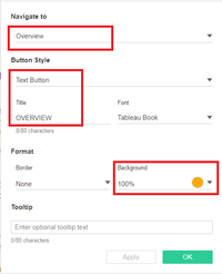
| Navigation button | To provide users the ease in moving from one dashboard page to another. |
|
Overview Page
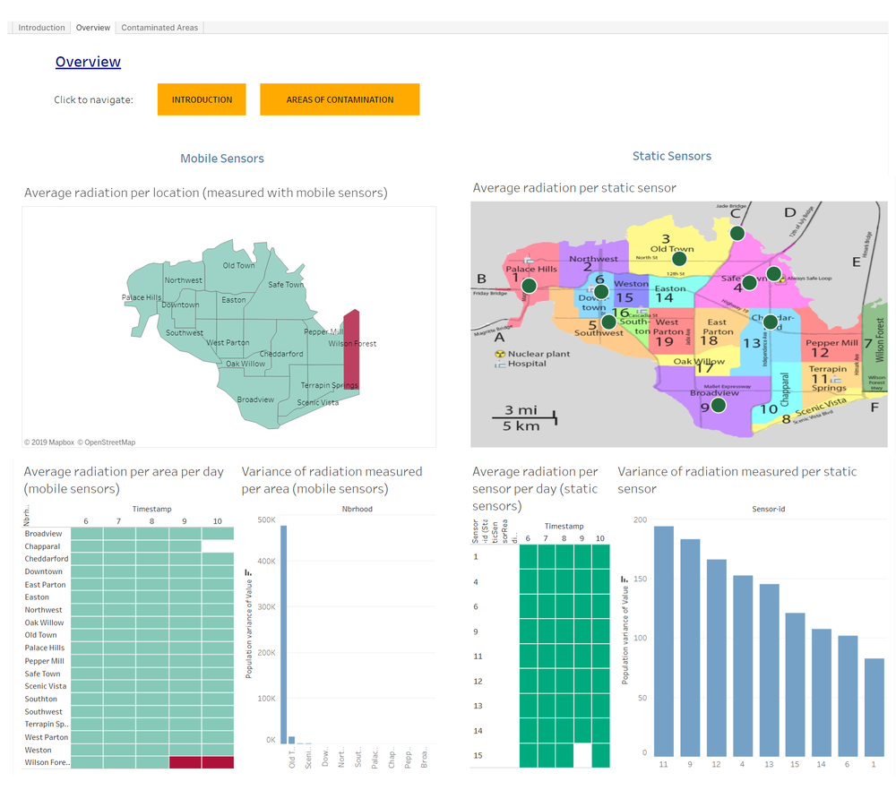
Below depicts the overview dashboard page, showing insights for both static and mobile sensors as follows:
- Area of contamination across the available time period.
- Contaminated areas shown per day.
- Variance of the radiation measurements throughout the whole period of time.
| Interactive Feature | Rationale | Implementation Steps |
| Navigation button | To provide users the ease in moving from one dashboard page to another. |
Areas of Contamination Page
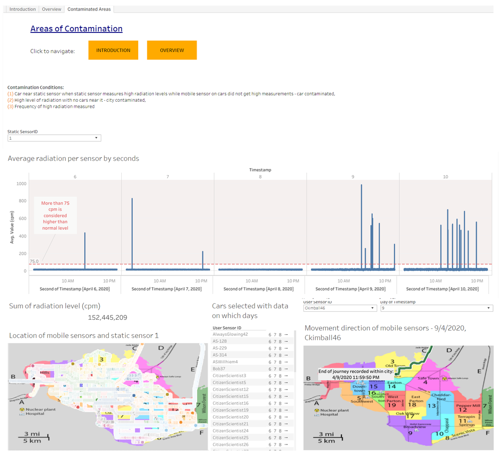
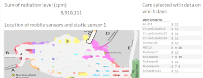
Dashboard page shown below allows users to identify the locations and cars contaminated by radiation in detail.
| Interactive Feature | Rationale | Implementation Steps |
| Navigation button | To provide users the ease in moving from one dashboard page to another. | |
|
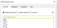
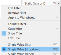
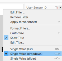
Filter Radiation per Sensor chart by each sensor |
To allow users to analyze radiation levels for each static sensors, helping them to better identify areas of concern for the government to take actions. |
|
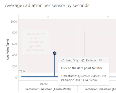
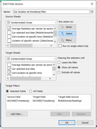
| To allow users to identify whether cars are contaminated or not in the other chart while using static data to support it. |
|
|
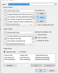
| To allow users to identify which cars are in which location at which day to assist in showing whether car has left the area or not. |
|
|
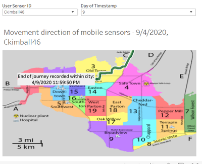
| To help users identify whether contaminated cars have left the area and through which route. |
|
Questions & Observations
Q1. Visualize radiation measurements over time from both static and mobile sensors to identify areas where radiation over background is detected. Characterize changes over time. (Limit your response to 6 images and 500 words)
- Generally, the frequency of radiation increases as in the later part of the available period (refer to Figure 1.1.1).
- Radiation measurements fluctuate heavily (refer to Figure 1.1.2) which can be caused by the air movement in certain directions (towards or away from sensors).
- The locations with sensor readings of high frequency of radiation level above 75 are potential places of contamination.
- Although the average radiation for most places over the entire available period is lower than 75 cpm (refer to Figure 1.1.3), it does not mean that the location is not contaminated. This is because, by looking at Figure 1.1.1, you can still see that the sensors did detect high levels of radiation every now and then.
