Macau777-Proposal
Contents
Problem Statement
Macao’s tourism industry has always been one of the most important industries driving economic progress, with visitor arrivals in Macao reporting around 32 million visitors in 2017. Another key aspect of tourism in Macao is its gaming industry. The most densely populated region in the world heavily relies on the popularity of being a gambling destination. 40% of Macao’s GDP comes from the gaming industry and more than 70% of tax revenues are collected from casinos. Despite the rapid growth, the Macao SAR Government has the vision to build it into a World Centre of Tourism and Leisure in the next 15 years. Hence, one of the key questions while analyzing Macao’s tourism statistics would be how the Government of Macao could uncover and utilise trends and patterns to further boost their economy by optimising marketing campaigns and imports.
Motivation
The tourism industry has always been one of the most important industries driving economic progress in Macao. Ever since the establishment of the Macao Special Administrative Region (Macao SAR), special emphasis has been placed on the development of the city’s tourism industry, which has been a catalyst for continued growth over the last decade.
Our main motivation in this is to address the lack of a convenient and comprehensive platform to study the correlation and trends amidst Macao’s most important industry to their financial growth. The current visualisation tool employed by Macao’s Government is inadequate and difficult to visualise trends and uncover patterns for the tourism industry. The Macao Government Tourism only provides market report and basic info-graphics on tourist arrivals and hotel statistics. Furthermore, the Macao’s government does not have a proper visualisation tool for its gaming industry, which is a huge component of the tourism industry in Macao.
This project provides an interactive visualization to better analyze Macao’s tourism industry, consisting of lodging, gaming and tourism spending. Through our visualisation, we aim to identify the relation between the tourism industry, and its two biggest components: hotel and gaming industry, as well as to uncover trends and patterns that the Government of Macao can utilise to further boost their economy by optimising marketing campaigns. We aim to answer questions such as how much resources should be allocated to Macao’s tourism industry, or where do most of Macao’s main contributors to its tourism industry come from?
Objectives
This project aims to provide insights into the following:
- Countries that are sending the most tourists to Macao (monthly and yearly) and their average length of stay over the past 10 years
- Identify tourists preference for accommodation
- Breakdown of tourists’ expenditure to find out which country is spending the most in Macao and which area they are spending the most on (e.g. Shopping, F&B)
- Gain insights on Macao’s gaming industry and the popular games at the Casinos
Data Sources
We have obtained the following datasets for this research:
| Dataset/Source | Data Attributes | Purpose |
|---|---|---|
| Gaming Statistics (CEIC)
(2009 - 2018) |
|
This dataset will allow us to see the popular games in the casinos. This can be joined with other datasets to draw a relation with the tourists that are driving the popular games. |
| Hotel Statistics(CEIC)
(2009 - 2018) |
|
This dataset will allow us to determine the various statistics of hotel occupancy, which can be used to analyse visitors preference for hotels based on conditions such as price and star ratings. |
| Visitor Arrivals (CEIC)
(2009 - 2018) |
|
This dataset will let us see the arrivals of tourists and whether it is overnight or same day arrivals. |
| Resident Departures (CEIC)
(2009 - 2018) |
|
This dataset will be used to determine how residents depart, and to which country. |
| Visitor per Capita Spending (CEIC)
(2009 - 2018) |
|
This dataset will allow us to determine what do tourists from each country spend in Macao. |
| Visiting Purposes (Data plus)
(2009 - 2018) |
|
This dataset will be used to understand the purpose of visit by the tourists into Macao. |
Literature Review
| Visualizations | Explaination |
|---|---|
|
|
This visualisation enables the viewer to find out the countries that the tourists are coming from. This, combined with the thickness of the line to represent the relative number of tourists compared to the other countries will enable us to have a quick and clear overview. Additionally, the team will look into customising this current chart, to allow for a more detailed view of each countries' actual proportion of tourists that are coming into Singapore compared to the other countries being visited. |
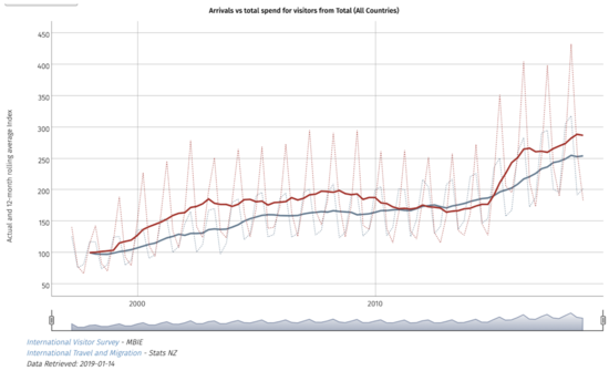
New Zealand Tourism Our team took inspiration from the New Zealand Tourism Dashboard, which was developed by New Zealand’s government. The dashboard aims to act as a one-stop shop for information about the tourism industry in New Zealand. By combining government tourism research and insight, the information is presented in a series of dynamic graphs and data table. Link: https://mbienz.shinyapps.io/tourism_dashboard_prod/
This visualisation allows us to see the total arrivals against the total spend for visitors into New Zealand. The data allows us to see the 12-month rolling average Index as well. However, one drawback of the visualisation is that it does not allow us to plot different countries on the same graph.
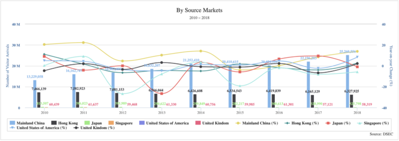
Macao Data plus Our team also took inspiration from the current visualisation tool provided by Macao’s government (Data plus) for its tourism industry. The tool aims to provide statistics on the current tourism industry in Macao. Link: https://dataplus.macaotourism.gov.mo/
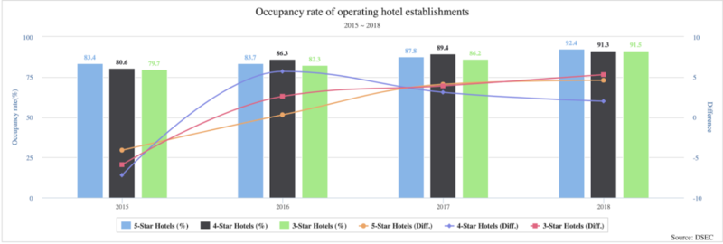
This combined bar and line chart from Data plus shows which countries do the visitors come from and the occupancy rate of operating hotel establishments, as well as the respective year-on-year change in percentage.
Consideration & Visual Selection
The following are visual selections which we have found that we plan to use for our visualisation:
1) Treemap
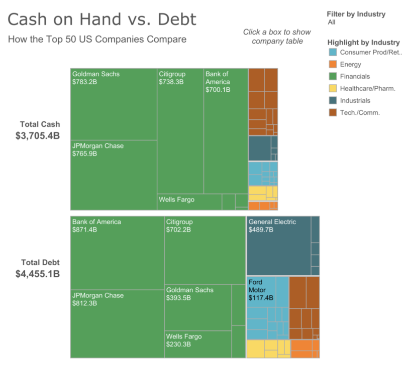
Source: https://www.tableau.com/about/blog/2014/12/5-chart-types-youve-never-tried-tableau-35281
Treemap diagrams can be used to visualise hierarchical and part-to-whole relationships very effectively. This diagram can be used to visualise total spending by different visitors into Macao.
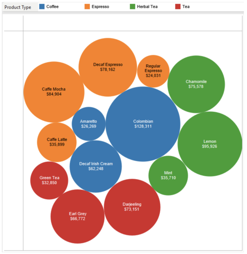
2) Packed Bubble
This visualisation is used to show relational value without regards to axes. This can be used to show the different betting amounts for different games in Macao’s casino. (Source: https://interworks.com/blog/ccapitula/2015/01/06/tableau-essentials-chart-types-packed-bubbles/)
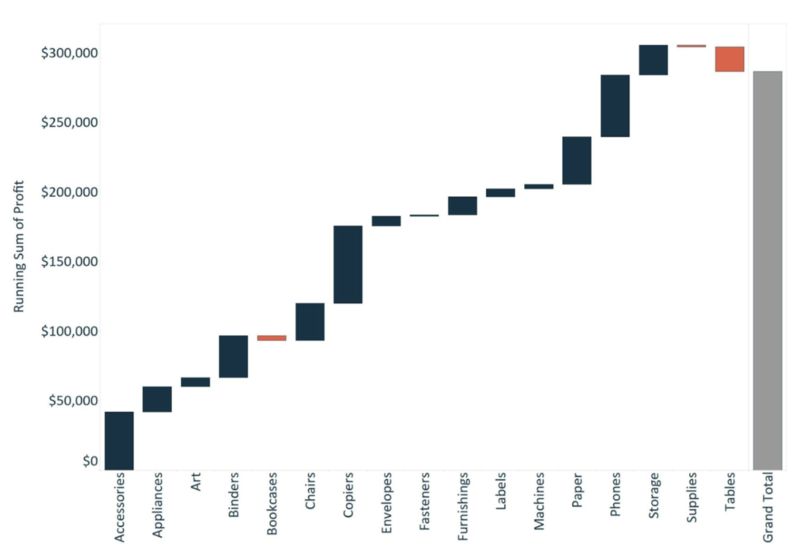
3) Waterfall Chart
This waterfall chart helps to visualise the effect that positive and negative values of dimension members contribute to the total. This can be used to visualise the year-on-year change in visitors to Macao. (Source: https://www.evolytics.com/blog/tableau-201-make-waterfall-chart/)
Brainstorming Sessions
Technologies
| Key Technical Challenge | Solution |
|---|---|
| Unfamiliarity with visualisation tools such as R, RShiny and Tableau |
To address this challenge, the team will focus on learning more about the different visualisation tools on the course from Datacamp as well as to practise with the tools in our free time. We will also seek help from our fellow peers and make use of Google for any queries. |
| Analysis and transformation of data for visualisation |
The current datasets has to be cleaned as the data is messy and the format is not proper. Since our project has 26 datasets to be analysed, we will face key issues in preparing the data for visualisation. Our team plans to split up the work into different segments and work on it individually, before coming together to check the datasets together, and promptly proceed to merge them as required. |
Timeline
A list of milestones breaking the project into smaller chunks and a description of what each person in the group will work on.
Week 8: Proposal submission
Week 9: Start on Data Cleaning and Data Preparation
Week 10: Visualisation on R (Everyone)
Week 11: Visualisation on R (Everyone)
Week 12: Creation of application using R-Shiny
Week 13: Completion of posters and research paper
Week 14: Final Touchups and Submission

