Ball4life proposal

From Visual Analytics for Business Intelligence
Revision as of 22:17, 13 October 2019 by Greg.tan.2017 (talk | contribs)
Jump to navigation Jump to search
Ball4life.png


Team


Proposal


Poster


Application


Research Paper


<--- Go Back to Project Groups

INTRODUCTION


The National Basketball Association (NBA) is a men’s professional basketball league in North America. Comprising of 30 teams (29 in the United States and 1 in Canada), it is one of the 4 major professional sports leagues in the United States and Canada. Furthermore, it is widely regarded as the premier basketball league in the world, with many fans touting it as the hardest league with the world’s best players competing in it.

With an average NBA team being valued at US$1.9 billion, the NBA continues to generate earnings in the hundreds of millions. This, coupled with growing fan bases in China, Philippines, Vietnam and Europe ensures that the NBA will be able to provide entertaining and competitive basketball games for all their fans.

PROBLEM & MOTIVATION


Despite the success of the NBA in global markets, it remains relatively obscure in our local society. Many Singaporeans play a variety of sports and know of many famous athletes both worldwide and locally, such as:

International: Cristiano Ronaldo: Soccer Lionel Messi: Soccer Roger Federer: Tennis

Local: Table Tennis: Feng Tianwei Swimming: Joseph Schooling

However, few to no Singaporeans could say out even the name of an NBA player, apart from Michael Jordan, who has retired 16 years ago in 2003. However, there has been an increase in interest in the sport, as more and more locals begin to be associated with the sport.

Therefore, the team wishes to teach and showcase the insights behind each NBA game for the rising pool of basketball enthusiasts. This will serve to allow basketball enthusiasts get a better appreciation of the game, and help players with their basketball skills by providing them with actionable insights on how to improve their game. This will be done through data visualisation insights derived from the premier players and teams of the NBA.

OBJECTIVE


This visualisation aims to provide insights into the following:

1. What is the key attribute to help basketball teams win games
2. Is height truly essential to be a good basketball player
3. Which type of shot will make you a more efficient player


SELECTED DATABASE


The Data Sets we will be using for our analysis and for our application is listed below:

Dataset/Source Rationale Of Usage
NBA Player Profile

Having the profile statistics (eg. Height, Weight) of an NBA player will allow us to accurately assess if there is indeed any correlation between his player profile and his ability to be a good player.

NBA Team Breakdown


This will help us to determine which are the teams that consistently outperform other teams, and through analysis allow us to determine the key aspects that gives each team their edge.

NBA Player Scoring Breakdown

This will help us to properly segment each player into different categories based on various metrics, which will ultimately help us to determine what are the things that each player does that best maximizes their abilities.


BACKGROUND SURVEY


We did basic background research on some existing visualizations or dashboards we could drive inspirations from or make it better. Below are a few visuals we found:

Reference of Other Interactive Visualization Learning Point

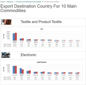
Title: Export Destination Country For 10 Main Commodities

Cakrawala Background1.png


Source: https://www.kemendag.go.id/en/economic-profile/10-main-and-potential-commodities/10-main-commodities

Positive Points:

  1. The bar graph shows the comparison of export in Jan-Jul 2017 to Jan-Jul 2018 for a specific commodity, e.g. Textile and Product Textile. It allows immediate comparison of export performance for the top trading partners of Indonesia.

Negative Points:

  1. There is no data label and it is hard to manually trace the graph to the figure.
  2. It only gives information in 2017 and 2018 from January to July
  3. There are no interactive tools that allow the user to choose the year or the commodities that they want to see
  4. The y-axis should start from 0 instead of a dash symbol

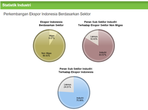
Title: Indonesia Growth of Export by Sector

Cakrawala Background2.png


Source: https://www.kemenperin.go.id/statistik/peran.php?ekspor=1

Positive Points:

  1. The first pie chart (yellow) shows the breakdown of Indonesian export by sector. It follows by the red and blue pie chart that shows further breakdown into percentage of non-oil and gas sector export. It gives the viewer more details and breakdown of Indonesia export.

Negative Points:

  1. It takes time and effort to understand the 3 pie charts at once.
  2. The use of the pie chart is not suitable to display the breakdown of export by sector. Instead, a stack bar chart can be used to show the total export and what made up of Indonesia export.
  3. Lack of Legend to show what goes inside the industry in the pie chart red and blue.

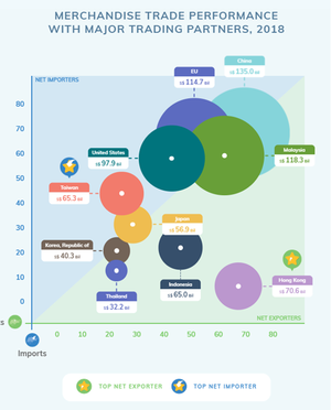
Title: Marchendise Trade Performance

Cakrawala Background3.png


Source: https://www.singstat.gov.sg/modules/infographics/singapore-international-trade

Positive Points:

  1. It shows the 2 information at once, which are merchandise trade value and the trading partners in 2018.
  2. Able to spot which the highest import and export trading partner clearly by the bubble position and its size.

Negative Points:

  1. The bubbles are overlapped yet the color use is opaque. It should use opacity so that the viewer will still be able to see the whole bubble.
  2. It is messy to cluster all elements on the graph (bubble + legend) and take a lot of time to make sense of the graph.
  3. Lack of interactive element and limited information as it only contain 2018 information. It would be better to include the filter so that the viewer is able to choose the year's input.

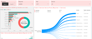
Title: ASEAN's Stat

Cakrawala Background4.png


Source: https://data.aseanstats.org/dashboard/tis

Positive Points:

  1. Interactive filter that gives choice for the viewer to filter the data that they want to see
  2. The toggle export and import allows the user to view both data on the same platform. It also helps the user to figure out the trade balance of service.
  3. The Trade in Services Service Flows (Reporter -> Services) graph is useful in showing the distribution contribution of service based on the quantity.


CONSIDERATION & VISUAL SELECTION


Below are a few visualizations and charts we considered making for our projects.

Visual Considerations Insights / Comments

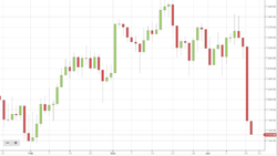
Title: Candlestick Graph

Cakrawala ConsiderationVisual1.png

Source: https://thestophunter.co.uk/technical-analysis-candlestick-charts/

Show the price movement at given instrument

  • Pros:
    • Can be used in describing the trade balance (export-import) of Indonesia
    • With color-coding can easily point out of the possible earning / losses
  • Cons:
    • Need a minimum number of data to work with (e.g. must have Open/Close, High/Low data to work).

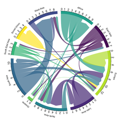
Title: Chord Graph

Cakrawala ConsiderationVisual2.png

Source: https://www.data-to-viz.com/graph/chord.html

Shows flows / connection between several entities

  • Pros:
    • Aim to show the import and export of Indonesia
    • With highlighting, we will be able to spot them in and outflow of Indonesia’s Trade
  • Cons:
    • Over-cluttering makes figure unreadable (too many data / country)
    • Hard to discover the pattern

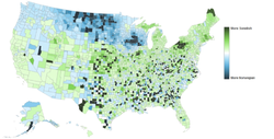
Title: Choropleth Map

Cakrawala ConsiderationVisual3.png

Source: https://viscomvibz.wordpress.com/2012/03/17/the-pros-cons-of-choropleth-maps-blot-maps-patch-maps/

Using coloring scheme to show the value levels

  • Pros:
    • Can effectively show the reported country that works with Indonesia through the shaded area.
    • Can detect the relationship between the encoded variable and geographic location.
  • Cons:
    • Choropleth map used average value to represent the area so the user might not able to access detail information.
    • Area is not uniform so that it might misleading between the area on map and the value levels represented.

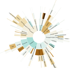
Title: Sunburst Graph

Cakrawala ConsiderationVisual4.png

Source: https://observablehq.com/@julesbonnard/sunburst

Display the hierarchical data in circular format

  • Pros:
    • Can visualize the hierarchical of import and export items based on the amount
    • Can visualize the breakdown between oil & gas and non-oil & gas
  • Cons:
    • Cannot clearly define which is belong to oil & gas and non-oil & gas
    • Too many breakdowns make it hard to identify the details clearly


BRAINSTORMING SESSION


Cakrawala Brainstorming.png


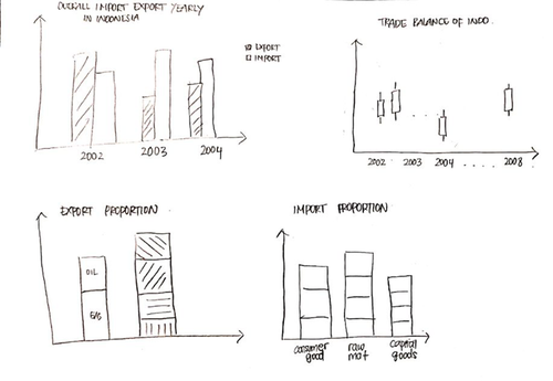
During the first few brainstorming sessions, our initial idea was visualizing the hotspot (forest fire) in Indonesia. It started from our concern with the current haze situation in Singapore. Thus, we are determined to explore the effect of forest fire towards the air quality in several neighbouring country. After some preliminary research and consultation, feedback that we got was this topic will be more useful for scientific research purpose instead of visualization project. On top of that, this topic might limit the team to visualize as when PSI reading is involved, the affecting factor might not only forest fire but also wind direction and rainfall which is difficult to obtain the accurate data. Hence, we decided to drop the idea due to time constraint.

In the next few discussion, our group tried to look at the aspect of Indonesia that still lacking in visualization which directs us to the trading of Indonesia. We feel the importance to visualize trading in Indonesia as it is one of the most important factors for the country’s economic growth. Our group met several times to discuss the project objective and design the storyboard. In the import and export context, we tried to visualize what information is interesting for the user. Initially, we came up with the first four charts for our project with simple views so that the user can get all the information at one glance.

The first chart is the bar chart where it shows the total amount of both import and export every year; with second and third charts shows the proportion of oil & gas and non-oil & gas for both import and export.

The most interesting part will be on candlestick chart; where it will show the trade balance with the calculation of export minus import and each candlestick will be shaded with color where green means positive net trade balance while red means negative net trade balance. However, we decided to drop the candlestick chart that shows trade balance. It was because candlestick meant to show the price difference where raw data should have 4 attributes (e.g. close-open, high-low) and our data did not match with the purpose of this chart.

After a few sessions of brainstorming, we came up with our final designs which are listed below.

PROPOSED STORYBOARD


Below is the proposed story board for our project:

Storyboard Insights / Comments

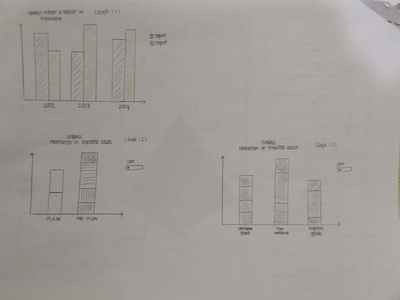
Title: DASHBOARD 1 - OVERVIEW (STORY 1 - OVERVIEW)

Cakrawala ProposedStoryboard1.png
  • Aim to show the overall import and export of Indonesia over the year (Graph 1.1)
  • Aim to show the proportion of exported (Graph 1.2) and imported (Graph 1.3) goods at certain year
  • There is a dropdown list where user can choose the desired result on a particular year (dropdown available in Graph 1.2 & 1.3)

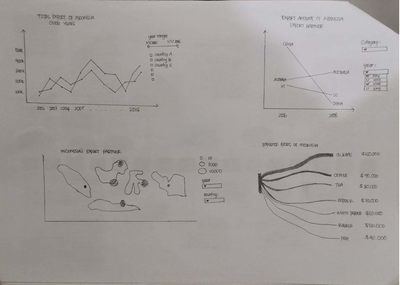
Title: DASHBOARD 1 - OVERVIEW (STORY 2 - EXPORT, STORY 3 - IMPORT)

Cakrawala ProposedStoryboard2.png
  • Consist of two main stories: separated by Export and Import
  • Aim to show the trend of import and export of Indonesia within certain year range (line graph)
  • Show the total amount of export and import of each country on the map on a particular year (geographical map)
  • Show the performance of each country between 2 selected years (slope graph)
  • Show the product that is exported and imported along with the total amount (Sankey graph)
  • There is a slider of year range provided to let the user view the trend of import and export on the year range
  • There is a dropdown list of year and country provided to let the user filter the year and country to highlight on the map
  • There are dropdown list on category and year to let the user show the performance of certain country on category selected between these 2 years

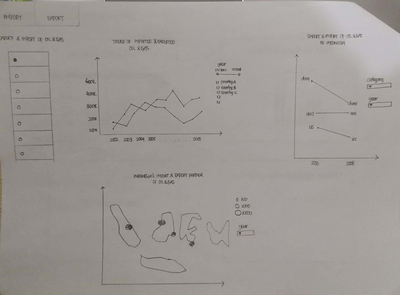
Title: DASHBOARD 2 - CATEGORY (STORY 2 - EXPORT & IMPORT OF GAS & OIL; STORY 3 - EXPORT & IMPORT OF NON-GAS & OIL)

Cakrawala ProposedStoryboard3.png
  • Table radio button to let the user choose the export and import graph on specific category breakdown (e.g. oil & gas, non-oil & gas can be a consumer good such as white pepper, etc.)
  • Aim to show the trend of exported and imported goods category of Indonesia within certain year range (line graph)
  • Show the total amount of exported and imported category of each country on the map on particular year (geographical map)
  • Show the performance of each country between 2 selected years (slope graph)
  • Slider of year will be provided to let the user choose the year range
  • Dropdown list of category and year will be provided to show additional information

Title: DASHBOARD 3 - TRADE BALANCE

Cakrawala ProposedStoryboard4.png
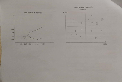
  • Aim to show the trade balance of Indonesia over the years where can derive insight of surplus and deficit trade balance
  • Aim to look at the performance of each country in terms of export and import by using the percentile (graph divided into 4 main areas - area where Indonesia should focus more on the country that contributes the most in export, country of goods that Indonesia imported the most, country that makes no big effect on trading, and area where Indonesia should focus more - positive relationship in both import and export).


TECHNOLOGIES


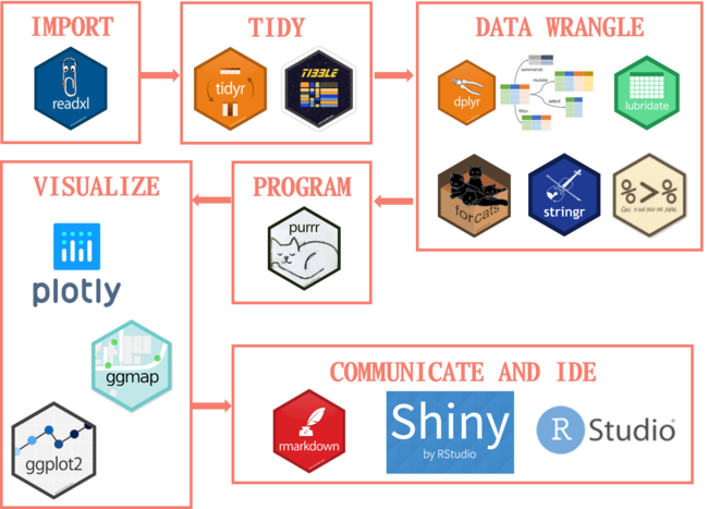
The technologies we will be using for this Project is as below:

Cakrawala Technologies V2.png


CHALLENGES


Challenges Mitigation Plan
  • Unfamiliarity of visualisation tools such as R, R Shiny, Tableau.
  • Hands on practice using the different training platforms such as Data Camps
  • Watch video tutorials from YouTube
  • Peer Learning
  • Unfamiliarity of data cleaning and transformation using Tableau Prep
  • Attend workshop on data cleaning methods
  • Watch video tutorials on how to fully utilise Tableau Prep
  • Trial and test on the different cleaned data sets while maintaining the raw data
  • Limited knowledge and the jargon used in Indonesia’s trading industry
  • Research and learn the situation of Indonesia’ export and import in the last ten years
  • Read articles or news to find out the recent trends and global updates on trade


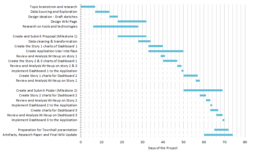
TIMELINE


Cakrawala TimelineProposal.png


COMMENTS


Feel free to leave us some comments so that we can improve!

No. Name Date Comments
1. Insert your name here Insert date here Insert comment here
2. Insert your name here Insert date here Insert comment here
3. Insert your name here Insert date here Insert comment here