Dashboard
Revision as of 22:00, 13 October 2019 by Jazreel.tho.2017 (talk | contribs)
|
|
|
|
|
Dashboard
Access dashboard link:https://public.tableau.com/views/Jazreel_MC2/Home?:embed=y&:display_count=yes&publish=yes&:origin=viz_share_link
Homepage

This is the homepage of the dashboard that shows an overview of what this dashboard is analyzing. There are 2 main tabs to analyze:
- Neighbourhood -> Analyze radiation levels by Neighbourhoods
- Sensor - > Analyze radiation level by Sensors
Sensor Analysis
 ]
]
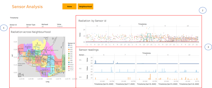
This page shows the analysis by both static and mobile sensors. The top of the page consist of 2 buttons:
- Home -> Navigates to homepage
- Neighbourhood -> Navigates to Neighbourhood Analysis page
There are 5 different filters:
- Timestamp -> Drag the slider to obtain the preferrred range of dates for analysis
- Sensor id -> Includes both static and moobile sensor ids to filter from
- Sensor Type -> Filter by Mobile, Static or All
- Neighbourhood -> Filter by St.Himark's neighbourhoods
- Value -> Drag the slider to obtain analysis on sensor ids with value more than value on the slider. To analyse contaminated areas/cars, drag the pointer to 75 mark to filter sensors with a value of 75cpm and above

There are a total of 3 charts:
- Radiation across Neighbourhoods -> shows the movement of each sensor id on St. Hilmark map throughout the period that is being filtered. The sensor ids are being represented by different colours
- Radiation by Sensor id -> Shows the radiation level of all sensor ids taken at each timestamp over days and hours. Good for checking for outliers in the data
- Sensor readings -> Displays the radiaion level for each sensor id individually over days and hours. Good to analyze each sensor individually such as the radiation growth in each sensor and if there is any missing data for each sensor.
Neighbourhood Analysis

This page shows the analysis by both static and mobile sensors. The top of the page consist of 2 buttons:
- Home -> Navigates to homepage
- Sensor -> Navigates to Sensor Analysis page
There are 5 filters:
- Timestamp -> Drag the slider to obtain the preferrred range of dates for analysis
- Sensor id -> Includes both static and moobile sensor ids to filter from
- Sensor Type -> Filter by Mobile, Static or All
- Neighbourhood -> Filter by St.Himark's neighbourhoods
- Value -> Drag the slider to obtain analysis on sensor ids with value more than value on the slider. To analyse contaminated areas/cars, drag the pointer to 75 mark to filter sensors with a value of 75cpm and above
- Average radiation across Neighbourhoods -> Shows the average radiation for each Neighbourhood on the polygon map. The higher the value, the darker the red.
- Radiation changes over days by Neighbourhood->Shows the percentage int the growth of the radiation readings as compared to the previous day. If there is an increase in the percentage, the data cell wiill be highlighted in red. If there is a decrease, it will be reflected in green. Else, if there is not much growth, it will be grey colour.
- Radiation by Neighbourhood -> Shows the average radiation level by mobile and static sensors over days and hours by Neighbourhood.

