IS428 AY2019-20T1 Assign Lee Jenny Csm
Contents
Background
St. Himark has been hit by an earthquake, leaving officials scrambling to determine the extent of the damage and dispatch limited resources to the areas in most need. They quickly receive seismic readings and use those for an initial deployment but realize they need more information to make sure they have a realistic understanding of the true conditions throughout the city.
In a prescient move of community engagement, the city had released a new damage reporting mobile application shortly before the earthquake. This app allows citizens to provide more timely information to the city to help them understand the damage and prioritize their response. With emergency services stretched thin, officials are relying on citizens to provide them with much-needed information about the effects of the quake to help focus recovery efforts.
Objectives & Tasks
With the huge amount of information provided by the citizens, emergency planners are unable to gather insights and discover patterns without any visualization tools. Hence, there is a need to help the emergency planners build an interactive data visualization that allows them to efficiently gather the information that they need and identify areas of concern. The interactive visualization aims to provide emergency planners with the following information:
- Decide how responses (by emergency planners) will change based on damage reports from citizens on the ground
- Prioritize neighbourhoods based on responses given
- The region that experience the hardest hit
- Compare the reliability of neighbourhood reports
- Changes in conditions/uncertainty over time
Data analysis & Transformation Process
This section will elaborate on the dataset analysis and transformation process for each dataset in order to prepare the data for import and analysis on interactive visualization.
There is one zip file provided for this assignment and the dataset is given for this assignment spans the entire length of the event, containing individual reports of shaking/damage by neighbourhood over time. Reports are made by citizens at any time, in 5-minute batches/increments.
There are 5 main areas in the city that was affected by the earthquake: Buildings, Medical, Power, Roads & Bridges and Sewer and Water. Alongside these affected areas are damage values that were reported by the citizens on the ground. Reports are made by citizens at any time; in 5-minute batches/increments.
The format of the captured data for all the affected areas (e.g. buildings, medical, etc) is the same.

The following section illustrates the issues faced in the data analysis phase leading to a need to transform the data into a specified format.
| Problem #1 | Format of Data |
|---|---|
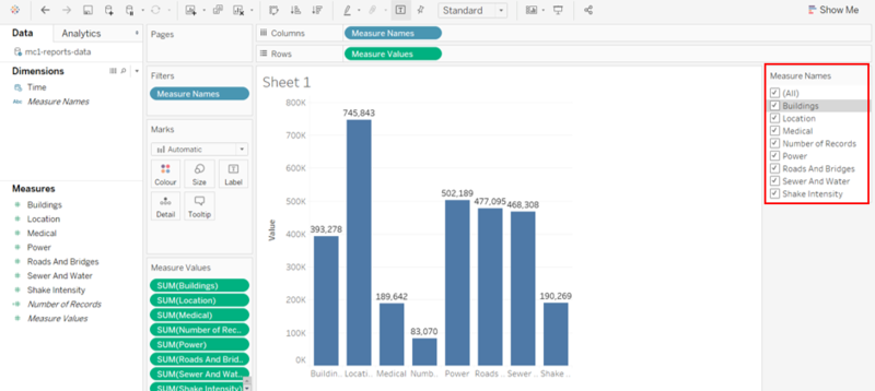
| Issue | As all the affected areas (e.g. buildings, medical, etc) are recorded individually on different columns, we are unable to compare the different affected areas nicely in one visualization because of the following reasons:
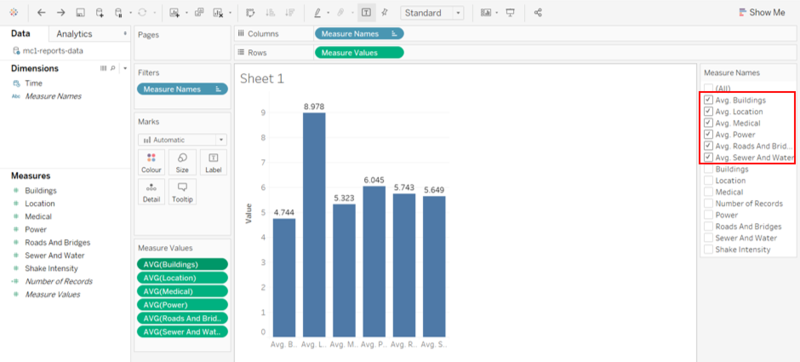
2. The damage value that is tied to each affected area at a given time is recorded on a scale from 1 to 10 depending on how bad the damage was (0 – lowest; 10 – highest). Hence, we should not aggregate it but instead, use the average to compare and analyse how bad the damage was. As such, when we change the measure to an average, the previous measures are not replaced. The average measure will be added to the filter selection, causing more unnecessary selections in the filter pane.
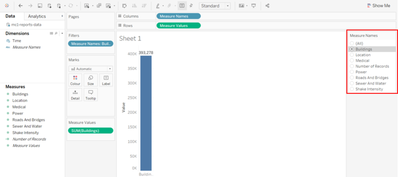
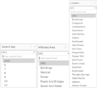
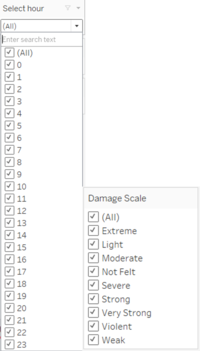
3. The format of the filter is only limited to ‘Multiple Values (list)’. As seen from the images below, we can change the format of the filter to ‘Single Value (list)’. However, when we select ‘(All)’ in the filter pane, the format of the filter will automatically change to the ‘Multiple Values (list)’ format. Hence, it is not ideal and user-friendly for users if the format of the filter changes upon selection.
The format and structure of the current data are not ideal as we are unable to perform the basic comparison and apply filters to the visualization. |
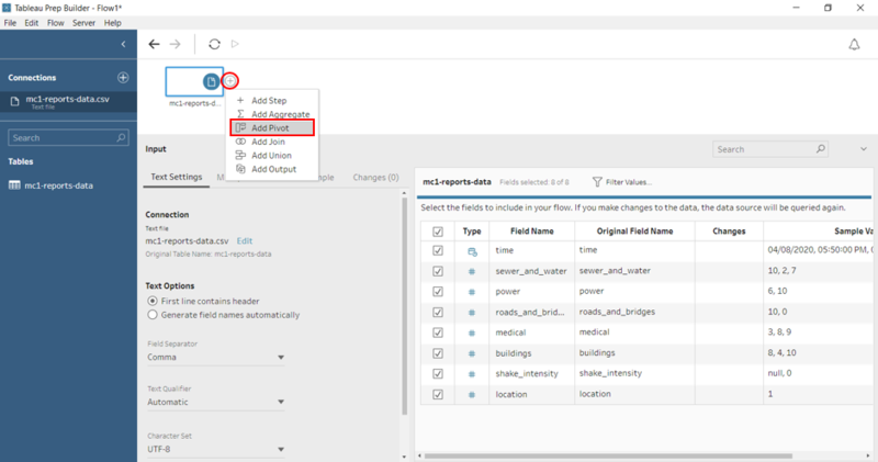
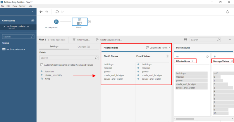
| Solution | The resolution to the above-mentioned issues is to pivot the columns using Tableau Prep Builder. By pivoting the columns, it makes the data easy to use and it allows users to easily analyse data, summarize data and find patterns in data.
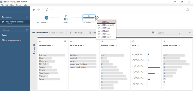
1. Open Tableau Prep Builder and drag the data file – ‘mc1-reports-data’ into Tableau Prep Builder. 2. To pivot the columns, click on the ‘+’ sign and select ‘Add Pivot’
|
| Problem #2 | Insufficient information - Damage Scale |
|---|---|
| Issue | All reports collected from citizens on the ground are recorded on a scale from 1 to 10 depending on how bad the damage is. Hence, it is hard for us to visualize numbers. All we know is that 0 represents the lowest damage and 10 represents the highest damage. However, the numbers 1 to 9 are not defined. This may cause misinterpretation of the data, leading to an inaccurate result. This is an important issue that must be handled because the visualization is used by various emergency responders and they may analyse the results differently. |
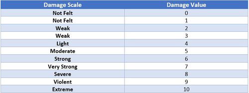
| Solution | Create a Calculated Field to map the ‘Damage Value’ to a new field – ‘Damage Scale’ which is an ordinal scale. The scale is taken from the majorquake-shakemap.png.
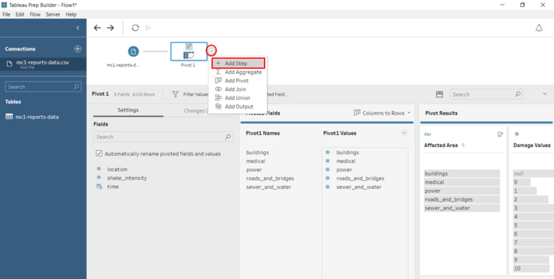
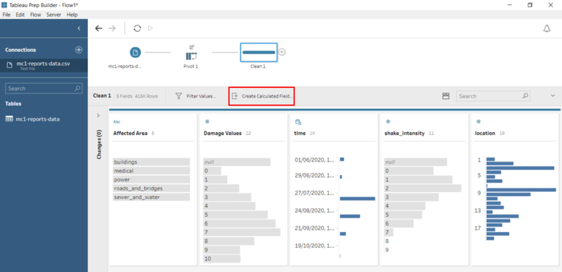
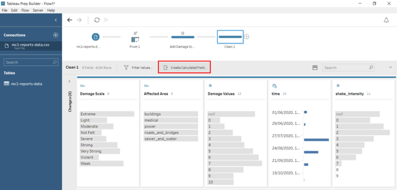
1. To create a calculated field, click on the ‘+’ sign and select ‘Add Step’.
IF([Damage Values]==0) THEN "Not Felt"
|
| Problem #3 | Insufficient Information - Location Name |
|---|---|
| Issue | Currently, the data only consists of a location field that is in a numerical format (1 to 19). As such, we are unable to identify the region of the city based on the location data given. Hence, it is important that we include the location name to the visualization so that it is clearer and well represented. |
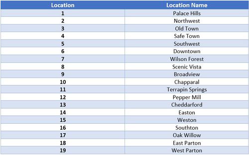
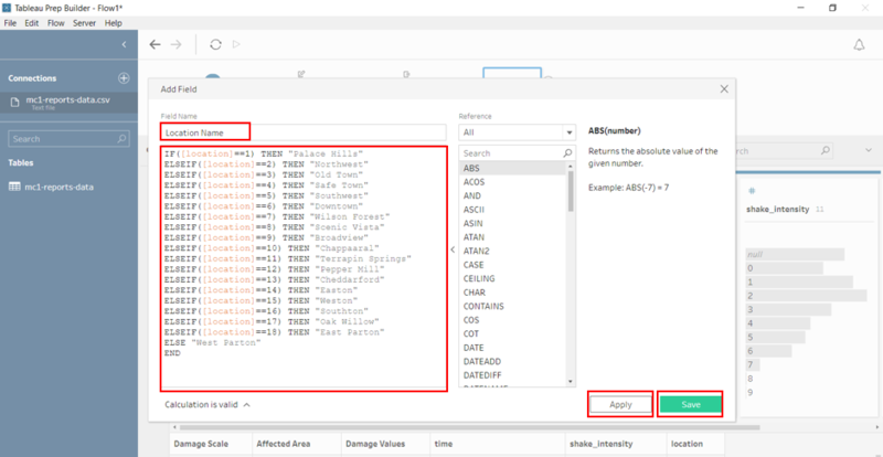
| Solution | Create a Calculated Field to map the ‘Location’ to a new field – ‘Location Name’ . The location name is taken from the StHimarkLabeledMap.png in MC2
1. To create a calculated field, click on the ‘+’ sign and select ‘Add Step’.
IF([location]==1) THEN "Palace Hills"
|
After solving the 3 problems above, we are done with the data transformation process. To download the data:
1. Click on the ‘+’ sign and select ‘Add Output’.
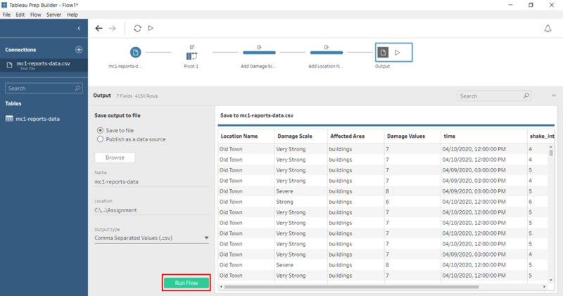
2. Enter the name of data file – ‘mc1-reports-data’, select location and output type – ‘Comma Separated Values’ (.csv) and click on the ‘Run Flow’ button.
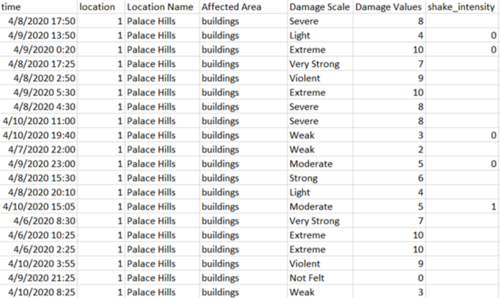
The final data file should look like this. As you can see, we have successfully pivoted the 5 columns to 2 columns – ‘Affected Area’ and ‘Damage Values’. Also, the new columns – ‘Location Name’ and ‘Damage Scale’ is added to the data file.
Dataset Import Structure and Process
After preparing the data using Tableau Prep Builder, the following files must be imported into Tableau for analysis. The data file (output from Tableau Prep Builder) and the SHP file must be added in Tableau before we create the interactive visualization.
The data file and SHP file are added as a data source in Tableau. To add the SHP file, select the Spatial file and select the SHP file. The relationships defined between the data file and the SHP file is the Id (in SHP file) and Location (in mc1-reports-data.csv) and perform a left join between Id and Location. This will allow analysis to be conducted across all the data sources at any one point.
Interactive Visualization/Dashboard Design
The interactive visualization can be accessed here: https://public.tableau.com/views/IS428Assignment_15709368017700/Home?:embed=y&:display_count=yes&:origin=viz_share_link
The size of the interactive visualization is set to automatic. This means that the dashboard will resize to fit any screen it is displayed on.
Throughout all the interactive visualization, navigation buttons are provided at the top to help users navigate through the different dashboards. Moreover, filters and actions are included in the visualization to allow users to efficiently analyse and gather insights with much ease. The following interactivity elements are used throughout the dashboards:
The following sections elaborate on other interactivity techniques are integrated into each of the individual dashboards.
The breakdown of the visualization is as follows:
- Overview of the damage Report
- Uncertainty in the report by citizens
- Changes in damage over time
Home Dashboard
Users using the interactive visualization will start off at the home page (aka landing page). The home page provides an overview and context of the visualization, and the possible data exploratory functions available. Moreover, it provides users with the flexibility of navigating between different dashboards to gather insights. To do so, a homepage is created with 3 different categories in mind – Damage Report, Uncertainty of data and Changes over time. Each of these categories is further broken down into its respective sub-categories for users to conduct their analysis. As the dashboards are neatly categorized, it allows users to easily navigate to the visualization that they are interested to analyse.
| Interactive Technique | Rationale |
|---|---|
| Navigate across dashboards with buttons | To create a user-friendly visualization where users can navigate from one dashboard to another easily based on what they want to analyse at that point in time. |
| Display tooltips when users hover over each button | To provide users with context of what they can expect to see when clicking on the button. This allows them to understand the actions that are tagged to the icon. |
Shake Map
The purpose of this dashboard is to provide users with insights on how pre-quake and major quake are affecting the different regions in the city. Emergency planners use this to identify the regions that are highly affected by the earthquake.
Overview of Damage
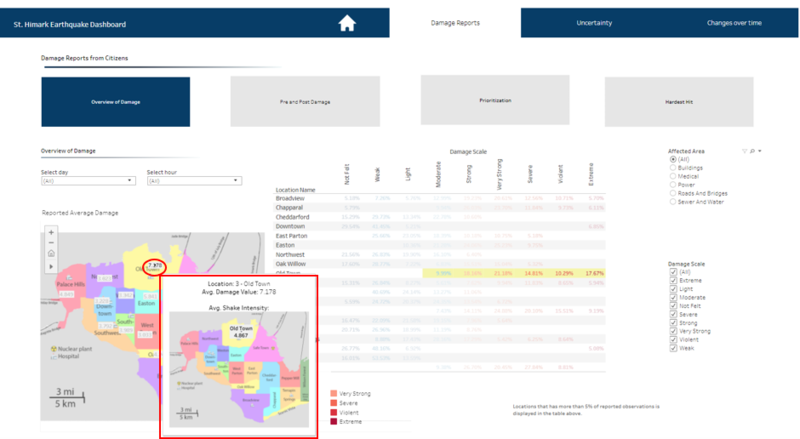
Below the navigation bar, there are 4 buttons that represent the 4 sub-categories for users to explore the data in more details. This dashboard provides an overview of the average damage rate in each region and it allows us to place focus on specific damage scale (e.g. violent) and we can visualize the proportion of the overall damage that is categorized as violent in each region.
The purpose of using actions is to create interactive relationships between data, dashboard objects, other workbook sheets, and the web. When users place the cursor over the data point, a tooltip will be displayed with the relevant details. Moreover, when placing the cursor over a data in the table, the details on the x and y-axis and the average damage value of the region will be highlighted on the map. This provides users a more granular level of detail.
When users place the cursor over a data point on the map, a tooltip will instantly appear. This tooltip is slightly different from the one before as it displays the average shake intensity of each location on this map. Hence, we can better visualize and draw conclusions as to why the average damage value is as such based on the shake intensity.
To better visualise the damage faced by each region, we plot the data on a background image as it allows users to compare the damage value with the size of the region (shape of the polygon) and its neighbouring regions. This can also help users to justify why the damage value is as such.
Type of charts used: Image Maps and Text Table.
Pre and Post Damage
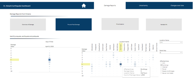
The purpose of this dashboard is to identify the different phases - pre-quake, earthquake, and post-quake based on the number of reports made by the citizens. It also allows us to see the damage value for each region during the different phases of the earthquake. As such, users can visualise when the earthquake is happening and identify the damage value when it is occurring.
By highlighting the axis on the chart, it allows users to see how one data point is correlated to another data point in another chart, given the same day. In addition, a tooltip will instantly appear when the users place the cursor over a data point. Filters are also present on the side of the visualization for a more specific analysis of the data.
Type of chart used: Stacked bars with square marks
Prioritization
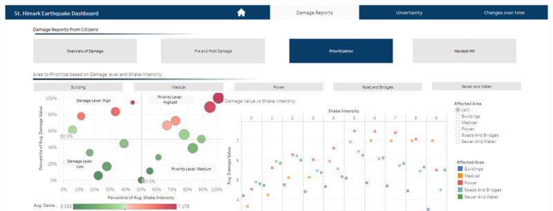
This dashboard allows us to view the different regions that are categorized based on its average damage value and shake intensity. The categories are split into 4 quarters: Damage level: High and Low and Priority Level: Highest and Medium based on the percentile of average damage value and shake intensity. Now that the regions are properly categorized, it gives better clarity on the damage faced by each region. Furthermore, the used of Red-Green Diverging colours allows users to differentiate the severity between the damage and shake intensity.
Type of chart used: horizontal bars with circle and shape marks
Hardest Hit
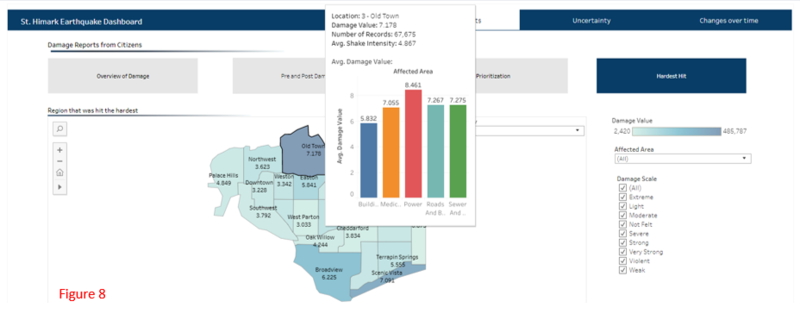
The aim of this dashboard is to allow users to easily identify the region that was hit the hardest based on the average damage value. With the use of colour intensity, users can quickly spot the region(s) with the hardest hit (darkest shade) quickly. When users place the cursor over a region on the map, the tooltips will display a bar chart showing the damage for each affected area.
Type of chart used: Symbol maps
Shake Intensity
The above visualization is used to compare the shake intensity and the damage value and hence, we can draw insights as to whether the damage was caused by the shake intensity or there were other factors causing the damage. Filters are added to allow for more in-depth discovery. Colours are used to differentiate the different affected areas on the same graph. Furthermore, when users place the cursor on a point on the chart, a corresponding point on the other chart is displayed. This is done using actions (Dashboard > Actions > select “highlight”).
Type of chart used: Line chart
Number of Reports Over Time
This dashboard shows the relationship between the number of reports, damage value and the shake intensity. The use of annotation is displayed to point out details that we want the users to take note of – for example the peaks.
Type of chart used: Line chart
Damage Over Time - Building
Horizon graph is a time series visualization that shows an overview of the damage in buildings where users can compare the trends in a different region over time. The colour scale represents the different damage value – the darker the colour, the higher the damage value. In addition, a time range slider is added to the visualization for users to select the specific time period they wish to gather insights from.
Analyzing Streamed Data - Average Shake Intensity
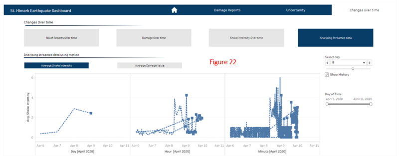
The motion chart above is designed to take into account real time data and it allow users to view exactly what is going on with the data. It’s a nice way of watching the story of the visualization play out of how things are changing over time versus seeing the entire results at once. It is more impactful, and it is made possible by the pages pane that allows us to set the level of details that we want the chart to advance by. Since the data will be constantly arriving, the chart will continue looping and we are able to see the pattern of the visualization over time.
Observations and Insights
Using the interactive visualization as a platform for reporting and analysis, the following aims to provide answers to the questions posed.
Question 1 - Initial Response vs Citizens Report
Based on the earthquake shake map, we can observe that the epicentre of the earthquake is near Jade Bridge and the 12th of July Bridge. From 6th April to 11th April, the epicentre will slowly move toward the major regions of St. Himark’s, causing damage and disruptions to the people, buildings and power supply.
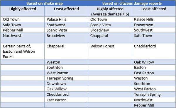
We will be using the table below to compare the initial response on the earthquake shake map to the damage reports from citizens on the ground. Regions that are expected to be highly affected by the earthquake will be given higher priority in terms of emergency supplies, manpower, etc. Hence, it is important that we identify those regions accurately to avoid any wastage of resources.
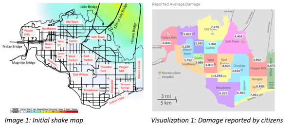
Initial response on the earthquake shake map and results from the damage reports from citizens on the ground can be seen from the image and visualization below.
Based on the table above, we can see that the initial response on the earthquake shake map and results from the damage reports from citizens on the ground is slightly different. The 3 regions: Scenic Vista, Broadview and Chapparal were categorized to be the least affected by the earthquake according to the shake map. However, based on the citizen damage report, the 3 regions were highly affected by the earthquake, experiencing an average damage value of 6.225 to 7.178.
Moreover, the 4 regions: Safe Town, Pepper Mill, Northwest, and Easton were categorized as regions that will be highly affected by the earthquake based on the initial shake map. But based on the citizen report, it was not greatly affected by the earthquake and the damage scale was within weak to moderate. This means that the region did not experience much disruption during the earthquake.
Hence, emergency responders should take into consideration the discrepancy between the results from the shake map and the damage reports by the citizens.
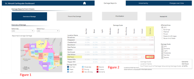
Old Town was highly affected by the earthquake, with an average damage of 7.178 (Damage scale: Very Strong) and an average shake intensity is 4.867. Northwest was the least affected, with average damage of 3.023 (Damage scale: Weak) and an average shake intensity of 3.623 (Figure 1). Even though the damage scale for Old Town is Very Strong, 17.67% of the citizens reported a high damage value (Damage scale: Extreme) (Figure 2). The reason could be that, since Old Town is a big region, the damage impact that the citizens are experiencing may be different as they may be living in different areas. Hence, this explains the variation in reported damage among citizens. Moreover, even though Old Town and Northwest are just next to each other, and the difference in shake intensity is 1.244. Old Town was greatly affected as it is nearer to the epicentre of the earthquake and it received the highest average shake intensity as compared to the other regions.
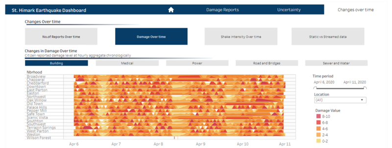
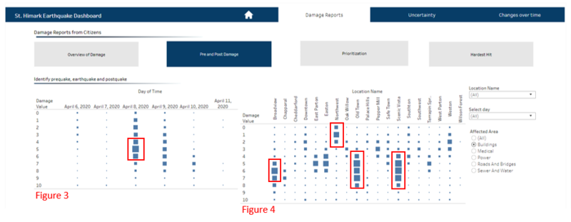
From the visualization above, we can see that the earthquake happened on April 8 where the number of reports received from citizens increased from 6,253 to a maximum of 11,478 across the entire period. After which, there was a decrease to 7,253. This evidently shows a build-up in damage from pre-quake, to the actual earthquake and post-quake (Figure 3). The shape that is highlighted in red (figure 4) allows us to easily identify when the earthquake is happening in every region. Based on the visualization, we can see that Old Town and Scenic Vista was greatly affected by the earthquake and both regions experienced damage ranging from a scale of 4 to 8.
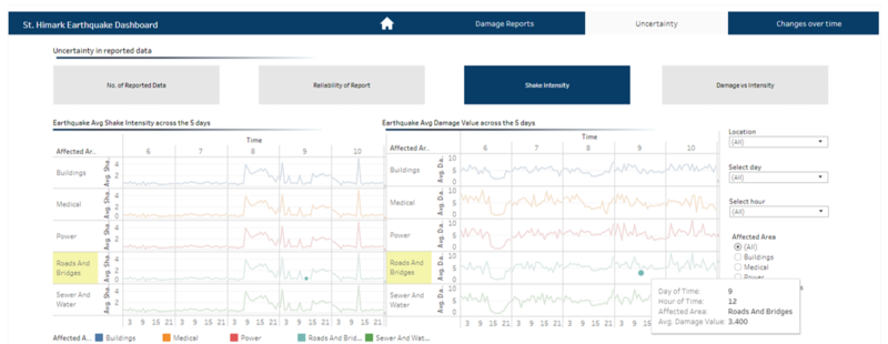
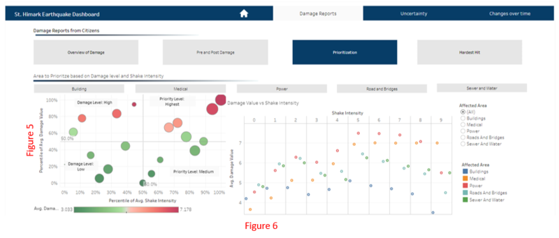
Regions with the highest damage and shake intensity will receive a higher priority over the other regions. In this case, Old Town and Wilson Forest should be given a higher priority when deciding the allocation of resources during an earthquake. Diving deeper to analyse the shake intensity (figure 6), it shows that:
- Buildings are not highly affected by the shake intensity because as the shake intensity increases, the damage of buildings decreases.
- Medical and power are highly affected by the shake intensity because as it increases, the damage increases as well.
- When the shake intensity is 9, we observed that the damage value for all affected areas decreases.
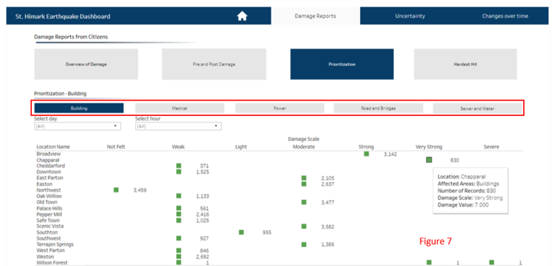
The affected areas are analysed individually with the visualization above and it displays only the damage scale with the greatest number of reports for each region. Based on figure 7, we can see that 10/19 regions reported the damage for buildings to be weak, and 5/19 reported the damage as moderate. Hence, this shows that buildings, in general are not hugely affected by the earthquake. The above visualization is only for buildings. However, users will be able to see the same visualization for the other affected areas using the tabs created.
Figure 8 reveals that Old Town (darkest in shade on the map) was hit the hardest as compared to the other regions based on the average damage value. In addition, we can see that power contributes most to the damage in Old Town, followed by sewer and water, roads and bridges, medical and buildings.
Question 2 - Uncertainty/Reliability in data
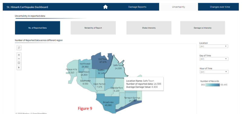
This map (figure 9) shows the number of reports for each region. Visually, we can see that the size of Safe Town is slightly larger or the same as Old town. However, when we compare the number of reports between Old Town and Safe Town, the difference is about 4 times more. One assumption that we can make is that citizens in Safe Town are unable to make their reports for the damage that happened due to the damages in their power systems. Hence, this explains the disparity in the number of reports between Safe Town and Old Town.
Such a result is highly questionable because the number of reports made affects the average damage value. If one region has a significantly higher number of reports, the results may not be accurate for emergency responders to follow in hope to mitigate the damage during an earthquake.
Figure 10 shows the proportion of each damage scale for each location reported by citizens and the results seem suspicious and arguable because people in the same region are reporting different damage results. Placing our focus on Wilson Forest, we analysed that majority of the citizens (59.88%) reported the damage scale as not felt. However, the shake intensity reported at Wilson Forest is above average (figure 12) and its average damage for all affected areas is high (within the range of 5.667 to 7.838) (figure 11). Hence, this is highly arguable as to whether the damage occurring at Wilson Forest is due to the earthquake or other factors because the citizens reports is not in line with the damage rate. As such, reports from citizens in Wilson Forest is deemed as unreliable and inaccurate. Besides Wilson Forest, regions such as Scenic Vista, Chapparal, Broadview and Safe Town also seem to be providing unreliable results. However, regions such as Cheddarford, Downtown, Northwest, Southton and West Parton are providing reliable reports because the number of reports for each damage scale (e.g. extreme) matches the level of shake intensity and the damage rate for each affected area (e.g. power).
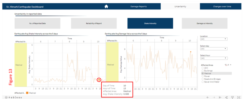
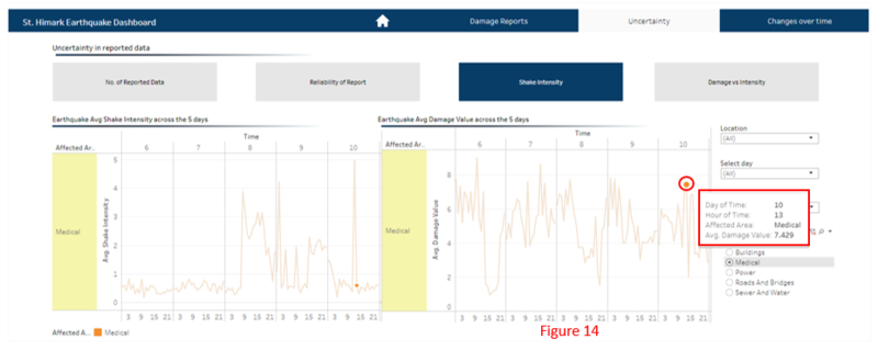
When analyzing the average shake intensity and damage value for the affected areas - Medical, figure 13 shows that the average shake intensity is 0.588. However, the corresponding average damage value in figure 14 is 7.429. This is evidently doubtful and questionable because these 2 figures are not in line as a low shake intensity should not generate a high damage value unless there are other factors causing damage to medical.
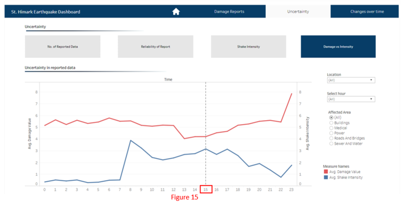
Figure 15 displays the change and the relationship between the average damage value and shake intensity over time. When users are analyzing the damage from the impact of an earthquake, they expect to see that an increase in shake intensity will cause an increase in damage value (direct relationship). However, the visualization above shows otherwise. From 3 pm onward, we can observe that as the shake intensity decreases, the damage increases (inverse relationship). Hence, this result is odd, causing inaccuracy to the reports received from the citizens.
To determine if the damage was a result from the earthquake, the 3 factors above should be similar. However, when analyzing the number of reports, the damage value and the shake intensity over time, we observed that on 10 April, there was a rise in number of reports and damage value, but the shake intensity is relatively low. Hence, it is safe to say that the damaged was not as a result of the earthquake.
Question 3 - Changes in conditions over time
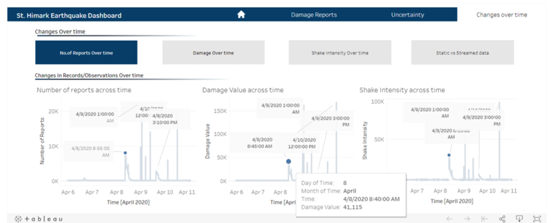
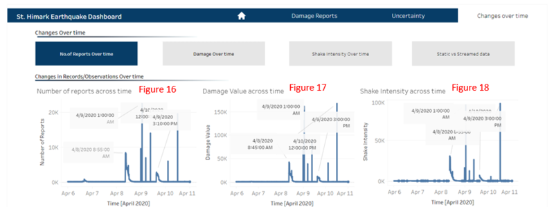
The number of reports from citizens is not consistent over time. Based on figure 16, we can see that there are a few peaks across the entire time period and the highest peak was on 9th April, 1:00 am with 22,425 number of reports. The shape of the line graph in figure 16 – number of reports is similar to figure 17 – damage value and figure 18 – shake intensity. Overall, the relationship between the 3 figures above is that when the shake intensity increases, the damage value also increases and hence, the number of people reporting the damage increases as well. Hence, we can see that the peaks for both 3 figures above are the same.
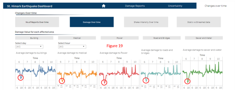
Damage over time varies across different affected areas in the region. From figure 19, there was a drop in the average damage on day 6, possibly because the regions were prepared and have the resources to mitigate and overcome the damage from the earthquake. However, its mitigation strategies weren’t successful, and the damage increases within the day. The average value for all affected areas rose on day 8, possibly because it is when the earthquake occurs. However, the damage continues to rise for these affected areas; Power, Road and Bridges and Sewer and Water where it reaches its highest peak on day 10 and experiencing the highest damages over the entire period.
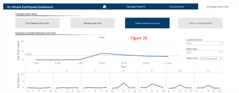
When analyzing the shake intensity across a time period, we gathered that the shake intensity was weak from day 5 to 7. However, on day 8, it starts to rise to its peak of an average 3.872. After which, it slowly starts to decrease over the days. This evidently shows that the earthquake might have occurred on day 8 where the shake intensity was the highest and subsequently from day 9 onward, it decreases.
Question 4 - Static vs Stream data
Static data is self-contained and enclosed. To analyse static data, we must handle problems associated with static data such as gaps, outliers, or incorrect data, all of which require data cleaning, preparation, and pre-processing before we can use it for analysis.
Streamed data is continuously changing and updating after it is recorded. The sheer amount of non-stop data constantly arriving can be overwhelming. The faster the data is streaming in, the harder it is to catch up with the data for analysis. To analyse streamed data, it is important that we examine only the newest data points and make a decision about the state of the model and its next move. This approach is incremental — essentially building up a picture of the data as it arrives. Another approach that we can consider is to evaluate the entire dataset, or a subset of it, to make a decision each time new data points arrive. This approach is inclusive of more data points in the analysis — what constitutes the “entire” dataset changes every time new data is added.
Static data refers to historical data. Analyzing historical data allows us to discover patterns or relations that are useful in projecting/predicting future values. It describes the past and plan for the future. However, static model may render incorrect results and we are unable to determine the accuracy of our results until it happened. Hence, it is more effective to use streamed data for analysis because it considers real-time data and it provides us with the most up-to-date results for decision making.
Figure 21 shows the shake intensity on 8th April and figure 22 shows the shake intensity on 9th April. Both figures aims to show the change in shake intensity on a daily, hourly and minute basis and we can gather that the shake intensity decreases from 8th April to 9th April. One possible reason for this is because the period of the earthquake is over, and it is transiting into its post-quake period.
