IS428 2019-1920 T1 Assign LeeSunho Interactive Visualization
|
|
|
|
|
Taks one
Emergency responders will base their initial response on the earthquake shake map. Use visual analytics to determine how their response should change based on damage reports from citizens on the ground. How would you prioritize neighborhoods for response? Which parts of the city are hardest hit? Limit your response to 1000 words and 10 images.
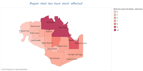
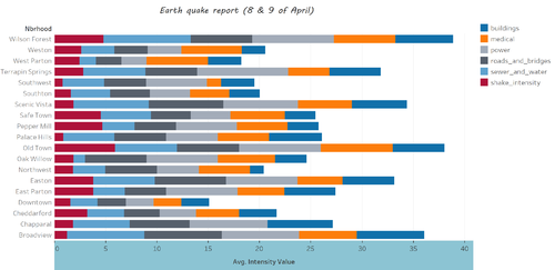
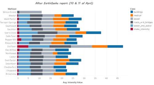
As the emergency responders of St. Himark have limited resources, it is imperative that they are able to prioritize certain areas in the city during the natural disaster. They can do so by basing their initial response on the earthquake shake map. Using visual analytics, I have created two live dashboards which will report the various data regarding the earthquakes. Through this dashboard, the emergency responders will be able to answer several important questions such as: “How to prioritize which neighbourhoods for response?” and “Which parts of the city are hardest hit?”
|
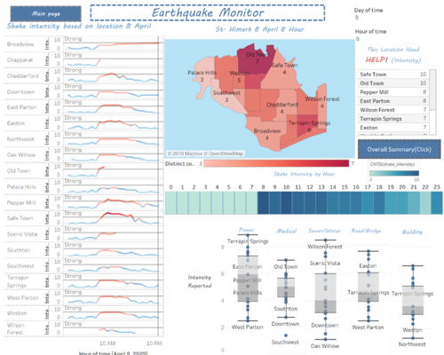
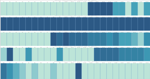
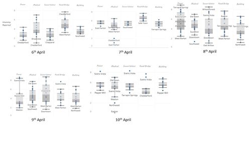
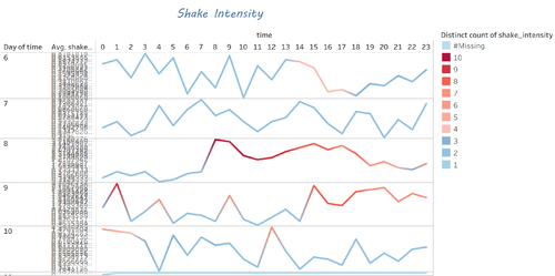
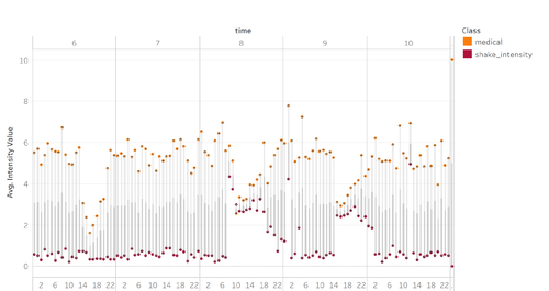
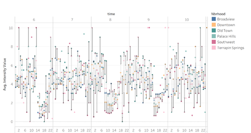
Live Dashboard The first dashboard provides a more micro view of the data by showing the user the earthquake intensities grouped by the different regions on specific dates and times. On the top right corner of the dashboard, emergency responders are able to adjust the date to see the intensity of the earthquake on those specific days. This dashboard currently is split into five different sections: line chart, cartogram, intensity counter, heat map, and box plot. I will now be explaining each of the different sections in detail. |
Overll Summary
bla bla
|
|---|
| Explanation | Visual Representation |
|---|---|
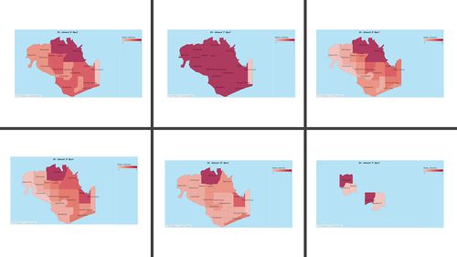
| 1.Cartogram </font
description |
|
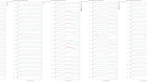
| 2.LINE</font
line |
|
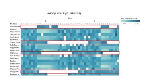
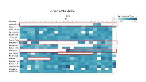
| 3.Heat Map</font
HEat
|
|
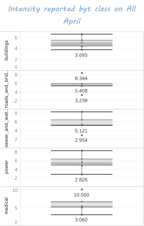
| 4.Box" analysis </font
Box
|
|
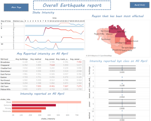
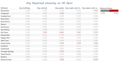
| 5. Total Summary Intensity level from 6th April to 11th April </font
Box
|
|
| 6. Total Summary by region</font
Box
|
|
| 7. Total Summary data table</font
Box
|
|
| 8. Total Summary for Class</font
Box
|
|
| 9. Total Summary different level of intensity </font
Box
|
|
Taks TwoHow do conditions change over time? How does uncertainty in change over time? Describe the key changes you see. Limit your response to 500 words and 8 images.
hi
Taks ThreeHow do conditions change over time? How does uncertainty in change over time? Describe the key changes you see. Limit your response to 500 words and 8 images.
hi
|

