IS428 AY2019-20T1 Assign Wong Kuan Wai Gordon
Contents
- 1 Overview
- 2 Data Preparation
- 3 Interactive Visualization
- 4 Tasks & Interesting Observations
- 4.1 Task #1 Use visual analytics to determine how their response should change based on damage reports from citizens on the ground.
- 4.2 Task #2 Use visual analytics to show uncertainty in the data.
- 4.3 Task #3 How do conditions change over time? How does uncertainty in reports change over time?
- 4.4 Other Observations
- 5 References
- 6 Comments
Overview
St. Himark has been hit by an earthquake, leaving officials scrambling to determine the extent of the damage and dispatch limited resources to the areas in most need. They quickly receive seismic readings and use those for an initial deployment but realize they need more information to make sure they have a realistic understanding of the true conditions throughout the city.
In a prescient move of community engagement, the city had released a new damage reporting mobile application shortly before the earthquake. This app allows citizens to provide more timely information to the city to help them understand damage and prioritize their response. In this mini-challenge, use app responses in conjunction with shake maps of the earthquake strength to identify areas of concern and advise emergency planners. Note: the shake maps are from April 6 and April 8 respectively. With emergency services stretched thin, officials are relying on citizens to provide them with much needed information about the effects of the quake to help focus recovery efforts. By combining seismic readings of the quake, responses from the app, and background knowledge of the city, help the city triage their efforts for rescue and recovery.
Objective
My task as a visual analytics expert is to analyze and provide interactive visualizations through seismic readings of the earthquake, damage reports from the mobile application and background knowledge of the city. These visualizations will enable citizens and emergency planners with situational awareness of the disaster. Ultimately, this will further optimize the response of emergency services by enabling them to dispatch their limited resources to the right place at the right time with the right emergency tools, prioritizing their efforts for rescue and recovery. Therefore, my task as a visual analytics expert will explore the following:
1) Geometric damage patterns of St. Himark and its neighborhood
2) Earthquake scale and classes based on seismic readings
3) Sending the correct emergency response based on infrastructure damages
4) Damage inflicted to St. Himark infrastructures in each neighborhood
5) Uncertainty of damage reports
Task #1: Emergency responders will base their initial response on the earthquake shake map. Use visual analytics to determine how their response should change based on damage reports from citizens on the ground. How would you prioritize neighborhoods for response? Which parts of the city are hardest hit?
Task #2: Use visual analytics to show uncertainty in the data. Compare the reliability of neighborhood reports. Which neighborhoods are providing reliable reports? Provide a rationale for your response.
Task #3: How do conditions change over time? How does uncertainty in reports change over time? Describe the key changes you see.
About the Data
The data for Mini-Challenge 1 includes one (CSV) file spanning the entire length of the event, containing (categorical) individual reports of shaking/damage by neighborhood over time. Reports are made by citizens at any time, however, they are only recorded in 5-minute batches/increments due to the server configuration. The fields of the data and its relevance are as follows:
1) time: timestamp of incoming report/record, in the format YYYY-MM-DD hh:mm:ss
2) sewer_and_water: Value of how bad the damage was to St. Himark's sewer and water infrastructure (0 - lowest, 10 - highest; missing data allowed)
3) power: Value of how bad the damage was to St. Himark's power infrastructure (0 - lowest, 10 - highest; missing data allowed)
4) roads_and_bridges: Value of how bad the damage was to St. Himark's roads and bridges infrastructure (0 - lowest, 10 - highest; missing data allowed)
5) medical: Value of how bad the damage was to St. Himark's medical infrastructure (0 - lowest, 10 - highest; missing data allowed)
6) buildings: Value of how bad the damage was to St. Himark's buildings infrastructure (0 - lowest, 10 - highest; missing data allowed)
7) shake_intensity: Value of how violent the shaking was (0 - lowest, 10 - highest; missing data allowed)
8) location: ID of neighborhood where person reporting is feeling the shaking and/or seeing the damage
The Shapefile "StHimark.shp" and image "StHimarkMapBlank.png" was taken from Mini-Challenge 2 to be used to map and display the St. Himark map
Data Preparation
Tools Used:
Data Preparation for St. Himark Map
The aim for this step is to be able to display the background overlay "StHimarkBlankMap.png" along with the given the Shapefile "StHimark.shp" from Mini-Challenge 2.
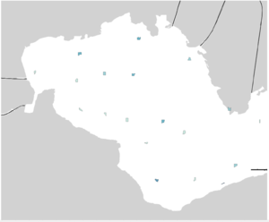
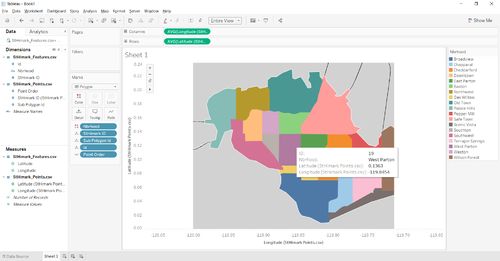
However, performing these steps alone produced the following undesired results:
With reference to Kelvin Chia's discussion in the class forum and research in the Tableau community, this undesired result was produced as Tableau is unable to identify and determine how the polygons are scaled by the Geometry which then defaults the polygons to be small in size and placed as centroids.
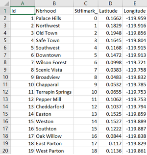
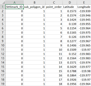
Therefore, a solution to this problem is to create our own custom filled map. This is done through research and an online tool by the Tableau community. As a results, 2 CSV files were generated: StHimark_Features.csv and StHimark_Points.csv.
StHimark_Features.csv will contain a row for each row in the shape file with all the feature details (including the calculated coordinates of the center of the shapes), StHimark_Points.csv will contain a row per boundary point, structured as needed to draw polygons in Tableau. Used like that, with no optional parameters, both files will include a generated unique ID column, which can be used to join the two files, so classifying details from the shapefiles can be used as dimensions in the Tableau workbook. The sample screenshot for StHimark_Features.csv and StHimark_Points.csv are illustrated respectively:
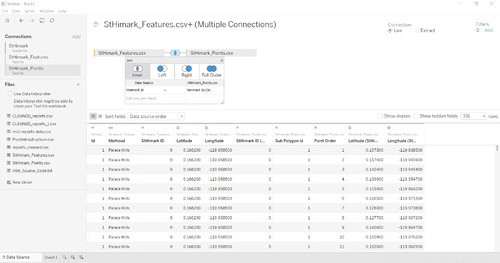
We then perform an inner join between StHimark_Features.csv and StHimark_Points.csv by StHimark ID and the desired result is achieved:
Neighborhoods with No Reports at a Specified Date and Time
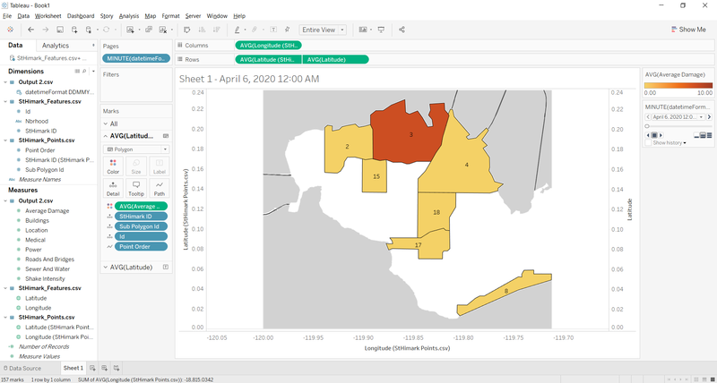
As I look into the raw data in "mc1-reports-data.csv", I realized that if we filter the damage by date (Eg. 06/04/2020 00:00:00), the map will only display neighborhoods that have received damage reports. Neighborhoods that DID NOT receive any damage reports during this time will not be displayed in the map. This is not what I want the visualization to look like as I want all neighborhoods to be displayed regardless of whether they received any damage reports or not. The undesired sample display of the map is as follows:
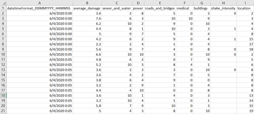
" Therefore the solution to this issue is to create dummy data. For example, at "06/04/2020 00:00:00" only locations 2, 3, 4, 8, 15, 17 and 18 received AT LEAST 1 damage report. As such, I will create and insert rows for locations 1, 5, 6, 7, 9, 10, 11, 12, 13, 14, 16 and 19. However, since there is technically no damage reports made for these locations, I will assign NULL values for all the infrastructure damages and shake intensity. Lastly, I assign a value of "-1" instead of a NULL value for the average damage. To perform this step, I utilized Microsoft Excel's Visual Basic for Application (VBA) to help me automate this process. To allow my program for continuous usage , I have created a new Excel workbook with the VBA that is able to upload the raw data "mc1-reports-data.csv" and perform the automation. My VBA source codes are as follows:
   Dim x As Long
   Dim dict As New Scripting.Dictionary
   Dim uniqueId As String
   Dim location As String
   Dim datetimeString As String
   Dim nextDatetimeString As String
   Dim NumRows As Long
   Dim lastRow As Long

   Application.ScreenUpdating = False

   'Set numrows = number of rows of data.
   NumRows = Range("A1", Range("A1").End(xlDown)).Rows.Count
   lastRow = NumRows

   'Select cell A2.
   Range("A2").Select

   'Establish "For" loop to loop "NumRows" number of times.
   'Using a dictionary
   'Loop through each row and add the location ID in to the dictionary
   'For loop to loop through 1 to 19 to check if dictionary contains the location IDs
   'If no, insert dummy data with datetime, locationId and "-1" average damage into last row
   For x = 2 To NumRows
       datetimeString = Format(Range("A" + CStr(x)).Value, "DD/MM/YYYY HH:MM:SS")
       location = Range("I" + CStr(x)).Value

       If x = 2 Then
           dict.Add Key:=location, Item:=location
       End If

       nextDatetimeString = Format(Range("A" + CStr(x + 1)).Value, "DD/MM/YYYY HH:MM:SS")

       If datetimeString = nextDatetimeString And dict.Exists(location) = False Then
           dict.Add Key:=location, Item:=location
       ElseIf datetimeString <> nextDatetimeString And dict.Exists(location) = False Then
           dict.Add Key:=location, Item:=location

           For y = 1 To 19
               If dict.Exists(CStr(y)) = False Then
                   lastRow = lastRow + 1
                   Range("A" + CStr(lastRow)).Value = datetimeString
                   Range("B" + CStr(lastRow)).Value = -1
                   Range("I" + CStr(lastRow)).Value = CStr(y)
               End If
           Next

           dict.RemoveAll
       ElseIf datetimeString <> nextDatetimeString And dict.Exists(location) = True Then

           For y = 1 To 19
               If dict.Exists(CStr(y)) = False Then
                   lastRow = lastRow + 1
                   Range("A" + CStr(lastRow)).Value = datetimeString
                   Range("B" + CStr(lastRow)).Value = -1
                   Range("I" + CStr(lastRow)).Value = CStr(y)
               End If
           Next
           dict.RemoveAll
       End If
   Next
   Application.ScreenUpdating = True
|
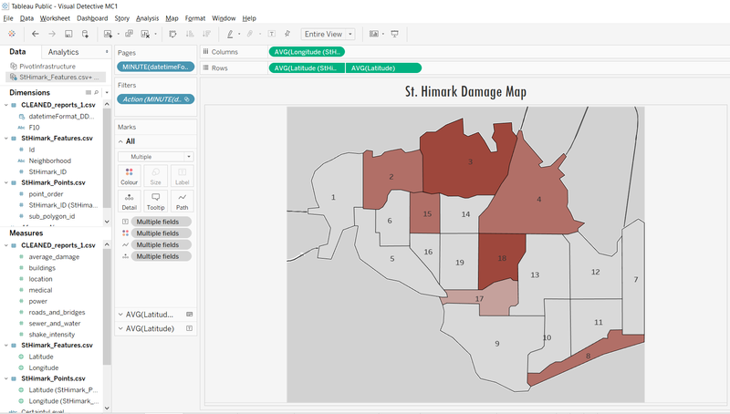
With that, I am now able to display neighborhoods which do not have any damage reports at the specified time. As illustration of the desired result is as follows:
Data Preparation for Damage Reports
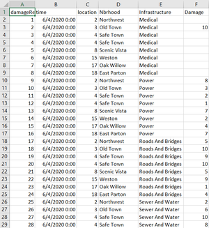
This step aims to clean and transform the raw data in "mc1-reports-data.csv" and produce one with the following fields: 1) damageReportId: Unique ID of the damage report 2) time: Date and time the report was made (DD/MM/YYYY HH:MM:SS) 3) location: Location ID of the neighborhood 4) Nbrhood: Name of the neighborhood 5) Infrastructure: Any of the 5 types of infrastructure of St. Himark (Sewer and Water, Power, Medical, Roads and Bridges, Buildings) 6) Damage: Value of how bad the damage is (0 - lowest, 10 - highest; missing data allowed)
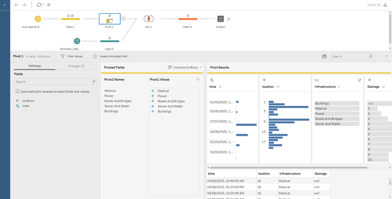
To achieve the desired data, I used Tableau Prep Builder to perform the cleaning and transformation. The illustration of the steps taken are as follows:
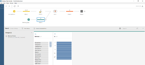
In the first cleaning step, I removed the field "shake_intensity" as this is not a field that I want in this data. I then renamed the fields to be easily understood (Eg. "Sewer and Water" instead of "sewer_and_water". The next step is the pivoting of the fields; Sewer and Water, Power, Medical, Roads and Bridges and Buildings. This step is illustrated as follows:
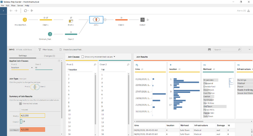
Next, as my current output only contains the neighborhood ID, I want the neighborhood Name to be specified in my data as well. To do this, I imported the StHimark_Features.csv file obtained from "Data Preparation for St. Himark Map". First, I remove the unwanted fields; StHimark_Id, latitude and longitude. Next, I then performed an inner join of "location" field with StHimark_Features.csv's "Id" field. This step is illustrated as follows:
My final output is as follows: (Note that I did not remove damage reports with NULL values for damage)
Data Preparation for DateTime Formatting & Average Damage
This step aims to format the time field to the correct format and to create a new column from the raw data in "mc1-reports-data.csv" which computes the average damage dealt to the specified location at the specified time. To achieve the desired data, I used Tableau Prep Builder to perform the cleaning and transformation. The illustration of the steps taken are as follows:
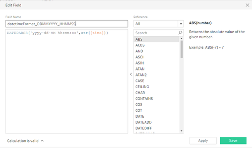
The calculated field for formatting the date and time are as follows:
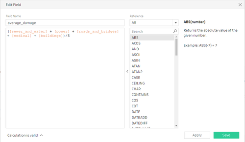
The calculated field for calculating the average damage are as follows:
The sample screenshot of the desired final output of the data is as follows:
Interactive Visualization
The interactive visualization can be accessed here: https://public.tableau.com/profile/gordon.wong4333#!/vizhome/VisualDetectiveMC1/Home
Throughout all the different dashboards, useful guides/tips are provided to help users navigate through the different filters and actions so that their analysis can be performed smoothly. The detailed explanation of my dashboards are as follows:
Home Dashboard
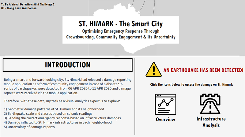
The aim of the home dashboard is to provide viewers a quick overview of the problem by reading the title of the dashboard. The "Introduction" allows viewers to understand the scope and the problems that I will be exploring. On the right side of the dashboard, interactive buttons are placed to allow viewers to easily navigate to the different dashboards with just a click of a button.
St. Himark Overview Dashboard
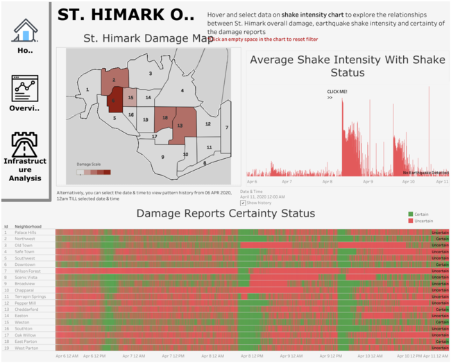
The aim of the St. Himark Overview dashboard is to allow viewers to explore the analysis behind the disaster throughout the entire period from 06 APR 2020, 00:00:00 to 11 APR 2020, 00:00:00. To zoom in on a specific date and time, a drop down bar is in place to perform that function as well. Guiding messages and tips are also placed around the dashboard for users to perform to assist in their visualization experience. The detailed explanation of each interactive function and charts are as follows: (This screenshot is reformatted to fit into .PNG file and hence, alignment may seem out of place. Visit my Tableau Public to assess the main dashboard)
| Interactive Visualization | Rationale | Screenshot Example |
|---|---|---|
| The side navigation menu contains interactive buttons to allow viewers to easily navigate to the different dashboards with just a click of a button. | ||
| The synchronized date and time drop down menu enables viewers to select a specific date and time. Once selected, all the charts in the dashboard will be automatically rendered to display the correct data for visualization. | ||
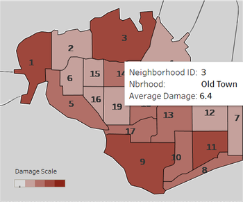
| The St. Himark damage map displays the average damage for each and every neighborhood. Depending on the date and time selected in the drop down menu, the St. Himark map will automatically render to display the correct data for visualization. At a single glance, viewers can then be able to observe which neighborhood sustained the most/least/zero damage.
The legend at the bottom left of the map displays the color codes in which the most damage will be in the darkest tone. Additionally, viewers can hover over each neighborhood to determine the exact value of the average damage sustained by that specific neighborhood. |
||
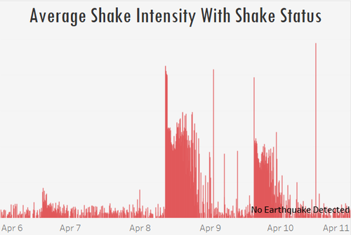
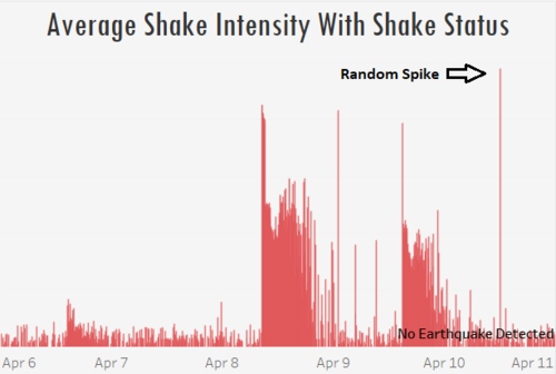
| The average shake intensity with shake status synchronized chart shows how violent the shake intensity is at any particular date and time. Similar to the Himark Damage Map, depending on the date and time selected in the drop down menu, the chart will automatically render to display the correct data for visualization.
Being a synchronized chart, there is also can additional function whereby viewers can click on any point of the chart and automatically render the other charts in the dashboard. This allows viewers to examine and analyse the relationships between shake intensity with the average damage on the St. Himark map as well as with the Damage Reports Certainty Status chart. Additionally, viewers can hover over the chart at various points to determine the average shake intensity at the specified date and time. The Shake Status is also displayed in the tool tip which provides information of the different classes (Minor, Moderate, Major and Critical) based on the average shake intensity value. |
||
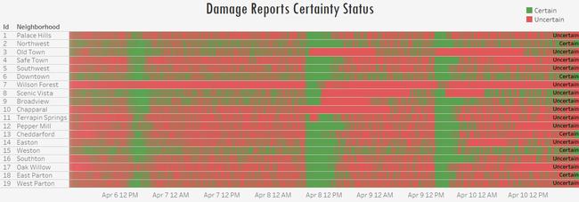
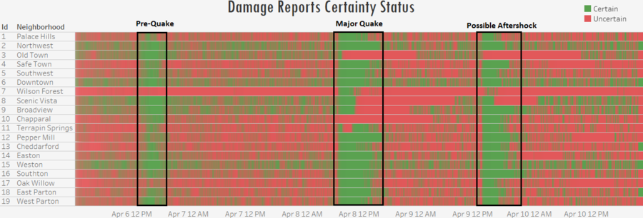
| The damage reports certainty/uncertainty status chart provides viewers an overview of the certainty of the reports at specific dates and time. In the top right of the chart, the legend is displayed whereby green color denotes that the damage reports were certain and red otherwise.
The certainty of the damage reports is determined by the number of reports for a specific date and time and compared against the measured shake intensity. The conditions to measure certainty are 1) If the number of reports is less than or equal to 2 for a particular neighborhood and the average shake intensity is less than or equal to 1, the damage reports are deemed "Uncertain". 2) If the number of reports is more than 2 for a particular neighborhood and the average shake intensity is more than 1, the damage reports are deemed "Certain". Additionally, by selecting a specific date and time in the drop down menu or Average Shake Intensity with Shake Status chart, viewers will be able to determine the damage report certainty status for that specific date and time. Similarly, viewers can hover over the Damage Reports Certainty/Uncertainty Status chart to activate the tool tip containing the information. |
St. Himark Infrastructure Analysis Dashboard
The aim of the St. Himark Infrastructure Analysis Dashboard is to enable viewers to determine the extent of the damage dealt to the 5 different infrastructures in each neighborhood. Guiding messages and tips are also placed around the dashboard for users to perform to assist in their visualization experience. The detailed explanation of each interactive function and charts are as follows: (This screenshot is reformatted to fit into .PNG file and hence, alignment may seem out of place. Visit my Tableau Public to assess the main dashboard)
| Interactive Visualization | Rationale | Screenshot Example |
|---|---|---|
| The side navigation menu contains interactive buttons to allow viewers to easily navigate to the different dashboards with just a click of a button. | ||
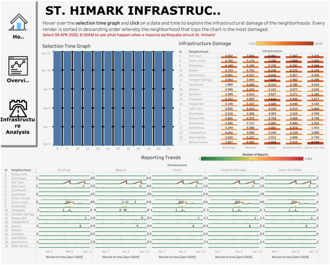
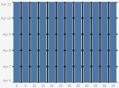
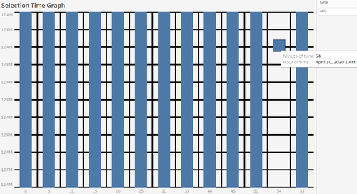
| The Synchronized Selection Time Graph enables viewers to select a specific date and time similar to that of a drop down menu. However, this graph was created with viewer interaction in mind. Viewers are able to hover over the Synchronized Selection Time Graph and the various charts in the dashboard will automatically render and display the correct data for visualization right upon hover. This also allows viewers with an immediate overview of the different charts without the need to click on a specific date and time. The x-axis of the graph represents the minutes while the y-axis represents the hours of the period from 06 APR 2020, 12AM to 11 APR 2020, 12AM. In other words, moving horizontally across the graph changes the minute while moving vertically across the graph changes the date and hour time. | ||
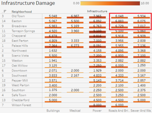
| The Infrastructure Damage Chart enables viewers to view, at a single glance, the damage dealt to each infrastructure (Buildings, Medical, Power, Roads and Bridges and Sewer and Water) for each neighborhood. At the top right of the chart, the legend specifies the color coding for the different values of damage, the higher the damage, the darker the tone. Additionally, the key function of this chart is the automatic sort whereby the neighborhoods are sorted in descending order based on the overall damage for every render of the date and time using the selection time graph.
For instance, in the screenshot example on the right, selected date and time is 08 APR 2020, 8.35AM and neighborhood "3" (Old Town) sustained the highest overall damage and its power infrastructure sustained the most damage. On the other hand, neighborhood "7" (Wilson Forest) sustained the least overall damage. Viewers can also hover each bar to view the tool tip which contains all the information, including the value of the damage. |
||
| The Reporting Trends Chart enables viewers to view, at a single glance, the damage reporting patterns for each infrastructure for each neighborhood. At the top right of the chart, the legend specifies the color coding for the different values of damage reports made, the higher the damage reports made, the darker the red tone. Green tone denotes a low or zero damage reports made.
With this visualization, we can then determine the relationships between the number of damage reports made with infrastructural damages as well as the relationships with shake intensity in the "St. Himark Overview" dashboard. Viewers can also hover each data to view the tool tip which contains all the information, including the number of reports made. |
Tasks & Interesting Observations
Task #1 Use visual analytics to determine how their response should change based on damage reports from citizens on the ground.
Emergency responders will base their initial response on the earthquake shake map. Use visual analytics to determine how their response should change based on damage reports from citizens on the ground. How would you prioritize neighborhoods for response? Which parts of the city are hardest hit?
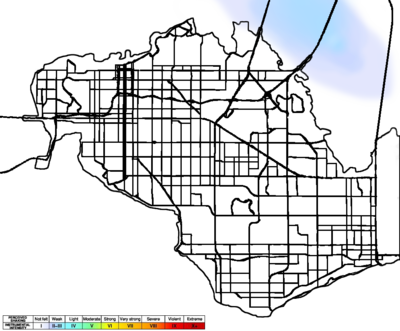
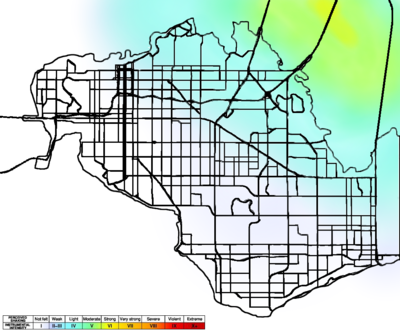
Let us first take a look at the earthquake shake maps provided for Mini-Challenge 1. The earthquake shake maps for pre-quake and major quake are as follows:
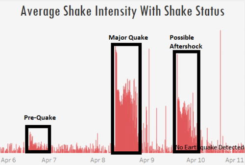
With both earthquake shake maps, it is understood that a small-scale earthquake had occured prior to the major earthquake. To further illustrate this point, let us take a look at the "Average Shake Intensity with Shake Status" chart in our St. Himark Overview dashboard. The illustration is as follows:
From the above chart, we can then determine the exact date and time in which the pre-quake and major quake happened. Using the same chart, it is identified that the pre-quake happened on 06 APR 2020, 2.30PM and the major quake happened on 08 APR 2020, 8.30AM. To allow for a human reaction time upon feeling the earthquakes, we will use the next 5mins of damage reports; 06 APR 2020, 2.35PM and 08 APR 2020, 8.35AM respectively. On the same dashboard, as I click onto the respective dates, my St. Himark Map displayed the following results:
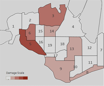
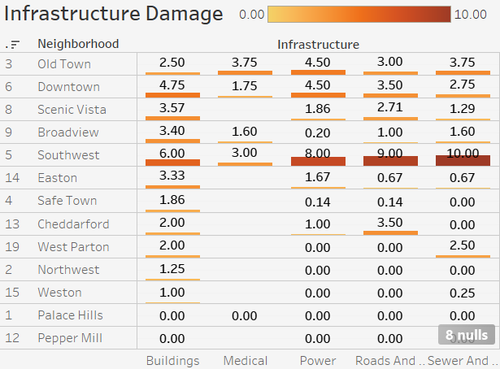
Let us first analyse the St. Himark Overview map for 06 APR 2020, 2.35PM (left). It can be seen that Neighborhood 5 (Southwest) has sustained the greatest damage based on the damage reports received. However, we have to keep in mind that there may only be a single damage report made with very high values. To check for such cases, we need to take a look at the reporting trends/patterns chart in the Infrastructure Analysis dashboard. And let us compare it with the second most damaged neighborhood; Neighborhood 3 (Old Town). It is illustrated as follows:
From the above picture, it is observed that "Southwest" only received 1 damage report while "Old Town" received 4 damage reports. Therefore, with this information, neighborhood 3 (Old Town) sustained the hardest hit for pre-quake. Along with the direction and location of the pre-quake illustrated in the shake map, this can be further supported by the Infrastructure Damage chart which shows that "Old Town" has sustained the most damage on 06 APR 2020, 2.35PM. It is illustrated as follows:
Emergency responders should therefore, prioritize their resources and rescue efforts towards "Old Town" first as it is the hardest hit during the pre-quake on 06 APR 2020, 2.35PM and ove down the Infrastructural Damage chart. Emergency services should also equip themselves with tools related to damage in power infrastructure as compared to the other infrastructures. This is also supported by the fact that "Old Town" is a historic center of St. Himark with old infrastructures.
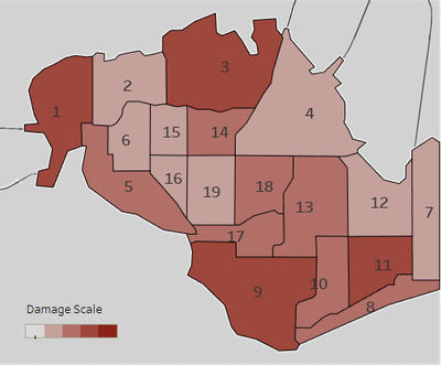
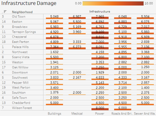
Next, let us analyse the St. Himark Overview map for 08 APR 2020, 8.35AM (right). It can be seen that Neighborhoods 1 (Palace Hills), 3 (Old Town), 9 (Broadview) and 11 (Terrapin Springs), had sustained the great damage based on the damage reports received. Similar to the steps taken to analyse the pre-quake damage and along with the direction and location of the major quake quake illustrated in the shake map, the following further illustrates that neighborhood 3 (Old Town) sustained the greatest damage with the highest number of damage reports made:
Emergency responders should therefore, prioritize their resources and rescue efforts towards "Old Town" first as it is the hardest hit during the major uake on 08 APR 2020, 8.35AM and move down the Infrastructural Damage chart. Emergency services should also equip themselves with tools related to damage in power infrastructure as compared to the other infrastructures. This is also supported by the fact that "Old Town" is a historic center of St. Himark with old infrastructures.
Task #2 Use visual analytics to show uncertainty in the data.
Use visual analytics to show uncertainty in the data. Compare the reliability of neighborhood reports. Which neighborhoods are providing reliable reports? Provide a rationale for your response. Let us first take a look at the "Average Shake Intensity With Shake Status" chart in the St. Himark Overview dashboard. The chart is as follows:
From the above chart, we can observe that shake intensities were exceeded the "Moderate" shake status in 3 difference occasions. 1) Pre-Quake on 06 APR 2020, 2.30PM 2) Major Quake on 08 APR 2020, 8.30AM and 3) Possible Aftershock on 09 APR 2020, 3PM. We will therefore, leverage on these 3 occasions to determine the reliability and uncertainty of the damage reports. The "Damage Reports Certainty Status" chart in the St. Himark Overview dashboard and "Damage Reporting Trends" chart will be used for this analysis. The respective charts are illustrated as follows:
From the above 3 charts, we can observe that there is indeed a very strong relationship between shake intensity, certainty status of damage reports and damage reporting trends. Whereby the higher the shake intensity, the more certain the data is and the more damage reports received. However, as we further observe this relationship, it can be seen that neighborhoods 3 (Old Town), 7 (Wilson Forest) and 10 (Chapparal) were uncertain during the 3 earthquake occasions. As we explore further, here are my findings:
1) Old Town has massive amounts of damage reports during the 3 different occasions of earthquake. However, some damage reports were not aligned with the shake intensity whereby low values of damage were reported despite the critical status of the major earthquake. This is relatively evident when we compare the infrastructural damage of Old Town (the historic center of St. Himark) with the rest of the neighborhoods as follows:
2) Wilson Forest received zero or very little damage reports during pre-quake and possible aftershock. Therefore, it is only fair to analyse the certainty of data of Wilson Forest during the major quake. It can be observed that during the entire period of the major quake, only half of the damage reports were certain. Taking a closer look at the infrastructural damage chart, sustained damage in infrastructures illustrated below. Knowing that Wilson Forest is a wooded area on the edge of the Wilson Forest Nature Preserve,it should not contain any roads/bridges in the neighborhood. However, its damage reports say otherwise. Therefore, damage reports from Wilson Forest are uncertain:
Lastly, it is also observed that there was a random spike in shake intensity as illustrated below:
As I analyse further into this issue, the infrastructure damage chart stood out with the following visualization:
These reports from Old Town are definitely uncertain as the rest of the neighborhoods sent out very little damage reports at this date and time (10 APR 2020, 12PM). One possible reason for this uncertainty of data could be due to the delays in the receipt of reports which were cause by power outages.
Task #3 How do conditions change over time? How does uncertainty in reports change over time?
How do conditions change over time? How does uncertainty in reports change over time? Describe the key changes you see.
1) Looking at the Shake Intensity chart in the St. Himark Overview dashboard, the main change in condition is the 3 occasions of earthquake. The pre-quake was felt on 06 APR 2020, 2.30PM, the major earthquake was felt on 8 APR 2020, 8.30AM and the possible after shock was felt on 09 APR 2020, 3PM. We can clearly observe the spike in shake intensities for all 3 earthquake occasions.
2) Looking at the damage reporting trends chart, we see that damage reports follow a single pattern. Whereby, upon experiencing the first instance of the earthquake, number of damage reports increase over time and then drastically decrease when the earthquake is coming to an end (decreasing shake intensity).
3) Looking at the damage reporting trends chart again, we observe that the number of damage reports received during the pre-quake and possible aftershock is lesser than that received during the major earthquake. Apart from the reason being higher shake intensity during the major earthquake, I believe that the St. Himark citizens were caught off guard during the pre-quake and were not sure what to do.
However, when the major earthquake struck, citizens were prepared to send damage reports. At the possible aftershock stage, citizens were already devastated by the damage done by the major earthquake and hence, did not send as much damage reports.
4) The uncertainty in data is observed to increase over time. Whereby reports were less uncertain during the pre-quake. However, when it reaches the major earthquake and possible aftershock, uncertainty in damage reports and data increased. Accompanied with delays in receipt of damage reports and missing data due to possible power outages caused by the earthquake. Another possible reason for this change is due to the fact that the citizens are more concern with their safety and evacuating/taking safety precautions from the earthquake and hence, provided inaccurate damage reports via the mobile application.
Other Observations
As I was plotting the Selection Time Graph, a single date and time stood out whereby its date and time was 10 APR 2020, 1.54AM. This is abnormal as it is not aligned with the Mini-Challenge 1 data description; Reports are made by citizens at any time, however, they are only recorded in 5-minute batches/increments due to the server configuration. A possible reason could be a delay in the receipt of the report at an earlier time due to power outages. To ensure that these data are considered in my analysis, I have configured the timing of these reports to the last damage report record at 10 APR 2020, 1.50AM.
The finding is illustrated as follows:
References
The following references were used during the entire process:
- Tableau Training Video - Polygon Maps (http://www.tableau.com/learn/tutorials/on-demand/polygon-maps-8.2)
- Tableau Training Video - Background Images (http://www.tableau.com/learn/tutorials/on-demand/background-images-8)
- Creating Custom Polygons On A Background Image (https://tableauandbehold.com/2015/04/13/creating-custom-polygons-on-a-background-image/)
Comments
Feel free to provide feedback!


