IS428 AY2019-20T1 Assign Lim Pei Xuan: Visualization
Walkthrough
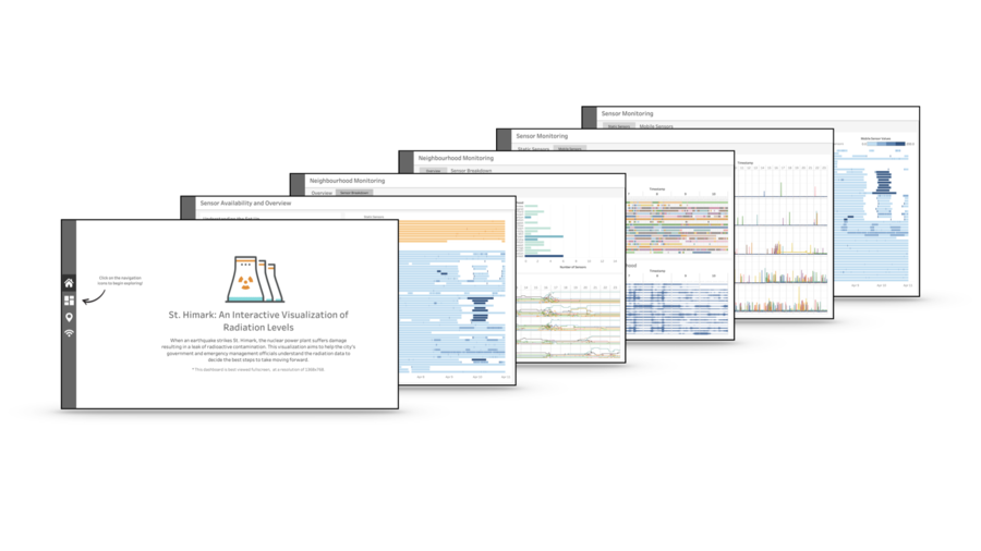
The final interactive visualization consists of a few linked Dashboards organised as follows:
- Home
- Sensor Availability and Overview
- Neighbourhood Monitoring
- Overview
- Sensor Breakdown
- Sensor Monitoring
- Static Sensors
- Mobile Sensors
The dashboard is organised such that the user will begin with a rough overview of the data, followed by a gradual deep dive into the details of the data. This is to facilitate understanding and prevents the user from getting too overwhelmed by chaotic nature of the data. As the interactive visualization techniques utilised are repeated throughout the dashboard, an overall summary of the techniques utilised can be found in the next section.
| No. | Description |
|---|---|
|
1 |
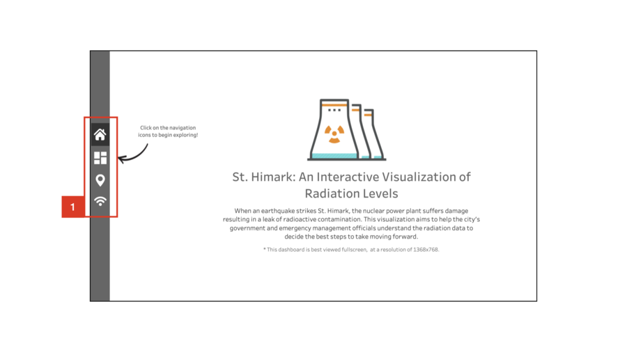
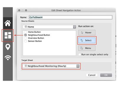
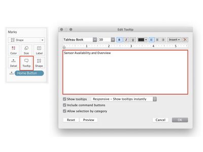
The navigation bar allows for easy toggling between dashboards, and is present throughout the visualization. When the mouse is hovered over the icons, a tooltip with the title of the dashboard it leads to will appear. This is to help the user navigate between pages with ease. |
| No. | Description |
|---|---|
|
1 |
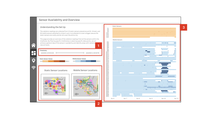
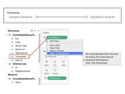
This filter applies to all visualizations on this dashboard. The filter is granulated on an hourly basis, so the user can get a quick overview of the sensor readings and positions of any given hour within the simulation. |
|
2 |
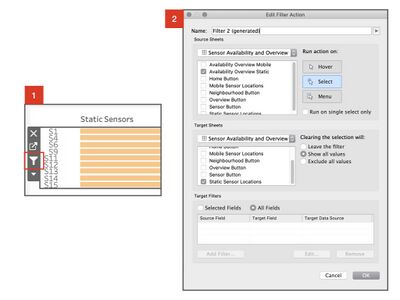
There are two separate maps showing the locations of the static and mobile sensors within the given timeframe. If a sensor has stopped transmitting readings within the selected timeframe, it will stop appearing on the map. To get a closer look at the readings from a particular sensor, selecting it from the map will highlight the corresponding row in the chart on the right. |
|
3 |
Highlighting a specific region on this chart will update the maps accordingly. This enables the user to easily get insights like the movements of a specific or a group of mobile sensors. This is especially useful in finding out the coverage of the sensors in a given timeframe. |
| No. | Description |
|---|---|
|
1 |
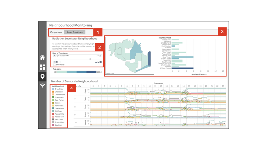
Toggle between the neighbourhood overview and neighbourhood sensor breakdown pages. The overview page provides a broad view of the overall readings and counts of sensors in each region. The sensor breakdown page provides more detail, allowing the user to track neighbourhood activity with regard to specific sensors. |
|
2 |
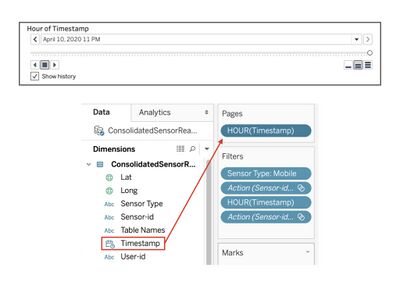
Instead of a filter, this page uses pagination by the hour. This is because it was designed to capture changes in radiation readings over time, instead of aggregating the values. |
|
3 |
The map and bar chart work hand in hand to help officials find out how reliable the radiation readings are. The choropleth map displays the average radiation readings coming from each neighbourhood over the last hour. However, the map alone may be unreliable in situations where there is only one sensor in the neighbourhood, and it is faulty. Readings are more reliable if there are more sensors in the vicinity all reporting high readings, which is the purpose of the bar chart. Selecting a region on the map and the bar chart will also highlight the corresponding region in the other. |
|
4 |
The bump chart makes it easy to visualise anomalies in citizen behaviour. The number of sensors in a neighbourhood in different times of the day should not vary too greatly over time as people tend to have daily routines. A sudden drop or increase in sensors in a given neighbourhood could imply some form of disruption in the citizen's routine, like infrastructural damage rendering a region inaccessible. Selecting a specific neighbourhood will highlight the corresponding line in the bump chart. |
| No. | Description |
|---|---|
|
1 |
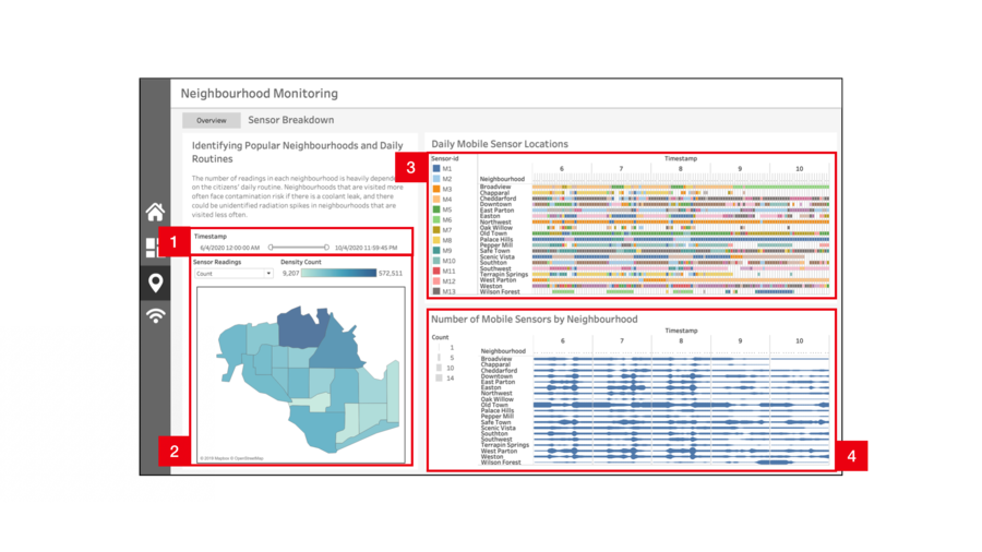
This filter applies to all visualizations on this dashboard. |
|
2 |
The choropleth map of the neighbourhood can be configured(parameter controls) to show the count of sensor readings, or count of sensors in the neighbourhood at the selected timeframe. The user can then identify which neighbourhoods are frequently visited, which is very useful when trying to analyse the severity of a contamination. |
|
3 |
Should there be possible contamination of a certain car or region, this chart can be used to swiftly analyse its spread. Selecting a specific sensor will display the regions that the car has been to, and by visualising the travel patterns deductions can also be made on where the car is likely to go next. This enables officials to easily trace the movements of a contaminated car and take appropriate action. Alternatively, selecting a particular region will highlight the paths of all cars that have passed through the region within the timeframe. This is valuable data in the event of a localised contamination in a specific region, as the cars passing through may have gotten contaminated while passing through and went on to spread the contamination to other regions. |
|
4 |
A visual representation of the number of sensors in each neighbourhood over time to detect anomalies and identify locations with lesser, and hence uncertain readings. |
| No. | Description |
|---|---|
|
1 |
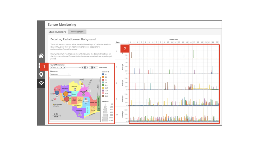
As this page aims to provide detailed analysis, pagination by the hour is used instead of a timestamp range filter. To visualise how the readings compare throughout the city, the size of the data points scale with the readings. Parameter controls allow for 2 different measures - hourly maximum and hourly average. Selecting a specific sensor will highlight the corresponding values throughout the charts on this dashboard. |
|
2 |
A line graph visualising the static sensor readings over time makes it easy to identify spikes or sustained increases in readings. |
| No. | Description |
|---|---|
|
1 |
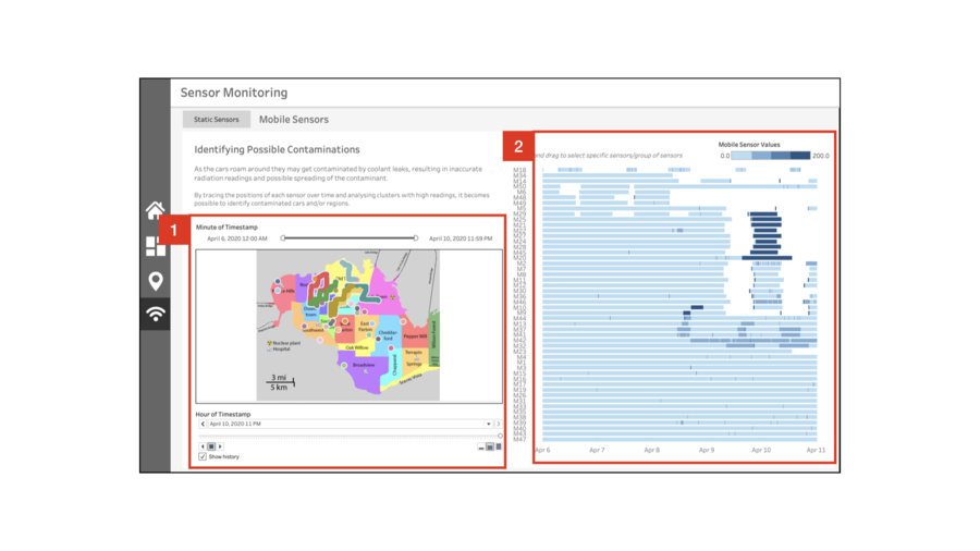
Unlike the other pages, this page has both a timeframe filter as well as pagination. This is because the mobile sensor readings are volatile and can get chaotic when displayed on a map. With a filter and pagination, the user can select specific timeframes of interest and then trace the sensors' paths frame by frame. |
|
2 |
Assuming the data is static, this visualisation enables the user to identify clusters and patterns in the mobile sensor readings. By grouping the sensors with similar transmission patterns or values over time, we are able to clearly recognise legitimate clusters of high readings or sensor failures, as well as which sensors are unreliable/outliers. |
Techniques
| No. | Technique | Image |
|---|---|---|
|
1 |
Go To Sheet |
|
|
2 |
Hover Tooltip |
|
|
3 |
Timestamp Range Filter |
|
|
4 |
Chart Selection Filter |
|
|
5 |
Pagination |
|
|
6 |
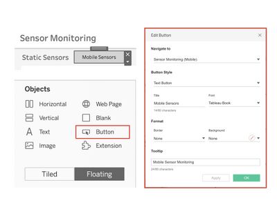
Buttons |
|
|
7 |
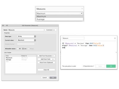
Parameter Controls |
|
|
8 |
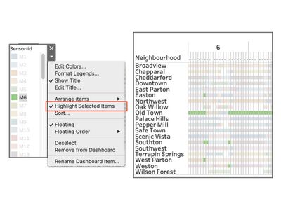
Highlight Selection |

