IS428 2019-1920 T1 Assign LeeSunho Data Preparation
|
|
|
|
|
The dataset zip file
- AnswerSheet Folder
- MC1-DataDescription ( Word document )
- mc1-majorquake-shakemap ( PNG File )
- mc1-prequake-shakemap ( PNG File)
- mc1-reports-data ( Excel document )
- VAST 2019 - St. Himark - About Our City ( Word document )
Data Cleaning
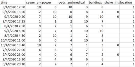
mc1-reports-data includes
1. 83700 datas
2. Time (d/m/yyyy h:mm)
- Time: 6/4/2020 12:00:00 am to 11/4/2020 12:00:00 am
3. sewer_and_water (number)
- sewer_and_water: 0 to 10 with blanks
4. power (number)
- power: 0 to 10
5. roads_and_bridges (number)
- roads_and_bridges: 0 to 10
6. medical (number)
- medical: 0 to 10 with blanks
7. buildings (number)
- buildings: 0 to 10 with blanks
8. shake_intensity (number)
- shake_intensity: 0 to 9 with blanks
9. location (number)
- 1 to 19
Issue
1.null data
Out of 83700, 59925 data are null data.
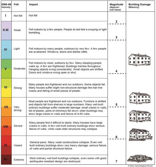
2.Intensity level is not specified into group.
As the reported earthquake intensities are on a scale of 1-10, it is important for users to first understand what these numbers actually mean. Above is a table which succinctly summarizes the scale, explaining that a 1 is basically a non-existent earthquake while a 10 is a catastrophic one. Furthermore, an intensity greater than 6 signifies that the earthquake is strong enough to cause damage.
3.The data does not have longitude and latitudes hence there is issue with plotting map.
Solution
1. The reason why there are null data might be because the data is lively collected, it is possible the report is not properly recorded, or they might purposely not show it. In order to further analysis, i did not remove the null data.
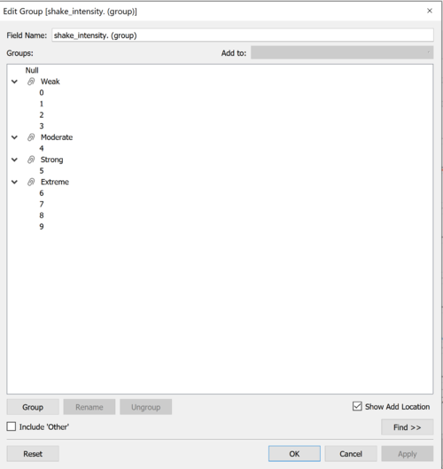
2. Group the intensity level
I have used tebleau group function to group the intensity level. Hence, user can identify seriousness of the reported value.
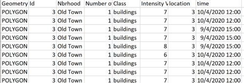
3. In order to plot Map chart, I have downloaded mini2 case data’s “StHimark.shp” file using Tableau which will allow me to visualize map. In order to solve
I used tableau to combine two data sets. Both data set shared common data column, "location" and "Id"
I was able to get name of the each region, longitude and latitude.
4. In order to visualize different class ( ex) power, sewer and water..etc), I combined all the classes into two column. Hence, this will allow me to filter and visualize easily.


