IS428 AY2019-20T1 Assign Lim Pei Xuan: Visualization
Walkthrough
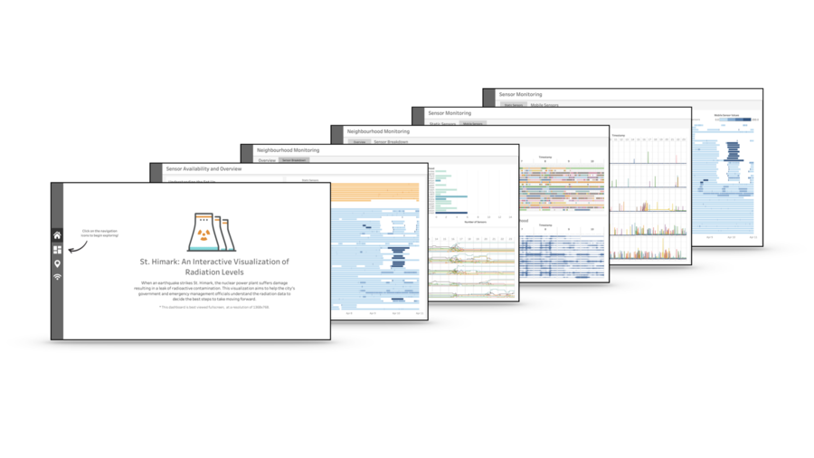
The final interactive visualization consists of a few linked Dashboards organised as follows:
- Home
- Sensor Availability and Overview
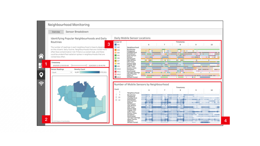
- Neighbourhood Monitoring
- Overview
- Sensor Breakdown
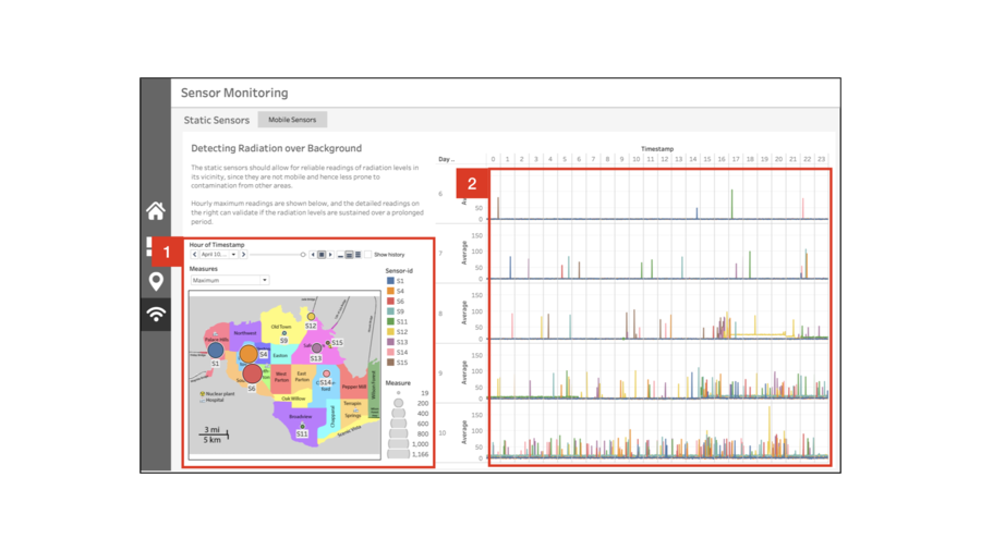
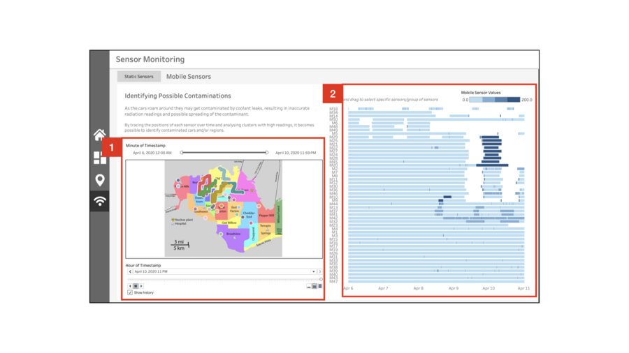
- Sensor Monitoring
- Static Sensors
- Mobile Sensors
The dashboard is organised such that the user will begin with a rough overview of the data, followed by a gradual deep dive into the details of the data. This is to facilitate understanding and prevents the user from getting too overwhelmed by chaotic nature of the data. As the interactive visualization techniques utilised are repeated throughout the dashboard, an overall summary of the techniques utilised can be found in the next section.
| No. | Description |
|---|---|
|
1 |
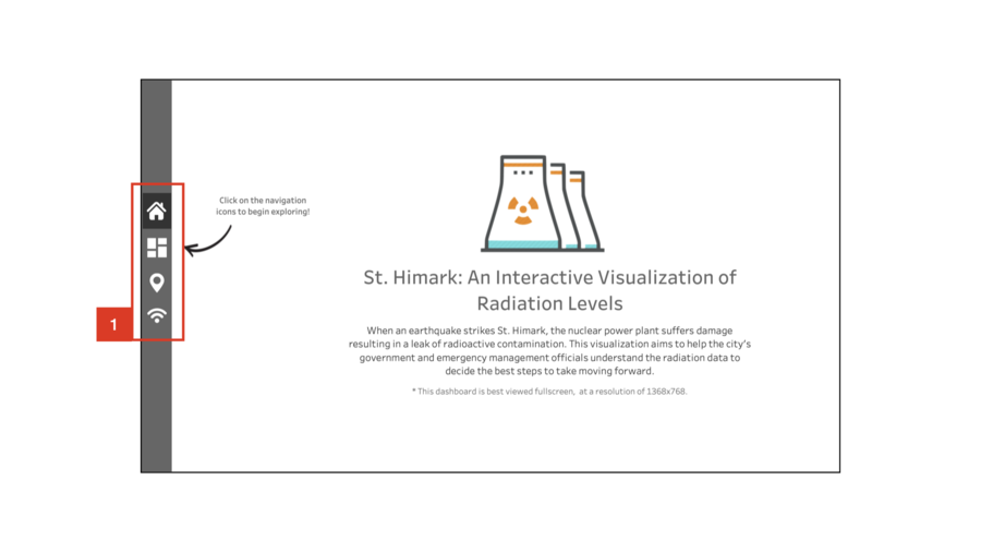
The navigation bar allows for easy toggling between dashboards, and is present throughout the visualization. When the mouse is hovered over the icons, a tooltip with the title of the dashboard it leads to will appear. This is to help the user navigate between pages with ease. |
| No. | Description |
|---|---|
|
1 |
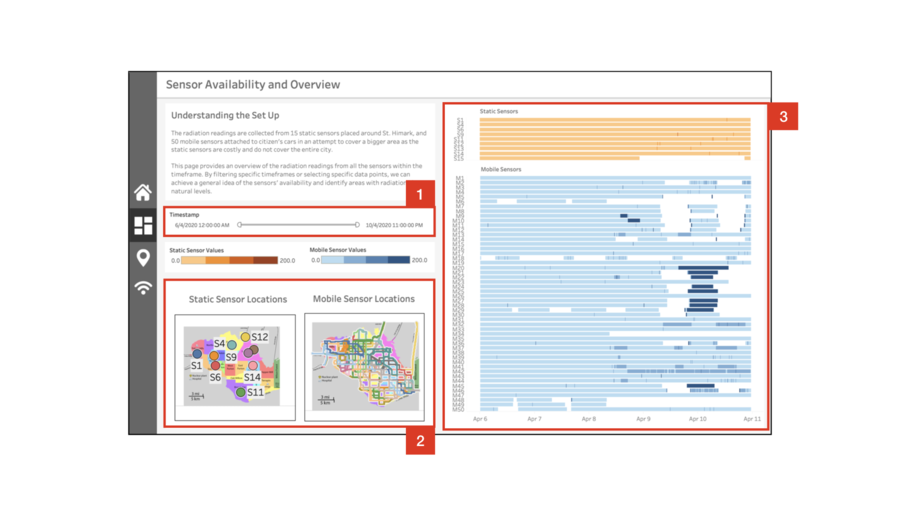
This filter applies to all visualizations on this dashboard. The filter is granulated on an hourly basis, so the user can get a quick overview of the sensor readings and positions of any given hour within the simulation. |
|
2 |
There are two separate maps showing the locations of the static and mobile sensors within the given timeframe |
|
3 |
Blablabla |
| No. | Description |
|---|---|
|
1 |
Blablabla |
|
2 |
Blablabla |
|
3 |
Blablabla |
|
4 |
Blablabla |
| No. | Description |
|---|---|
|
1 |
Blablabla |
|
2 |
Blablabla |
|
3 |
Blablabla |
| No. | Description |
|---|---|
|
1 |
Blablabla |
|
2 |
Blablabla |
| No. | Description |
|---|---|
|
1 |
Blablabla |
|
2 |
Blablabla |

