Temp file RLzx Answers
Q1: Emergency responders will base their initial response on the earthquake shake map. Use visual analytics to determine how their response should change based on damage reports from citizens on the ground. How would you prioritize neighborhoods for response? Which parts of the city are hardest hit?
STATIC SENSOR READINGS
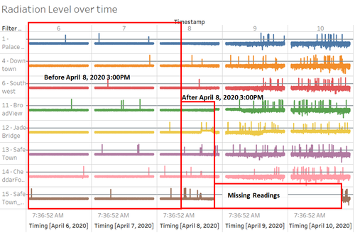
In terms of radiation level, healthy reading level was set at 25cpm, when any sensor readings that exceed this healthy level; attention need to be given to the respective sensor. Based on the readings, before 8 April 2020 04:00PM, radiation level shows minor fluctuation (relatively stable in terms of changes in reading); however, after 8 April 2020 04:00PM, there are significant spikes of radiation readings spotted across all sensors but especially sensor 12-JadeBridge, 13-SafeTown, 14-CheddarFord, and 15-SafeTown_Nuclear have the noisiest spikes among other sensors on this day. In addition, notable that after 8 April 2020 10:06:25PM, sensor 15-SafeTown_Nuclear has some missing readings but the readings start to appear again on 10 April 2020 8:47PM. Some possible reason could be due to location sensor 15-SafeTown_Nuclear that located near to the power plant.

