IS428 AY2019-20T1 Assign Kelvin Chia Sen Wei
Contents
- 1 Problem & Motivation
- 2 Dataset Analysis & Transformation Process
- 3 Dataset Import Structure & Process
- 4 Interactive Visualization
- 4.1 Dashboard X
- 4.2 Dashboard X
- 4.3 Dashboard X
- 4.4 Dashboard X
- 4.5 Dashboard X
- 4.6 Dashboard X
- 4.7 Q1: Emergency responders will base their initial response on the earthquake shake map. Use visual analytics to determine how their response should change based on damage reports from citizens on the ground. How would you prioritize neighborhoods for response? Which parts of the city are hardest hit? Limit your response to 1000 words and 10 images.
- 4.8 Q2: Use visual analytics to show uncertainty in the data. Compare the reliability of neighborhood reports. Which neighborhoods are providing reliable reports? Provide a rationale for your response. Limit your response to 1000 words and 10 images.
- 4.9 Q3: How do conditions change over time? How does uncertainty in change over time? Describe the key changes you see. Limit your response to 500 words and 8 images.
- 5 Comments
Problem & Motivation
St. Himark has been hit by an earthquake, leaving officials scrambling to determine the extent of the damage and dispatch limited resources to the areas in most need. They quickly receive seismic readings and use those for an initial deployment but realize they need more information to make sure they have a realistic understanding of the true conditions throughout the city. In a prescient move of community engagement, the city had released a new damage reporting mobile application shortly before the earthquake. This app allows citizens to provide more timely information to the city to help them understand damage and prioritize their response. In this mini-challenge, use app responses in conjunction with shake maps of the earthquake strength to identify areas of concern and advise emergency planners. Note: the shake maps are from April 6 and April 8 respectively.
With emergency services stretched thin, officials are relying on citizens to provide them with much needed information about the effects of the quake to help focus recovery efforts.
By combining seismic readings of the quake, responses from the app, and background knowledge of the city, help the city triage their efforts for rescue and recovery.
Tasks and Questions:
- Emergency responders will base their initial response on the earthquake shake map. Use visual analytics to determine how their response should change based on damage reports from citizens on the ground. How would you prioritize neighborhoods for response? Which parts of the city are hardest hit? Limit your response to 1000 words and 10 images.
- Use visual analytics to show uncertainty in the data. Compare the reliability of neighborhood reports. Which neighborhoods are providing reliable reports? Provide a rationale for your response. Limit your response to 1000 words and 10 images.
- How do conditions change over time? How does uncertainty in change over time? Describe the key changes you see. Limit your response to 500 words and 8 images.
Dataset Analysis & Transformation Process
Some of the data given have to be processed to provide an accurate display of information and analysis.
Data Manipulation for given dataset: mc1-reports-data.csv
Pivoting for damage categories
Issue: The different categories of damage can be aggregated to give a more concise dataset and to be displayed as filters.
Solution: The categories: Medical, Power, Road_And_Bridges, Sewer_And_Water and buildings can be pivoted so that the categories can be filtered on Tableau's Dashboard.
The mentioned categories are pivoted using Tableau Prep Builder and transformed into "Area" for the category and "Area Damage" for the values.

Binning of Shake Intensity:
Issue: As mentioned in the provided data, the shake intensity are categorised as above and we have to align the data as such.
Solution: Through Tableau Prep Builder, we can create a calculation to bin each numerals to their respective categories.
Below is a screenshot of the calculation statement:

Below is the generated CSV from Tableau Prep Builder after data manipulation:

Data Manipulation for given dataset: StHimarkNeighborhoodShapefile/StHimark.shp
In order to overlay the different areas of the neighborhood to display its area outline, I used the shp file that was given in MC2 Challenge.
Issue: However, after Polygons became the centroid after adding the background image.
- Like this
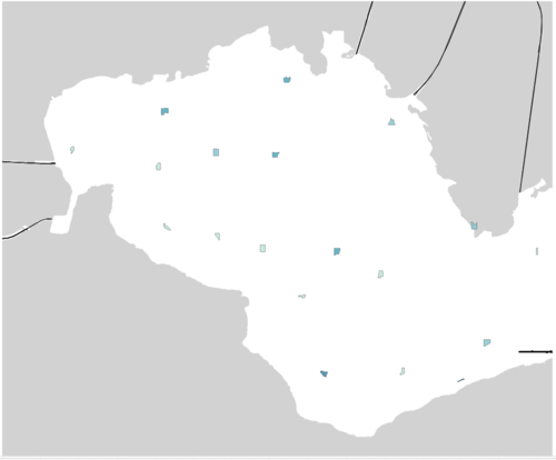

Solution: Transforming SHP File to Polygon Coordinates.
- Refer to VA Discussion Forum for steps to implement.
- Online Link: https://community.tableau.com/thread/116369
- After the completion of this process, the issue of lacking individual zone coordinates will be resolved.
- Like this

Dataset Import Structure & Process
With the dataset analysis and transformation phase completed, the following files will have to be imported into Tableau for analysis:
RELATIONS.
ADDITIONAL DATASET.
- Import
- Add new data connections to XXX.
- Perform a left join between the XXX and the XX to correlate the XXX together. XXX The following shows the configuration of the join:
To process and display XXX
The formula used is as follows:
STR(DATEPART('day', [Date/Time])) + " " + DATENAME('month',[Date/Time]) + " (" + DATENAME('weekday', [Date/Time]) + ")"
Interactive Visualization
The interactive visualization can be accessed here: TABLEAU LINK
Throughout all the different dashboards, useful guides/tips are provided to help users navigate through the different filters and actions so that their analysis can be performed smoothly. The following interactivity elements are also used throughout all the dashboards to maintain consistency:
| Interactive Technique | Rationale | Brief Implementation Steps |
|---|---|---|
| ||
| ||
|
The following sections elaborates on other interactivity techniques are integrated into each of the individual dashboard.
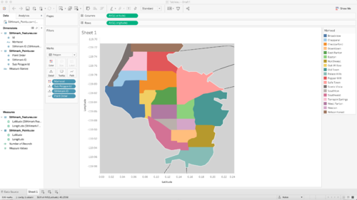
Dashboard X
The following shows the XX dashboard:
The following interactive techniques have been employed in this dashboard:
| Interactive Technique | Rationale | Brief Implementation Steps |
|---|---|---|
| XX |
Dashboard X
The following shows the XX dashboard:
The following interactive techniques have been employed in this dashboard:
| Interactive Technique | Rationale | Brief Implementation Steps |
|---|---|---|
| XX |
Dashboard X
The following shows the XX dashboard:
The following interactive techniques have been employed in this dashboard:
| Interactive Technique | Rationale | Brief Implementation Steps |
|---|---|---|
| XX |
Dashboard X
The following shows the XX dashboard:
The following interactive techniques have been employed in this dashboard:
| Interactive Technique | Rationale | Brief Implementation Steps |
|---|---|---|
| XX |
Dashboard X
The following shows the XX dashboard:
The following interactive techniques have been employed in this dashboard:
| Interactive Technique | Rationale | Brief Implementation Steps |
|---|---|---|
| XX |
Dashboard X
The following shows the XX dashboard:
The following interactive techniques have been employed in this dashboard:
| Interactive Technique | Rationale | Brief Implementation Steps |
|---|---|---|
| XX |
Q1: Emergency responders will base their initial response on the earthquake shake map. Use visual analytics to determine how their response should change based on damage reports from citizens on the ground. How would you prioritize neighborhoods for response? Which parts of the city are hardest hit? Limit your response to 1000 words and 10 images.
ZZ'
Ans
- Ans1
- Ans2
Ans
Ans1:
- Ans2
- Ans3
| Col1 | Col2 | Col3 |
|---|---|---|
| Row | Row
| |
| Row | Row
| |
| Row | Row
| |
| Row | Row
| |
| Row | Row
| |
| Row | Row
| |
| Row | Row
| |
| Row | Row
|
Q2: Use visual analytics to show uncertainty in the data. Compare the reliability of neighborhood reports. Which neighborhoods are providing reliable reports? Provide a rationale for your response. Limit your response to 1000 words and 10 images.
Ans:
| Col1 | Col2 | Col3 |
|---|---|---|
| Row | Row
| |
| Row | Row
| |
| Row | Row
| |
| Row | Row
| |
| Row | Row
| |
| Row | Row
| |
| Row | Row
| |
| Row | Row
|
Q3: How do conditions change over time? How does uncertainty in change over time? Describe the key changes you see. Limit your response to 500 words and 8 images.
Ans:
| Col1 | Col2 | Col3 |
|---|---|---|
| Row | Row
| |
| Row | Row
| |
| Row | Row
| |
| Row | Row
| |
| Row | Row
| |
| Row | Row
| |
| Row | Row
| |
| Row | Row
|
Comments
Please input your comments here!