IS428 AY2019-20T1 Assign Ronald Lay Answers
Q1: Emergency responders will base their initial response on the earthquake shake map. Use visual analytics to determine how their response should change based on damage reports from citizens on the ground. How would you prioritize neighborhoods for response? Which parts of the city are hardest hit?
Q2: Use visual analytics to show uncertainty in the data. Compare the reliability of neighborhood reports. Which neighborhoods are providing reliable reports? Provide a rationale for your response.
Based on Figure 2.1, there are 3 key analysis:
- Downtown, Northwest and Weston provide the most reliable reports among all the neighborhoods
- Wilson Forest provides the least reliable reports. Possible explanation could be Wilson Forest may experience power outage even before the major earthquake happens. However, there is no ongoing repair under Power current project.
- As highlighted in oval red, there are occasional periods where there are simply no reports. The possible cause may point to power/server outages
Power outages and other infrastructural problem result in delayed reports (Indicated by red ovals) and the server does not process the information until the power is restored. The explanation of number annotation is as followed:
1 & 2: It is noticeable the reported damage is on different timing. The timestamp is only recorded when the power is restored, resulting in an increase of the amount of damage reports from Thursday 3 to 5 PM due to accumulation of reports over the period of power outages.
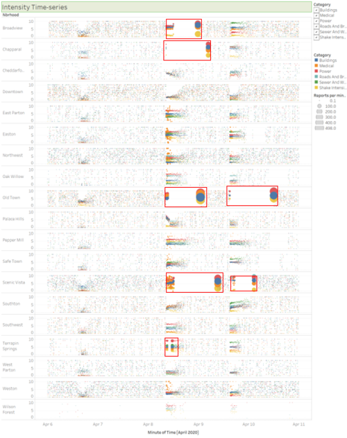
Based on the break down by each neighbor, the highlighted red box shows there is indeed a sudden increase in number of reports posted on the server at the same time. Most of the neighbors are affected at some point of time, particularly Broadview, Chapparal, Old Town and Scenic Vista are the most vulnerable.


