IS428 AY2019-20T1 Assign Greg Tan Boon Kit Data Analysis & Transformation
Data Analysis & Transformation
The primary step to every data visualisation would be to always ensure that the data is processed and ready for proper data visualisation.
In this case, most of the data was collected from citizens of St. Himark through the use of the Rumble App. Capitalising on the benefit of crowd sourced information from the citizens ensure that emergency responders know which area is most disaster stricken, and can target those areas first.
Data collected from the Rumble includes both Categorical and Continuous data, with the main data collected being: 1. Timestamps of reports from citizens 2. The intensity of the earthquake shaking at a particular timestamp 0: Lowest, 10: Highest 3. The different types of infrastructure (eg. Buildings, Power, Sewers, Medical, Roads) 4. The ID of each neighbourhood’s location 5. Damage done to each type of infrastructure from the earthquake 0: Not Felt, 10: Extreme
| Issues Faced |
|---|
|
Issue: Data provided with regards to the details of various facilities are in their own specific rows. This poses a challenge for further visualisation as each data is not being properly segmented. |
|
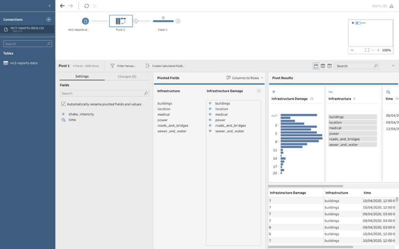
Solution: Making use of Tableau Prep, the columns for the various infrastructure's details can be pivoted to show just 1 column, labelled infrastructure. This column would include the data from previous columns:
This would streamline all the data under each of this infrastructure type to ensure proper data visualisation can be done. To solve this issue:
|
| Issues Faced |
|---|
|
Issue: The damage done to the various infrastructure is in a numerical format. At first glance, it might not be clear to emergency responders based on a numerical scale which area is badly damaged and needs immediate assistance. |
|
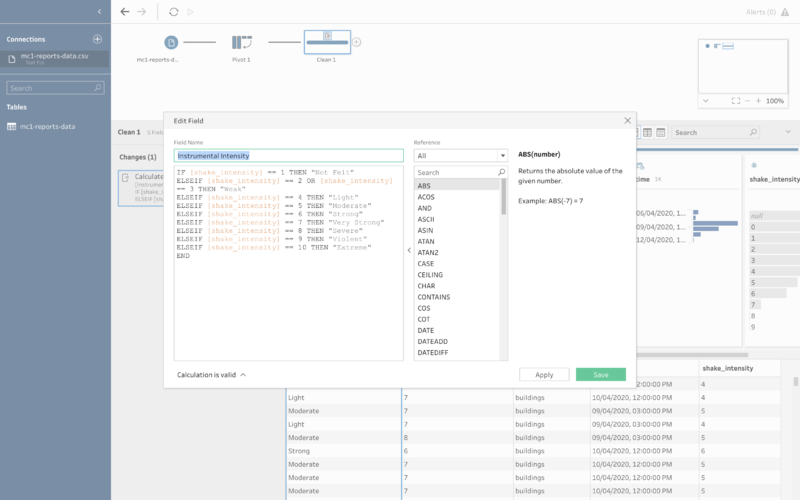
Solution: Making use of Tableau Prep to create a calculated field, the damage done to the various infrastructure can be tagged by their Instrumental Intensity. This would make it easier for the emergency respondents to identify at once which areas are the worst hit based on the existing Instrumental Intensity indicator. To solve this issue:
|

