IS428 AY2019-20T1 Assign Teng Jing Wen
Contents
Problem and Motivation
St. Himark has been hit by an earthquake, leaving officials scrambling to determine the extent of the damage and dispatch limited resources to the areas in most need. They quickly receive seismic readings and use those for an initial deployment but realize they need more information to make sure they have a realistic understanding of the true conditions throughout the city.
In a prescient move of community engagement, the city had released a new damage reporting mobile application shortly before the earthquake. This app allows citizens to provide more timely information to the city to help them understand damage and prioritize their response. In this mini-challenge, use app responses in conjunction with shake maps of the earthquake strength to identify areas of concern and advise emergency planners. Note: the shake maps are from April 6 and April 8 respectively.
With emergency services stretched thin, officials are relying on citizens to provide them with much needed information about the effects of the quake to help focus recovery efforts.
By combining seismic readings of the quake, responses from the app, and background knowledge of the city, help the city triage their efforts for rescue and recovery.
Transforming and analysing the dataset
<Before the analysis began, the dataset given is analysed to identify its respective format and attributes. There were 6 different zip files provided in the assignment and each has its own unique ways to process and make sense of the data to bring value to the analysis. This section will elaborate on the dataset analysis and transformation process for each dataset in order to prepare the data for import and analysis on an interactive visualization.>
Data Cleaning
| Problem 1 | Transposing the Data |
|---|---|
| Issue | The damage reports given contain multiple columns of damage area reported and this will make it difficult for interpretation on Tableau, especially when attempting to plot charts. |
| Solution |  |
| Problem 2 | Polygon issue?? |
|---|---|
| Issue | |
| Solution |
Issue: .
Solution:
Issue:
Solution:
Dataset Import Structure & Process
After performing the data transformation, the data from 3 data sources will be imported into Tableau.

As there are 3 different datasets to import, we will need to perform inner joins on the tables together with a common attribute. The relationship between each data source is as follow:
- Between reports data and StHimark Features
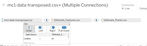
- Between StHimark Features and StHimark Points
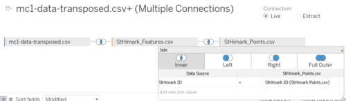


After joining the data by common attribute, additional processing to the data sources still has to be done.
Additional Processing: Emergency Reports Data
| No. | Brief Implementation |
|---|---|
| 1. |
Under the data source tab, we will rename the "Time" field into Date and create an additional Time field. The following formula will be used: “MAKETIME(DATEPART('hour',[Date]), DATEPART('minute',[Date]),0)”  |
| 2. |
 |
| 3. | Under a new Worksheet, perform the following actions:
|
| 4. | Example |
Interactive Visualization
Home Dashboard
xxx
xxx.1
The following shows the HVAC Control System (Chemicals) dashboard:
The following interactive techniques have been employed in this dashboard:
| Interactive Technique | Rationale | Brief Implementation Steps |
|---|---|---|
For example, the line graph allows analysts to view the change in hazium concentration level overtime while the heatmap allow analysts to easily view the concentration levels of hazium based on colours representation. |
- | |
| The implementation steps are similar to the use of highlighting in the “HVAC Control System & Chemical Levels (Heating)” dashboard. | ||
|
| |
| To ensure that the filter applied in the dashboard is linked with the “HVAC Control System Ventilation Elements” dashboard, similar steps were taken as mentioned previously to link filters across different dashboards.
To allow clicking of the chart to another dashboard, actions were defined based on the following configuration: |
xxx.2
The following shows the Power Consumption dashboard:
The following interactive techniques have been employed in this dashboard:
| Interactive Technique | Rationale | Brief Implementation Steps |
|---|---|---|
| The implementation steps are similar to the use of linking technique used in the “HVAC Control System & Chemical Levels (Chemicals)” dashboard. |
Interesting Observations
Using the dashboard as a platform for emergency response analysis, the following aims to provide answers to the questions posed.
Q1:
data
xxxx
- xx
xxx
xx:
- xx
points:
| Department | Activities |
|---|---|
| |
|
Q2:
xxx.
| Priority | Anomaly/Unusual Events | Possible Danger/Serious Issue |
|---|---|---|
| xxx
[Source: xxx Dashboard] |
xx
| |
| xxx
[Source: xxx Dashboard] |
xx
| |
| xxx
[Source: xxx Dashboard] |
xx
|
Q3:
xx
points:
- xxxx
| Priority | Anomaly/Unusual Events | Possible Danger/Serious Issue |
|---|---|---|
| xxx
[Source: xxx Dashboard] |
xx
| |
| xxx
[Source: xxx Dashboard] |
xx
| |
| xxx
[Source: xxx Dashboard] |
xx
|
References
The following references have been useful in the completion of the analysis process:
- <title> (url)