John Bau
<--- Go Back to Project Groups
Contents
Problem
South Korea, despite being one of the rapidly growing economies in the world, has the highest suicide rate in the world. According to OECD Statistics, 25.6 people commit suicide per 100,000 people (OECD, 2018). In other words, suicide incidents happen to 36 people per day and 13,092 people per year; much higher than the OECD average of 11.6.
Hence, our group would like to analyze multiple data sets such as gender, social status, and age to understand the underlying social issue of South Korea leading to suicides.
Every number in the datasets affects loved ones, family and precious life. Throughout our journey, we hope to derive insightful meanings from the datasets to highlight the severity of suicide social issue in South Korea, in which the government and society tend to overlook.
Motivation
A blockbuster korean drama, Sky Castle, has been our source of inspiration to the initial idea of our project as the drama portrayed a huge issue of Korea’s education system and Socioeconomic Status (SES), which weigh heavily in measuring an individual’s success and to a greater extent, they have been ingrained in Korean culture. However, when the pressure to conform to family and society’s expectations is too great, suicide is increasingly a top option to escape those expectations.
Our motivation is to review the pattern of suicide numbers over the years based on several factors - occupation, income etc. Korea government website does provide a basic suicide visualisation; however, the visualisation only considers one data set and no correlation. Hence, it is essential to identify several factors and of these factors, how they correlate to suicide rate.
Objectives
- To analyse suicide growth rate over the years
- To analyse and compare which region is impacted the most and least.
- To understand how significant each factor affects suicide rate.
- To correlate the cause of suicide to suicide growth rate.
- To understand which demographic committed suicide by age and gender.
- Based on demographic, we can analysis the relationship with cause of suicide to discover the common suicide reason.
Selected Datasets
The Data Sets we will be using for our analysis and for our application is listed below:
| Dataset/Source | Data Attributes | Rationale Of Usage |
|---|---|---|
|
impulse_to_commit_suicide
|
|
This dataset will be used to understand the reasons for suicide thought in South Korea from 2008 to 2018. |
suicide_rate_region
|
|
This dataset will be used to understand suicide rate in the different major cities in Korea. We will also be able to gain insights on the Number of suicide. |
|
suicide_by_occupation
|
|
This data set will be used to understand the general demographic of occupations of who committed suicide in Korea from 1993 to 2017. We will be able to gain descriptive insights of which occupation tend to have higher suicide rate. |
|
suicide_attampt_student
|
|
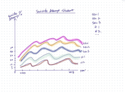
This data set will be used to understand the general demographic of different level of students attempted to commit suicide coming to Korea from 2005 to 2018. We will be able to gain descriptive insights on the students demographics by Gender, Education level. |
suicide_by_age
|
|
This data set will be used to understand the general demographic of different ages who committed suicide in Korea from 1983 to 2017. We will be able to gain descriptive insights on the age trend who committed suicide over the years. |
suicide_marital_status
|
|
This data set will be used to understand the general demographic of suicide rate based on Martial status in Korea. We will be able to gain descriptive insights on the status trend who intend to commit suicide over the years. |
(2010 - 2017) |
|
This data set will be used to understand the general demographic of international suicide intention based on status in Korea. We will be able to gain descriptive insights on the status trend who intend to commit suicide over the years. |
Background Survey
| Examples | Takeaways |
|---|---|
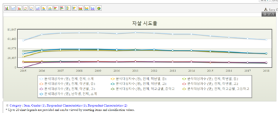
| Line chart is used to detect any anomalies in the trend. However, The use of absolute value displays a slight fluctuation and relatively constant trend. | |
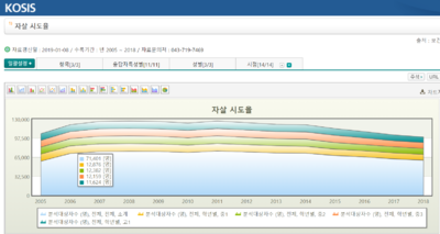
| Raw values tend to inflate the value of suicide attempt. | |
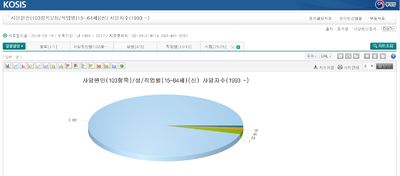
| They use absolute value to visualise the data. KOSIS generally uses bar or pie chart hence it’s not very attractive or just too simple | |
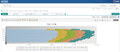
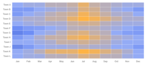
| The colour does not represent. They combined the total into the chart. | |
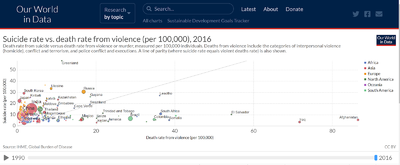
| Our world in data used scatter chart with trend line to visualise the violence rate. Also the size of the circle to represent the violence rate. | |
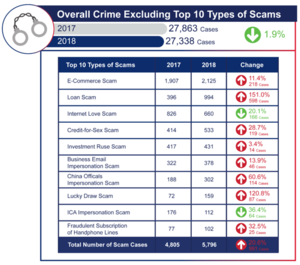
| To display top 10 scams and difference from 2017 to 2018. It utilises stock color to differentiate the increase (red) and decrease (green). The image of related handcuffs helps to identify a cause for concern |
Consideration and Visual Selection
Below are a few visualizations and charts we considered making for our projects.
| Considerations | Pros | Cons |
|---|---|---|
|
| |
|
| |
|
|
Brainstorming Sessions
| Examples | Remark |
|---|---|
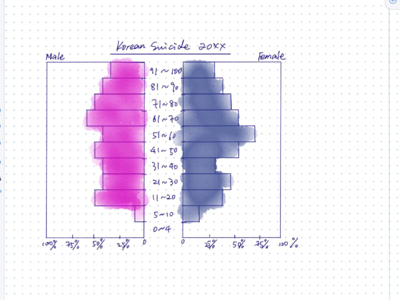
| Display the distribution of age-group using pyramid chart. We can identify the most vulnerable age group and analyse the cause further. Use scatter plot to identify how age group are clustered together. With the addition of interactive animation for years, a trail function will help to discover the trend over the years. | |
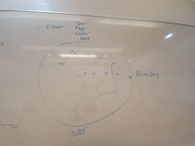
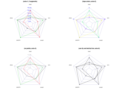
| A Radar Chart, also called as Spider Chart, Radial Chart or Web Chart, is a graphical method of displaying multivariate data in the form of a two-dimensional chart of three or more quantitative variables represented on axes starting from the same point. We will be using this to show the reasons for Korean’s suicide reason/thoughts. | |
| Identification of anomalies will be clear across categories. | |
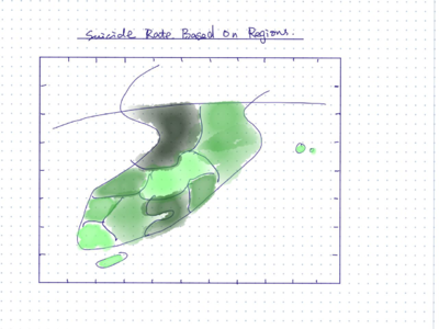
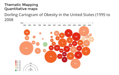
| Use Cartogram chart to analyse which resgion has the higher or lower suicide rate. | |
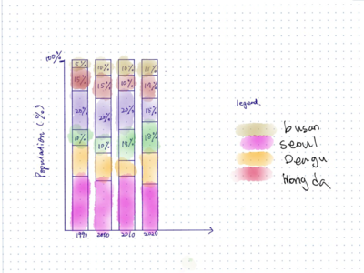
| We will also use bar chart to show clearer picture of exact percentage of each region and compare |
Proposed Storyboard
| Layout | Learning Points |
|---|---|
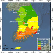
| Use map chart to indicate which region has the least to most suicides based on the intensity of the colour. | |
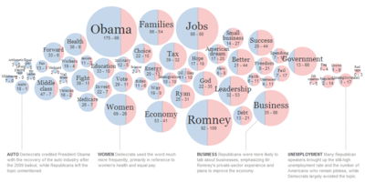
| Base on the splitted bubble chart, we are able to identify which occupation has the highest suicide rate in percentage and of each occupation, it shows the propotion of gender. The time series will be positioned on top of the splitted bubble chart Credit to Professor Kam Tin Seong |
Technologies
Timeline
Comments
Feel free to leave us some comments so that we can improve!
| No. | Name | Date | Comments |
|---|---|---|---|
| 1. | <your name> | <date> | <comment> |
| 2. | <your name> | <date> | <comment> |
| 3. | <your name> | <date> | <comment> |

