IS428 AY2019-20T1 Assign Pham Anh Kim Chau
Contents
Problem Statement
One of St. Himark’s largest employers is the Always Safe nuclear power plant. The pride of the city, it produces power for St. Himark’s needs and exports the excess to the mainland providing a steady revenue stream. However, the plant was not compliant with international standards when it was constructed and is now aging. As part of its outreach to the broader community, Always Safe agreed to provide funding for a set of carefully calibrated professional radiation monitors at fixed locations throughout the city. Additionally, a group of citizen scientists led by the members of the Himark Science Society started an education initiative to build and deploy lower cost homemade sensors, which people can attach to their cars. The sensors upload data to the web by connecting through the user’s cell phone. The goal of the project was to engage the community and demonstrate that the nuclear plant’s operations were not significantly changing the region’s natural background levels of radiation.
When an earthquake strikes St. Himark, the nuclear power plant suffers damage resulting in a leak of radioactive contamination. Further, a coolant leak sprayed employees’ cars and contaminated them at varying levels. Now, the city’s government and emergency management officials are trying to understand if there is a risk to the public while also responding to other emerging crises related to the earthquake as well as satisfying the public’s concern over radiation
Data Provided
- St. Himark shapefile
- StaticSensorReadings.csv
- 4 columns: Timestamp, Sensor-id, Value, Units
- Import to Python as "value" dataframe
- StaticSensorLocations.csv
- 3 columns: Sensor-id, Lat, Long
- Import to Python as "location" dataframe
- MobileSensorReadings.csv
- 7 columns: Timestamp, Sensor-id, Long, Lat, Value, Units, User-id
- Import to Python as "mobile" dataframe
Data Analysis and Preparation
Aggregate the data
- Problem: The 2 datasets is recorded every 5 seconds which lead to the enormous amount of data points. It is impossible to merge the 2 datasets (mobile & static) and store the data back to Excel
- Solution: Aggregate the data from every 5 seconds to every 5 minutes with an underlying assumption - The mobile sensors would not be able to move so far within 5 minutes. The radiation measure would be the average value of all data points within 5 minutes time to prevent the distortion of data (The radiation would be higher if there is no missing data in the period but it would not mean that there is a spike in radiation at the point in time)
- Tool and Packages: Python (Numpy, Pandas, Datetime)
- Steps applied to both Static and Mobile data
| Step | Code |
|---|---|
| Create a new list of data & time ranges within the start time and end time of the data set |
Real start date & time |
| Create a list that contains the IDs of all static sensors |
Create a list that contains all unique values in column "Sensor-id" |
| Create an list that contains the IDs of all mobile sensors |
Create a list that contains all unique values in column "Sensor-id" |
- Steps to aggregate static data:
1/ Create a new list called "static_data"
2/ Loop through each index in the date list and each item in the static id list, check the requirements and carry out the steps depend on the scenario
| Scenario | Step | Code |
|---|---|---|
| Scenario 1: When date-time is the start date-time (There will be 1 value for each sensor) | Assign value to the variables | time = str(dd[d]) ss_id = i |
| Create a new list called "row" that contains the newly created variables | row = [time,ss_id,num] | |
| Append "row" to the "static_data" list | static_data.append(row) | |
| Scenario 2: When date-time is the end date-time (There will be multiple values for each sensor) | Assign value to the variables | time = str(d3) ss_id = i |
| Create a new list called "row" that contains the newly created variables | row = [time,ss_id,num] | |
| Append "row" to the "static_data" list | static_data.append(row) | |
| Scenario 3: All the other date-time in between (There will be multiple values for each sensor) | Assign value to the variables | time = str(dd[d]) ss_id = i |
| Create a new list called "row" that contains the newly created variables | row = [time,ss_id,num] | |
| Append "row" to the "static_data" list | static_data.append(row) |
3/ Create a new dataframe with the data from static_data list. The new dataframe will have 3 columns: 'Timestamp','Sensor ID','Value'
4/ Vertically merge the new dataframe with the static sensors' location by matching the Sensor ID
5/ Delete the duplicated "Sensor-id" column, which was the result of the vertical merge above
6/ Add in two new columns, User-id and Type of sensor to match the mobile sensors' data
- Steps to aggregate mobile data
1/ Create a new dataframe,mobile_sensor, by copying the "mobile" dataframe and keep only the "Sensor-id" and "User-id" columns. Remove the duplicated values within the new dataframe so we can match the "User-id" column later
2/ Create a new list called "mobile_data"
3/ Loop through each index in the date list and each item in the mobile id list, check the requirements and carry out the steps depend on the scenario
| Scenario | Step | Code |
|---|---|---|
| Scenario 1: When date-time is the start date-time (There will be 1 value for each sensor) | Assign value to the variables | time = str(dd[d]) ss_id = i |
| Create a new list called "row" that contains the newly created variables | row = [time,ss_id,num,lat,long] | |
| Append "row" to the "static_data" list | mobile_data.append(row) | |
| Scenario 2: When date-time is the end date-time (There will be multiple values for each sensor) | Assign value to the variables | time = str(d3) ss_id = i |
| Create a new list called "row" that contains the newly created variables | row = [time,ss_id,num,lat,long] | |
| Append "row" to the "static_data" list | mobile_data.append(row) | |
| Scenario 3: All the other date-time in between (There will be multiple values for each sensor) | Assign value to the variables | time = str(dd[d]) ss_id = i |
| Create a new list called "row" that contains the newly created variables | row = [time,ss_id,num,lat,long] | |
| Append "row" to the "static_data" list | mobile_data.append(row) |
4/ Create a new dataframe,mobile_agg, with the data in mobile_data. The new dataframe will have 4 columns: 'Timestamp','Sensor ID','Value','Lat','Long'
5/ Vertical merge the new dataframe with the mobile_sensor dataframe based on Sensor ID to get the User ID
6/ Delete the duplicated "Sensor-id" column, which was the result of the vertical merge above
7/ Add in 1 new column,Type of sensor to differentiate with the static sensors
Merge mobile data and static data
- Problem: Currently, the data for the static sensors and mobile sensors are in 2 dataframes. This makes the analysis process difficult with the need to blend or join data in Tableau.
- Solution: Use Python to concatenate the 2 dataframes into 1 and write the data back to csv
- Tool and Packages: Python (Pandas)
- Detailed Steps:
- Change the name of "User-id" column to match that of static data (there is a space in front of the words)
- Merge the static and mobile data into 1 dataframe
- Create a new "Sensor-id" column
- If the sensor is static sensor, the sensor id will be "Static - " and the ID (e.g. Static - 1)
- If the sensor is mobile sensor, the sensor id will be "Mobile - " and the ID (e.g. Mobile - 1)
- Remove the old "Sensor ID" column
- Write the new data back to csv file
Add neighborhood information to the data set
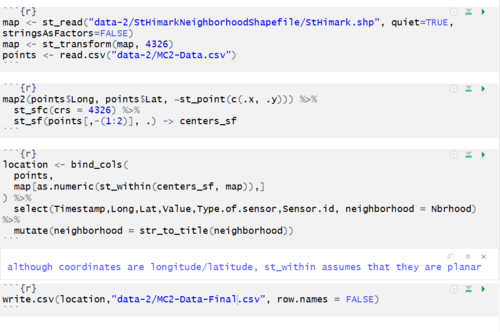
- Problem: There is only longtitude and latitude of the sensors in the data. There is no way to know which neighborhood a sensor is in unless manually compared against the St.Himark map
- Solution: Based on the provided longtitude and latitude of the map, map the points against the map to retrieve the neighborhood information
- Tool and Packages: R (tidyverse, sf)
- Detail steps
- Load the value data set
- Load th St.Himark shapefile
- Change the longtitude and latitude of the points to the correct format and property
- Combine the 2 dataframes based on the longtitudes and latitudes
- Write the new value file with the neighborhood information to csv
Dashboard Design
Dashboard Link: https://public.tableau.com/views/Individualassignment-MC2/Story1?:embed=y&:display_count=yes&publish=yes&:origin=viz_share_link
In case there is any distortion to the display on Tableau Public, please choose to switch to "Desktop view" to get the best layout
- There are 5 pages in the Tableau story:
- Homepage: Problem Statement
- Overall situation: The radiation situation in St.Himark within the 6-10 April 2020
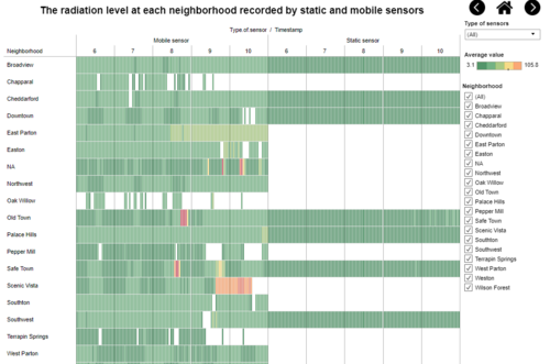
- Neighborhood: Average radiation level in 1 hour by neighborhood, recorded by static and mobile sensors separately
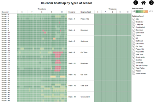
- Sensor ID: Average radiation level in 1 hour recorded by each sensor
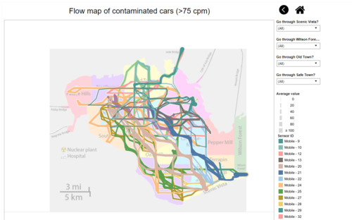
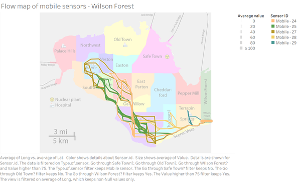
- Contaminated cars: The flow map of contaminated cars, which recorded the radiation level higher than 75 cpm, to see the routes and potential radiation spread caused by them
- Navigation:
| Navigation button | Description |
|---|---|
 |
Show the current page you are at & move forward/backward |
| Go back to the Homepage | |
| Go to the previous page | |
| Go to the next page |
Interactive Visualization
Color Legends
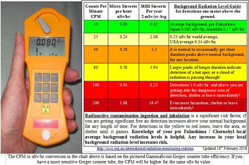
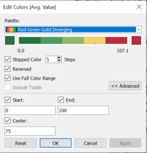
According to the some sources, the normal radiation level is around 25 to 75 while any measurement that is 100 and above is dangerous. As a result, I set the property of the color legend like the picture below. This is also to prevent a few extreme outliers in the dataset
Interactive Visualization
Throughout all of the dashboards, there are different visualization and filters used to provide additional information to viewers depend on their own interests. For details, please refer to the table below:
| Interactive features | Rationale | Brief implementation steps |
|---|---|---|
| Type of sensor filter |
To provide better insight regarding the value and location of sensors |
|
| Neighborhood filter |
To provide more insight regarding the area of interest |
|
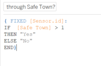
| "Go through..." filter |
To narrow the the cars that have gone through potential contaminated location |
|
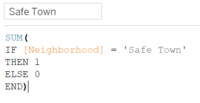
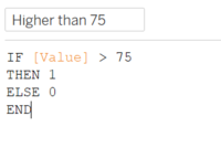
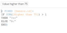
| Contaminated filter (hidden) | To narrow down to potential contaminated vehicles | *Create a calculated field "Higher than 75" with the formula:
|
Overall situation
Potential contaminated area on map
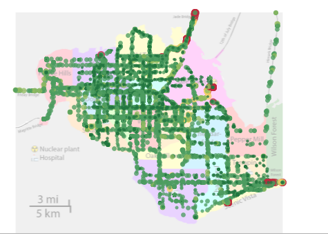
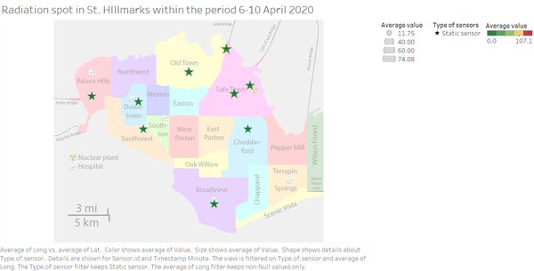
This map shows all radiation value recorded over time as well as the location of potential contamination. Each value would either a star or a circle depends it was recorded by which type of sensor. Moreover, based on the size and the color, we will know whether the value is in acceptable or dangerous range
The color opacity of the point is also reduced to 75% to sow how frequent there is a mobile sensor cross by an area. The darker the area, the more mobile sensors passed through and lead to higher chance of radiation contamination.
Overall calendar heatmap
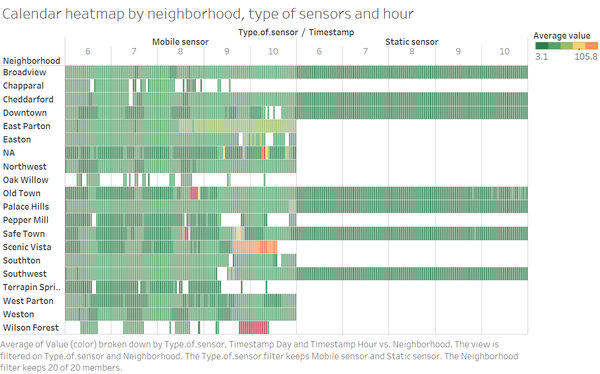
The calendar heatmap provide the average value provided by all sensors in 1 hour at each neighborhood. It would allow viewers to quickly identify area of problem and at what time. Moreover, this type of visualization would minimize the the effect of the extreme outliers
Neighborhood
This calendar heatmap show the radiation value at each neighborhood but these value are separated based on which type of sensors captured the value. This would help viewers to identify the difference in value captured by different type of sensors at the same neighborhood at the same point of time.
Sensor ID
This visualization help to show the records of each sensor within the period. In case there is any anomalies with the type of sensors, any individual sensors, this heatmap can help to identify the pattern
Contaminated cars
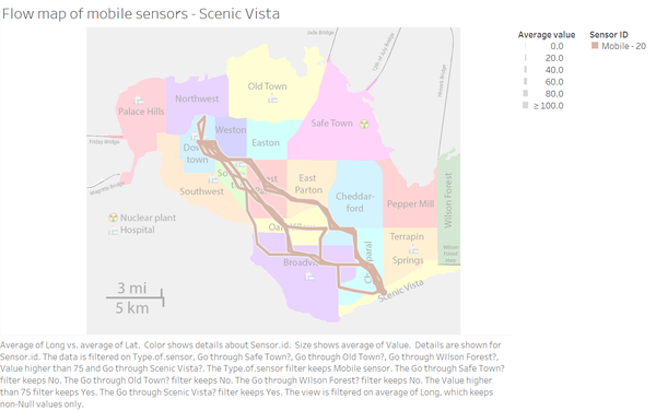
This map helps to identify the contaminated cars and their routes within the time period. From here, we can drill down further to analyze why some areas might get contaminated without being closed to the nuclear power plant. In the future, it can expand to have the filter check for all of the neighborhoods (filter for the mobile sensor that go through the particular neighborhood) to cater for all scenario.
Observation & Insight
Question 1
Visualize radiation measurements over time from both static and mobile sensors to identify areas where radiation over background is detected. Characterize changes over time.
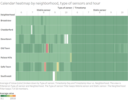
From the calendar heatmap below, we can clearly see that there are 5 neighborhoods contaminated with radiation at unhealthy level: Old Town, Safe Town, Scenic Vista, Wilson Forest and unidentified neighborhood (NA). Among these neighborhoods, Wilson Forest is the worst of all with extremely high level of radiation by the end of 9th till the beginning of 10th April
For the unidentified neighborhood, when we compare the measurement with the map of St. Himark, the "NA" location are at highways/ bridges out of St.Himark. That is why there is information about the neighborhood. On the other hand, when we check the location of Wilson Forest and Scenic Vista, the distance is actually quite close so there might be the chance that the radiation is spread from one area to the other
Question 2
Use visual analytics to represent and analyze uncertainty in the measurement of radiation across the city
- Compare uncertainty of the static sensors to the mobile sensors. What anomalies can you see? Are there sensors that are too uncertain to trust?
In the picture below, there are the calendar heatmaps based on the values captured by static sensors and mobile sensors separately. For Calendar heatmap for mobile sensors, the filter is set to show only the neighborhoods that have static sensors. Despite displaying the radiation level at the regions at the same time frame with the same color legends setting, there are big differences between these 2 visualizations. The mobile sensors could pick up a few concerning radiation signal while according to static sensors, the radiation level is safe all the time. On the other hand, each type of sensors have its own uncertainty due to its property:
- Static sensor: can only measure the radiation within certain diameter. Hence, it is hard to cover the whole neighborhood
- Mobile sensor: can only measure the radiation at the region it went through so there is a risk of spreading the contamination around. Even if there is a high value recorded by the sensor, we do not know if it is the region got contaminated or it is the vehicle itself. Moreover, there is no way to measure the radiation situation in the area over time.
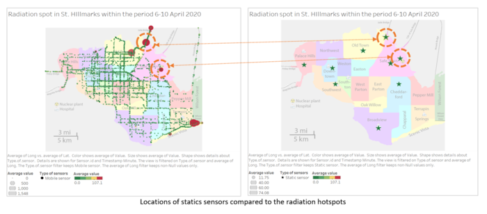
Comparing the locations of static sensors against the radiation hotspots detected by mobile sensors, there are 2 points where the static sensors are quite near to the radiation zones but they did not pick up anything the whole time. From this point, we can concluded that one type of sensors might provide incorrect value
- Which regions of the city have greater uncertainty of radiation measurement? Use visual analytics to explain your rationale.
According to this visualization below, Old Town and Safe Town are the 2 neighborhood with the greater uncertainty of radiation measurement
- What effects do you see in the sensor readings after the earthquake and other major events? What effect do these events have on uncertainty?
There is a sudden surge in radiation measurement at Safe Town around 1pm on the 8th April so I assume that this is the time of earthquake/ major events that led to the leak of radiation. The radiation spiked for 3-4 hours then returned to normal at around 5pm. This measurement was picked up by the mobile sensor(s) so it is hard to know for sure whether the location was back to normal or the contaminated car(s) moved away.
Question 3
Given the uncertainty you observed in question 2, are the radiation measurements reliable enough to locate areas of concern?
- Highlight potential locations of contamination, including the locations of contaminated cars. Should St. Himark officials be worried about contaminated cars moving around the city?
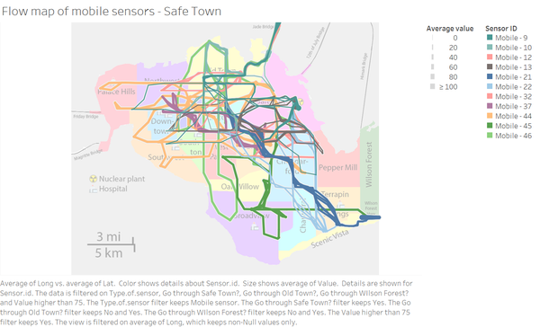
From the visualization on the left, we can identify that there are 5 potential locations of contamination: Jade Bridge, Old Town, Safe Town, Scenic Vista and Wilson Forest. In the visualization on the right side, there are flow map and a list of 17 mobile sensors had recorded any value that higher than 75 cpm at any point in time. This means 34% of the mobile sensors had came in contact with the radiation and moved around town. Moreover, considering the distance of Scenic Vista and Wilson Forest to the main source of radiation, Safe Town, we can concluded that some of vehicles had spread the radiation.
- Estimate how many cars may have been contaminated when coolant leaked from the Always Safe plant. Use visual analysis of radiation measurements to determine if any have left the area.
From the flow map, we can see that there are 11 out of 17 contaminated cars have gone through Safe Town. All of these vehicles then left Safe Town and moved across different neighborhood
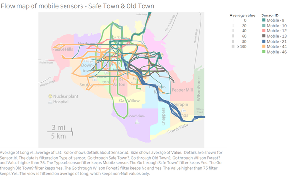
Out of those 11 vehicles, 7 of them went through Old Town and may have spread the contamination there because there are no contamination cars went through Old Town only.
3 out of the 11 contaminated cars from Safe Town traveled to Wilson Forest and contaminated the area
5 out of of 17 cars did not pass through Safe Town but they came in contact with the radiation at Wilson Forest and then spread the radiation to Scenic Vista, which lead to the contamination of mobile sensor 20
- Indicated where you would deploy more sensors to improve radiation monitoring in the city. Would you recommend more static sensors or more mobile sensors or both? Use your visualization of radiation measurement uncertainty to justify your recommendation.
From all of the visualizations, I believe there is a need to place additional static and mobile sensors across the town. For static sensors, there should be more at the southern part of St.Himark as there are a lot of regions that are not recorded by the static sensors due to the distance. Moreover, we can reduce the risk of missing data or radiation spreading with static sensors. On the other hand, there is also a need to additional mobile sensors as they are more dynamic. Even within a neighborhood, 1-2 static sensors are not enough due to neighborhood size so mobile sensors would be a better choice in term of economical choice.
Question 4
Summarize the state of radiation measurements at the end of the available period. Use your novel visualizations and analysis approaches to suggest a course of action for the city. Use visual analytics to compare the static sensor network to the mobile sensor network. What are the strengths and weaknesses of each approach? How do they support each other?
At the end of radiation measurement, all sensors reported the radiation measurement within the safety level. In the future, there is a need to increase the number of sensors across the city, both static and mobile sensors for the reasons mentioned above in Question 3. The static sensors would be more stable with less missing data and more detailed information about radiation measurement in the area while mobile sensors would be more dynamic and can cover more ground.
There should be at least 2-3 static sensors in a neighborhood depend of the area size to measure the radiation situation of the area. Moreover, there should be 1 static sensors at every entrance to St. Himark island to check the radiation level. If the bridge/ highway have high radiation, the city council can block that way to avoid the spreading the radiation to other towns.
For mobile sensors, there should be an system to send text messages to the mobile sensors when there is a sudden spike in radiation recorded so they can avoid moving around while carrying the risk of radiation exposure. These car owners can also carry out protection measures to clean their cars and reduce the risk for themselves as well.
Question 5
The data for this challenge can be analyzed either as a static collection or as a dynamic stream of data, as it would occur in a real emergency. Describe how you analyzed the data - as a static collection or a stream. How do you think this choice affected your analysis?
I analyzed the data as a static collection because the I used Python and R to aggregate the data and add in neighborhood information to provide a more accurate and detailed data for the analysis. This approach can reduce the processing time of the visualization as well as provide more insight but it would have lead time in case of real emergency. However, in reality, it is possible to develop a closed process to automatically retrieve and process the information before feeding to the dashboard. Although there would be lead time but much shorter.
