Difference between revisions of "IS428 AY2019-20T1 Assign Tommy Johnson"
| Line 221: | Line 221: | ||
<b> Wilson Forest Highway </b> | <b> Wilson Forest Highway </b> | ||
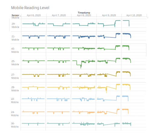
| − | For the Wilson Forest Highway incident, there are multiple cars contaminated | + | For the Wilson Forest Highway incident, there are multiple cars contaminated. They are namely (In Descending order of contamination level): Sensor 29,21,45,25,27,28,22,24. In addition, Mobile Sensor 30 is also contaminated but at a much lower level. |
| + | |||
| + | Initially, most of the vehicles come from Scenic Vista except for Mobile Sensor 29 from Terrapin Springs at around 9:26 AM towards the highway. By 10 AM, all vehicles has left and readings are not noticeable. Sensor 30 do not leave the area and stays throughout the days. Around 6 PM onwards, all cars started to come back from the highway and the readings started to spike. | ||
| + | [[File:Railwaycontamination.PNG |500px]] | ||
| + | [[File:Railwaycontamination(2).PNG|500px]] | ||
Revision as of 19:29, 5 October 2019
Contents
- 1 Problem & Motivation
- 2 Dataset Analysis & Transformation Process
- 3 Interactive Visualization
- 4 Interesting Observation and Anomalies
- 4.1 Q1. Visualize radiation measurements over time from both static and mobile sensors
- 4.2 Q2a. Compare uncertainty of the Static sensor to the Mobile sensor. What anomalies can you see? Are there sensors that are too uncertain to trust?
- 4.3 Q2b. Which regions of the city have greater uncertainty of radiation measurement? Use visual analytics to explain your rationale.
- 4.4 Q2c. What effects do you see in the sensor readings after the earthquake and other major events? What effect do these events have on uncertainty?
- 4.5 Q3a. Highlight potential locations of contamination, including the locations of contaminated cars. Should St. Himark officials be worried about contaminated cars moving around the city?
- 4.6 Q3b. Estimate how many cars may have been contaminated when coolant leaked from the Always Safe plant. Use visual analysis of radiation measurements to determine if any have left the area.
Problem & Motivation
One of St. Himark’s largest employers is the Always Safe nuclear power plant. The pride of the city, it produces power for St. Himark’s needs and exports the excess to the mainland providing a steady revenue stream. However, the plant was not compliant with international standards when it was constructed and is now aging. As part of its outreach to the broader community, Always Safe agreed to provide funding for a set of carefully calibrated professional radiation monitors at fixed locations throughout the city. Additionally, a group of citizen scientists led by the members of the Himark Science Society started an education initiative to build and deploy lower cost homemade sensors, which people can attach to their cars. The sensors upload data to the web by connecting through the user’s cell phone. The goal of the project was to engage the community and demonstrate that the nuclear plant’s operations were not significantly changing the region’s natural background levels of radiation.
When an earthquake strikes St. Himark, the nuclear power plant suffers damage resulting in a leak of radioactive contamination. Further, a coolant leak sprayed employees’ cars and contaminated them at varying levels. Now, the city’s government and emergency management officials are trying to understand if there is a risk to the public while also responding to other emerging crises related to the earthquake as well as satisfying the public’s concern over radiation.
With the data visualization, it would help analyse:
- The radiation level for both static and mobile sensor over time
- Identify observations and anomalies to the existing data available
- Identify contaminated areas and cars so that evacuation can be done efficiently and quickly
Dataset Analysis & Transformation Process
Before moving on to the analysis, it is essential to clean and transform the raw data so that I can bring value to the analysis. In the zipped file, I am given 3 raw data sets namely:
- MobileSensorReadings.csv - contains the sensor readings of different mobile sensor Ids over a period of time and its locations
- StaticSensorReadings.csv - contains the sensor readings of different static sensor Ids over a period of time
- StaticSensorLocations.csv - contains the different static sensor Ids with its locations
I will be using Tableau Prep to clean and transform the data. It is a new feature provided by the Tableau. The following section will explain step by step on how I prepare the data sets.
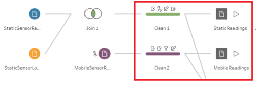
1. Combine the Static sensor readings and locations
The first step is to combine the two csv files of static into one. This is to create a tidier data (Tall and skinny structure). I use Join to combine the columns from two different files into one.
2. Create a calculated field for Static and Mobile sensor Ids
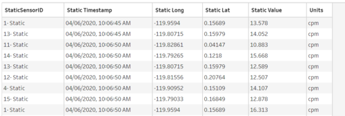
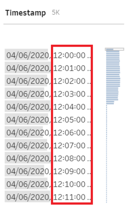
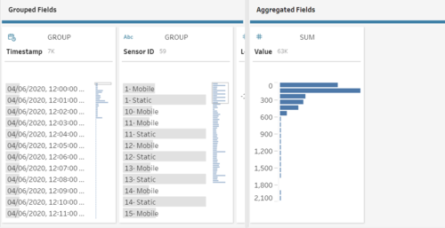
The next step is to concatenate "- Static" or "- Mobile" at the back of the sensor Ids with the [Sensor-id] + "- Mobile" or [Sensor-id] + "- Static" calculated fields. This is because I realize that the static sensor Ids have the same Id number although they are referring to different records. Hence, this is done to avoid confusion at the later part. The final output will be as follow.
Static Sensor
Mobile Sensor
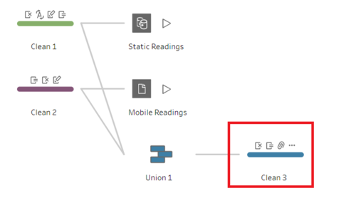
3. Combine the static and mobile sensor data into one
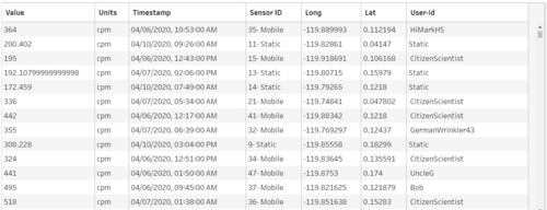
The next step is to combine the static and mobile sensor data into 1 file. This will be the working file that I am going to use in Tableau. I use Union because I am just going to append more rows. After that, I will still need to clean the data to remove any duplicate columns so that all columns are arranged.
4. Aggregated the Timestamp by 1 minute interval
Using the following formula, I aggregate the timestamp by 1 minute interval
DATETIME(INT([Timestamp]) + (INT(FLOAT([Timestamp]) % 1 * (60*24)) / (60*24)))
DATETIME(INT([Timestamp]) : Retain the datetime of the timestamp
(INT(FLOAT([Timestamp]) % 1 * (60*24)) / (60*24))) : A calculation to create a 1-minute interval. ([60 minute] / [desired minute interval] * [24 hour])
After that, i deleted the original Timestamp from the raw data.
5. Aggregated the Value based on the Timestamp
After aggregated the timestamp, I sum all the measuring readings for that particular sensor ID within that 1 minute interval. For example, 12 counts of readings level for Sensor ID 1 across different seconds. I summed the 12 counts and created 1 row within that minute. This will reduce the number of rows in the data set. Hence, create a faster running time.
The final Workflow will look like this:
Interactive Visualization
The interactive visualization can be accessed here:
Home Page
Radiation Level by Map Chart
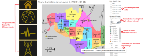
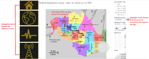
I am using map chart to visualize the radiation measurements for both static and mobile sensors. With this chart, analysts will be able to see which areas are prone to high or low radiation levels from each sensor types. Adding on, they are able to visualize the track that one mobile sensor took throughout the day and how these affect the readings.
Static sensor radiation level
Mobile sensor radiation level
To enhance the visualization of the data, implementing interactive elements would help users in analyzing the data intuitively. The following elements are used in this graph.
| Interactive Features | Rationale | Brief Implementation Steps |
|---|---|---|
| Click on the arrow button on the Sensor ID filter and choose "Show Highlighter | ||
| ||
| ||
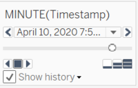
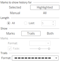
| Change the setting of the Timestamp pages as per following image |
Readings Level by sensor type
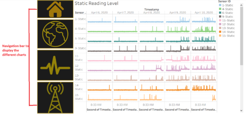
For further breakdown, I visualize how the readings changes over time according to the sensor type.This visualization allows the analyst to look at the pattern of the readings at one glance. to ensure that the distribution is less skewed, i used the logarithm on the value readings.
Static reading level
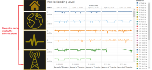
Mobile reading level
The snapshot below is not limited. Analysts are able to scroll down to view more reading levels from different sensor Id
| Major features included | Rationale | Brief Implementation Steps |
|---|---|---|
| Drag the sensor ID to the color Marks | ||
| Drag the Timestamp in the Columns and custom the date to Month/Date/Year with Date Part option | ||
| Create a calculated field of log value. Then, put it at the Rows |
Interesting Observation and Anomalies
This section aims to answer the questions posed at the mini challenges
Q1. Visualize radiation measurements over time from both static and mobile sensors
To answer this question, you may look at the Radiation Level by Map Chart and Readings Level by sensor type
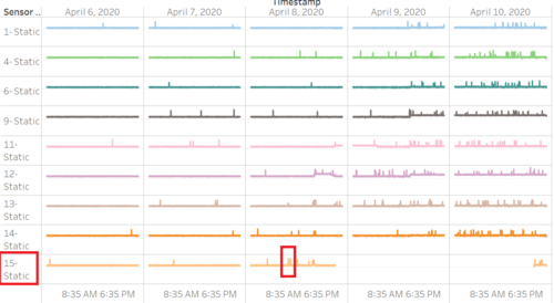
- I found out that the highest readings level for static sensor comes from sensor 15-Static at 1,238 cpm on 8 April 2020 at 10:20 AM
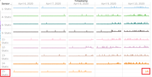
- The lowest reading level for static sensor comes from sensor 15 - Static at 112 cpm on 10 April 2020 at 8:45 PM
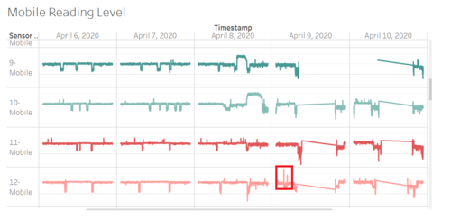
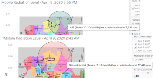
- The highest readings level for mobile sensor comes from sensor 12-Mobile at 57,449 cpm on 9 April 2020 at 2:43 PM
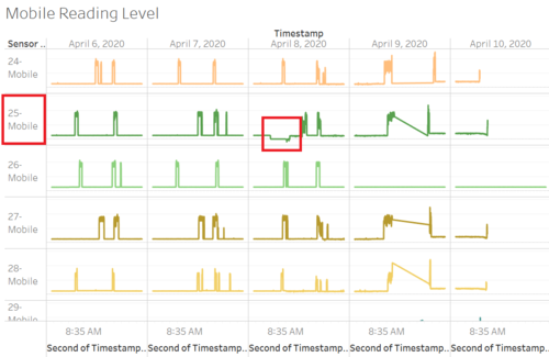
- The lowest reading level for mobile sensor comes from sensor 25-Mobile at 0 cpm across both 8 April 2020 AT 8:47 pm
Q2a. Compare uncertainty of the Static sensor to the Mobile sensor. What anomalies can you see? Are there sensors that are too uncertain to trust?
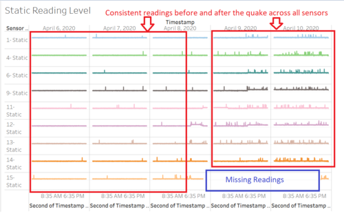
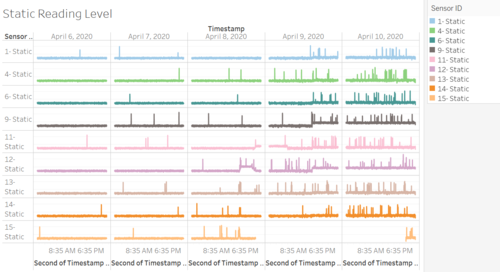
Looking at the static sensor, the sensors appear largely reliable and consistent. Before Wednesday, 8 April around 4:30 PM, all the sensors are stable and have a similar readings with minor random variations. Afterwards, the readings started to have large spikes. This applies to all the static sensors. This may be due to the first quake happened around this time. From this visual, I can conclude that there is not much uncertainty for static sensors. However, an obvious anomaly exists for Static sensor 15 that shows missing readings between around Wednesday, 8 April 10 PM to around Friday, 10 April 9 PM.
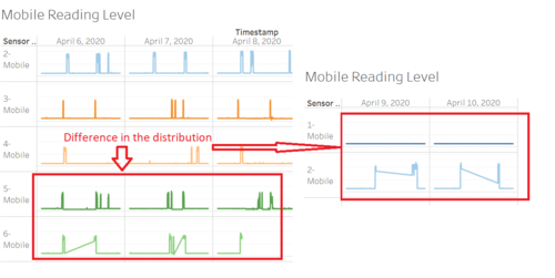
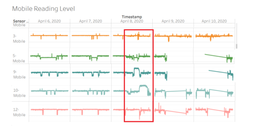
Looking at the mobile sensor, I can see that there is too many variations between the sensors before the probable first quake and even after it happened. For example, let's take a look at Mobile Sensor 5 and 6. There is an obvious difference in the distribution from 6 April until 8 April morning around 7 AM. This shows that there are more background noise for Sensor 6 compared to Sensor 5. Particularly, 8 April at around 7 AM, the readings for Sensor 6 spiked up till 356cpm. However, the readings for Sensor 5 only shows 105cpm. Another obvious difference is between Sensor 1 and 2 on the last 2 days. The readings for Sensor 2 spiked up as high as 1282cpm around 8:10 AM but at that time, the sensor 1 readings only show 400cpm. Hence, the readings between mobile sensors are not reliable and consistent making it uncertain.
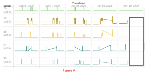
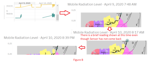
There are quite lots of readings that are missing such as sensor 5, 6, 9, 14, 18 to 25, 27 to 30, 48, and 49. Mostly these sensor readings were missing from 9 April to 10 April morning except for Sensor 18 which has missing readings inconsistently from 6 April to 10 April (See Figure A) . Based on what i observed, these readings are missing because they are out of the radar. For example, for Sensor 9 at around 7:49 AM on 9 April, it exited through Jade Bridge. However, on 10 April at around 8:17 AM, both readings appeared for a brief moment and then re appear again at night around 8:39 PM although from the map, it only show that they came back to the radar at night. This means the brief reading on the morning is an anomaly and the readings are too uncertain (See Figure B) .
There are also a lot of background noise from Sensor 12,19,20,21. This can be seen from the wider gap on these sensors. Hence, these sensors should be treated with caution.
Q2b. Which regions of the city have greater uncertainty of radiation measurement? Use visual analytics to explain your rationale.
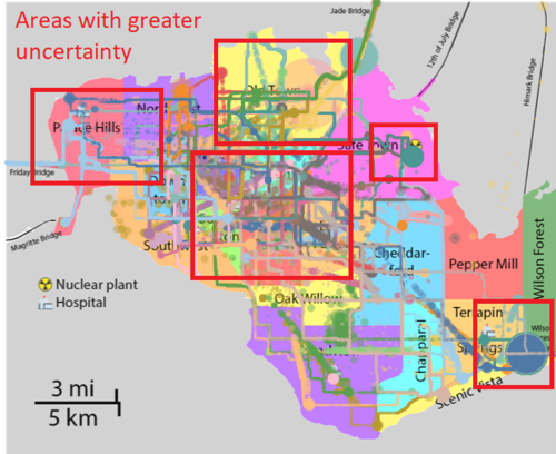
Looking at the regional reading level map, the areas that may have greater uncertainty will be around the North East of Safe Town (In the vicinity of the power plant. As mentioned in the previous answer, Static Sensor 15 which is located around the area has long period of missing data. This means I cannot say for sure that the readings around this area is reliable especially if the high readings are more contributed by the mobile sensors.
Another area that shows uncertainty will be at Wilson Forest. This area is very far away from the power plant and yet it has a high readings at a certain point in time. Hence, it cannot be said to be reliable as well.
A large part of the central areas like Northwest, through Weston, Easton, Southton, West Parton, East Parton and Palace Hills also shows diverse readings which are unlikely contributed by the environmental causes. It is more likely contributed by the incorrect fluctuation of readings caused by the mobile sensors.
A large spike seen around Old Town should be paid more attention. This area has the highest probability of having reliable readings due to its location near the power plant and some other evidence that reveals it is associated with the environmental causes.
Q2c. What effects do you see in the sensor readings after the earthquake and other major events? What effect do these events have on uncertainty?
Using the static reading level by log scale, I can see a general increase in the readings across the sensors from 8 April at around 4:30 PM. There are increasing background noise around this period. Hence, I deduce that the earthquake happened around this period.
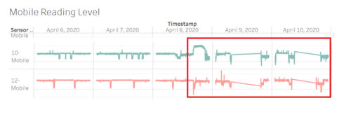
However, by looking at the mobile sensors, I observed that there are readings that were decreasing instead after the earthquake. For example, Sensor readings 3,5,9,10 that shows a major spikes during the earthquake. However, it does not sustain for very long and began to decrease subsequently. This is further supported by the highest readings for Mobile Sensor 12. It decreases to 0 cpm during the earthquke. Hence, these sensors shows their unreliability and the confidence in the recorded value.
Q3a. Highlight potential locations of contamination, including the locations of contaminated cars. Should St. Himark officials be worried about contaminated cars moving around the city?
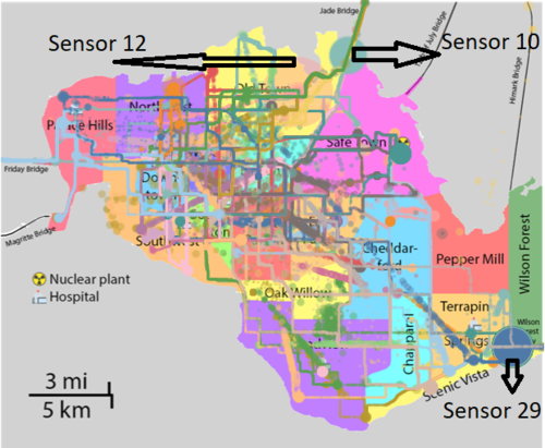
The potential locations of contaminated cars are at Wilson Forest (9 April, 6 PM to 10 April, 6 AM) largely caused by Mobile Sensor 10 and the Jade Bridge (8 April, 4:37 PM to 10 PM) largely caused by Mobile Sensor 29. The other potential contaminated car is at Old Town contributed by Mobile Sensor 12 on 9 April at around 2:43 PM. However, Sensor 12 has a low reliability in its reading based on the answers given in Q2c. Other areas of contamination would be at Safe Town where the power plant is located.
Q3b. Estimate how many cars may have been contaminated when coolant leaked from the Always Safe plant. Use visual analysis of radiation measurements to determine if any have left the area.
Jade Bridge
Mobile Sensor 10 is the only vehicles that is strongly contaminated. There might be a small possibility of cross contamination to the Mobile Sensor 12 which caused it to have the highest readings. This is because both vehicles share similar locations over the three days.
Wilson Forest Highway For the Wilson Forest Highway incident, there are multiple cars contaminated. They are namely (In Descending order of contamination level): Sensor 29,21,45,25,27,28,22,24. In addition, Mobile Sensor 30 is also contaminated but at a much lower level.
Initially, most of the vehicles come from Scenic Vista except for Mobile Sensor 29 from Terrapin Springs at around 9:26 AM towards the highway. By 10 AM, all vehicles has left and readings are not noticeable. Sensor 30 do not leave the area and stays throughout the days. Around 6 PM onwards, all cars started to come back from the highway and the readings started to spike.
