Difference between revisions of "IS428 AY2019-20T1 Assign Linus Cheng Xin Wei"
| Line 707: | Line 707: | ||
===Interactive Technique=== | ===Interactive Technique=== | ||
| − | [[File:Interactive | + | [[File:Interactive 4.png|1000px]] |
{| class="wikitable" | {| class="wikitable" | ||
|- | |- | ||
| Line 733: | Line 733: | ||
| | | | ||
*The gnatt chart and reference map are linked together. By highlighting parts of the gnatt chart, the location of each entry will appear in the reference map | *The gnatt chart and reference map are linked together. By highlighting parts of the gnatt chart, the location of each entry will appear in the reference map | ||
| + | |- | ||
| 6. Select: Slicer, Black boxes | | 6. Select: Slicer, Black boxes | ||
| | | | ||
Revision as of 18:27, 28 October 2019
Contents
- 1 Overview
- 2 Data
- 3 Tasks
- 3.1 Q1) Visualize radiation measurements over time from both static and mobile sensors to identify areas where radiation over background is detected. Characterize changes over time.
- 3.2 Q2) Use visual analytics to represent and analyze uncertainty in the measurement of radiation across the city
- 3.2.1 Q2a) Compare uncertainty of the static sensors to the mobile sensors. What anomalies can you see? Are there sensors that are too uncertain to trust?
- 3.2.2 Q2b) Which regions of the city have greater uncertainty of radiation measurement? Use visual analytics to explain your rationale.
- 3.2.3 Q2c) What effects do you see in the sensor readings after the earthquake and other major events? What effect do these events have on uncertainty?
- 3.3 Q3) Given the uncertainty you observed in question 2, are the radiation measurements reliable enough to locate areas of concern?
- 3.3.1 Q3a) Highlight potential locations of contamination, including the locations of contaminated cars. Should St. Himark officials be worried about contaminated cars moving around the city?
- 3.3.2 Q3b) Estimate how many cars may have been contaminated when coolant leaked from the Always Safe plant. Use visual analysis of radiation measurements to determine if any have left the area.
- 3.3.3 Q3c) Indicated where you would deploy more sensors to improve radiation monitoring in the city. Would you recommend more static sensors or more mobile sensors or both? Use your visualization of radiation measurement uncertainty to justify your recommendation.
- 3.4 Q4) Summarize the state of radiation measurements at the end of the available period. Use your novel visualizations and analysis approaches to suggest a course of action for the city. Use visual analytics to compare the static sensor network to the mobile sensor network. What are the strengths and weaknesses of each approach? How do they support each other?
- 3.5 Q5) The data for this challenge can be analyzed either as a static collection or as a dynamic stream of data, as it would occur in a real emergency. Describe how you analyzed the data - as a static collection or a stream. How do you think this choice affected your analysis?
- 4 Interactive Visualization
- 5 References
- 6 Comments
Overview
One of St. Himark’s largest employers is the Always Safe nuclear power plant. The pride of the city, it produces power for St. Himark’s needs and exports the excess to the mainland providing a steady revenue stream. However, the plant was not compliant with international standards when it was constructed and is now aging. As part of its outreach to the broader community, Always Safe agreed to provide funding for a set of carefully calibrated professional radiation monitors at fixed locations throughout the city. Additionally, a group of citizen scientists led by the members of the Himark Science Society started an education initiative to build and deploy lower cost homemade sensors, which people can attach to their cars. The sensors upload data to the web by connecting through the user’s cell phone. The goal of the project was to engage the community and demonstrate that the nuclear plant’s operations were not significantly changing the region’s natural background levels of radiation.
When an earthquake strikes St. Himark, the nuclear power plant suffers damage resulting in a leak of radioactive contamination. Further, a coolant leak sprayed employees’ cars and contaminated them at varying levels. Now, the city’s government and emergency management officials are trying to understand if there is a risk to the public while also responding to other emerging crises related to the earthquake as well as satisfying the public’s concern over radiation.
Data
Data Files
| Name | Info |
|---|---|
| VAST 2019 - St. Himark - About Our City.docx | A document describing the scenario, as well as general information about St.Himark |
| MC2_datadescription.docx | A document that provides descriptions for data files provided for MC2 |
| MobileSensorReadings.csv | Contains readings from 50 mobile sensors that are attached to cars.
Data fields include: Timestamp, Sensor-id, Long, Lat, Value, Units, User-id. The timestamps are reported in 5 second intervals, though poor data connectivity can result in missing data. Each sensor has a unique identifier that is a number from 1 to 50. Location of the sensor is reported as longitude and latitude values (see map description below). The radiation measurement is provided in the Value field. Radiation is reported with units of counts per minute (cpm). Each measurement is independent and does not represent a summation over the previous minute. Some users have chosen to attach a user ID to their measurements while some others chose with a default name. |
| StaticSensorReadings.csv | Contains readings from a set of carefully calibrated professional radiation monitors at fixed locations throughout the city.
Data fields include: Timestamp, Sensor-id, Value, Units. |
| StaticSensorLocations.csv | Contains locations of the static sensors |
| StHimarkMapBlank.png | A picture containing the outline of the whole area of St Himark |
| StHimarkNeighborhoodMapNoLabels.png | A picture containing the outline of neighbourhoods in St Himark, without any labels |
| StHimarkNeighborhoodMap.png | A picture containing the outline of neighbourhoods in St Himark, including neighbourhood name, Nuclear plant and hospital labels |
| StHimarkLabeledMap.png | A fully labelled picture of St Himark, including main roads and bridges |
| StHimarkNeighborhoodShapefile | A folder containing a map of the neighbourhoods provided as a shapefile. Geometry of the polygons is reported in meters. |
Data Preprocessing and Cleaning
Creation of POI.csv
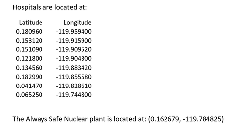
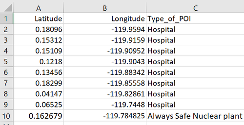
In 'MC2_datadescription.docx', a list of coordinates pertaining to the hospitals and Always Safe Nuclear plant located in St Hilmark was given. These are possible point of interests that might be useful for analysis, so I decided to create a data file to contain the information.
| Step | Info |
|---|---|
| 1. |
Open up MC2_datadescription.docx and scroll to the bottom to find coordinate information |
| 2. |
Input the information into excel to create a .csv file. The resulting file contains the following data columns:
|
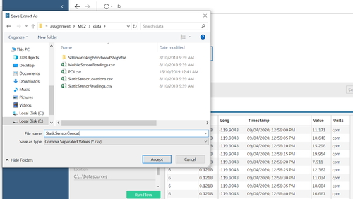
Creation of StaticSensorConcat.csv, appending geographical coordinates to Static readers
As 'StaticSensorLocations.csv' and 'StaticSensorReadings.csv' share the common column, sensor-id, I am able to extract the geographical information from 'StaticSensorLocations.csv' and tie it to each individual reading.
| Step | Info |
|---|---|
| 1. |
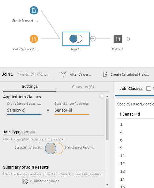
I opened up Tableau prep and loaded both 'StaticSensorLocations.csv' and 'StaticSensorReadings.csv'. I created a Join clause, with the common field being Sensor-id. I used a left join in this case because it sorts your data nicely at the output stage. |
| 2. |
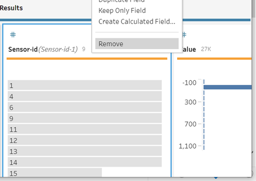
There is a redundant column called 'Sensor-id-1', which is a repeat of the 'Sensor-id' column. As it provides no utility, I decided to drop it in the Join function. |
| 3. |
After inspecting the output and ensuring it is correct, I exported the file to a csv named 'StaticSensorConcat.csv'. |
| 4. |
The resulting file contains the following data columns:
Note, I left the units in place so that I could remember and understand what I'm dealing with. As well as providing some context if I ever view the project again. |
Creation of AllSensorData.csv
To make analysis easier, I want to combine both Static and Mobile sensors together into one file 'AllSensorData.csv'
| Step | Info |
|---|---|
| 1. |
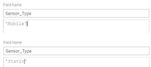
I created a new column named *Sensor_Type in order to differentiate between the static and mobile sensors. I did this by using creating a new calculated field, and filling in the value 'Static' or 'Mobile accordingly. |
| 2. |
Upon inspection of the 'User-id' column in 'MobileSensorReadings.csv', I realized that it does not provide any substantial amount of information to be used for analysis and decide to drop that column. As stated by a paragraph in 'MC2_datadescription.docx', the naming of the user's are not standardized, thus looking at the id number of each sensor would be better. |
| 3. |
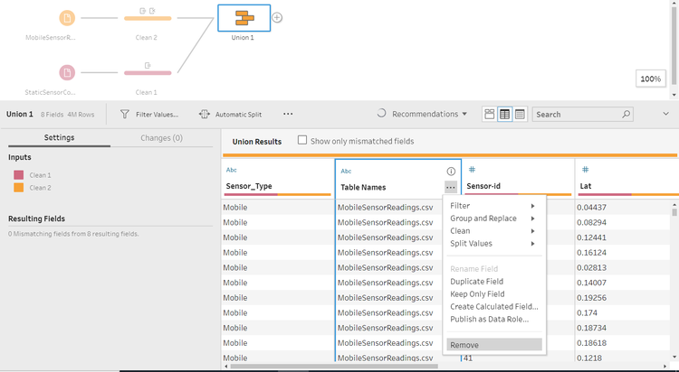
I used a union function in order to join the two datasets together. Since they have the exact same columns, there are 0 mismatching fields and I am able to perform the function with ease. I dropped the created column 'Table Names', as we have the column 'Sensor_Type' to differentiate between the 'Mobile' and 'Static sensors. |
| 4. |
The resulting file contains the following data columns:
|
Extracting Neighbourhood to data from StHimark.shp
Ever since Tableau 2019.2 came out, they have added the ability to manipulate spatial data. As there is a shapefile provided, I decided to combine some features into the main dataset, 'AllSensorData.csv'
| Step | Info |
|---|---|
| 1. |
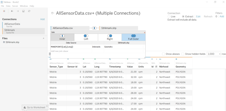
I changed the connection type to 'Extract', as it allows Tableau to function faster, and to use all the data available. |
| 2. |
Referencing https://www.tableau.com/about/blog/2016/4/tableau-online-tips-extracts-live-connections-cloud-data-53351, I used the Tableau function 'MAKEPOINT', which makes points so that we can join 'AllSensorData.csv' and 'StHimark.shp' based on their spatial relationship, Geometry. |
| 3. | The resulting file contains the following data columns:
|
Creation of full_data.csv
My computer is pretty old and outdated, so to save on computational time and processing, I have removed more columns after Tableau runs too slowly, and have saved the data to 'full_data.csv'.
| Steps | Info |
|---|---|
| 1. | The resulting file contains the following data columns:
|
Tasks
Q1) Visualize radiation measurements over time from both static and mobile sensors to identify areas where radiation over background is detected. Characterize changes over time.
Note About Radiation
For this particular question, I am referencing https://wattsupwiththat.com/2011/03/17/live-real-time-monitoring-map-of-radiation-counts-in-the-usa/, which states that the alert level of cpm is >= 100 counts per minute (cpm). Thus I will only be looking at values >= 100 cpm.
Static
| Step | Info |
|---|---|
| 1. |
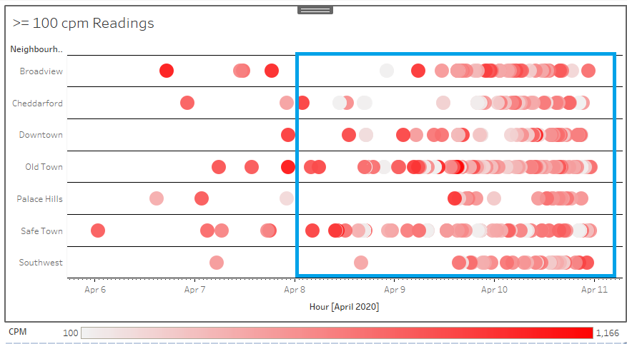
The above figure shows mobile sensor readings that are >= 100 CPM in 7 different neighbourhoods,
The peak of readings seems to happen sometime after the 8th April 2020, as highlighted by the blue box. We can observe an increased number of readings represented by the circles in the figure. |
| 2. |
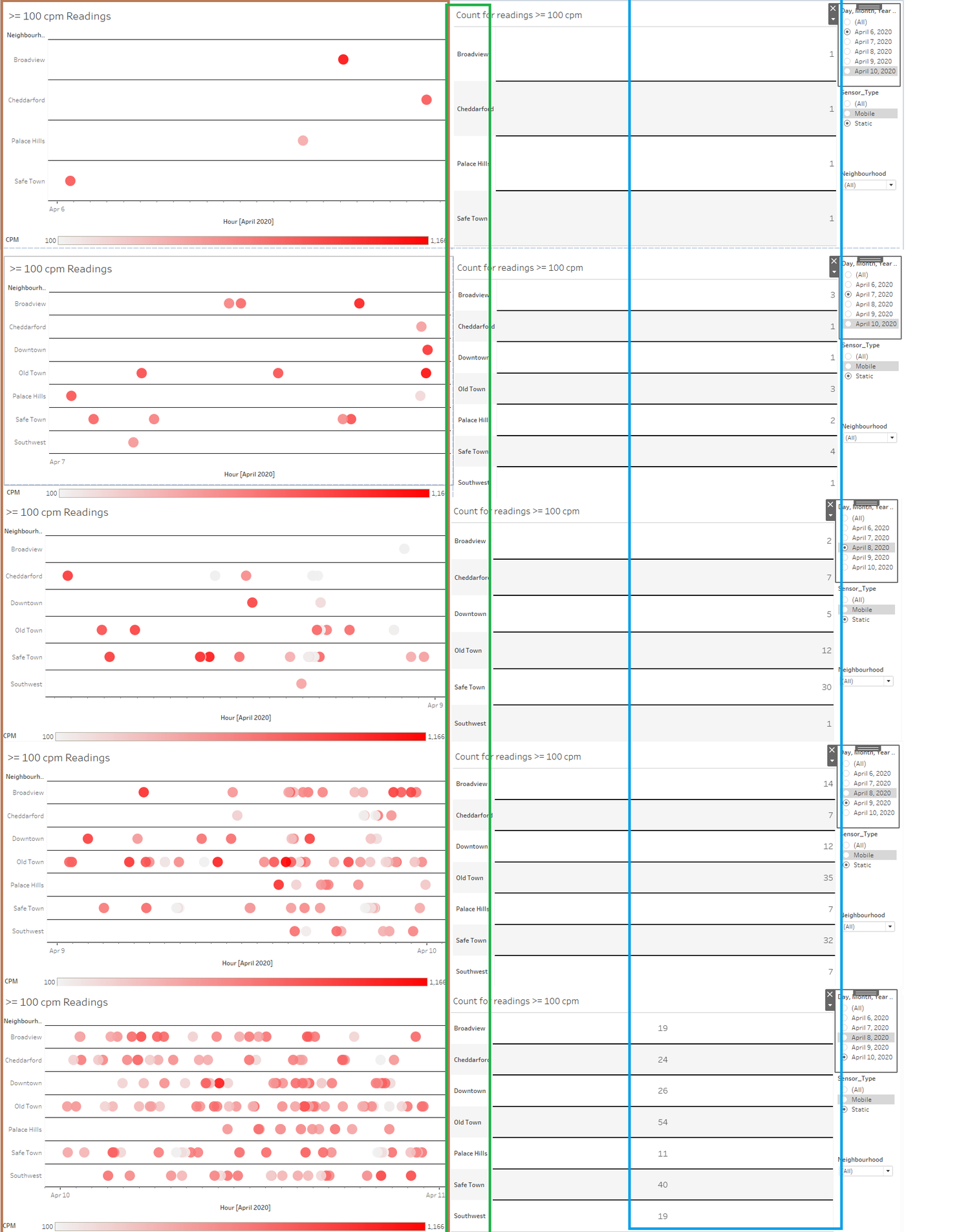
If we were to break down the figure by day, we can see that there is an increase of readings >= 100 CPM daily, as evidenced by comparing the number of circles highlighted by the brown box and comparing the numbers highlighted in the blue box. Moreover, there is an increase in the number of neighbourhoods being affected, from 4->7->6->7-> 7, which can be observed by viewing the green box. |
| 3. |
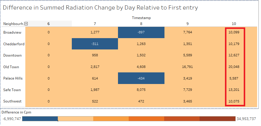
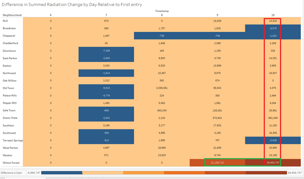
Here is a figure showing the average change of CPM, relative to the first day of the readings, 6th April 2020. Boxes that are coloured blue represent a decrease in CPM, and boxes that are brown represent an increase in CPM. From the red box, we are able to see that all neighbourhoods affected see a net increase in CPM on the last day of the readings, 10th April 2020. |
Mobile
| Step | Info |
|---|---|
| 1. |
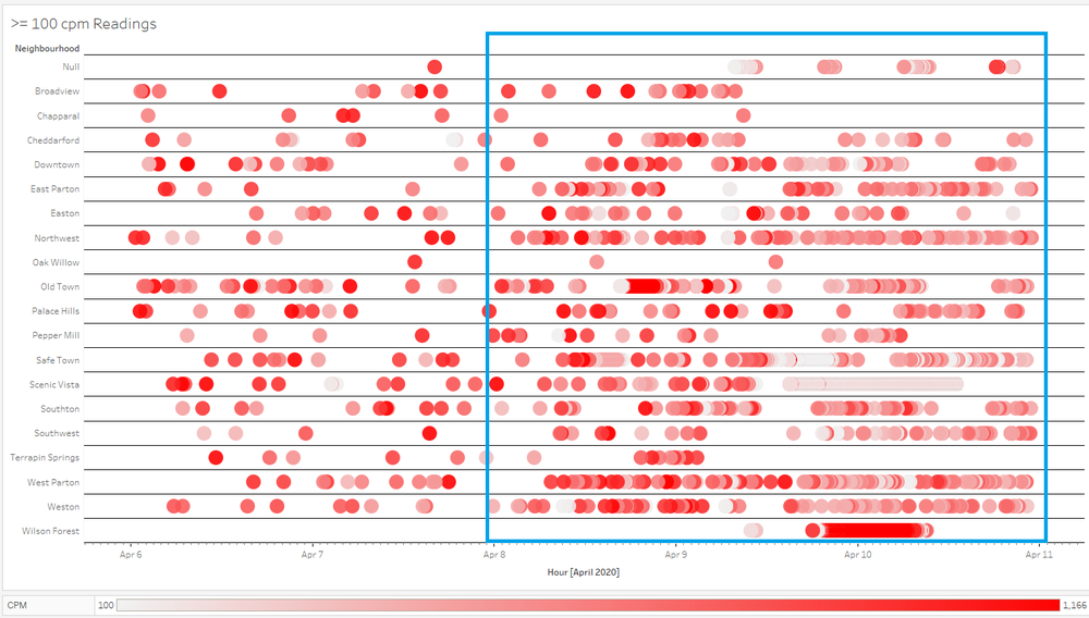
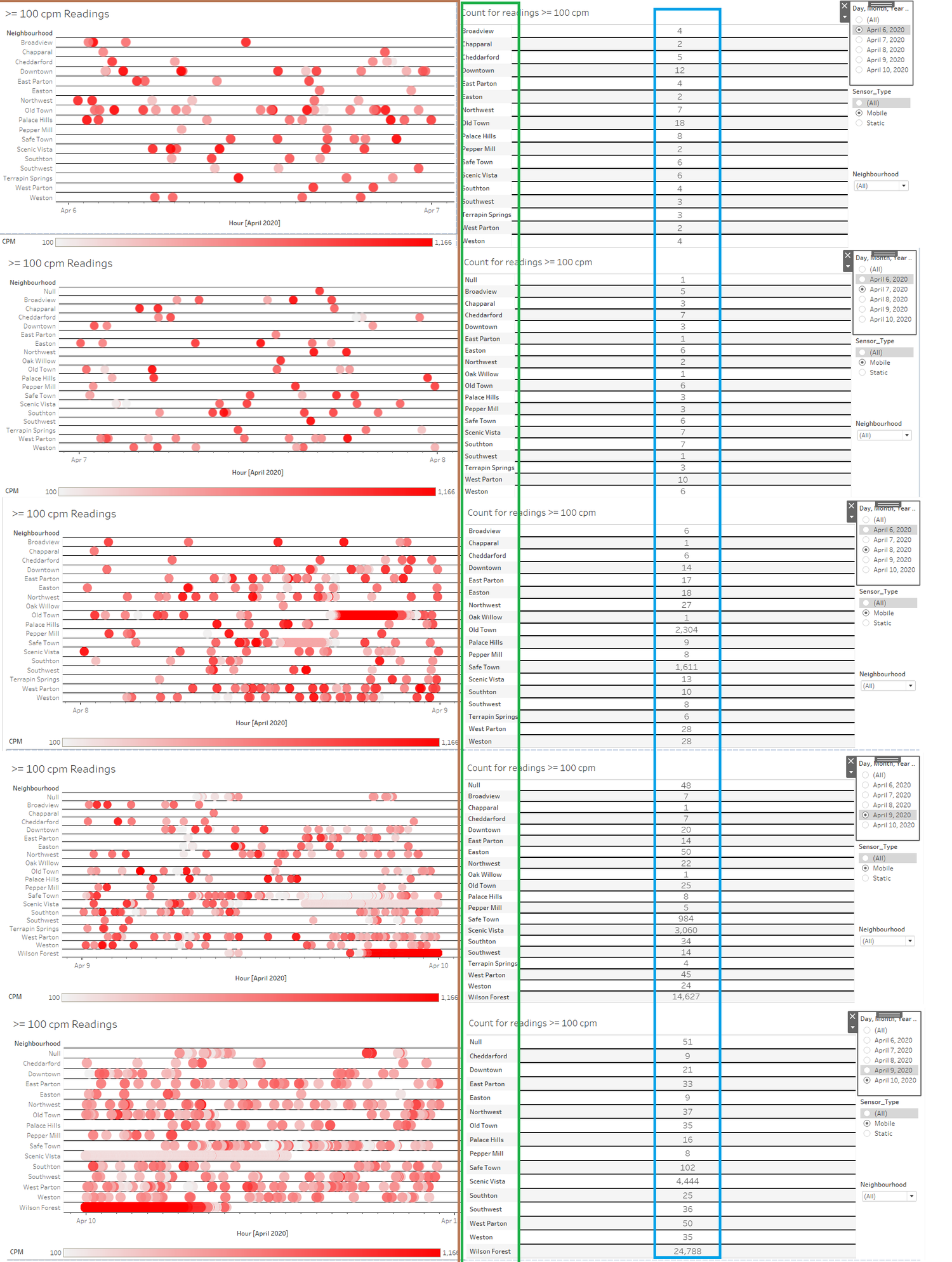
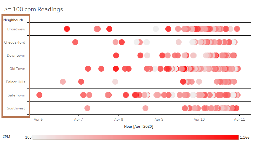
The above figure shows mobile sensor readings that are >= 100 CPM in 20 different neighbourhoods,
|
| 2. |
Looking at each day, we can observe an increasing number of >= CPM 100 as evidenced by the density of the left figure, highlighted by the brown box, as well as comparing the absolute values highlighted by the blue box. Unlike static sensors, mobile sensors have the ability to travel between neighbourhoods, which is why we do not really see a sharp increase/decrease of neighbourhoods affected by radiation, as highlighted by the green box. |
| 3. |
The above figure shows the average change of CPM for mobile sensors, relative to the first day of the readings, 6th April 2020. Boxes that are coloured blue represent a decrease in CPM, and boxes that are brown represent an increase in CPM. Referencing the red box, there are three neighbourhoods, namely Broadview, Chapparal and Terrapin Springs that see a decrease in CPM during the last day. This could be due to the radiation moving, or because the sensors are mobile, the total number of times being sense decrease for that particular neighbourhood. The rest of the neighbourhoods all have an increase in their CPM, with Wilson Forest being the obvious outlier. Taking a closer look, we can see a very dense plot of circles highlighted by the yellow box for Wilson Forest during 9th April-10th April ties in with our results in highlighted by the greenbox. |
| 4. |
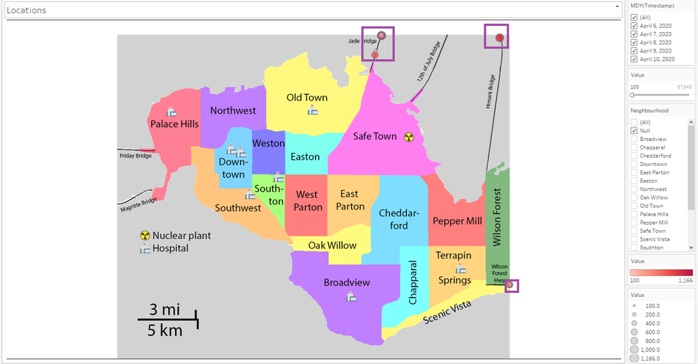
Note on 'Null' neighbourhoodFor mobile sensors, there are a few data points that are denoted with 'Null', as they do not happen within St Hilmark. Denoted by the purple boxes, we can see that they come from Jade Bridge, Himark Bridge, and somewhere along the Wilson Forest Hwy. |
Q2) Use visual analytics to represent and analyze uncertainty in the measurement of radiation across the city
Q2a) Compare uncertainty of the static sensors to the mobile sensors. What anomalies can you see? Are there sensors that are too uncertain to trust?
Static
| Step | Info |
|---|---|
| 1. |
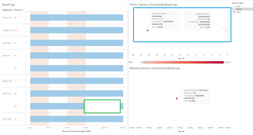
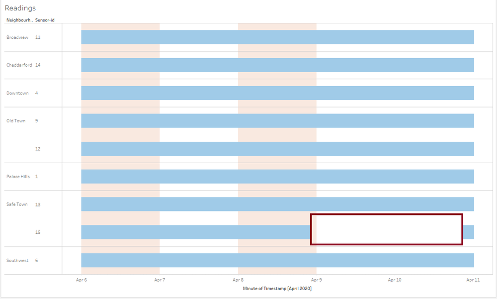
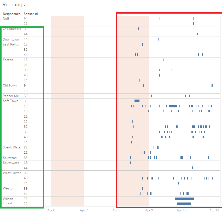
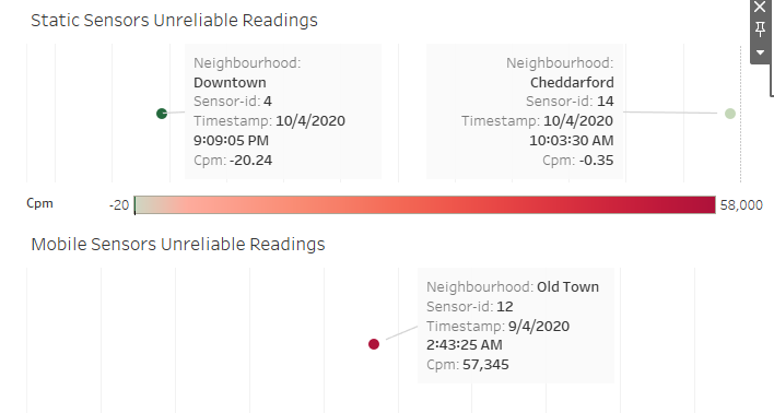
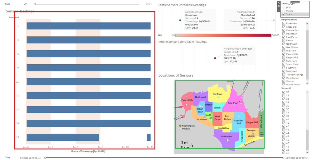
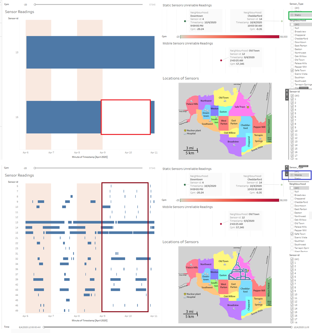
As highlighted by the green box in the picture, there seems to be a lack of readings from sometime during the night 9th April, to the night of 10th April. We can see that Sensor ID 15 is located in Safe Town, which is the region where the nuclear powerplant is located, thus it is really strange as it should be constantly pick up readings of radiation due to its close proximity. Another uncertain factor is that there are two readings that are negative CPM, which do not make sense. Thus, the readings from the sensor-id 4 and sensor-id 14 may be subjected to scrutiny. |
Mobile
| Step | Info |
|---|---|
| 1. |
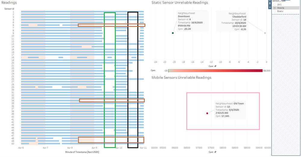
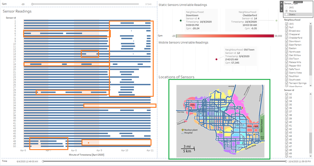
Mobile sensors have more pockets of no readings available, but there are a few clusters that stand out. For example, highlighted by the green box, we can see that a considerable amount of sensors have no readings sometime in the afternoon of 9th April to the night of 9th April. The black box also highlights a cluster of missing readings from the afternoon of 10th April to the night of 10th April. The brown box highlights sensors 6,33,34,48 and 49 all having outages sometime during the late morning of 8th April, after which they do not pick up any readings at all. On top of that, the pink box highlights a highly unusual reading of CPM, being an all-time high of 57345 by sensor 12, located in Old Town. Based on the references that I have read, such a high dosage will lead to instant death, and since it happened only once, it might be due to a malfunction in reading by the sensor. |
Q2b) Which regions of the city have greater uncertainty of radiation measurement? Use visual analytics to explain your rationale.
Static
| Step | Info |
|---|---|
| 1. |
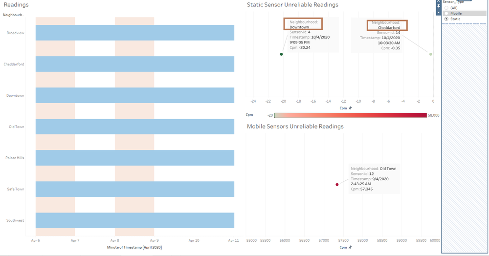
For static sensors, it seems like there are no discernible patterns of uncertainty for specific neighbourhoods. The only exceptions are the in Downtown and Cheddarford which have negative CPM readings, which are illogical. |
Mobile
| Step | Info |
|---|---|
| 1. |
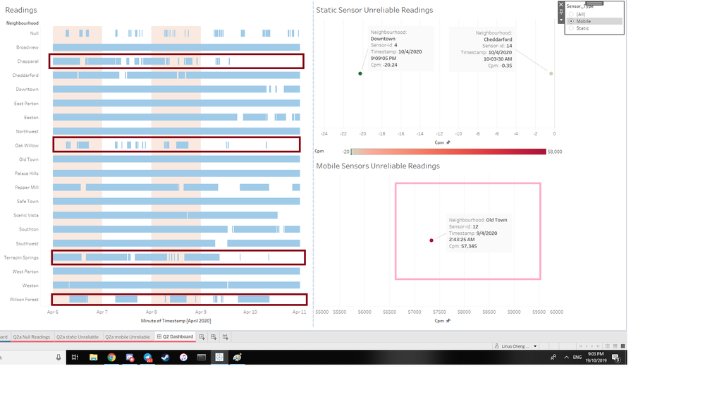
For mobile sensors, excluding the Null neighbourhood, Chapparal, Oak Willow, Terrapin Springs and Wilson Forest all have high levels of missing readings as highlighted by the brown boxes, increasing their uncertainty. On top of that, Old Town picked up a very high reading of CPM 57345, which is extremely unusual, thus making the reading uncertain. |
Q2c) What effects do you see in the sensor readings after the earthquake and other major events? What effect do these events have on uncertainty?
Note on Earthquake
I have highlighted in the visualizations by a pink area for each respective earthquake, 6th and 8th April.
Static
| Step | Info |
|---|---|
| 1. |
The only effect we can observe for static sensors is that for sensor 15 located in Safe Town, it might be possible that the earthquake affected the collection of readings as the lack of readings happened directly after the earthquake of 9th April, denoted by the brown box. |
Mobile
| Step | Info |
|---|---|
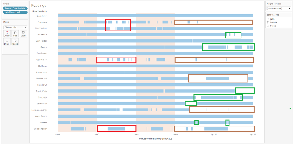
| 1. |
For mobile sensors, after the 6th April earthquake, we can see missing readings from Chapparal, Cheddarford, Oak Willow and Wilson Forest, as highlighted by the red boxs After the 8th April earthquake, we can see a huge amount of missing sensor readings, with constant downtime in neighbourhoods like Chapparal, Oak Willow, Pepper Mill, Terrapin Springs and Wilson Forest, as highlighted by the brown boxes. What is interesting to note are the neighbourhoods that are highlighted by the green boxes, Downtown, Easton, Scenic Vista, Southon, Southwest and Weston. These neighbourhoods had all along consistant readings before the 8th April earthquake, and this could be caused due to the earthquake. |
Q3) Given the uncertainty you observed in question 2, are the radiation measurements reliable enough to locate areas of concern?
Q3a) Highlight potential locations of contamination, including the locations of contaminated cars. Should St. Himark officials be worried about contaminated cars moving around the city?
| Step | Info |
|---|---|
| 1. |
If we take a look at readings above 100 CPM based on static sensors, we can see that there are 7 neighbourhoods that are potentially contaminated as they happen numerous times within a day. They are
|
| 2. |
Based on my findings in question 1, I am going to assume the coolant leaked sometime after April 8th 00 00. Firstly, we take a look at cars in the neighbourhood of Safe Town during that time period. We can see that there are 9 cars affected, as evidenced by the green box. They have the mobile id:
|
| 3. |
In the above screenshot, I have filtered for the 9 cars affected by the coolant leaked. I am then looking at readings above 100 CPM, after April 8th 00 00. Based on the highlighted red and green box, I have identified 13 potential neighbourhoods that have been contaminated. They are:
|
| 4. | When comparing the findings of both the mobile and static sensors, we can see that there are some neighbourhoods that overlap. These neighbourhoods are the ones that are the most likely to be contaminated, although this does not disqualify any other neighbourhood found by the mobile sensor as the static sensors are rooted in place. There are 5 neighbourhoods to take special note of, and they are:
|
| 5. |
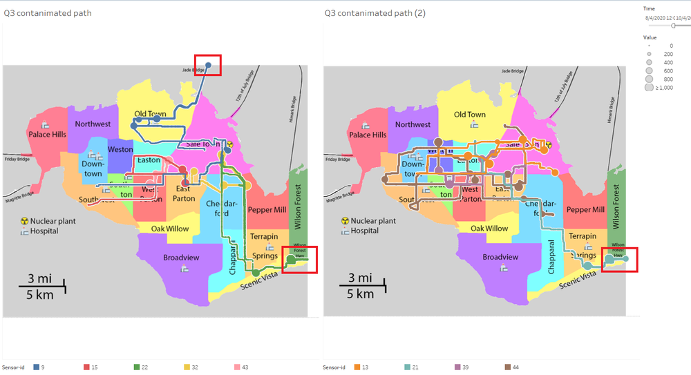
Officials should be wary about contaminated cars! For example, highlighted in red is a contaminated car moving between Easton, Safe Town and Southon. Another example of this would be the area highlighted by the orange box, where a contaminated car moves between Easton, Safe Town and West Parton. This phenomena happens for a multitude of cars and is something that needs to be further investigated. |
Q3b) Estimate how many cars may have been contaminated when coolant leaked from the Always Safe plant. Use visual analysis of radiation measurements to determine if any have left the area.
| Step | Info |
|---|---|
| 1. |
Assuming the coolant leaked sometime after April 8th 00 00, we can assume that 9 cars have been contaminated, as highlighted by the green box They have the mobile id:
|
| 2. |
In relation to Safe Town where the nuclear plant is located in, as well as tracking the movements of the 9 cars from 8th April 00 00, we can see that all 9 cars have travelled out of the Safe Town neighbourhood into other neighbourhoods from the above image. We can also see, highlighted in red, Cars with sensor-id's 9,22,21 leaving St Hilmark |
Q3c) Indicated where you would deploy more sensors to improve radiation monitoring in the city. Would you recommend more static sensors or more mobile sensors or both? Use your visualization of radiation measurement uncertainty to justify your recommendation.
| Step | Info |
|---|---|
| 1. |
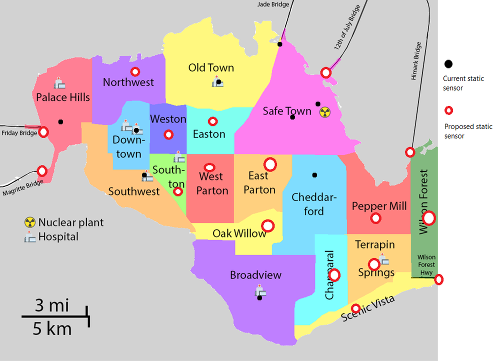
I would recommend at least one sensor being placed around each neighbourhood, as well as a sensor for each entrance and exit to St Hilmark. |
| 2. | Based on the results found by https://wiki.smu.edu.sg/1920t1is428g1/IS428_AY2019-20T1_Assign_Linus_Cheng_Xin_Wei#Q2.29_Use_visual_analytics_to_represent_and_analyze_uncertainty_in_the_measurement_of_radiation_across_the_city, we can clearly see that static sensors are more reliable and consistent when compared with mobile sensors. We also tackled the fact that there might be cross-contamination caused by mobile sensors. Based on these reasons, I would recommend putting up more static sensors over mobile sensors, to the point where mobile sensors are redundant. |
Q4) Summarize the state of radiation measurements at the end of the available period. Use your novel visualizations and analysis approaches to suggest a course of action for the city. Use visual analytics to compare the static sensor network to the mobile sensor network. What are the strengths and weaknesses of each approach? How do they support each other?
Course of action
| Step | Info |
|---|---|
| 1. |
Perform maintenance on static sensors 4,14 and mobile sensor 12 and ensure they are working as intended, as they have captured faulty readings. |
| 2. | For static sensors, I would recommend doubling the number of sensors in each location. This is to ensure that if one sensor dies, the other one is still able to get readings. We can also look at the average of both sensors to see if there are any anomalies in the readings. |
| 3. |
Track down these 9 potentially contaminated cars (9,13,15,21,22,32,39,43,44) and perform radiation decontamination on both the drivers and the cars. |
| 4. | High priority to find cars with mobile id's 9,21,22 (highlighted in a red box by step 3) as soon as possible to perform decontamination. They might have travelled in and out of St Hilmark, leading to contamination that is even further out. |
| 5. | Referencing Step 4 of https://wiki.smu.edu.sg/1920t1is428g1/IS428_AY2019-20T1_Assign_Linus_Cheng_Xin_Wei#Q3a.29_Highlight_potential_locations_of_contamination.2C_including_the_locations_of_contaminated_cars._Should_St._Himark_officials_be_worried_about_contaminated_cars_moving_around_the_city.3F, officials should look into potential contamination in these areas (Cheddarford, Downtown, Old Town, Safe Town, South West) first as dangerous readings appear in both mobile and static sensors. After wards, take a look at the other low priority areas that have been picked up by the two types of sensors |
| 6. | Standardize routes taken by mobile sensors, especially around the borders for efficient and effective readings. |
Strengths & Weakness
Static
| Step | Info |
|---|---|
| Strengths |
|
| Weakness |
|
Mobile
| Step | Info |
|---|---|
| Strengths |
|
| Weakness |
|
Support
| Step | Info |
|---|---|
| 1. |
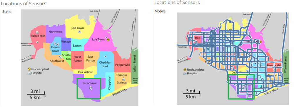
Mobile Sensors are able to support Static sensors by covering a wider area and reach in the same neighbourhood. Highlighted in green is an example of the Broadview neighbourhood, where we can see a wider area of readings as compared to the static sensor. The static sensor is able to be placed in a strategic location that a mobile sensor carried by car may not reach due to road limitations, like the top of the hospital for example. |
| 2. |
Both sensors are able to make up for any downtime each sensor has. An example of this would be the downtime of static sensor readings during the 9th April highlighted by the red and green boxes. We can see that the mobile sensor are able to give us readings during the static sensors downtime, as highlighted by the brown and blue boxes. |
Q5) The data for this challenge can be analyzed either as a static collection or as a dynamic stream of data, as it would occur in a real emergency. Describe how you analyzed the data - as a static collection or a stream. How do you think this choice affected your analysis?
| Step | Info |
|---|---|
| 1. |
Referencing https://www.techopedia.com/definition/31590/static-data, all my analysis has been done statically (i.e the data was prepared and stored nicely before visualization, and the data never changes). The static collection allowed me to easily see patterns, as there is a definitive end and start. For example, referencing the red box, I am able to see an outage of readings from sensor 15, at April 9th. Another reason is because I am not dealing with real time data, everything has already been prepared. |
| 2. | In the case of static data, all I had to really do was to prepare it for analysis (e.g. cleaning missing values, data entry errors, manupilation of rows). Although it was really slow at times, I knew that so long my computer could handle the operations I gave it I would not have any trouble in the long run. This might change where if I were to use a dynamic data, I have to decide with the constant stream of growing data, if my computer is able to perform operators and how big/small batches I should process my data. |
Interactive Visualization
Visualization can be found here:
Dashboard 1: Dangerous Radiation Readings by Neighbourhoods
Component
| Component | Description/Purpose |
|---|---|
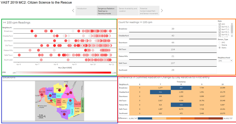
| 1. Scatterplot, highlighted by green box |
|
| 2. Table, highlighted by orange box |
|
| 3. Thematic map, highlighted by blue box |
|
| 4. Table, highlighted by red box |
|
Interactive Technique
| Technique | Info |
|---|---|
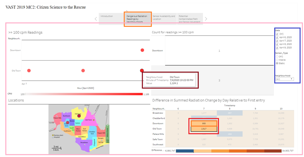
| 1. Select: Pointer, Orange boxes |
|
| 2. Select: Hover, Brown Box |
|
| 3. Select: Brush, Red boxes |
|
| 4. Filter, Blue box |
|
| 5. Connection: Linked Multiple Views, Pink Box |
|
Dashboard 2: Sensor Availability and Location
Component
| Component | Description/Purpose |
|---|---|
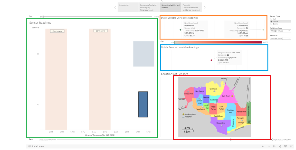
| 1. Gnatt Chart, highlighted by green box |
|
| 2. Scatterplot, highlighted by orange box |
|
| 3. Scatterplot, highlighted by blue box |
|
| 4. Reference Map, highlighted by red box |
|
Interactive Technique
| Technique | Info |
|---|---|
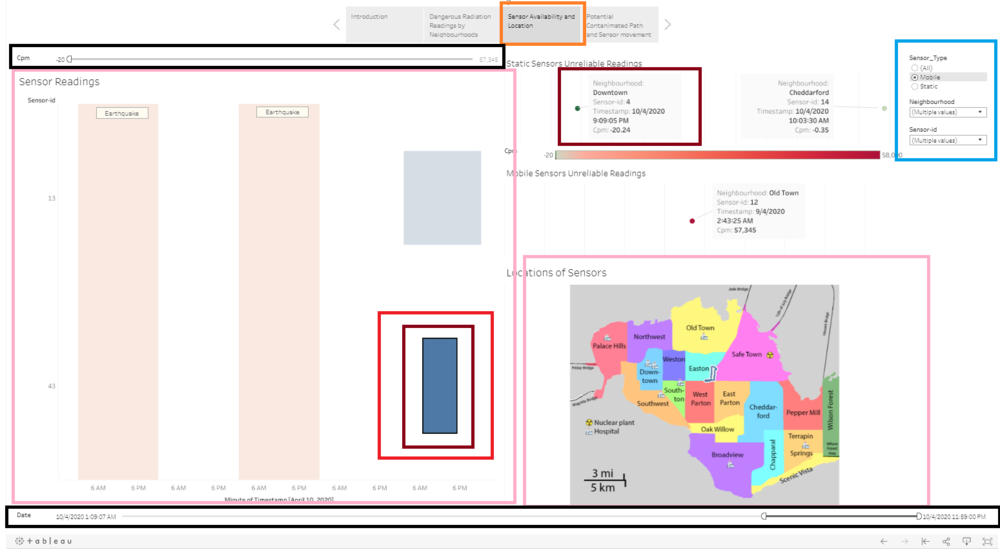
| 1. Select: Pointer, Orange boxes |
|
| 2. Select: Hover, Brown Box |
|
| 3. Select: Brush, Red boxes |
|
| 4. Filter, Blue box |
|
| 5. Connection: Linked Multiple Views, Pink Boxes |
|
| 6. Select: Slicer, Black boxes |
|
Dashboard 3: Potential Contanimated Path and Sensor movement through Neighbourhoods
Component
Interactive Technique
References
Tableau Online tips: Extracts, live connections, & cloud data - https://www.tableau.com/about/blog/2016/4/tableau-online-tips-extracts-live-connections-cloud-data-53351
Information about understanding Counts Per Minute (cpm) - https://wattsupwiththat.com/2011/03/17/live-real-time-monitoring-map-of-radiation-counts-in-the-usa/
More Information about understanding Counts Per Minute (cpm)- https://www.gqelectronicsllc.com/forum/topic.asp?TOPIC_ID=4348
Information about radiation spread - https://radiationanswers.org/radiation-questions-answers/nuclear-power.html
Static vs Dynamic Data - https://www.techopedia.com/definition/31590/static-data
Comments
Please comment I will note with thanks
