Difference between revisions of "IS428 2019-1920 T1 Assign LeeSunho Interactive Visualization"
| Line 28: | Line 28: | ||
==<font color="#008000">Taks one</font>== | ==<font color="#008000">Taks one</font>== | ||
| − | <font size="3"><font color="# | + | <font size="3"><font color="#228B22">''Emergency responders will base their initial response on the earthquake shake map. Use visual analytics to determine how their response should change based on damage reports from citizens on the ground. How would you prioritize neighborhoods for response? Which parts of the city are hardest hit? Limit your response to 1000 words and 10 images.'' |
<b></b> | <b></b> | ||
Revision as of 13:21, 13 October 2019
|
|
|
|
|
Taks one
Emergency responders will base their initial response on the earthquake shake map. Use visual analytics to determine how their response should change based on damage reports from citizens on the ground. How would you prioritize neighborhoods for response? Which parts of the city are hardest hit? Limit your response to 1000 words and 10 images.
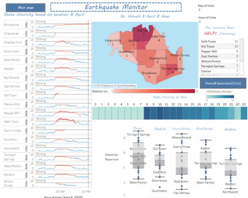
As the emergency responders of St. Himark have limited resources, it is imperative that they are able to prioritize certain areas in the city during the natural disaster. They can do so by basing their initial response on the earthquake shake map. Using visual analytics, I have created two live dashboards which will report the various data regarding the earthquakes. Through this dashboard, the emergency responders will be able to answer several important questions such as: “How to prioritize which neighbourhoods for response?” and “Which parts of the city are hardest hit?”
|
Live Dashboard The first dashboard provides a more micro view of the data by showing the user the earthquake intensities grouped by the different regions on specific dates and times. On the top right corner of the dashboard, emergency responders are able to adjust the date to see the intensity of the earthquake on those specific days. This dashboard currently is split into five different sections: line chart, cartogram, intensity counter, heat map, and box plot. I will now be explaining each of the different sections in detail. |
Overll Summary
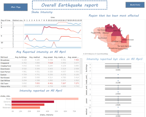
The second dashboard provides a more macro view of the data which shows the summary of the overall reported intensity faced by St. Himark for all the days instead of a specific one. This dashboard is also divided into 5 different sections – line graph, cartogram, table, bar chart, and box plot – in which I will also be explaining in detail. |
|---|
| Explanation | Visual Representation |
|---|---|
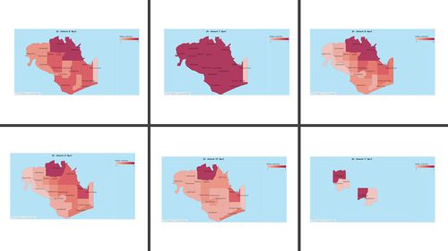
| Cartogram to indicate priority </font
|
|
| Intensity Counter
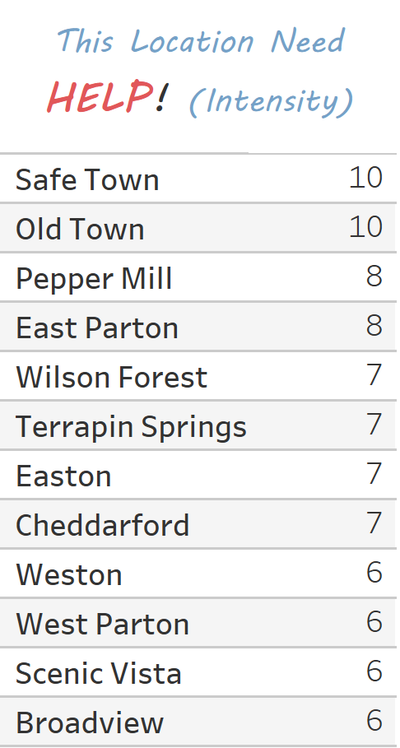
the intensity counter is a list which indicates the specific numerical intensity that these regions experienced. In addition, this counter only reports those regions that have experienced an intensity of 6 or higher, or the more dangerous earthquakes. This section of the dashboard perfectly complements the cartogram since the cartogram uses colour to indicate intensity while the list uses an actual numerical amount.
|
|
| Line chart
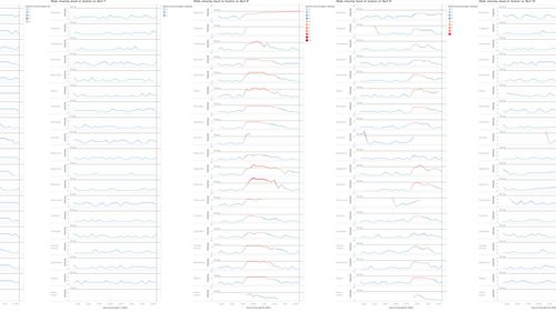
the line chart is the shake intensities of the different regions of St. Himark. Having 19 different regions within its borders, St. Himark is bound to experience varying levels of earthquake intensity during the natural disaster, thus it is important to separate the effects of the intensity by region. The x-axis represents time in hours while the y-axis represents the intensity of the earthquake For all the of the line graphs, there is a gray horizontal line which signifies the reference line. This is to help indicate the intensity level of 6, which is the threshold between a catastrophic earthquake and a minor shake; if the line is below the reference line, it will be blue, indicating that the earthquake is still moderately safe but a red line indicates danger. Hence, based on the chart, users can easily identify which region needs the most help at certain times of the data on a specific date. For example, from the chart, it is evident that Broadview, Cheddarford, East Parton, Pepper Mill, Safe Town, Old Town, Terrapin Springs, West Parton, ad Weston have reportedly high intensities between 9 am until 4 pm.
|
|
| Heat Map
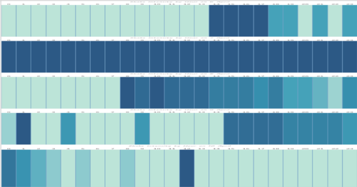
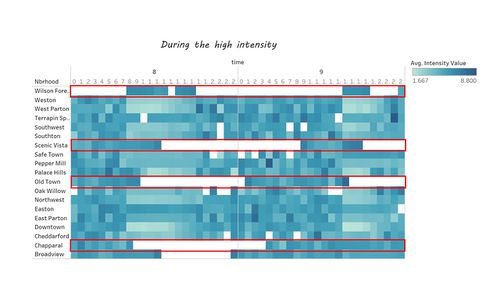
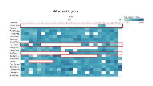
The heat map indicates the cumulative shake intensity of St. Himark by the hour. In other words, it will help the users understand which hours experience higher levels of intensity in the whole region. By looking at the heatmap, it is evident that St. Himark is hit with earthquakes after 8am.
|
|
| Box and whiskers plot
the box and whiskers plot shows the reported intensity faced by the various public facilities and amenities. This is to help address the question of “Which public good needs to be repaired the most?” By observing this plot, users can quickly see the mean, median, and range of the reported intensities.
|
|
| Total Summary Intensity level from 6th April to 11th April
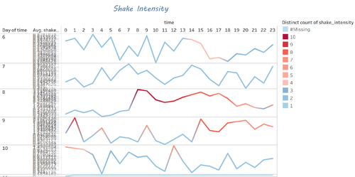
The line graph indicates the shake intensity from April 6 to 11. Similar to the first dashboard, when the line graph turns red, it means that the earthquake is more intense and dangerous. By observing the chart, it is evident that the 8th and the 9th are the most severely impacted by the earthquakes. During the 8th, the whole region aggregately faced consistently high intensity levels after 8am while during the 9th, there was a slight shock in the morning which then reverted to a safe level, only to increase again after 2pm and remain at that level until the night.
|
|
| Total Summary by region
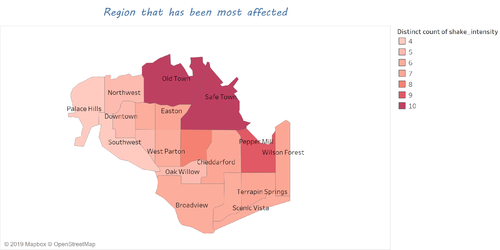
The cartogram indicates the region that has been most affected by the earthquake. It shows which region has been the most affected overall by the earthquake in all 6 days by using colors to indicate the regions with the highest number of reported intensities with darker hues of red.
|
|
| Total Summary data table
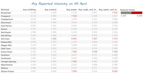
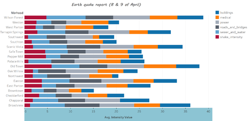
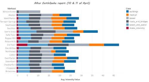
The table reveals the average reported intensity faced by the facilities in the different regions for all the days. If the average aggregate reported intensity is greater than 6, the number is colored in red; for example, the sewer and water facilities in Broadview exceed 6, thus they are prominently colored.
|
|
| Total Summary for Class
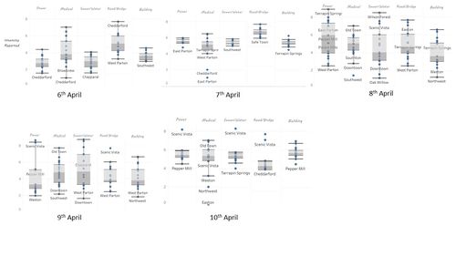
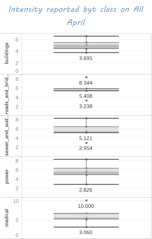
The box plot shows the overall minimum, maximum, and median intensities faced by the different facilities in St. Himark. Through this method of visualization, users are able to quickly gauge the range and medians of the intensities in each section.
|
|
| Total Summary different level of intensity
The bar charts convey the amount of people who reported those specific intensity levels. Weak includes an intensity level between 1 and 3, moderate is 4, strong is 5, and extreme is any intensity level greater than 6. Thus, for example, there were 35,000 reports of a strong earthquake felt in St. Himark.
|
|
Taks TwoHow do conditions change over time? How does uncertainty in change over time? Describe the key changes you see. Limit your response to 500 words and 8 images.
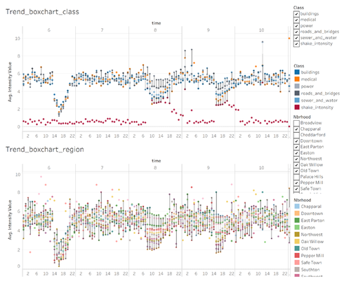
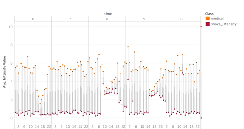
As aforementioned, because St. Himark has seismic sensors throughout the cities, they are able to obtain the actual magnitude of the disaster. However, it would be unwise to simply deploy their people there just because there’s a high intensity earthquake because that earthquake might not cause that much damage. It is thus important to compare the actual seismic reading with the reported damage in each of the separate amenities.
Taks ThreeHow do conditions change over time? How does uncertainty in change over time? Describe the key changes you see. Limit your response to 500 words and 8 images.
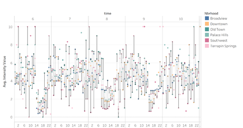
As the days pass, more and more citizens input their observations and reports into the mobile application. Hence, in theory, the data should become more accurate and reliable. However, over time, this is not the case. Even though there is large number of reported observations, consistency and reliability cannot be found.
|

