Difference between revisions of "IS428 AY2019-20T1 Assign Kok Jim Meng Tasks Questions and Answers"
| Line 1: | Line 1: | ||
| + | # Numbered list item | ||
<div style=background:#76BA1B border:#8EE4AF #top> | <div style=background:#76BA1B border:#8EE4AF #top> | ||
[[File:StHimarkNeighborhoodMap.png|200px]] | [[File:StHimarkNeighborhoodMap.png|200px]] | ||
| Line 125: | Line 126: | ||
====Dashboard 2==== | ====Dashboard 2==== | ||
| + | |||
| + | [[File:Jim Task2 Dashboard2.png|600px|center]] | ||
| + | |||
| + | This dashboard answers the last part of the task and it provides a total of 4 visuals which all of them serve as filters:<p> | ||
| + | '''1. Map'''<br> | ||
| + | A map of the sensors’ whereabouts. Hover to see sensor-id and its location coordinates.<p> | ||
| + | '''2. Time Series (Minutes) of Radiation Measurements by both Mobile and Static Sensors'''<br> | ||
| + | Time-series line chart showing the effects of happenings in St Himark over the period. Use a sample size of maximum radiation measurement from 0 to 5000. Hover to see the radiation measurement and the timestamp.<p> | ||
| + | '''3. Mobile Anomaly and Uncertainty'''<br> | ||
| + | A time-series line chart using a sample size of maximum radiation measurement value from 0 to 5000 showing the mobile sensors’ id and its maximum radiation measurement. This chart helps to check where is the uncertainty and the anomaly. Hover to see its value and the timestamp. It is used as a filter for the contamination path chart.<p> | ||
| + | '''4. Static Anomaly and Uncertainty'''<br> | ||
| + | Similar to Mobile Anomaly and Uncertainty, it is also a time-series line chart using a sample size of maximum radiation measurement value from 0 to 5000 showing the mobile sensors’ id and its maximum radiation measurement. This chart helps to check where is the uncertainty and the anomaly. Hover to see its value and the timestamp. It is used as a filter for the contamination path chart. | ||
| + | |||
| + | ===Task 2 Questions & Answers=== | ||
| + | '''Use visual analytics to represent and analyze uncertainty in the measurement of radiation across the city. Limit your responses to 12 images and 1000 words.''' | ||
| + | '''1. Compare uncertainty of the static sensors to the mobile sensors. What anomalies can you see? Are there sensors that are too uncertain to trust?''' | ||
| + | '''2. Which regions of the city have greater uncertainty of radiation measurement? Use visual analytics to explain your rationale.''' | ||
Revision as of 21:15, 12 October 2019
- Numbered list item
|
|
|
|
|
|
Contents
Tasks Questions and Answers
Task 1
Dashboard
The dashboard provides a total of 3 visuals:
1. Map of the Mobile Sensors and Static Sensors throughout the period from 6 April 2020 to 10 April 2020
Map that provides the location of the sensors of their whereabouts since 6 April 2020 to 10 April 2020. Serves as a filter to filter the other charts. Hover to see the sensor id, its radiation value, the location coordinates, and the timestamp in minutes.
2. Radiation Measurement (Maximum) for Mobile Sensors in Minute of the Timestamp
A time-series chart based on minutes by using a sample size of maximum radiation measurement value from 0 to 5000 of the mobile sensors. Marked by colour intensity where light blue is low and dark blue is high. Hover to see the sensor id and its radiation value.
3. Radiation Measurement (Maximum) for Static Sensors in Minute of the Timestamp
A time-series chart based on minutes by using a sample size of maximum radiation measurement value from 0 to 5000 of the static sensors. Hover to see the sensor id and its radiation value.
Task 1 Questions & Answers
Visualize radiation measurements over time from both static and mobile sensors to identify areas where radiation over background is detected. Characterize changes over time. Limit your response to 6 images and 500 words.
Description |
Images |
|
When the radiation measurement of a sensor has reached a minimum value of 100 CPM, it is at the dangerous radiation level. According to the International Nuclear and Radiological Event Scale, there are 8 classes of radiation classification as follows:
Hence, we will choose “6. Accident with wider consequences”, “7. Serious accident”, and “8. Major accident” to find out where do these radiation classifications are detected as these classifications are range from 100 CPM onwards. In the map, the blue dots indicate the mobile sensors while the orange dots indicate the static sensors. Based on the timeline of April 6 2020 12.37am to April 10 2020 11.59pm, most of the high radiation occur in the north and central part of St Himark such as:
This is most likely that the radioactive contamination has spread from the nuclear plant from Safe Town to its nearby regions. |
|
|
While selecting M-9 during that timestamp as a filter in the dashboard, sensor M-9 is actually near the nuclear plant in Safe Town. We assume that since that timestamp strikes, the radiation contamination has started to take place as according to the time-series chart. |
|
|
With the same indication of the radiation classification as mobile sensors’, for the static sensors, only S-15 has the high radiation measurement as the sensor is fixedly placed near the nuclear plant in Safe Town after selecting S-15 in the time-series chart of static sensors as the filter in the dashboard. |
|
|
When indicating all the radiation classification for the static sensors, as compared to the rest of the static sensors, only S-15 has no value from 8 April 2020 10.06pm and the value has resumed from 10 April 2020 8.45pm onwards. Probably during that period, S-15 is faulty as it is the only static sensor that is placed very near to the nuclear power plant and most likely both earthquake and the plant leakage were occurred during that period. |
Task 2
Dashboard 1
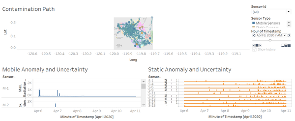
This dashboard answers the first 2 parts of the task and it provides a total of 3 visuals:
1. Contamination Path
Map that provides the location of the sensors of their whereabouts since 6 April 2020 to 10 April 2020 in hours. Hover to see the sensor id and its sensor type, its radiation value, the location coordinates, and the timestamp.
2. Mobile Anomaly and Uncertainty
A time-series line chart using a sample size of maximum radiation measurement value from 0 to 5000 showing the mobile sensors’ id and its maximum radiation measurement. This chart helps to check where is the uncertainty and the anomaly. Hover to see its value and the timestamp. It is used as a filter for the contamination path chart.
3. Static Anomaly and Uncertainty
Similar to Mobile Anomaly and Uncertainty, it is also a time-series line chart using a sample size of maximum radiation measurement value from 0 to 5000 showing the mobile sensors’ id and its maximum radiation measurement. This chart helps to check where is the uncertainty and the anomaly. Hover to see its value and the timestamp. It is used as a filter for the contamination path chart.
Dashboard 2
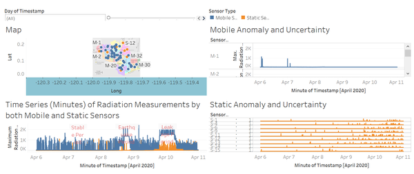
This dashboard answers the last part of the task and it provides a total of 4 visuals which all of them serve as filters:
1. Map
A map of the sensors’ whereabouts. Hover to see sensor-id and its location coordinates.
2. Time Series (Minutes) of Radiation Measurements by both Mobile and Static Sensors
Time-series line chart showing the effects of happenings in St Himark over the period. Use a sample size of maximum radiation measurement from 0 to 5000. Hover to see the radiation measurement and the timestamp.
3. Mobile Anomaly and Uncertainty
A time-series line chart using a sample size of maximum radiation measurement value from 0 to 5000 showing the mobile sensors’ id and its maximum radiation measurement. This chart helps to check where is the uncertainty and the anomaly. Hover to see its value and the timestamp. It is used as a filter for the contamination path chart.
4. Static Anomaly and Uncertainty
Similar to Mobile Anomaly and Uncertainty, it is also a time-series line chart using a sample size of maximum radiation measurement value from 0 to 5000 showing the mobile sensors’ id and its maximum radiation measurement. This chart helps to check where is the uncertainty and the anomaly. Hover to see its value and the timestamp. It is used as a filter for the contamination path chart.
Task 2 Questions & Answers
Use visual analytics to represent and analyze uncertainty in the measurement of radiation across the city. Limit your responses to 12 images and 1000 words. 1. Compare uncertainty of the static sensors to the mobile sensors. What anomalies can you see? Are there sensors that are too uncertain to trust? 2. Which regions of the city have greater uncertainty of radiation measurement? Use visual analytics to explain your rationale.


