From Visual Analytics for Business Intelligence
Jump to navigation
Jump to search
|
|
| Line 109: |
Line 109: |
| | During the major intensity | | During the major intensity |
| | | | |
| − | [[File:Question2_Peak_comparison.png|500px|center]] | + | [[File:question2_peakheat.jpg|500px|center]] |
| | | | |
| | After the major intensity | | After the major intensity |
| Line 127: |
Line 127: |
| | | | |
| | During the major intensity | | During the major intensity |
| − | [[File:Question2 Peak comparison.pn|500px|center]] | + | [[File:Question2 Peak comparison.png|500px|center]] |
| | | | |
| | After the major intensity | | After the major intensity |
Revision as of 04:53, 12 October 2019
Taks one
Emergency responders will base their initial response on the earthquake shake map. Use visual analytics to determine how their response should change based on damage reports from citizens on the ground. How would you prioritize neighborhoods for response? Which parts of the city are hardest hit? Limit your response to 1000 words and 10 images.
hi
| Explanation |
Visual Representation |
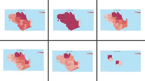
| 1.Cartogram </font
description
|
|
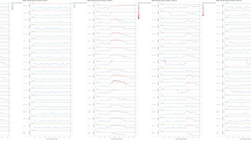
| 2.LINE</font
line
|
|
| 3.Heat Map</font
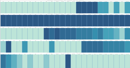
HEat
Two terminologies used in the analysis need to be clarified before we move on to the analysis result, paths vs sequences.
|
|
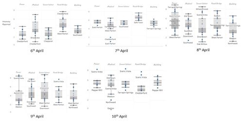
| 4.Box" analysis </font
Box
|
|
Taks Two
Use visual analytics to show uncertainty in the data. Compare the reliability of neighborhood reports. Which neighborhoods are providing reliable reports? Provide a rationale for your response. Limit your response to 1000 words and 10 images.
hi
| Explanation |
Visual Representation |
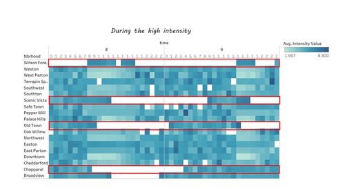
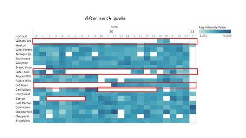
| 1. Heatmap </font
description
|
During the major intensity
After the major intensity
|
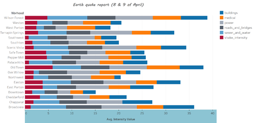
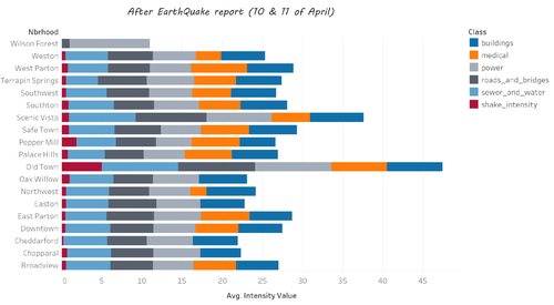
| 2.Bar Chart
line
|
During the major intensity
After the major intensity
|
| 3.Heat Map</font
HEat
Two terminologies used in the analysis need to be clarified before we move on to the analysis result, paths vs sequences.
|
|
| 4.Box" analysis </font
Box
|
|
Taks Three
How do conditions change over time? How does uncertainty in change over time? Describe the key changes you see. Limit your response to 500 words and 8 images.
hi
| Explanation |
Visual Representation |
| 1.Cartogram </font
description
|
|
| 2.LINE</font
line
|
|
| 3.Heat Map</font
HEat
Two terminologies used in the analysis need to be clarified before we move on to the analysis result, paths vs sequences.
|
|
| 4.Box" analysis </font
Box
|
|
|
|
|
