|
|
| Line 181: |
Line 181: |
| | |- | | |- |
| | | | | | |
| − | [[File:HW_overview.jpg|700px|center]] | + | [[File:HW_Overview.jpg|700px|center]] |
| | || | | || |
| | | | |
Revision as of 12:17, 19 November 2019
<--- Back to Project Groups
Upon exploring the data and consulting Prof. Kam, our team decided to focus on visualising global happiness instead due to data constrains and to prevent making false correlations between suicide rates and happiness scores.
PROBLEM & MOTIVATION
Traditionally, a country’s well-being has been measured on economic variables like GDP or unemployment rate. However, no institution, nation or group of people can really be properly understood without also factoring in a number of other elements. One of these key elements is happiness. What contributes to a country’s happiness? Why are some countries happier than others? Are there any trends or patterns we can discern from the available data? With reference to the World Happiness Report, we attempt to visualize the factors that contribute to a country’s happiness on a global scale.
OBJECTIVES
In this project, we are hope to create a visualization that enables the following:
- Identify regions or countries with the highest happiness scores
- Visualise the happiness scores over time
- Explore the factors contributing to happiness score
- Comparison of happiness scores and its factors across countries
SELECTED DATASETS
| Dataset/Source
|
Data Attributes
|
Why this Dataset?
|
World Happiness index 2019
(https://worldhappiness.report/ed/2019/)
|
- Overall Happiness Rankings of Countries Worldwide
- Individual segment scores for each country (Freedom of speech, social support, etc)
|
Happiness cannot be easily measured, but the data from the World Happiness Report is the most consistent option with sufficient data points across the past decade. Hence, this will be our choice of data for analysis.
|
RELATED WORKS
| Example
|
Takeaways
|
|
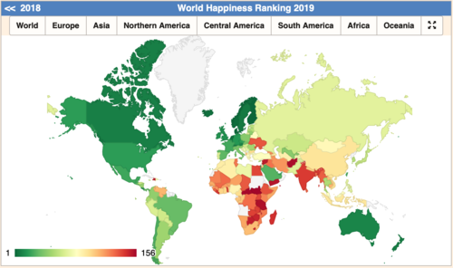
Choropleth Map by Region
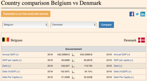
Comparison Table of Two Countries' Happiness Score Components
Source: https://countryeconomy.com/demography/world-happiness-index
|
- By visualising the happiness rankings, it enables the viewer to make easy comparison between continents.
- The comparison table however, makes it difficult to compare the differences in components at a glance.
|
|
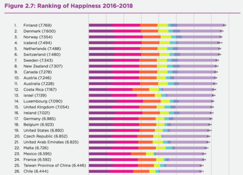
Stacked Bar Chart of Individual Happiness Score Components
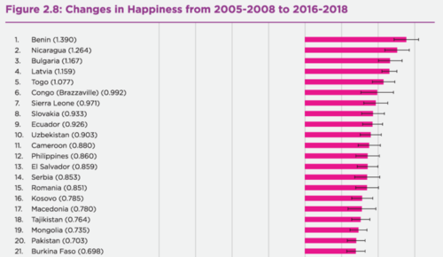
Bar Chart Measuring Change in Happiness Score Over the Years
Source: https://worldhappiness.report/ed/2019/
|
- The sorted stacked bar chart visualises the component breakdown of each countries' happiness score. However, it is difficult to compare the differences in individual components across countries.
- Visualising the change in happiness scores with a bar chart makes the changes in individual country's score obvious, but there is no indication of the actual score. (e.g. low to high? Or high and higher?)
|
|
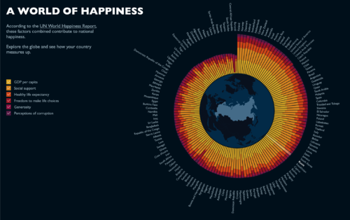
Interactive Radial Stacked Bar Chart of Global Happiness Score Components
Source: http://www.benscott.co.uk/wdvp/
|
- The interactivity makes for an enjoyable user experience. The use of filtering enables users to explore the individual components as well, for more in depth analysis.
- The radial layout causes some difficulty in looking for a specific country.
|
DESIGN INSPIRATIONS
PROPOSED STORYBOARD
Our proposed application will consist of four pages:
OVERVIEW
This page will provide the viewer with an overview of global suicide rates and overall happiness scores.
| Proposed Layout
|
Description
|
|
|
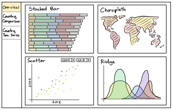
- Bar Chart and Choropleth Map
- The bar chart will show the suicide rates globally, sorted in ascending or descending order.
- Both charts will be coloured with the same color intensity scale, to allow for ease of comparison.
- When selecting a particular country on either maps, the corresponding object on the other chart will be highlighted as well.
- Scatterplot
- The scatterplot of suicide rates vs happiness score visualises the relationship between these 2 measures.
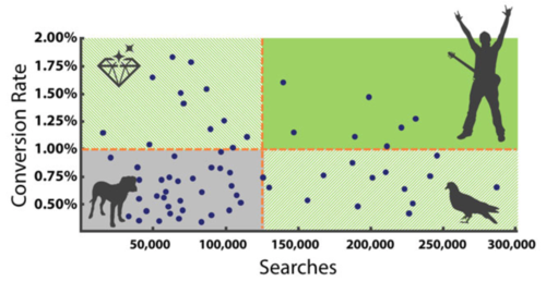
- Depending on their positions within the 4 quadrants, we can get interesting insights on a specific country's suicide numbers. For example, a country that ranks highly on the happiness index but has high suicide rates could represent the presence of some underlying issues that lead to increased suicides.
|
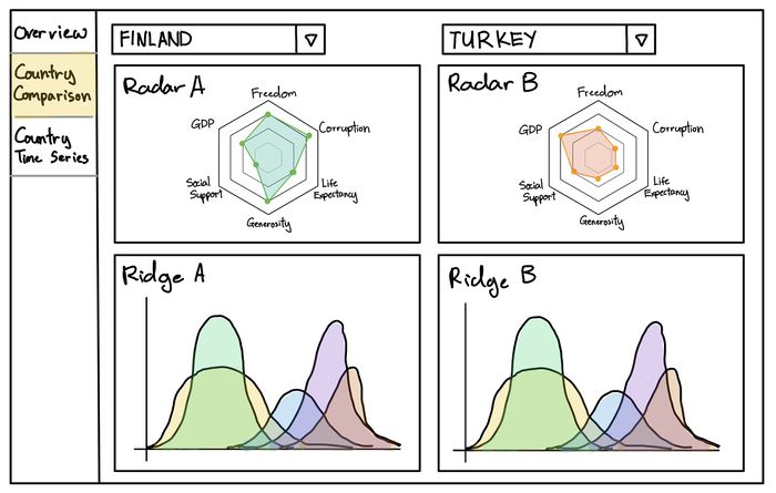
COUNTRY COMPARISON
| Proposed Layout
|
Description
|
|
|
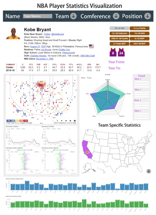
- Summary Card
- A combination of statistics and charts that summarises the demographics of a particular country's suicides.
- Radar Chart: Component breakdown of the Happiness Index.
- Line Chart: Time series of the country's suicide figures, separated by age and gender.
- Country Comparison
- Viewers can add another Summary Card for side-by-side comparison between 2 or more countries' suicide demographics.
|
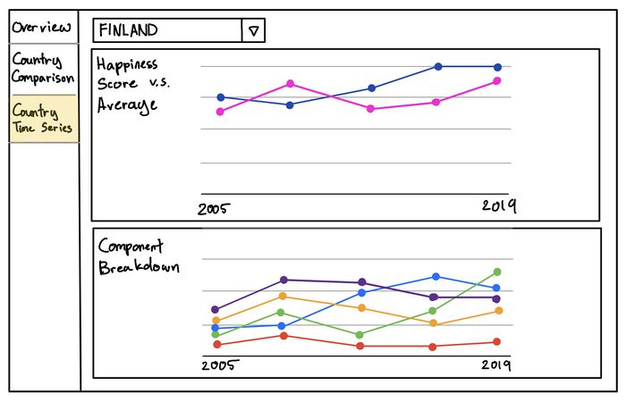
COUNTRY TIME-SERIES
To show that country level analysis may still be too generalised, this page is a further breakdown of Japan's suicide statistics at the prefecture level.
| Proposed Layout
|
Description
|
|
|
- Cartogram of Japan
- An animated cartogram of Japan that shows the suicide rate of each prefecture.
- Users can select 1 or more prefectures for comparison across the other charts.
- Reasons for Suicide and Occupations
- Radar Chart: A breakdown of the reasons for suicide in the prefecture.
- Stacked Bar Chart: A breakdown of the occupations of the people who committed suicide in the prefecture.
- The radar and bar chart will layer themselves according to the prefectures selected to allow for easy comparison.
- Connected Dot Plot
- Visualises the changes in suicide rates over time, based on prefectures selected.
|
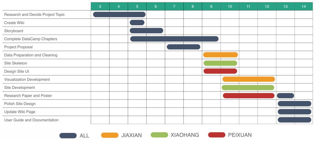
PROJECT TIMELINE
KEY CHALLENGES
| Challenge
|
Mitigation
|
|
Inexperienced with Creating and Designing Visualisations
|
- Engage in hands-on practice during and after class.
|
|
Inexperienced with R and R Shiny
|
- Make full use of the DataCamp resources provided
- Self-directed and peer learning
|
|
Limited Access to Sensitive Suicide Data
|
- Acquire data from various sources and conduct data cleaning to organize the data.
- Make do with what we can get, down scope the project accordingly.
|
|
Time and Workload Constrains
|
- The team will come up with a reasonable project timeline based on everyone's ability and capacity.
- Set milestones and adjust the timeline accordingly based on the team's progress.
|
REFERENCES
Feel free to leave us some comments or feedback!
| Name
|
Comment/Feedback
|
|
Your Name
|
|
|
Your Name
|
|
