Difference between revisions of "IS428-AY2019-20T1 Climate Vizards: Proposal - Background Survey"
Wendyng.2015 (talk | contribs) |
Wendyng.2015 (talk | contribs) |
||
| Line 96: | Line 96: | ||
<br><td> | <br><td> | ||
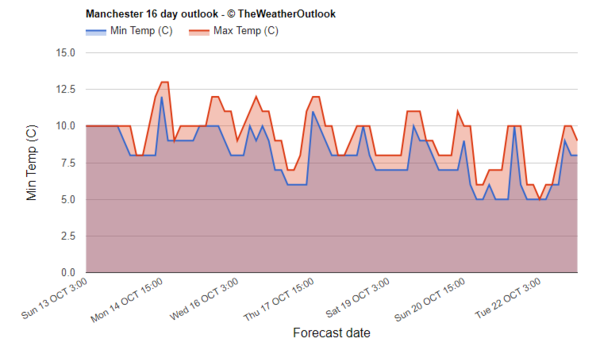
This diagram shows an area chart of the forecast maximum and minimum temperature in Manchester UK for the next few days. Users can easily see a trend and such diagram enable several metrics to be observed and comparison can be done. | This diagram shows an area chart of the forecast maximum and minimum temperature in Manchester UK for the next few days. Users can easily see a trend and such diagram enable several metrics to be observed and comparison can be done. | ||
| + | </td> | ||
| + | |||
| + | </tr> | ||
| + | <tr> | ||
| + | <td> | ||
| + | <b> 4. Spatial interpolation</b> <br> | ||
| + | Source: | ||
| + | [[File:.png|center|600px]]</td> | ||
| + | <br><td> | ||
| + | XXXX | ||
</td> | </td> | ||
</table> | </table> | ||
Revision as of 16:43, 13 October 2019
|
|
|
|
|
|
|
|
|
|
|
|
|
Background Survey
The following are the sources of inspirations that aid our brainstorming process and proposed storyboard.
| Source | What we can learn |
|---|---|
|
1. Calendar heat map |
This diagram allows us to view a year worth of data where we can see the changes in rainfall daily across the year. Hence, it is applicable and useful to see the changes across the year for both the rainfall and temperature in Singapore. |
|
2. Box and Whisker Plot |
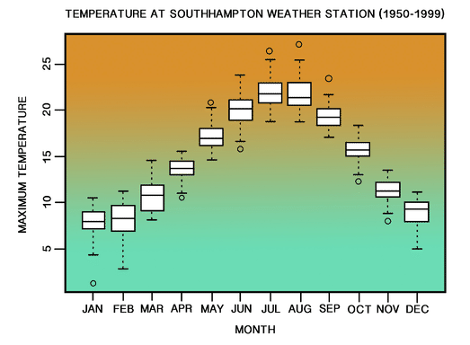
This diagram shows the range of monthly temperature at the Southampton Weather Station in southern England from year 1950 to 1999. Using box and whisker plots, it enables users to easily identify information such as the range for each month and which month has the highest temperature. |
|
3. Area chart |
This diagram shows an area chart of the forecast maximum and minimum temperature in Manchester UK for the next few days. Users can easily see a trend and such diagram enable several metrics to be observed and comparison can be done. |
|
4. Spatial interpolation |
XXXX |


