Difference between revisions of "SuicideWatch: Proposal v2"
| Line 200: | Line 200: | ||
|- | |- | ||
| | | | ||
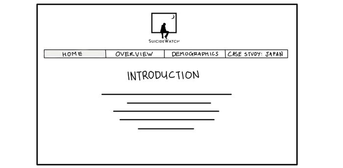
| − | [[File: | + | [[File:SuicideWatch_v2_home.jpg|700px|center]] |
|| | || | ||
* This page will serve as an introduction to our problem and objectives, to give the viewer an overview of our project. | * This page will serve as an introduction to our problem and objectives, to give the viewer an overview of our project. | ||
| Line 215: | Line 215: | ||
|- | |- | ||
| | | | ||
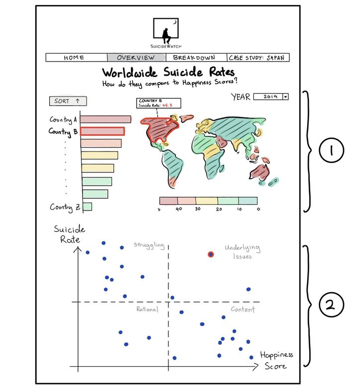
| − | + | [[File:SuicideWatch_v2_overview.jpg|700px|center]] | |
| − | [[File: | ||
|| | || | ||
* Allows visualization of Worldwide Suicide Rate/Happiness Index Scores by year, sorted in ascending/descending order. | * Allows visualization of Worldwide Suicide Rate/Happiness Index Scores by year, sorted in ascending/descending order. | ||
* Color of the bars and map will correspond to the Suicide Rate/Happiness Index Score of each country. This makes it easy to identify clusters or regions where suicide rates or happiness index scores tend to be high or low. | * Color of the bars and map will correspond to the Suicide Rate/Happiness Index Score of each country. This makes it easy to identify clusters or regions where suicide rates or happiness index scores tend to be high or low. | ||
| − | |||
| − | |||
| − | |||
| − | |||
| − | |||
| − | |||
| − | |||
| − | |||
| − | |||
| − | |||
| − | |||
| − | |||
|} | |} | ||
<br/> | <br/> | ||
| Line 243: | Line 230: | ||
|- | |- | ||
| | | | ||
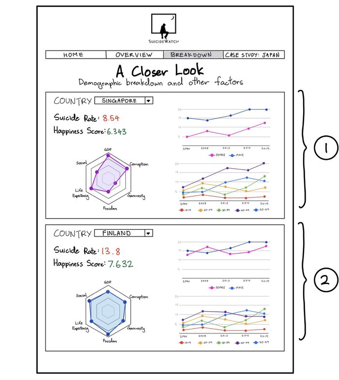
| − | + | [[File:SuicideWatch_v2_demographic.jpg|700px|center]] | |
| − | [[File: | ||
| − | |||
|| | || | ||
* Breakdown of Suicides by Gender/Age | * Breakdown of Suicides by Gender/Age | ||
| Line 260: | Line 245: | ||
|- | |- | ||
| | | | ||
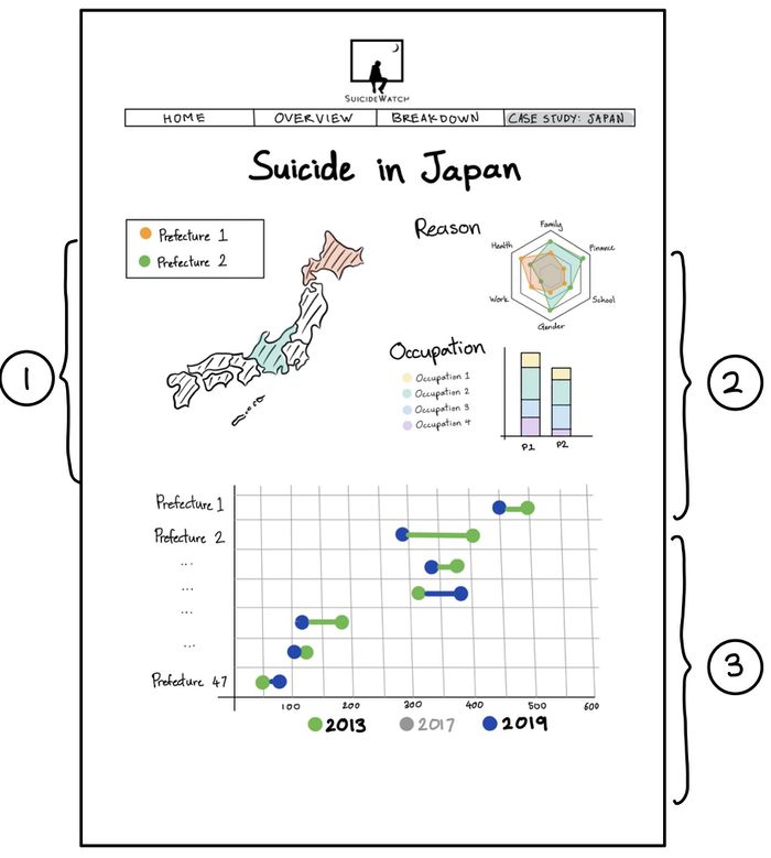
| − | + | [[File:SuicideWatch_v2_japan.jpg|700px|center]] | |
| − | [[File: | ||
| − | |||
|| | || | ||
* Represents the correlation between Suicide Rate/GDP and Suicide Rate/Social Network Penetration. | * Represents the correlation between Suicide Rate/GDP and Suicide Rate/Social Network Penetration. | ||
Revision as of 01:58, 13 October 2019
Version 2
|
Contents
PROBLEM & MOTIVATION
Suicide rates are at their highest since WWII. Close to 800 000 people die due to suicide globally every year, which is one person every 40 seconds. Suicide is a global phenomenon and occurs throughout the lifespan. In Singapore, suicide is the leading cause of death for those aged 10-29. Females are more likely to be diagnosed with depression and attempt suicide, but males accounted for more than 71% of all suicides in Singapore in 2018. The steady suicide figures signal the presence of an unseen epidemic, one that silently tips people over the edge. While most push the blame to depression, there is no one size fits all explanation when it comes to suicide. Can suicide rates be simply mapped to the Happiness Index or GDP per Capita? Or is there more than meets the eye?
With primary investigation, we found out that the suicide rate varies from country to country. To further study the suicide rate breakdown and the behind, we looked into Japan as it is a Asia country known for high suicide rate, and the Japan government has published more detailed statistics for annual suicide rate. This gives us a good starting point for visualization.
OBJECTIVES
In this project, we are interested to create a visualization that helps analysts perform the following:
- Explore suicides rates in each country
- Explore if there is a correlation between the suicide rate and happiness index
- Explore suicide demographic of each country
- Explore possible correlations of each country’s suicide with its GDP and social media penetration
- Conduct in-indepth visual analysis for Japan
SELECTED DATASETS
| Dataset/Source | Data Attributes | Why this Dataset? |
|---|---|---|
(https://www.kaggle.com/russellyates88/suicide-rates-overview-1985-to-2016) |
|
|
(https://worldhappiness.report/ed/2019/) |
|
|
(https://data.worldbank.org/indicator/ny.gdp.mktp.cd) |
|
|
(https://ourworldindata.org/internet) |
|
|
(https://www.npa.go.jp/publications/statistics/safetylife/jisatsu.html/) |
|
|
RELATED WORKS
| Example | Takeaways |
|---|---|
|
|
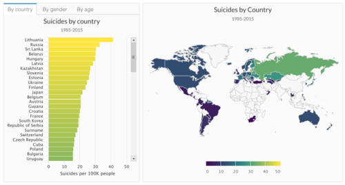
We get inspiration from this dashboard, which utilises the same set of data for world suicide statistics. |
|
|
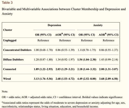
This paper supports our hypothesis on use of social media leaders to depression and suicide. The research results shows that membership in 2 clusters – “Wired” and “Connected” – increased the odds of elevated depression and anxiety symptoms (AOR = 2.7, 95% CI = 1.5–4.7; AOR = 3.7, 95% CI = 2.1–6.5, respectively, and AOR = 2.0, 95% CI = 1.3–3.2; AOR = 2.0, 95% CI = 1.3–3.1, respectively). |
DESIGN INSPIRATIONS
| Example | Takeaways |
|---|---|
|
|
Pros:
Cons:
|
|
|
Pros:
Cons:
|
PROPOSED STORYBOARD
Our proposed application will consist of four pages:
LANDING PAGE
| Proposed Storyboard | Description |
|---|---|
|
OVERVIEW
This page will provide the viewer with an overview of global suicide rates and overall happiness scores.
| Proposed Storyboard | Description |
|---|---|
|
DEMOGRAPHICS
| Proposed Storyboard | Description |
|---|---|
|
CASE STUDY: JAPAN
The purpose of this page is...
| Proposed Storyboard | Description |
|---|---|
|
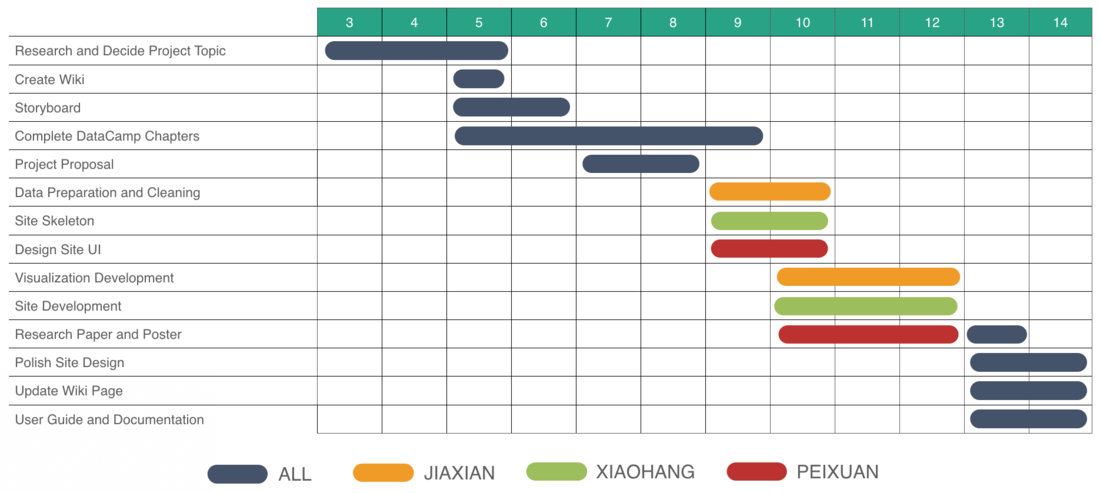
PROJECT TIMELINE
KEY CHALLENGES
| Challenge | Mitigation |
|---|---|
|
The team is new to data visualization and R Shiny |
|
|
Suicide data is not very accessible as it is a sensitive social issue |
|
|
Tight timeline for the semester |
|
REFERENCES
- link 1
- link 2
COMMENTS
Feel free to leave us some comments or feedback!
| Name | Comment/Feedback |
|---|---|
|
Your Name |
|
|
Your Name |
|

