Difference between revisions of "IS428 AY2019-20T1 Assign Lee Jenny Csm"
| Line 210: | Line 210: | ||
After preparing the data using Tableau Prep Builder, the following files must be imported into Tableau for analysis. The data file (output from Tableau Prep Builder) and the SHP file must be added in Tableau before we create the interactive visualization. | After preparing the data using Tableau Prep Builder, the following files must be imported into Tableau for analysis. The data file (output from Tableau Prep Builder) and the SHP file must be added in Tableau before we create the interactive visualization. | ||
| − | [[File: | + | [[File:Format of data.png|500px|center]] |
The data file and SHP file are added as a data source in Tableau. To add the SHP file, select the Spatial file and select the SHP file. The relationships defined between the data file and the SHP file is the Id (in SHP file) and Location (in mc1-reports-data.csv) and perform a left join between Id and Location. This will allow analysis to be conducted across all the data sources at any one point. | The data file and SHP file are added as a data source in Tableau. To add the SHP file, select the Spatial file and select the SHP file. The relationships defined between the data file and the SHP file is the Id (in SHP file) and Location (in mc1-reports-data.csv) and perform a left join between Id and Location. This will allow analysis to be conducted across all the data sources at any one point. | ||
| − | [[File: | + | [[File:Picture1.png|800px|center]] |
| + | |||
==Interactive Visualization/Dashboard Design== | ==Interactive Visualization/Dashboard Design== | ||
The interactive visualization can be accessed here: xxx | The interactive visualization can be accessed here: xxx | ||
| − | The | + | The size of the interactive visualization is set to automatic. This means that the dashboard will resize to fit any screen it is displayed on. |
| − | Throughout all the | + | Throughout all the interactive visualization, navigation buttons are provided at the top to help users navigate through the different dashboards. Moreover, filters and actions are included in the visualization to allow users to efficiently analyse and gather insights with much ease. The following interactivity elements are used throughout the dashboards: |
{| class="wikitable" | {| class="wikitable" | ||
|- | |- | ||
| − | ! style="font-weight: bold;background: #2E4053;color:#fbfcfd;width: | + | ! style="font-weight: bold;background: #2E4053;color:#fbfcfd;width: 50%;" | Interactive Technique |
| − | ! style="font-weight: bold;background: #2E4053;color:#fbfcfd;width: | + | ! style="font-weight: bold;background: #2E4053;color:#fbfcfd;width: 50%" | Rationale |
| + | |- | ||
| + | | '''Filter dates with the use of time range slider''' <br>[[File:Rangeslider.png|200px]] | ||
| + | || When filtering time series data, using a time range slider is preferred as it is more user-friendly and convenient. Users do not have to key in/select/check the date, month and year manually when filtering data. Moreover, it provides the flexibility for users to specify the time period they want to analyse simply by dragging the range slider. | ||
| + | |- | ||
| + | |- | ||
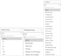
| + | | '''Filter time by day, affected area and location with the use of single value (dropdown/list)''' <br>[[File:Filters.png|200px]] | ||
| + | || The filter is created in this format because in most cases, users do not need to select more than one data from those fields – the data are to be analysed individually or as a whole. In addition, with the use of a single selection, it allows users to get a more specific result. | ||
| + | |- | ||
|- | |- | ||
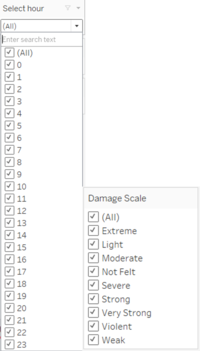
| − | | | + | | '''Filter damage scale and time by the hour with the use of Multiple Values (dropdown)''' <br>[[File:Filter2.png|200px]] |
| − | + | || As the name implies, this filter format allows users to select multiple choices. For example, when users want to compare the 2 ends of the damage scale – Extreme and Not Felt, they can do so using the Damage Scale filter. Moreover, the selection is displayed in drop-down because there are many familiar options available. | |
| − | || | ||
|- | |- | ||
|} | |} | ||
| + | |||
| + | The following sections elaborate on other interactivity techniques are integrated into each of the individual dashboards. | ||
| + | |||
| + | The breakdown of the visualization is as follows: | ||
| + | #Overview of the damage Report | ||
| + | #Uncertainty in the report by citizens | ||
| + | #Changes in damage over time | ||
| + | |||
===Home Dashboard=== | ===Home Dashboard=== | ||
Revision as of 00:25, 13 October 2019
Contents
Background
St. Himark has been hit by an earthquake, leaving officials scrambling to determine the extent of the damage and dispatch limited resources to the areas in most need. They quickly receive seismic readings and use those for an initial deployment but realize they need more information to make sure they have a realistic understanding of the true conditions throughout the city.
In a prescient move of community engagement, the city had released a new damage reporting mobile application shortly before the earthquake. This app allows citizens to provide more timely information to the city to help them understand the damage and prioritize their response. With emergency services stretched thin, officials are relying on citizens to provide them with much-needed information about the effects of the quake to help focus recovery efforts.
Objectives & Tasks
With the huge amount of information provided by the citizens, emergency planners are unable to gather insights and discover patterns without any visualization tools. Hence, there is a need to help the emergency planners build an interactive data visualization that allows them to efficiently gather the information that they need and identify areas of concern. The interactive visualization aims to provide emergency planners with the following information:
- Decide how responses (by emergency planners) will change based on damage reports from citizens on the ground
- Prioritize neighbourhoods based on responses given
- The region that experience the hardest hit
- Compare the reliability of neighbourhood reports
- Changes in conditions/uncertainty over time
Data analysis & Transformation Process
This section will elaborate on the dataset analysis and transformation process for each dataset in order to prepare the data for import and analysis on interactive visualization.
There is one zip file provided for this assignment and the dataset is given for this assignment spans the entire length of the event, containing individual reports of shaking/damage by neighbourhood over time. Reports are made by citizens at any time, in 5-minute batches/increments.
There are 5 main areas in the city that was affected by the earthquake: Buildings, Medical, Power, Roads & Bridges and Sewer and Water. Alongside these affected areas are damage values that were reported by the citizens on the ground. Reports are made by citizens at any time; in 5-minute batches/increments.
The format of the captured data for all the affected areas (e.g. buildings, medical, etc) is the same.

The following section illustrates the issues faced in the data analysis phase leading to a need to transform the data into a specified format.
| Problem #1 | Format of Data |
|---|---|
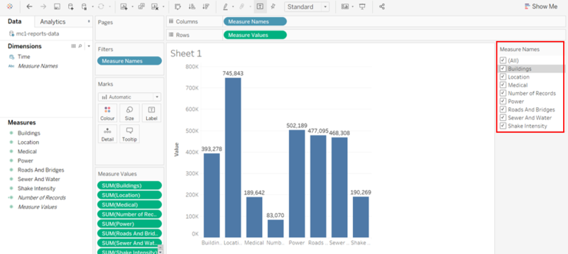
| Issue | As all the affected areas (e.g. buildings, medical, etc) are recorded individually on different columns, we are unable to compare the different affected areas nicely in one visualization because of the following reasons:
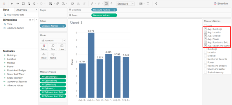
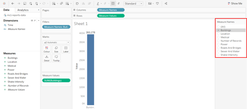
2. The damage value that is tied to each affected area at a given time is recorded on a scale from 1 to 10 depending on how bad the damage was (0 – lowest; 10 – highest). Hence, we should not aggregate it but instead, use the average to compare and analyse how bad the damage was. As such, when we change the measure to an average, the previous measures are not replaced. The average measure will be added to the filter selection, causing more unnecessary selections in the filter pane.
3. The format of the filter is only limited to ‘Multiple Values (list)’. As seen from the images below, we can change the format of the filter to ‘Single Value (list)’. However, when we select ‘(All)’ in the filter pane, the format of the filter will automatically change to the ‘Multiple Values (list)’ format. Hence, it is not ideal and user-friendly for users if the format of the filter changes upon selection.
The format and structure of the current data are not ideal as we are unable to perform the basic comparison and apply filters to the visualization. |
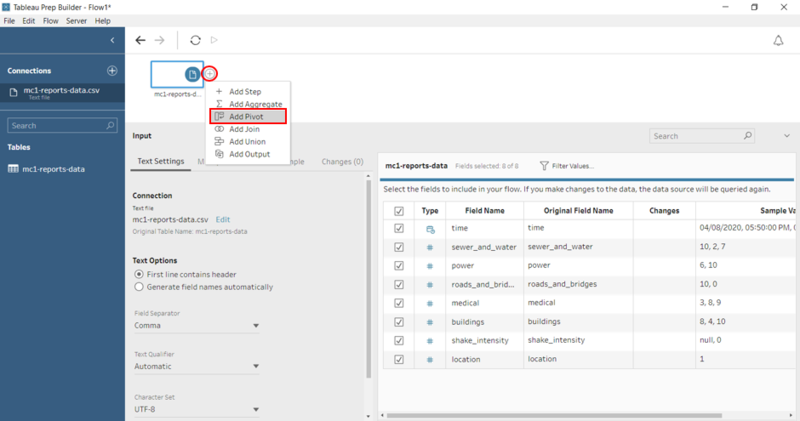
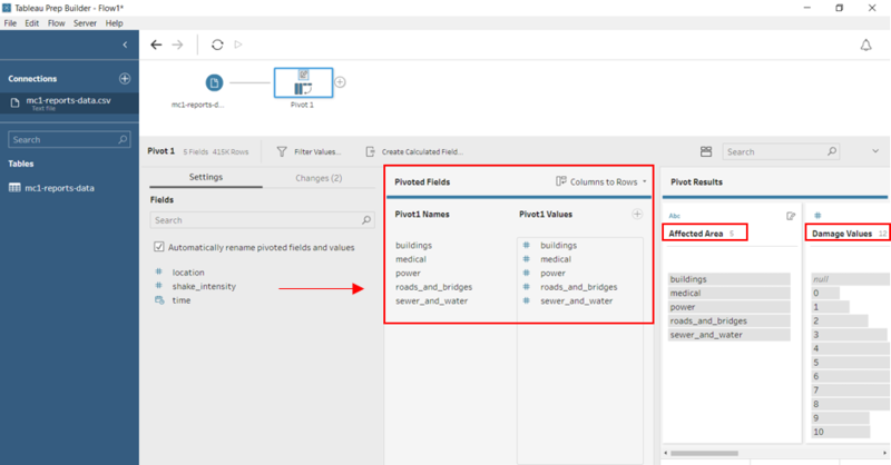
| Solution | The resolution to the above-mentioned issues is to pivot the columns using Tableau Prep Builder. By pivoting the columns, it makes the data easy to use and it allows users to easily analyse data, summarize data and find patterns in data.
1. Open Tableau Prep Builder and drag the data file – ‘mc1-reports-data’ into Tableau Prep Builder. 2. To pivot the columns, click on the ‘+’ sign and select ‘Add Pivot’
|
| Problem #2 | Insufficient information - Damage Scale |
|---|---|
| Issue | All reports collected from citizens on the ground are recorded on a scale from 1 to 10 depending on how bad the damage is. Hence, it is hard for us to visualize numbers. All we know is that 0 represents the lowest damage and 10 represents the highest damage. However, the numbers 1 to 9 are not defined. This may cause misinterpretation of the data, leading to an inaccurate result. This is an important issue that must be handled because the visualization is used by various emergency responders and they may analyse the results differently. |
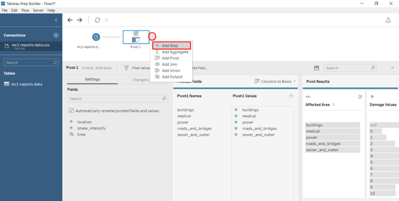
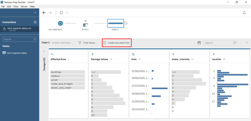
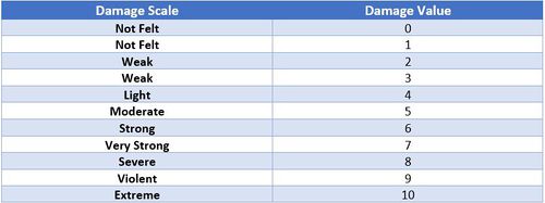
| Solution | Create a Calculated Field to map the ‘Damage Value’ to a new field – ‘Damage Scale’ which is an ordinal scale. The scale is taken from the majorquake-shakemap.png.
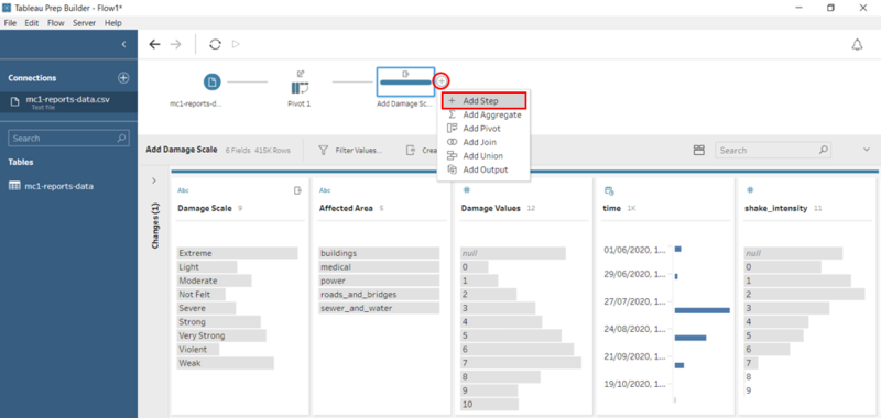
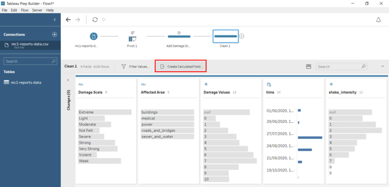
1. To create a calculated field, click on the ‘+’ sign and select ‘Add Step’.
IF([Damage Values]==0) THEN "Not Felt"
|
| Problem #3 | Insufficient Information - Location Name |
|---|---|
| Issue | Currently, the data only consists of a location field that is in a numerical format (1 to 19). As such, we are unable to identify the region of the city based on the location data given. Hence, it is important that we include the location name to the visualization so that it is clearer and well represented. |
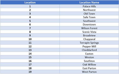
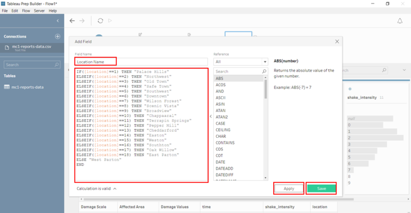
| Solution | Create a Calculated Field to map the ‘Location’ to a new field – ‘Location Name’ . The location name is taken from the StHimarkLabeledMap.png in MC2
1. To create a calculated field, click on the ‘+’ sign and select ‘Add Step’.
IF([location]==1) THEN "Palace Hills"
|
After solving the 3 problems above, we are done with the data transformation process. To download the data:
1. Click on the ‘+’ sign and select ‘Add Output’.
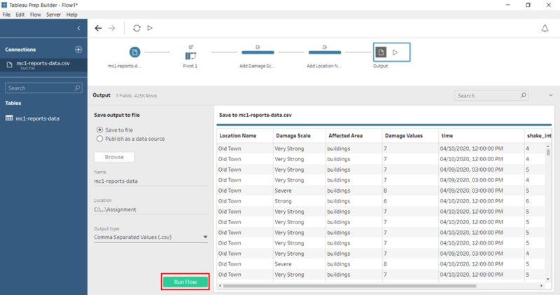
2. Enter the name of data file – ‘mc1-reports-data’, select location and output type – ‘Comma Separated Values (.csv) and click on the ‘Run Flow’ button.
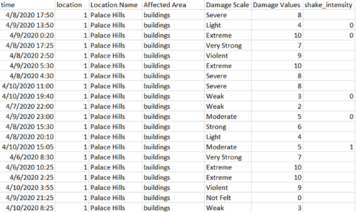
The final data file should look like this. As you can see, we have successfully pivoted the 5 columns to 2 columns – ‘Affected Area’ and ‘Damage Values’. Also, the new columns – ‘Location Name’ and ‘Damage Scale’ is added to the data file.
Dataset Import Structure and Process
After preparing the data using Tableau Prep Builder, the following files must be imported into Tableau for analysis. The data file (output from Tableau Prep Builder) and the SHP file must be added in Tableau before we create the interactive visualization.
The data file and SHP file are added as a data source in Tableau. To add the SHP file, select the Spatial file and select the SHP file. The relationships defined between the data file and the SHP file is the Id (in SHP file) and Location (in mc1-reports-data.csv) and perform a left join between Id and Location. This will allow analysis to be conducted across all the data sources at any one point.
Interactive Visualization/Dashboard Design
The interactive visualization can be accessed here: xxx
The size of the interactive visualization is set to automatic. This means that the dashboard will resize to fit any screen it is displayed on.
Throughout all the interactive visualization, navigation buttons are provided at the top to help users navigate through the different dashboards. Moreover, filters and actions are included in the visualization to allow users to efficiently analyse and gather insights with much ease. The following interactivity elements are used throughout the dashboards:
The following sections elaborate on other interactivity techniques are integrated into each of the individual dashboards.
The breakdown of the visualization is as follows:
- Overview of the damage Report
- Uncertainty in the report by citizens
- Changes in damage over time
Home Dashboard
A homepage is created with 3 main categories in mind:
- Damage Reports: Damage Reports by citizens on the ground
- Uncertainty: Uncertainty in data and reliability of reports
- Changes overtime: Changes in conditions (damage and shake intensity) overtime
Each of these categories are further broken down into its respective sub-categories for the ease of users to perform their analysis. As such, users can select any of the above categories to gather valuable patterns and insights.
| Insights | Visualization |
|---|---|
Observations and Insights
Using the interactive visualization as a platform for reporting and analysis, the following aims to provide answers to the questions posed.
Question 1
How responses of emergency responders should change.
xxx
Prioritizing neighborhoods based on responses.
xxx
Regions that experience the hardest hit.
xxx
Question 2
Reliability of neighborhood reports.
xxx
Question 3
Changes in Reports over time.
xxx
Changes in Damage over time.
xxx
Changes in Shake Intensity over time.
xxx
