Difference between revisions of "Answers"
| Line 57: | Line 57: | ||
==Question 2== | ==Question 2== | ||
| + | <b>Use visual analytics to represent and analyze uncertainty in the measurement of radiation across the city. </b><br> | ||
| + | <b>a. Compare uncertainty of the static sensors to the mobile sensors. What anomalies can you see? Are there sensors that are too uncertain to trust?</b> | ||
| + | |||
| + | [[File:Qns2-1.png|frameless]] | ||
| + | <br> | ||
| + | |||
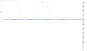
| + | As seen above, On the 9th of April, there is an outlier sensor id that has a value of 57,345 at 02:00 belonging to M12 while the rest are below 3K. This shows sensor id M12 may not be reliable. | ||
| + | |||
| + | Most times, the mobile sensor show different patterns as compared to the static sensors whereby they fluctuate much more. One example can be seen from the Broadview. As seen from the graph, the mobile sensors and static sensors spike at different timings. | ||
| + | |||
| + | [[File:Qns2-2.png|frameless]] | ||
| + | <br> | ||
| + | On the 6th, the static sensors showed that the average radiation readings at 5:12PM is above the normal radiation level, hitting 106.1cpm while the mobile sensor readings showed the average readings was 15.4cpm only, below the normal radiation level. | ||
| + | |||
| + | [[File:Qns2-3.png|frameless]] <br> | ||
| + | [[File:Qns2-4.png|frameless]] | ||
| + | <br> | ||
| + | Another example can be seen on the 7th of April. The mobile sensors readings spiked at 2:20pm with a value of 127.6cpm while the static sensor reading is only 14.6cpm. | ||
| + | |||
| + | <b>b. Which regions of the city have greater uncertainty of radiation measurement? Use visual analytics to explain your rationale.<b> | ||
Revision as of 16:07, 12 October 2019
St. Himark Radiation Analysis
|
|
|
|
|
Analysis
Question 1
Visualize radiation measurements over time from both static and mobile sensors to identify areas where radiation over background is detected. Characterize changes over time.
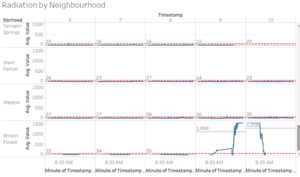
The chart above shows the average radiation of the mobile sensors (blue line) and static sensors (yellow line) by Neighbourhood. The red line is the 75cpm mark whereby any value beyond that point is abnormal.
As seen from above, from the 9th to 10th, Wilson Forest has spike in the radiation readings with an average value of 1093cpm on the 9th and 1258cpm on the 10th while the rest are under 54 and 72 on the 9th and 10th respectively.

As the readings for Wilson Forest is very high on the 9th and the 10th, I decided to uncheck Wilson Forest to further analyse the other days.
For the analysis above, sensor id M12 has been filtered out (explained in Question 2).
Even though the average reading on the 6th of April are below 75cpm, there are certain spikes in certain neighbourhoods such as Broadview, Chapparal and Palace Hills etc.
Similarly, on the 7th of April, there are also a few peaks at certain neighbourhoods such as Broadview and Chapparal whereby they exceed 75cpm.
The more extreme readings can be seen on the 8th of April in Old Town whereby the mobile sensor readings spiked to 264.4, which the readings were above 75cpm from 5:30PM to 9:30PM.
Also, in Safe Town, there was a spike to 193.2CPM, which the readings were above 75cpm 1:20PM to 4:30PM. Apart from those towns, more towns have a radiation level exceeding 75cpm at certain timings.

In this analysis, I excluded Wilson Forest as there was a contrasting difference in the readings which will be explained in part 2 later.
From the 6th to the 7th, there is not much difference in the level of the radiation level, with a maximum of 15.4% increase in the average radiation level in Terrapin Springs. From the 7th to the 8th, there is a visible increase in the radiation level in old town whereby it increased by 118.5%.
Question 2
Use visual analytics to represent and analyze uncertainty in the measurement of radiation across the city.
a. Compare uncertainty of the static sensors to the mobile sensors. What anomalies can you see? Are there sensors that are too uncertain to trust?
As seen above, On the 9th of April, there is an outlier sensor id that has a value of 57,345 at 02:00 belonging to M12 while the rest are below 3K. This shows sensor id M12 may not be reliable.
Most times, the mobile sensor show different patterns as compared to the static sensors whereby they fluctuate much more. One example can be seen from the Broadview. As seen from the graph, the mobile sensors and static sensors spike at different timings.
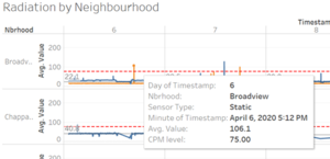
On the 6th, the static sensors showed that the average radiation readings at 5:12PM is above the normal radiation level, hitting 106.1cpm while the mobile sensor readings showed the average readings was 15.4cpm only, below the normal radiation level.
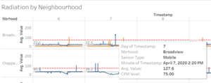
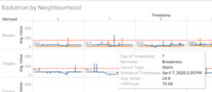
Another example can be seen on the 7th of April. The mobile sensors readings spiked at 2:20pm with a value of 127.6cpm while the static sensor reading is only 14.6cpm.
b. Which regions of the city have greater uncertainty of radiation measurement? Use visual analytics to explain your rationale.
