Difference between revisions of "IS428-AY2019-20T1 Group01-Proposal"
| Line 41: | Line 41: | ||
| | | | ||
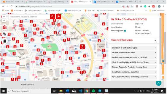
<center><br/> '''Title: HDB One Map''' | <center><br/> '''Title: HDB One Map''' | ||
| − | [[File:Onemap.png| | + | [[File:Onemap.png|150px|frame|center]] |
Source: https://services2.hdb.gov.sg/web/fi10/emap.html | Source: https://services2.hdb.gov.sg/web/fi10/emap.html | ||
</center> | </center> | ||
| Line 51: | Line 51: | ||
|- | |- | ||
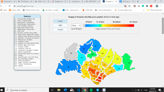
| <center><br/> '''Title: SRX Heat Map''' | | <center><br/> '''Title: SRX Heat Map''' | ||
| − | [[File:SRX Heatmap.png| | + | [[File:SRX Heatmap.png|150px|frame|center]] |
Source: https://www.srx.com.sg/heat-map | Source: https://www.srx.com.sg/heat-map | ||
</center> | </center> | ||
| Line 61: | Line 61: | ||
|- | |- | ||
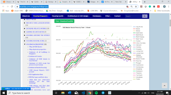
| <center><br/> '''Title: Line Chart''' | | <center><br/> '''Title: Line Chart''' | ||
| − | [[File:Linegraph.png| | + | [[File:Linegraph.png|150px|frame|center]] |
Source: https://www.teoalida.com/singapore/hdbprices/ | Source: https://www.teoalida.com/singapore/hdbprices/ | ||
</center> | </center> | ||
| Line 69: | Line 69: | ||
|- | |- | ||
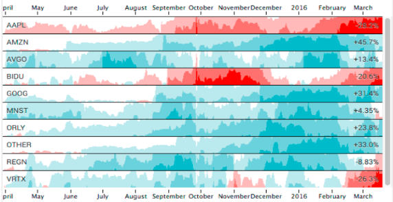
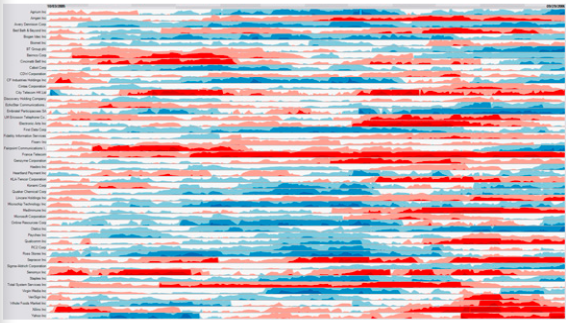
|<center><br/> '''Title: Horizon Chart''' | |<center><br/> '''Title: Horizon Chart''' | ||
| − | [[File:Horizon.png| | + | [[File:Horizon.png|150px|frame|center]] |
Source: https://flowingdata.com/2015/07/02/changing-price-of-food-items-and-horizon-graphs/ | Source: https://flowingdata.com/2015/07/02/changing-price-of-food-items-and-horizon-graphs/ | ||
</center> | </center> | ||
| Line 80: | Line 80: | ||
|- | |- | ||
|<center><br/> '''Title: Horizon Chart''' | |<center><br/> '''Title: Horizon Chart''' | ||
| − | [[File:Horizon1.png| | + | [[File:Horizon1.png|150px|frame|center]] |
Source: https://www.perceptualedge.com/blog/?p=390 | Source: https://www.perceptualedge.com/blog/?p=390 | ||
</center> | </center> | ||
| Line 89: | Line 89: | ||
|- | |- | ||
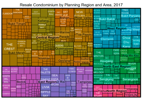
| <center><br/> '''Title: TreeMap''' | | <center><br/> '''Title: TreeMap''' | ||
| − | [[File:Treemap Resale.png| | + | [[File:Treemap Resale.png|150px|frame|center]] |
Source: http://rpubs.com/tskam/treemap | Source: http://rpubs.com/tskam/treemap | ||
</center> | </center> | ||
| Line 97: | Line 97: | ||
|- | |- | ||
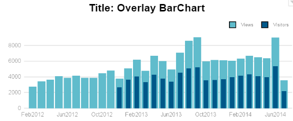
|<center><br/> '''Title: Overlay BarChart''' | |<center><br/> '''Title: Overlay BarChart''' | ||
| − | [[File:OverlayBarchart.png| | + | [[File:OverlayBarchart.png|150px|frame|center]] |
Source: https://blogs.sas.com/content/graphicallyspeaking/2014/07/27/overlay-bar-charts/ | Source: https://blogs.sas.com/content/graphicallyspeaking/2014/07/27/overlay-bar-charts/ | ||
</center> | </center> | ||
| Line 113: | Line 113: | ||
| Example || Example | | Example || Example | ||
|- | |- | ||
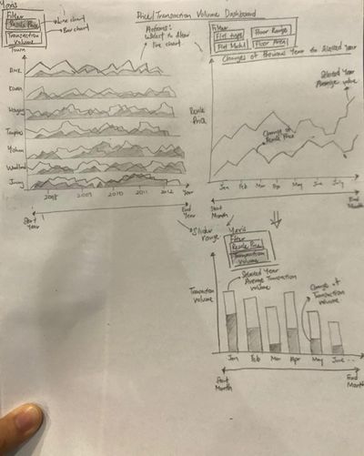
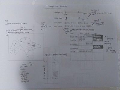
| − | | '''Dashboard 2: Price/Transaction Volume Dashboard''' | + | | |
| − | [[File:Dashboard 2.jpg|thumb| | + | <center><br/> '''Dashboard 2: Price/Transaction Volume Dashboard''' |
| + | [[File:Dashboard 2.jpg|thumb|400px|center]] | ||
| + | </center> | ||
|| | || | ||
* A horizon Chart to show the Resale Prices or Transaction Volumes by Towns. | * A horizon Chart to show the Resale Prices or Transaction Volumes by Towns. | ||
| Line 120: | Line 122: | ||
* When filtered by Transaction Volume, it will show the absolute Transaction Volume of the selected town and changes of transaction volume from the previous year to the current year. | * When filtered by Transaction Volume, it will show the absolute Transaction Volume of the selected town and changes of transaction volume from the previous year to the current year. | ||
|- | |- | ||
| − | | '''Dashboard 3: Past HDB Resale Transactions''' | + | | |
| − | [[File:Dashboard3.jpg|thumb| | + | <center><br/>'''Dashboard 3: Past HDB Resale Transactions''' |
| + | [[File:Dashboard3.jpg|thumb|400px|center]] | ||
| + | </center> | ||
|| | || | ||
* The user will apply filters on the price range, lease year, flat type and flat model | * The user will apply filters on the price range, lease year, flat type and flat model | ||
Revision as of 00:17, 11 October 2019
Contents
Problem Statement
Problem: Our team has identified a lack of information on HDB resale flats for homebuyers who want to understand and make decisions on the type of HDB flat to buy based on past transaction trends.
Motivation: With the increasing demand for housing, there is a need for homeowners to have a better understanding over the flats they are purchasing. Hence, there is a need to analyse the resale prices and transaction volume of the flats.
Objectives
Selected Data Sets
| Dataset/Source | Data Attributes | Rationale of Usage |
|---|---|---|
| HDB Resale Flat Prices |
|
To gain information on the HDB procurement over the years such as:
|
Background Survey of Related Work
| Reference of Other Interactive Visualization | What we Learnt |
|---|---|
|
Title: HDB One Map |
|
Title: SRX Heat Map Source: https://www.srx.com.sg/heat-map |
|
Title: Line Chart |
|
Title: Horizon Chart Source: https://flowingdata.com/2015/07/02/changing-price-of-food-items-and-horizon-graphs/ |
|
Title: Horizon Chart |
|
Title: TreeMap Source: http://rpubs.com/tskam/treemap |
|
Title: Overlay BarChart Source: https://blogs.sas.com/content/graphicallyspeaking/2014/07/27/overlay-bar-charts/ |
|
Proposed Dashboard
Our group has proposed the following storyboard in our Visual Application:
| Dashboards | Rational |
|---|---|
| Example | Example |
|
Dashboard 2: Price/Transaction Volume Dashboard |
|
|
Dashboard 3: Past HDB Resale Transactions |
|
