|
|
| (6 intermediate revisions by the same user not shown) |
| Line 24: |
Line 24: |
| | | | |
| | |} | | |} |
| | + | ==Data used for Mini Challenge 1== |
| | + | *mc1-reports-data.csv |
| | + | *StHimark.shp |
| | | | |
| − | == Q1: Emergency responders will base their initial response on the earthquake shake map. Use visual analytics to determine how their response should change based on damage reports from citizens on the ground. How would you prioritize neighborhoods for response? Which parts of the city are hardest hit? == | + | ==Pivoting for categories== |
| | + | ===Issue=== |
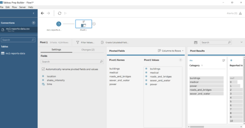
| | + | The categories are represented in columns, which is difficult when performing the filters and charts in tableau. |
| | | | |
| − | ===Earthquake events=== | + | ===Solution=== |
| | | | |
| − | <div><center><ul>
| + | Using Tableau prep to perform the pivoting of categories - Medical, Power, Road And Bridges, Sewer & Water and shake intensity - into a column called "Category" and "Reported intensity" for the value. |
| − | <li style="display: inline-block;" id="F11"> [[File:Ronald.Lay.2017_Reported_Intensity_Reading.png|thumb|none|500px|''Figure 1.1 - Overall intensity readings over time period'']] </li>
| |
| − | </ul></center></div>
| |
| − | | |
| − | Figure 1.1 presents a scatter plot chart with timeline of damaged reports. Based on figure 1.1, there are meaningful insights which are divided into 3 key events as followed:
| |
| − | | |
| − | ====Pre-Earthquake====
| |
| − | The pre-earthquake has noticeable pattern on Monday afternoon at 14.30. Despite relatively low damage and shake intensity, it has significant number of damage reports represented by the large size of the dot and the highest damage report belongs to building represented by blue dot. It has intensity between 2 and 3.
| |
| − | ====Major Earthquake====
| |
| − | Major earthquake commences on 8.30 AM. The highest damage report as followed:
| |
| − | | |
| − | {| class="wikitable"
| |
| − | |-
| |
| − | ! style="font-weight: bold;background: #536a87;color:#fbfcfd;" | Category
| |
| − | ! style="font-weight: bold;background: #536a87;color:#fbfcfd;" | Colour
| |
| − | ! style="font-weight: bold;background: #536a87;color:#fbfcfd;" | Intensity level
| |
| − | | |
| − | |-
| |
| − | | <center>'''Power'''</center>
| |
| − | || <center>Red</center>
| |
| − | || <center>5.5 - 8</center>
| |
| − | | |
| − | |-
| |
| − | | <center>'''Roads and Bridges'''</center>
| |
| − | || <center>Cyan</center>
| |
| − | || <center>5 - 7</center>
| |
| − | | |
| − | |-
| |
| − | | <center>'''Sewer and water'''</center>
| |
| − | || <center>Green</center>
| |
| − | || <center>4.5 - 7</center>
| |
| − | | |
| − | |-
| |
| − | | <center>'''Building'''</center>
| |
| − | || <center>Blue</center>
| |
| − | || <center>4 - 5</center>
| |
| − | | |
| − | |-
| |
| − | | <center>'''Medical'''</center>
| |
| − | || <center>Orange</center>
| |
| − | || <center>3 - 6</center>
| |
| − | |}
| |
| − | All categories experience significant damage reports, particularly <b>Power</b> experiences the most damage. Later on, power outage is the root cause of reporting reliability issues, which will be discussed on Question 2.
| |
| − | | |
| − | ====Post Earthquake====
| |
| − | {| class="wikitable"
| |
| − | |-
| |
| − | ! style="font-weight: bold;background: #536a87;color:#fbfcfd;" | Category
| |
| − | ! style="font-weight: bold;background: #536a87;color:#fbfcfd;" | Colour
| |
| − | ! style="font-weight: bold;background: #536a87;color:#fbfcfd;" | Intensity level
| |
| − | | |
| − | |-
| |
| − | | <center>'''Sewer and water'''</center>
| |
| − | || <center>Green</center>
| |
| − | || <center>4.5 - 7.5</center>
| |
| − | | |
| − | |-
| |
| − | | <center>'''Roads and Bridges'''</center>
| |
| − | || <center>Cyan</center>
| |
| − | || <center>4 - 7</center>
| |
| − | | |
| − | |-
| |
| − | | <center>'''Power'''</center>
| |
| − | || <center>Red</center>
| |
| − | || <center>3.5 - 6</center>
| |
| − | | |
| − | |-
| |
| − | | <center>'''Building'''</center>
| |
| − | || <center>Blue</center>
| |
| − | || <center>3.5 - 5.5</center>
| |
| − | | |
| − | |-
| |
| − | | <center>'''Medical'''</center>
| |
| − | || <center>Orange</center>
| |
| − | || <center>2.5 - 5</center>
| |
| − | | |
| − | |}
| |
| − | | |
| − | Another challenge is presented to St. Himark as another earthquake occurs after a major earthquake on Thursday afternoon at 3 PM. <b>Sewer and water</b> has the most significant damage report as indicated by the highest intensity level range in the table. This poses a challenge to public health as spoiled sewer and contaminated water will give birth to disease-cause germs to spread around the town. Although the intensity is not as great as major earthquake, <b>Road & Bridges</b> and <b>Power</b> still experience damage to a certain extent, which contribute to reliability issues as discussed later on Question 2.
| |
| − | | |
| − | ===Hardest-hit region===
| |
| − | <div><center><ul>
| |
| − | <li style="display: inline-block;" id="F21"> [[File:Ronald.Lay.2017_Damage_Report_By_Neighbourhoods.png|thumb|none|500px|''Figure 1.2 - Damage Reports By Neighborhoods'']] </li>
| |
| − | </ul></center></div>
| |
| − | <p></p>
| |
| − | Box-and-Whisker plot provides an overview on which region is hardest-hit based on the <b>Highest & Lowest observation</b> and <b>median</b>.
| |
| − | *Highest and lowest observation: To determine how high/low the level of intensity is on each region
| |
| − | *Median: How centered the value is.
| |
| − | For comparison purpose, let's use Old Town and SouthWest to view the damage reports between two towns.
| |
| − | <div><center><ul>
| |
| − | <li style="display: inline-block;" id="F21"> [[File:Ronald.Lay.2017_Comparison_Nbrhood.png|thumb|none|500px|''Figure 1.3 - Comparison of intensity between Old Town and Pepper Mill'']] </li>
| |
| − | </ul></center></div>
| |
| − | | |
| − | <p>Based on the comparison, the box-and-whisker plot shows Old Town has significantly higher intensity value of Highest and lowest observation than Southwest as well as higher median value; Hence, Old town experiences significantly more damage from Earthquake as compared to Southwest</p>
| |
| − | | |
| − | <p>To conclude, the hardest-hit regions are <b>Old Town, Scenic Vista, Broadview and Chapparal</b>(Criteria: Lowest observation is higher than median of 4.532)</p>
| |
| − | <p>Note: Wilson forest is excluded from the list despite fulfilling the criteria as there is no indication of dots, which signifies lacks of records to provide sufficient evidence that it experiences high level of intensity</p>
| |
| | | | |
| − | ===Prioritization=== | + | [[File:Pivoting.png|500px|thumb|center]] |
| | + | ==Binning of different intensity level== |
| | + | ===Issue=== |
| | + | The raw data contains categorical data represented by number. However, number representation provides an unclear definition of how each value is perceived by the users. |
| | + | ===Solution=== |
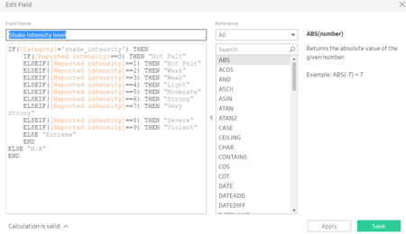
| | + | To standardize the definition, visual binning is performed by aligning the intensity value with instrumental intensity into a number of distinct categories. |
| | + | [[File:Ronald.Lay.2017_Instrumental_Intensity.PNG|500px|thumb|center]] |
| | + | Follow the 2-step process |
| | + | <center><strong>2 steps process</strong></center> |
| | <div><center><ul> | | <div><center><ul> |
| − | <li style="display: inline-block;" id="F21"> [[File:Ronald.Lay.2017_Prioritisation.PNG|thumb|none|500px|''Figure 1.4 - Prioritization for each category'']] </li> | + | <li style="display: inline-block;" id="F23"> [[File:Ronald.Lay.2017_Create_Calcul.PNG|thumb|center|450px]] </li> |
| | + | <li style="display: inline-block;" id="F24"> [[File:Ronald.Lay.2017_Shake_Category.PNG|thumb|center|450px]] </li> |
| | </ul></center></div> | | </ul></center></div> |
| | + | </ul> |
| | + | The output is generated below |
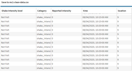
| | + | <center>mc1-clean-data</center> |
| | + | [[File:Ronald.Lay.2017_Output.PNG|thumb|center|450px]] |
| | | | |
| − | For each region, its priority varies greatly across neighborhoods. For instance, It is reported from Old town indicating power damage is very severe as compared to the rest of the categories; hence, the priority will be to fix the power damage for Old town.
| |
| − |
| |
| − | ===Summary===
| |
| − | *Majority of neighborhoods suffer <b> power outages </b>, which can be explained by huge red dots.
| |
| − | *<b>Sewer and Water</b> are found to have significant damage in Broadway, Chapparal, Terrapin Springs, Southon, Northon, Easton
| |
| − | *<b>Roads and Bridges</b> are found to have significant damage in Old town, Scenic Vista and Broadway.
| |
| − | *<b>Building</b> are found to have significant damage in Broadview, East Parton, Easton, Palace Hills and Scenic Vista
| |
| − | *<b>Medical</b> are found to have significant damage in Broadview, Scenic Vista, Chapparal, Terrapin Springs, Pepper Mill, Weston, Northon, West Parton.
| |
| − | *Combining 3 key events (Pre, Major, Post earthquake), <b> Power, Sewer & Water and Road & Bridges </b> have experience more damages, which should be prioritized first.
| |
| − | *<b> Downtown, Weston and West Parton </b> are not hugely impacted by the Earthquake, particularly for Downtown. The always Safe Nuclear plant is located on Downtown area and any damages to the nuclear plant poses a huge health threat to the citizens living there
| |
| − |
| |
| − | == Q2: Use visual analytics to show uncertainty in the data. Compare the reliability of neighborhood reports. Which neighborhoods are providing reliable reports? Provide a rationale for your response. ==
| |
| − |
| |
| − | ===Missing reports among neighborhoods===
| |
| | | | |
| − | <center><strong>Measure reliability among neighborhoods</strong></center>
| + | ==Importing data== |
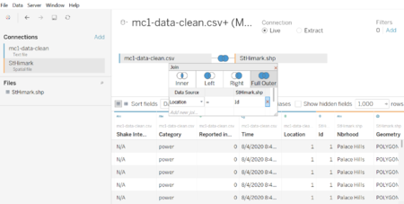
| − | | + | This is the overall picture of importing data process. Mc1-data-clean is merged with stHimark.shp using location and id as common attribute. |
| − | <div><center><ul>
| + | [[File:Ronald.Lay.2017_Overall_Process.PNG|thumb|center|450px]] |
| − | <li style="display: inline-block;" id="F21"> [[File:Ronald.Lay.2017_Reliability_Among_Neighbourhoods.PNG|thumb|none|500px|''Figure 2.1 - Overall intensity readings over time period'']] </li>
| |
| − | </ul></center></div>
| |
| − | | |
| − | Based on Figure 2.1, there are 3 key analysis:
| |
| − | * <b>Downtown, Northwest and Weston </b> provide the most reliable reports among all the neighborhoods
| |
| − | * <b>Wilson Forest</b> provides the least reliable reports. Possible explanation could be Wilson Forest may experience power outage even before the major earthquake happens. However, there is no ongoing repair under Power current project.
| |
| − | * As highlighted in oval red, there are occasional periods where there are simply no reports. The possible cause may point to power/server outages
| |
| − | ===Delayed reports===
| |
| − | <center><strong>Overall Delayed reports</strong></center>
| |
| − | <div><center><ul>
| |
| − | <li style="display: inline-block;" id="F22"> [[File:Ronald.Lay.2017_Delayed_Report.PNG|thumb|none|500px|''Figure 2.2 - Delayed reporting'']] </li>
| |
| − | </ul></center></div>
| |
| − | Power outages and other infrastructural problem result in delayed reports (Indicated by red ovals) and the server does not process the information until the power is restored. The explanation of number annotation is as followed: <br/>
| |
| − | *<p><b>1 & 2</b>: It is noticeable the reported damage is on different timing. The timestamp is only recorded when the power is restored, resulting in an increase of the amount of damage reports from Thursday 3 to 5 PM due to accumulation of reports over the period of power outages. </p>
| |
| − | | |
| − | <center><strong>Delayed reports by neighbourhood</strong></center>
| |
| − | <div><center><ul>
| |
| − | <li style="display: inline-block;" id="F23"> [[File:Ronald.Lay.2017_Delayed_Report_Per_Neighbour.PNG|thumb|none|450px|''Figure 2.3 - Delayed reporting per neighbour'']] </li>
| |
| − | <li style="display: inline-block;" id="F24"> [[File:Ronald.Lay.2017_Medical_Report_Per_Neighbour.png|thumb|none|450px|''Figure 2.4 - Medical reporting per neighbour'']] </li>
| |
| − | </ul></center></div>
| |
| − | Based on the Figure 2.3, the highlighted red box shows there is indeed a sudden increase in number of reports posted on the server at the same time. Most of the neighbors are affected at some point of time, particularly <b>Broadview, Chapparal, Old Town and Scenic Vista</b> are the most vulnerable. <br/>
| |
| − | Using filter function to include only medical, the discovery led us to Figure 2.4, which shows 2 key analysis: <br/>
| |
| − | *The medical reports are mostly available between <b>8th at 8 PM to 11 PM and 9th at 3 PM to 7 PM</b> for most of the neighborhoods.
| |
| − | *<b>Cheddarford, Wilson Forest and Chapparal</b> have the most amount of low density and missing reports across all the dates.
| |
| − | | |
| − | | |
| − | <center><strong>Variation on reported intensity and number of reports</strong></center>
| |
| − | <div><center><ul>
| |
| − | <li style="display: inline-block;" id="F25"> [[File:Ronald.Lay.2017_Variation_Among_Cateogries.PNG|thumb|none|500px|''Figure 2.5 - number of reports vs reported intensity'']] </li>
| |
| − | </ul></center></div>
| |
| − | | |
| − | Based on figure 2.5, The reported intensity is highly varied across categories, which indicates there is a varying response among all the records and particularly medical is vulnerable to the reliability issue. It suggests the submitted records by the devices are of a little help in assessing damages over time as it only records in 5 minutes batch and as discussed earlier, power outages and other infrastructural damages highly impact the accuracy of intensity readings at a specific time. Hence, it is necessary for monitoring tools to monitor and record intensity every second and the zero downtime deployment of server.
| |
| − | | |
| − | == Q3: How do conditions change over time? How does uncertainty in data change over time? Describe the key changes you see. ==
| |
| − | ===1. Discrepancy in reported and shake intensity===
| |
| − | <center><strong>Damage intensity versus Shake Intensity (Yellow line)</strong></center>
| |
| − | <div><center><ul>
| |
| − | <li style="display: inline-block;" id="F31"> [[File:Ronald.Lay.2017_Damage_report_vs_shake_intensity.PNG|thumb|none|500px|''Figure 3.1 - Damage report vs shake intensity'']] </li>
| |
| − | </ul></center></div>
| |
| − | | |
| − | Based on MC1 Data description, all the intensity are reported by people of St. Himark. However, there is a discrepancy between reported damage intensity and shake intensity, which leads to 2 possibilites: <br/>
| |
| − | * The reading of shake intensity can possibly be based on seismic monitor. It is explained by less variation on shake intensity (Refer to Figure 2.6) and significantly lower number of reports as seismic monitor or similar tools only reports to the server when they detect vibrations/shakes
| |
| − | * There is a difference in perceived feeling and actual view of damage. Based on figure 3.1, we can draw an insight that the actual view has more impact on our judgement, which can be explained by higher reported damage intensity.
| |
| − | | |
| − | ===2. Missing reports in Wilson Forest===
| |
| − | Referring to Figure 2.1, Wilson Forest provides the least reliable reports due to many missing reports over time and possible factors include power outages and other infrastructural damage that breaks electrical distribution system to Wilson Forest. Based on St. Himark report, there is an ongoing project of Wilson Forest Highway which could potentially impact the electrical distribution system and more evidences are needed to prove. Another uncertainty is before and the major earthquake happens, there is little amount of damage reports recorded to the server; hence, more exploration needs to be done
| |
| − | | |
| − | ===3. Blackout Period===
| |
| − | <center><strong>Damage intensity versus Shake Intensity (Yellow line)</strong></center>
| |
| − | <div><center><ul>
| |
| − | <li style="display: inline-block;" id="F31"> [[File:Ronald.Lay.2017_Reported_Blackout.png|thumb|none|500px|''Figure 3.2 - Blackout period'']] </li>
| |
| − | </ul></center></div>
| |
| | | | |
| − | *There is no live report and it is possible the condition could have changed during the blackout period (Higlighted with red ovals)
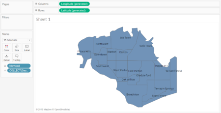
| + | A map is successfully loaded into tableau |
| − | *It is difficult to detect a new damage report and previously damage reports reported during certain blackout period. As such, there is an uncertainty in using the damage reports to indicate a temporal change as provided in figure 2.2 and 2.3
| + | [[File:Ronald.Lay.2017_Map.PNG|thumb|center|450px]] |
