Difference between revisions of "IS428-AY2019-20T1 HDBViz-Proposal"
Jwteng.2017 (talk | contribs) |
Jwteng.2017 (talk | contribs) |
||
| (16 intermediate revisions by 2 users not shown) | |||
| Line 1: | Line 1: | ||
| + | [[File:hdbviz-final.png|300px|center|frameless]] | ||
| + | <!--Header--> | ||
| + | <br/> | ||
| + | <div style="width:100%; text-align:center;"> | ||
| + | {|style="background-color:#143c67; color:#4d79ff; padding: 10 0 10 0;" width="100%" cellspacing="0" cellpadding="0" valign="top" border="0" | | ||
| + | <div style="width:100%; text-align:center;"> | ||
| + | | style="background:none;" width="1%" | | ||
| + | | style="padding:0.2em; font-size:100%; background-color:#143c67; border-bottom:0px solid #3D9DD7; text-align:center; color:#F5F5F5" width="10%" | | ||
| + | [[IS428-AY2019-20T1 HDBViz-Proposal|<font color="#F5F5F5" size=3 face="Helvetica">Proposal</font>]] | ||
| + | |||
| + | | style="background:none;" width="1%" | | ||
| + | | style="padding:0.2em; font-size:100%; background-color:#143c67; border-bottom:0px solid #3D9DD7; text-align:center; color:#F5F5F5" width="10%" | | ||
| + | [[IS428-AY2019-20T1 HDBViz-Poster|<font color="#F5F5F5" size=3 face="Helvetica">Poster</font>]] | ||
| + | |||
| + | | style="background:none;" width="1%" | | ||
| + | | style="padding:0.2em; font-size:100%; background-color:#143c67; border-bottom:0px solid #3D9DD7; text-align:center; color:#F5F5F5" width="10%" | | ||
| + | [[IS428-AY2019-20T1 HDBViz-Application|<font color="#F5F5F5" size=3 face="Helvetica">Application</font>]] | ||
| + | |||
| + | | style="background:none;" width="1%" | | ||
| + | | style="padding:0.2em; font-size:100%; background-color:#143c67; border-bottom:0px solid #3D9DD7; text-align:center; color:#F5F5F5" width="10%" | | ||
| + | [[IS428-AY2019-20T1 HDBViz-Research Paper|<font color="#F5F5F5" size=3 face="Helvetica">Research Paper</font>]] | ||
| + | |} | ||
| + | </div> | ||
| + | <!--/Header--> | ||
| + | <br /> | ||
| + | <big> [[Project Groups|<--- Go Back to Project Groups]] </big> | ||
| + | <br /><br /> | ||
| + | |||
| + | |||
== Problem Statement == | == Problem Statement == | ||
| Line 85: | Line 114: | ||
* It makes use of colour based code to separate positive and negative values | * It makes use of colour based code to separate positive and negative values | ||
* It collapses the negative values to the positive side of the axis, taking up less space and shows the same data. | * It collapses the negative values to the positive side of the axis, taking up less space and shows the same data. | ||
| − | |||
| − | |||
| − | |||
| − | |||
| − | |||
| − | |||
| − | |||
| − | |||
| − | |||
|- | |- | ||
| <center><br/> '''Title: Tree-Map''' | | <center><br/> '''Title: Tree-Map''' | ||
| Line 180: | Line 200: | ||
</center> | </center> | ||
|} | |} | ||
| + | |||
| + | == Tools and Technologies Used == | ||
| + | <p> | ||
| + | [[File:Archi.png|900px|center]] | ||
== Milestones == | == Milestones == | ||
| − | [[File: | + | [[File:Milestone2.jpg|600px|center]] |
| − | == References == | + | == References == |
| + | http://freerangestats.info/blog/2018/05/13/nz-govt-shinyapps <br> | ||
| + | http://rpubs.com/tskam/treemap <br> | ||
| + | https://public.tableau.com/profile/yslin#!/vizhome/HDBResalePrice_OverallTrend/DB_OverviewofHDBResalePrice | ||
| + | |||
| + | == Comments == | ||
| + | {| class="wikitable" style="margin-left: auto; margin-right: auto; width: 90%; | ||
| + | |- | ||
| + | ! style="background:#B0E0E6;|Name !! style="background:#B0E0E6;|Comments | ||
| + | |- | ||
| + | | | ||
| + | Your Name | ||
| + | || | ||
| + | * Comment | ||
| + | |- | ||
| + | | | ||
| + | Your Name | ||
| + | || | ||
| + | * Comment | ||
| + | |} | ||
Latest revision as of 22:25, 19 November 2019
<--- Go Back to Project Groups
Contents
Problem Statement
Problem: Our team has identified a lack of information on HDB resale flats for home-buyers who want to understand and make decisions on the type of HDB flat to buy based on past transaction trends.
Motivation: With the increasing demand for housing, there is a need for homeowners to have a better understanding of the flats they are purchasing. Hence, there is a need to analyse the resale prices and transaction volume of the flats.
Objectives
Target: Home Buyers
In this project, we aim to create a visualization tool that helps homeowners make decisions by identifying:
- Changes of resale prices by flat types, years and month
- Value of the house based on the estate area
- Resale transaction price based on the age of the estate area (lease year)
- Identify Estates that are worth buying
Selected Data Sets
| Dataset/Source | Data Attributes | Rationale of Usage |
|---|---|---|
HDB Resale Flat Prices |
|
To gain information on the HDB procurement over the years such as:
|
Background Survey of Related Work
| Reference of Other Interactive Visualization | What we Learnt |
|---|---|
|
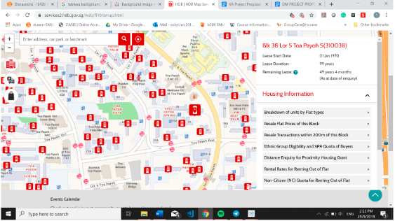
Title: HDB One Map |
|
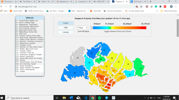
Title: SRX Heat Map Source: https://www.srx.com.sg/heat-map |
|
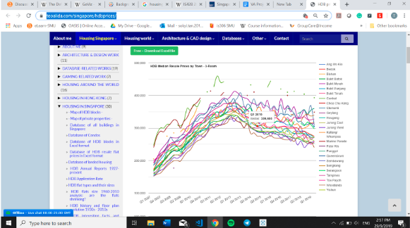
Title: Line Chart |
|
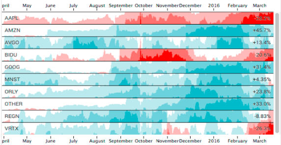
Title: Horizon Chart Source: https://flowingdata.com/2015/07/02/changing-price-of-food-items-and-horizon-graphs/ |
|
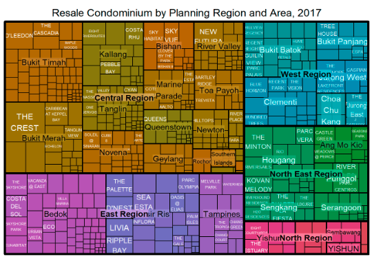
Title: Tree-Map Source: http://rpubs.com/tskam/treemap |
|
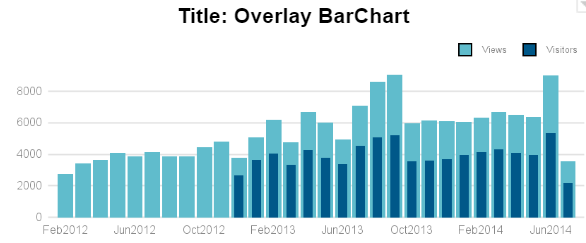
Title: Overlay BarChart Source: https://blogs.sas.com/content/graphicallyspeaking/2014/07/27/overlay-bar-charts/ |
|
Proposed Dashboard
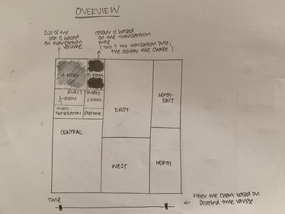
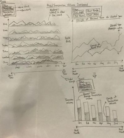
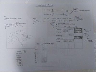
Our group has proposed the following storyboard in our Visual Application:
| Dashboards | Rationale |
|---|---|
Dashboard 1: Overview |
|
|
Dashboard 2: Price/Transaction Volume Dashboard |
|
|
Dashboard 3: Past HDB Resale Transactions |
|
Key Technical Challenges
| Challenges | Action Taken |
|---|---|
|
Unfamiliarity with R and the different packages required to build the visualizations |
Explore online resources (e.g. Rpubs) Self-learn on Data-camp |
|
Lack ideas in designing the storyboard |
Explore online resources such as Tableau Public Library to gather insights and inspirations |
|
Retrieving the coordinates for the different town required to build a map for our visualization |
Look into various projects and examples that made use of geographical mapping as reference |
Tools and Technologies Used
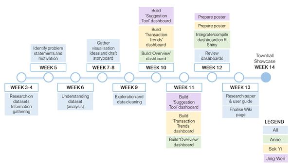
Milestones
References
http://freerangestats.info/blog/2018/05/13/nz-govt-shinyapps
http://rpubs.com/tskam/treemap
https://public.tableau.com/profile/yslin#!/vizhome/HDBResalePrice_OverallTrend/DB_OverviewofHDBResalePrice
Comments
| Name | Comments |
|---|---|
|
Your Name |
|
|
Your Name |
|
