Difference between revisions of "IS428 2019-1920 T1 Assign LeeSunho Task one"
Jump to navigation
Jump to search
(Created page with "==Taks One== <table> <table border='1'> <tr> <th>Explanation</th> <th>Visual Representation</th> </tr> <tr> <td><b> 1.Segmenting type of visitors </b> <br> description </t...") |
|||
| (16 intermediate revisions by the same user not shown) | |||
| Line 1: | Line 1: | ||
| − | ==Taks One== | + | <div style=background:#FFF5EE border:#A3BFB1> |
| + | |||
| + | <b><font size = 5.8; color="#228B22"> Take One </font></b> | ||
| + | </div> | ||
| + | |||
| + | <!--MAIN HEADER --> | ||
| + | {|style="background-color:#FFF5EE;" width="100%" cellspacing="0" cellpadding="0" valign="top" border="0" | | ||
| + | | style="font-family:Century Gothic; font-size:100%; solid #000000; background:#FFF5EE; text-align:center;" width="25%" | | ||
| + | ; | ||
| + | |||
| + | <font size="3"><font color="#8FBC8F">Emergency responders will base their initial response on the earthquake shake map. Use visual analytics to determine how their response should change based on damage reports from citizens on the ground. How would you prioritize neighborhoods for response? Which parts of the city are hardest hit? Limit your response to 1000 words and 10 images.</font></font></b> | ||
| + | |||
| + | <font color="#008000"> | ||
| + | |||
| + | hi | ||
| + | |||
| + | </font> | ||
| + | |||
| + | ==<font color="#008000">Taks One</font>== | ||
<table> | <table> | ||
<table border='1'> | <table border='1'> | ||
<tr> | <tr> | ||
| − | <th>Explanation</th> | + | <th><font color="#008000">Explanation</font></th> |
| − | <th>Visual Representation</th> | + | <th><font color="#008000">Visual Representation<font></th> |
</tr> | </tr> | ||
<tr> | <tr> | ||
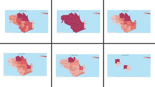
| − | <td><b> 1. | + | <td><b><font color="#008000"> 1.Cartogram </font</b> |
<br> | <br> | ||
| Line 13: | Line 31: | ||
</td> | </td> | ||
| − | <td> | + | <td> |
| − | [[File: | + | [[File:Carogram_chart.jpg|500px|center]] |
| − | |||
</tr> | </tr> | ||
<tr> | <tr> | ||
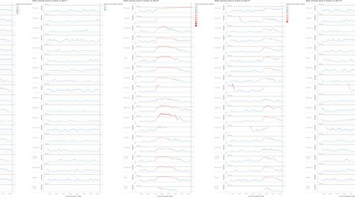
| − | <td><b> 2. | + | <td><b> <font color="#008000">2.LINE</font </b> |
| − | <br> | + | <br> |
| − | + | ||
| + | line | ||
| + | |||
</td> | </td> | ||
| − | <td>[[File: | + | <td>[[File:Line Chart question 1.jpg|500px|center]]</td> |
</tr> | </tr> | ||
<tr> | <tr> | ||
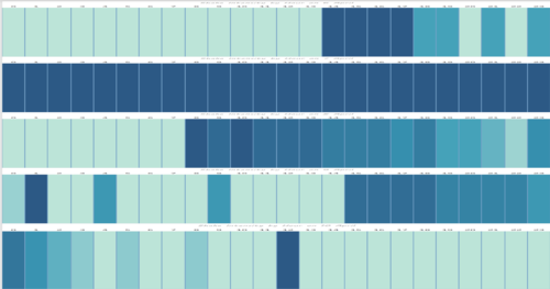
| − | <td><b> 3. | + | <td><b> <font color="#008000">3.Heat Map</font</b> |
| − | <br> | + | <br> |
| + | |||
| + | HEat | ||
<br>Two terminologies used in the analysis need to be clarified before we move on to the analysis result, paths vs sequences. | <br>Two terminologies used in the analysis need to be clarified before we move on to the analysis result, paths vs sequences. | ||
| − | <br> | + | <br> |
| + | |||
| − | |||
</td> | </td> | ||
<td> | <td> | ||
| − | + | [[File:Heatmap perday.png|500px|center]] | |
| − | |||
| − | |||
| − | [[File: | ||
</tr> | </tr> | ||
<tr> | <tr> | ||
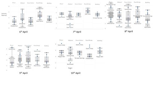
| − | <td><b> 4. | + | <td><b> <font color="#008000">4.Box" analysis </font</b> |
| − | <br> | + | <br> |
| + | |||
| + | Box | ||
| − | |||
| − | |||
</td> | </td> | ||
| − | <td>[[File: | + | <td> |
| + | [[File:Question1 boxchart.jpg|500px|center]] | ||
| + | </td> | ||
</tr> | </tr> | ||
| − | |||
| − | |||
| − | |||
| − | |||
| − | |||
</table> | </table> | ||
Latest revision as of 04:19, 12 October 2019
Take One
|
Emergency responders will base their initial response on the earthquake shake map. Use visual analytics to determine how their response should change based on damage reports from citizens on the ground. How would you prioritize neighborhoods for response? Which parts of the city are hardest hit? Limit your response to 1000 words and 10 images.
hi
Taks One
|


