Difference between revisions of "SuicideWatch: Proposal v2"
| (55 intermediate revisions by 2 users not shown) | |||
| Line 1: | Line 1: | ||
| + | <!-- Back Button--> | ||
| + | <big> [[Project Groups|<--- Back to Project Groups]] </big> | ||
| + | |||
<!--Logo--> | <!--Logo--> | ||
[[Image:Team_3_-_SuicideWatch_Logo.png|center|300px]] | [[Image:Team_3_-_SuicideWatch_Logo.png|center|300px]] | ||
| Line 30: | Line 33: | ||
<!-- Current Page --> | <!-- Current Page --> | ||
| − | | style="vertical-align:top;width:49%;" | <div style="padding: 3px; line-height: wrap_content; border-bottom:1px solid #999999;"> [[SuicideWatch: Proposal | <font color =#272d2d><b>Version | + | | style="vertical-align:top;width:49%;" | <div style="padding: 3px; line-height: wrap_content; border-bottom:1px solid #999999;"> [[SuicideWatch: Proposal | <font color =#272d2d><b>Version 1</b></font>]] |
| style="vertical-align:top;width:49%;" | <div style="padding: 3px; line-height: wrap_content; border-bottom:5px solid #000000;"><font color =#272d2d><b>Version 2</b></font> | | style="vertical-align:top;width:49%;" | <div style="padding: 3px; line-height: wrap_content; border-bottom:5px solid #000000;"><font color =#272d2d><b>Version 2</b></font> | ||
| Line 37: | Line 40: | ||
<br/> | <br/> | ||
| − | + | After further discussion and consultations with Prof. Kam, our team concluded that our initial problem statement and methodology may not be the best approach to analysing suicide data. There was insufficient evidence to draw correlations between socioeconomic factors and suicide rates, as suicide is a complex issue encompassing many factors that cannot be generalised. As such, we decided to pivot our project's direction slightly. Instead of attempting to make conclusions, we will focus on creating a visualisation that allows for exploration and comparison of suicide rates globally. | |
| − | + | <br> | |
| + | __TOC__ | ||
| + | |||
| + | <br/> | ||
| − | + | <!-- Problem and Motivation --> | |
| + | ==<div style="background: #364558; padding: 15px; font-weight: bold; line-height: 0.3em; text-indent: 0px;font-size:20px"><font face="Arial" color=#fbfcfd> PROBLEM & MOTIVATION </font></div>== | ||
| + | <p>Death by suicide is an extremely complex issue that causes pain to hundreds of thousands of people every year around the world. Close to 800 000 people die due to suicide globally every year, which is one person every 40 seconds. In Singapore, suicide is the leading cause of death for those aged 10-29. | ||
| + | <br/> | ||
| + | <p>The mortality data from the WHO suggests that the prevalence and characteristics of suicidal behavior vary widely between different communities, in different demographic groups and over time. One important source of heterogeneity, both globally and within countries, is gender: suicide rates are much higher for males, particularly in high-income countries. Interestingly in Singapore, females are more likely to be diagnosed with depression and attempt suicide, but males accounted for more than 71% of all suicides in Singapore in 2018. But are there other similarities or patterns that we can discern from the available data? Often seen as a taboo topic, suicide is a very real problem that is not talked about enough. Through our visualisation, we hope to be able to shed some light on and spur conversations on this issue. | ||
| + | <br/> | ||
| + | <!-- Objectives --> | ||
| + | ==<div style="background: #364558; padding: 15px; font-weight: bold; line-height: 0.3em; text-indent: 0px;font-size:20px"><font face="Arial" color=#fbfcfd>OBJECTIVES</font></div>== | ||
| + | <p>In this project, we are hope to create a visualization that enables the following:</p> | ||
| + | # Identify regions or countries with high/low suicide rates | ||
| + | # Visualise the relationship between Happiness Index scores and suicide rates | ||
| + | # Exploration of suicide demographics by country | ||
| + | # Comparison of suicide demographics between countries | ||
| + | # A more in-depth breakdown of Japan's suicide demographics | ||
| + | <br> | ||
| + | As mentioned, the reasons behind suicide is complex and cannot be generalised. Through our visualization we hope to show that generic measures like political stability or GDP per capita do not provide a general explanation for suicide. There are definitely many deep-seated issues or underlying cultural norms that could contribute to suicide rates as well. Ideally a further breakdown of the suicide demographics should be conducted for each country, as suicide rates within different parts of a country could vary as well. However, such data is not readily available. We managed to find detailed data on Japan's suicide rates and thought it would make for a good visualisation of the varying suicide rates within a country. Japan has long been known to have high suicide rates, posited to be an amalgamation of its aging population, overwork and even cultural glorification of suicide ("Seppuku"). As such, we decided to breakdown Japan's suicide figures across different prefectures. | ||
<br/> | <br/> | ||
| − | |||
| − | |||
| − | |||
| − | |||
| − | |||
| − | |||
| − | |||
| + | <!-- Selected Dataset --> | ||
| + | |||
| + | ==<div style="background: #364558; padding: 15px; font-weight: bold; line-height: 0.3em; text-indent: 0px; font-size:20px"><font face="Arial" color=#fbfcfd>SELECTED DATASETS</font></div>== | ||
| + | |||
| + | <!-- Table --> | ||
| + | {| class="wikitable" style="background-color:#FFFFFF;" width="100%" | ||
| + | |- | ||
| + | ! style="font-weight: bold;background: #536a87;color:#fbfcfd;width: 30%;" | Dataset/Source | ||
| + | ! style="font-weight: bold;background: #536a87;color:#fbfcfd;width: 30%" | Data Attributes | ||
| + | ! style="font-weight: bold;background: #536a87;color:#fbfcfd;" | Why this Dataset? | ||
| + | |- | ||
| + | | <center>Suicide Rates Overview (1985 to 2016)<br/> | ||
| + | (https://www.kaggle.com/russellyates88/suicide-rates-overview-1985-to-2016) </center> | ||
| + | || | ||
| + | * Suicide rate by country | ||
| + | * Suicide demography (Age/Gender) | ||
| + | * Economic data (GDP) | ||
| + | || | ||
| + | <center>This dataset will be our main source of global suicide data. | ||
| + | |- | ||
| + | | <center>World Happiness index 2019<br/> | ||
| + | (https://worldhappiness.report/ed/2019/) </center> | ||
| + | || | ||
| + | * Overall Happiness Rankings of Countries Worldwide | ||
| + | * Individual segment scores for each country (Freedom of speech, social support, etc) | ||
| + | || | ||
| + | <center>This dataset will be used for comparison to each country's suicide rates, to visualise the relationship between "Happiness" and suicides. Although it may not be the best measure of happiness, we will make do with it as it is the most comprehensive dataset available for happiness scores worldwide.</center> | ||
| + | |- | ||
| + | | <center>Japan Suicide Statistics(Yearly)<br/> | ||
| + | (https://www.npa.go.jp/publications/statistics/safetylife/jisatsu.html/) <br/> </center> | ||
| + | || | ||
| + | * Suicide rate by prefecture | ||
| + | * Suicide rate breakdown by gender and age group | ||
| + | * Suicide rate breakdown by profession and reason of suicide | ||
| + | || | ||
| + | <center>This dataset will be used for in-depth visual analysis for Japan. Compiled and released by Japan's National Police Agency, it contains a detailed breakdown of the suicide demographics across prefectures in Japan.</center> | ||
| + | |- | ||
| + | |} | ||
<br/> | <br/> | ||
| − | |||
| − | |||
| − | |||
| − | |||
| − | |||
| − | < | + | <!-- Related Work --> |
| − | + | ||
| − | + | ==<div style="background: #364558; padding: 15px; font-weight: bold; line-height: 0.3em; text-indent: 0px;font-size:20px"><font face="Arial" color=#fbfcfd>RELATED WORKS</font></div>== | |
| − | |||
| − | |||
| − | |||
| − | |||
| + | <!-- Table --> | ||
| + | {| class="wikitable" style="background-color:#FFFFFF;" width="100%" | ||
| + | |- | ||
| + | ! style="font-weight: bold;background: #536a87;color:#fbfcfd;width: 50%;" | Example | ||
| + | ! style="font-weight: bold;background: #536a87;color:#fbfcfd;" | Takeaways | ||
| + | |- | ||
| + | | | ||
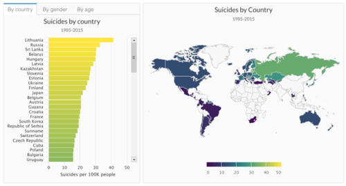
| + | <p><center>'''An interactive dashboard for worldwide suicide data 1985-2015''' </center></p> | ||
| + | [[File:Worldmap suicide rate.png|500px|center]] | ||
| + | <p><center>'''Source''': https://www.kaggle.com/tavoosi/suicide-data-full-interactive-dashboard/#data</center></p> | ||
| + | || | ||
| + | * This dashboard used a combination of a choropleth map and bar chart, which aids in recognition of regions with high/low suicide rates and identifying the rank of a particular country. | ||
| + | * The coordinated color scale makes it easy for users to understand data from both charts. | ||
| + | |- | ||
| + | | | ||
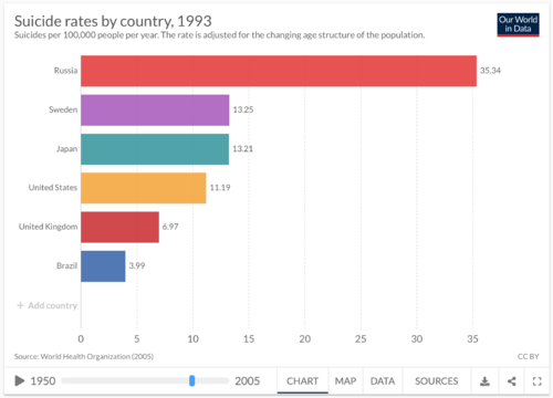
| + | <p><center>'''Animated time-series bar chart''' </center></p> | ||
| + | [[File:SW_related2.png|500px|center]] | ||
| + | <p><center>'''Source''': https://ourworldindata.org/suicide</center></p> | ||
| + | || | ||
| + | * Visualises the changes in countries with the highest suicide rate over the years | ||
| + | * Allows user to select specific countries that they wish to include in the comparison | ||
| + | |- | ||
| + | | | ||
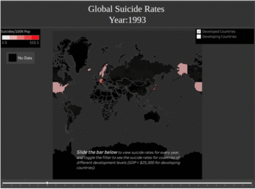
| + | <p><center>'''Animated time-lapse of suicide rates between developed and developing countries''' </center></p> | ||
| + | [[File:SW_related3.png|500px|center]] | ||
| + | <p><center>'''Source''': https://medium.com/@garytse_91587/world-suicide-rates-a-visualization-636c6f2f1e15</center></p> | ||
| + | || | ||
| + | * The visualization allows users to filter the data based on the type of countries(developed/developing) over time. | ||
| + | * By breaking down the data the user can target specific countries of interest without getting overwhelmed by the large amount of data. | ||
| + | |} | ||
<br/> | <br/> | ||
| − | <div style="background: #364558; padding: 15px; font-weight: bold; line-height: 0.3em; text-indent: 15px;font-size:20px"><font color=#fbfcfd> | + | |
| − | An | + | |
| − | + | <!-- Design Inspirations --> | |
| + | |||
| + | ==<div style="background: #364558; padding: 15px; font-weight: bold; line-height: 0.3em; text-indent: 0px;font-size:20px"><font face="Arial" color=#fbfcfd>DESIGN INSPIRATIONS</font></div>== | ||
| + | |||
| + | <!-- Table --> | ||
| + | {| class="wikitable" style="background-color:#FFFFFF;" width="100%" | ||
| + | |- | ||
| + | ! style="font-weight: bold;background: #536a87;color:#fbfcfd;width: 50%;" | Example | ||
| + | ! style="font-weight: bold;background: #536a87;color:#fbfcfd;" | Takeaways | ||
| + | |- | ||
| + | | | ||
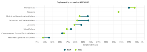
| + | <p><center>'''The New Zealand Labour Market Dashboard''' </center></p> | ||
| + | [[File:Two-point-line-graph.png|500px|center]] | ||
| + | <p><center>'''Source''': https://mbienz.shinyapps.io/labour-market-dashboard_prod/</center></p> | ||
| + | || | ||
| + | * Effectively visualises value changes between any two years | ||
| + | * Any increase/decrease is immediately apparent | ||
| + | * However, fluctuations between the selected points cannot be visualised. | ||
| + | |- | ||
| + | | | ||
| + | <p><center>'''NBA Player Statistics Visualization''' </center></p> | ||
| + | [[File:SW_Inspiration2.png|500px|center]] | ||
| + | <p><center>'''Source''': https://wilsoncernwq.github.io/NBAstatsVIS/documents/Proposal.pdf</center></p> | ||
| + | || | ||
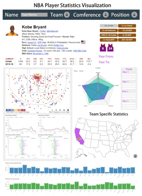
| + | * The concept of a "Summary Card" makes it easy to compare two players when put side by side. | ||
| + | * The use of radar chart can effectively break down a measure with multiple components (e.g. Happiness Index) | ||
| + | |} | ||
| + | <br/> | ||
| + | |||
| + | <!-- Proposed Storyboard --> | ||
| + | |||
| + | ==<div style="background: #364558; padding: 15px; font-weight: bold; line-height: 0.3em; text-indent: 0px;font-size:20px"><font face="Arial" color=#fbfcfd>PROPOSED STORYBOARD</font></div>== | ||
| + | |||
| + | Our proposed application will consist of four pages: | ||
| + | |||
| + | === LANDING PAGE === | ||
| + | <!-- Table --> | ||
| + | {| class="wikitable" style="background-color:#FFFFFF;" width="100%" | ||
| + | |- | ||
| + | ! style="font-weight: bold;background: #536a87;color:#fbfcfd;width: 50%;" | Proposed Layout | ||
| + | ! style="font-weight: bold;background: #536a87;color:#fbfcfd;" | Description | ||
| + | |- | ||
| + | | | ||
| + | [[File:SuicideWatch_v2_home.jpg|700px|center]] | ||
| + | || | ||
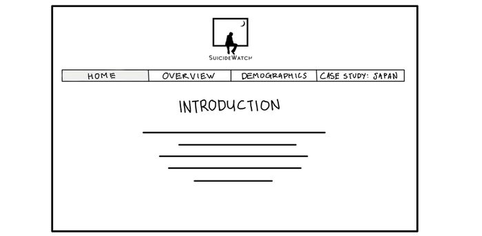
| + | This page will serve as an introduction to our problem and objectives, to give the viewer an overview of our project. The viewer can navigate to specific sections by clicking on the respective headers. | ||
| + | |} | ||
| + | <br/> | ||
| + | |||
| + | === OVERVIEW === | ||
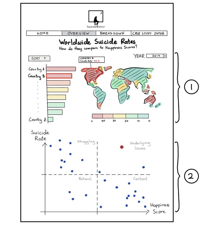
| + | This page will provide the viewer with an overview of global suicide rates and overall happiness scores. | ||
| + | <!-- Table --> | ||
| + | {| class="wikitable" style="background-color:#FFFFFF;" width="100%" | ||
| + | |- | ||
| + | ! style="font-weight: bold;background: #536a87;color:#fbfcfd;width: 50%;" | Proposed Layout | ||
| + | ! style="font-weight: bold;background: #536a87;color:#fbfcfd;" | Description | ||
| + | |- | ||
| + | | | ||
| + | [[File:SuicideWatch_v2_overview.jpg|700px|center]] | ||
| + | || | ||
| + | |||
| + | # '''Bar Chart and Choropleth Map''' | ||
| + | #* The bar chart will show the suicide rates globally, sorted in ascending or descending order. | ||
| + | #* Both charts will be coloured with the same color intensity scale, to allow for ease of comparison. | ||
| + | #* When selecting a particular country on either maps, the corresponding object on the other chart will be highlighted as well. | ||
| + | # '''Scatterplot''' | ||
| + | #* The scatterplot of suicide rates vs happiness score visualises the relationship between these 2 measures. | ||
| + | #* Depending on their positions within the 4 quadrants, we can get interesting insights on a specific country's suicide numbers. For example, a country that ranks highly on the happiness index but has high suicide rates could represent the presence of some underlying issues that lead to increased suicides. | ||
| + | |} | ||
| + | <br/> | ||
| + | |||
| + | === BREAKDOWN === | ||
| + | <!-- Table --> | ||
| + | {| class="wikitable" style="background-color:#FFFFFF;" width="100%" | ||
| + | |- | ||
| + | ! style="font-weight: bold;background: #536a87;color:#fbfcfd;width: 50%;" | Proposed Layout | ||
| + | ! style="font-weight: bold;background: #536a87;color:#fbfcfd;" | Description | ||
| + | |- | ||
| + | | | ||
| + | [[File:SuicideWatch_v2_demographic.jpg|700px|center]] | ||
| + | || | ||
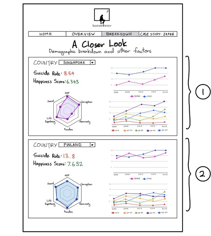
| + | # '''Summary Card''' | ||
| + | #* A combination of statistics and charts that summarises the demographics of a particular country's suicides. | ||
| + | #* '''Radar Chart:''' Component breakdown of the Happiness Index. | ||
| + | #* '''Line Chart:''' Time series of the country's suicide figures, separated by age and gender. | ||
| + | # '''Country Comparison''' | ||
| + | #* Viewers can add another Summary Card for side-by-side comparison between 2 or more countries' suicide demographics. | ||
| + | |} | ||
| + | <br/> | ||
| + | |||
| + | === CASE STUDY: JAPAN === | ||
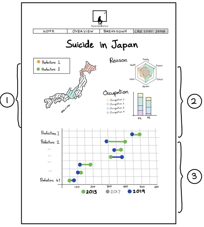
| + | To show that country level analysis may still be too generalised, this page is a further breakdown of Japan's suicide statistics at the prefecture level. | ||
| + | <!-- Table --> | ||
| + | {| class="wikitable" style="background-color:#FFFFFF;" width="100%" | ||
| + | |- | ||
| + | ! style="font-weight: bold;background: #536a87;color:#fbfcfd;width: 50%;" | Proposed Layout | ||
| + | ! style="font-weight: bold;background: #536a87;color:#fbfcfd;" | Description | ||
| + | |- | ||
| + | | | ||
| + | [[File:SuicideWatch_v2_japan.jpg|700px|center]] | ||
| + | || | ||
| + | # '''Cartogram of Japan''' | ||
| + | #* An animated cartogram of Japan that shows the suicide rate of each prefecture. | ||
| + | #* Users can select 1 or more prefectures for comparison across the other charts. | ||
| + | # '''Reasons for Suicide and Occupations''' | ||
| + | #* '''Radar Chart:''' A breakdown of the reasons for suicide in the prefecture. | ||
| + | #* '''Stacked Bar Chart:''' A breakdown of the occupations of the people who committed suicide in the prefecture. | ||
| + | #* The radar and bar chart will layer themselves according to the prefectures selected to allow for easy comparison. | ||
| + | # '''Connected Dot Plot''' | ||
| + | #* Visualises the changes in suicide rates over time, based on prefectures selected. | ||
| + | |} | ||
| + | <br/> | ||
| + | <!-- Project Timeline --> | ||
| + | |||
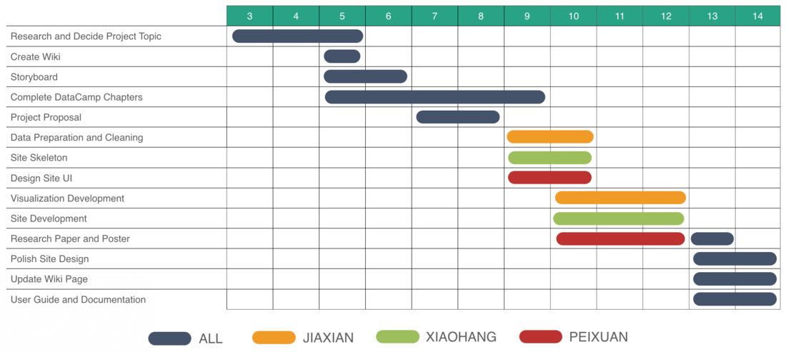
| + | ==<div style="background: #364558; padding: 15px; font-weight: bold; line-height: 0.3em; text-indent: 0px;font-size:20px"><font face="Arial" color=#fbfcfd>PROJECT TIMELINE</font></div>== | ||
| + | |||
| + | [[File:Team_3_-_SuicideWatch_Timeline.png|1100px|center]] | ||
| + | |||
| + | [[File:Team_3_-_SuicideWatch_Gantt.png|1100px|center]] | ||
| + | |||
| + | |||
| + | <!-- Key Challenges --> | ||
| + | |||
| + | ==<div style="background: #364558; padding: 15px; font-weight: bold; line-height: 0.3em; text-indent: 0px;font-size:20px"><font face="Arial" color=#fbfcfd>KEY CHALLENGES</font></div>== | ||
| + | |||
| + | <!-- Table --> | ||
| + | {| class="wikitable" style="background-color:#FFFFFF;" width="100%" | ||
| + | |- | ||
| + | ! style="font-weight: bold;background: #536a87;color:#fbfcfd;width: 50%;" | Challenge | ||
| + | ! style="font-weight: bold;background: #536a87;color:#fbfcfd;" | Mitigation | ||
| + | |- | ||
| + | | | ||
| + | Inexperienced with Creating and Designing Visualisations | ||
| + | || | ||
| + | * Engage in hands-on practice during and after class. | ||
| + | |- | ||
| + | | | ||
| + | Inexperienced with R and R Shiny | ||
| + | || | ||
| + | * Make full use of the DataCamp resources provided | ||
| + | * Self-directed and peer learning | ||
| + | |- | ||
| + | | | ||
| + | Limited Access to Sensitive Suicide Data | ||
| + | || | ||
| + | * Acquire data from various sources and conduct data cleaning to organize the data. | ||
| + | * Make do with what we can get, down scope the project accordingly. | ||
| + | |- | ||
| + | | | ||
| + | Time and Workload Constrains | ||
| + | || | ||
| + | * The team will come up with a reasonable project timeline based on everyone's ability and capacity. | ||
| + | * Set milestones and adjust the timeline accordingly based on the team's progress. | ||
| + | |} | ||
| + | <br/> | ||
| + | <!-- References --> | ||
| + | |||
| + | ==<div style="background: #364558; padding: 15px; font-weight: bold; line-height: 0.3em; text-indent: 0px;font-size:20px"><font face="Arial" color=#fbfcfd>REFERENCES</font></div>== | ||
| + | * WHO - World Suicides (https://www.who.int/news-room/fact-sheets/detail/suicide) | ||
| + | * R Shiny Gallery (http://shiny.rstudio.com/gallery/) | ||
| + | * World Happiness Report (https://worldhappiness.report) | ||
| + | |||
| + | <!-- Comments --> | ||
| + | |||
| + | ==<div style="background: #364558; padding: 15px; font-weight: bold; line-height: 0.3em; text-indent: 0px;font-size:20px"><font face="Arial" color=#fbfcfd>COMMENTS</font></div>== | ||
| + | Feel free to leave us some comments or feedback! | ||
| + | <!-- Table --> | ||
| + | {| class="wikitable" style="background-color:#FFFFFF;" width="100%" | ||
| + | |- | ||
| + | ! style="font-weight: bold;background: #536a87;color:#fbfcfd;width: 50%;" | Name | ||
| + | ! style="font-weight: bold;background: #536a87;color:#fbfcfd;" | Comment/Feedback | ||
| + | |- | ||
| + | | | ||
| + | Your Name | ||
| + | || | ||
| + | * Comment | ||
| + | |- | ||
| + | | | ||
| + | Your Name | ||
| + | || | ||
| + | * Comment | ||
| + | |} | ||
Latest revision as of 14:45, 13 October 2019
Version 2
|
After further discussion and consultations with Prof. Kam, our team concluded that our initial problem statement and methodology may not be the best approach to analysing suicide data. There was insufficient evidence to draw correlations between socioeconomic factors and suicide rates, as suicide is a complex issue encompassing many factors that cannot be generalised. As such, we decided to pivot our project's direction slightly. Instead of attempting to make conclusions, we will focus on creating a visualisation that allows for exploration and comparison of suicide rates globally.
Contents
PROBLEM & MOTIVATION
Death by suicide is an extremely complex issue that causes pain to hundreds of thousands of people every year around the world. Close to 800 000 people die due to suicide globally every year, which is one person every 40 seconds. In Singapore, suicide is the leading cause of death for those aged 10-29.
The mortality data from the WHO suggests that the prevalence and characteristics of suicidal behavior vary widely between different communities, in different demographic groups and over time. One important source of heterogeneity, both globally and within countries, is gender: suicide rates are much higher for males, particularly in high-income countries. Interestingly in Singapore, females are more likely to be diagnosed with depression and attempt suicide, but males accounted for more than 71% of all suicides in Singapore in 2018. But are there other similarities or patterns that we can discern from the available data? Often seen as a taboo topic, suicide is a very real problem that is not talked about enough. Through our visualisation, we hope to be able to shed some light on and spur conversations on this issue.
OBJECTIVES
In this project, we are hope to create a visualization that enables the following:
- Identify regions or countries with high/low suicide rates
- Visualise the relationship between Happiness Index scores and suicide rates
- Exploration of suicide demographics by country
- Comparison of suicide demographics between countries
- A more in-depth breakdown of Japan's suicide demographics
As mentioned, the reasons behind suicide is complex and cannot be generalised. Through our visualization we hope to show that generic measures like political stability or GDP per capita do not provide a general explanation for suicide. There are definitely many deep-seated issues or underlying cultural norms that could contribute to suicide rates as well. Ideally a further breakdown of the suicide demographics should be conducted for each country, as suicide rates within different parts of a country could vary as well. However, such data is not readily available. We managed to find detailed data on Japan's suicide rates and thought it would make for a good visualisation of the varying suicide rates within a country. Japan has long been known to have high suicide rates, posited to be an amalgamation of its aging population, overwork and even cultural glorification of suicide ("Seppuku"). As such, we decided to breakdown Japan's suicide figures across different prefectures.
SELECTED DATASETS
| Dataset/Source | Data Attributes | Why this Dataset? |
|---|---|---|
(https://www.kaggle.com/russellyates88/suicide-rates-overview-1985-to-2016) |
|
|
(https://worldhappiness.report/ed/2019/) |
|
|
(https://www.npa.go.jp/publications/statistics/safetylife/jisatsu.html/) |
|
|
RELATED WORKS
| Example | Takeaways |
|---|---|
|
|
|
|
|
|
|
|
|
DESIGN INSPIRATIONS
| Example | Takeaways |
|---|---|
|
|
|
|
|
|
PROPOSED STORYBOARD
Our proposed application will consist of four pages:
LANDING PAGE
| Proposed Layout | Description |
|---|---|
|
This page will serve as an introduction to our problem and objectives, to give the viewer an overview of our project. The viewer can navigate to specific sections by clicking on the respective headers. |
OVERVIEW
This page will provide the viewer with an overview of global suicide rates and overall happiness scores.
| Proposed Layout | Description |
|---|---|
|
BREAKDOWN
| Proposed Layout | Description |
|---|---|
|
CASE STUDY: JAPAN
To show that country level analysis may still be too generalised, this page is a further breakdown of Japan's suicide statistics at the prefecture level.
| Proposed Layout | Description |
|---|---|
|
PROJECT TIMELINE
KEY CHALLENGES
| Challenge | Mitigation |
|---|---|
|
Inexperienced with Creating and Designing Visualisations |
|
|
Inexperienced with R and R Shiny |
|
|
Limited Access to Sensitive Suicide Data |
|
|
Time and Workload Constrains |
|
REFERENCES
- WHO - World Suicides (https://www.who.int/news-room/fact-sheets/detail/suicide)
- R Shiny Gallery (http://shiny.rstudio.com/gallery/)
- World Happiness Report (https://worldhappiness.report)
COMMENTS
Feel free to leave us some comments or feedback!
| Name | Comment/Feedback |
|---|---|
|
Your Name |
|
|
Your Name |
|

