Difference between revisions of "Ball4life proposal"
Shchye.2017 (talk | contribs) |
|||
| (16 intermediate revisions by 2 users not shown) | |||
| Line 3: | Line 3: | ||
<p></p><br/> | <p></p><br/> | ||
<div style="width:100%; text-align:center;"> | <div style="width:100%; text-align:center;"> | ||
| − | {|style="background-color:# | + | {|style="background-color:#e80707; color:#fff; padding: 10 0 10 0;" width="100%" cellspacing="0" cellpadding="0" valign="top" border="0" | |
| − | | style="padding:0.2em; font-size:100%; background-color:# | + | | style="padding:0.2em; font-size:100%; background-color:#e80707; text-align:center; color:#fff" width="10%" | |
| − | [[ | + | [[ball4life_proposal|<font color="#fff" size=3 face="Helvetica">Proposal</font>]] |
| style="background:none;" width="1%" | | | style="background:none;" width="1%" | | ||
| − | | style="padding:0.2em; font-size:100%; background-color:# | + | | style="padding:0.2em; font-size:100%; background-color:#e80707; border-bottom:0px solid #e80707; text-align:center; color:#fff" width="10%" | |
| − | |||
| − | |||
| − | |||
| − | |||
[[ball4life_poster|<font color="#fff" size=3 face="Helvetica">Poster</font>]] | [[ball4life_poster|<font color="#fff" size=3 face="Helvetica">Poster</font>]] | ||
| style="background:none;" width="1%" | | | style="background:none;" width="1%" | | ||
| − | | style="padding:0.2em; font-size:100%; background-color:# | + | | style="padding:0.2em; font-size:100%; background-color:#e80707; border-bottom:0px solid #e80707; text-align:center; color:#fff" width="10%" | |
[[ball4life_application|<font color="#fff" size=3 face="Helvetica">Application</font>]] | [[ball4life_application|<font color="#fff" size=3 face="Helvetica">Application</font>]] | ||
| style="background:none;" width="1%" | | | style="background:none;" width="1%" | | ||
| − | | style="padding:0.2em; font-size:100%; background-color:# | + | | style="padding:0.2em; font-size:100%; background-color:#e80707; border-bottom:0px solid #e80707; text-align:center; color:#fff" width="10%" | |
[[ball4life_research_paper Paper|<font color="#fff" size=3 face="Helvetica">Research Paper</font>]] | [[ball4life_research_paper Paper|<font color="#fff" size=3 face="Helvetica">Research Paper</font>]] | ||
|} | |} | ||
| Line 26: | Line 22: | ||
<!--/Header--> | <!--/Header--> | ||
| + | |||
| + | <!--SubHeader--> | ||
| + | <p></p><br/> | ||
| + | <div style="width:100%; text-align:center;"> | ||
| + | {|style="background-color:#e80707; color:#fff; padding: 10 0 10 0;" width="100%" cellspacing="0" cellpadding="0" valign="top" border="0" | | ||
| + | | style="padding:0.2em; font-size:100%; background-color:#e80707; text-align:center; color:#fff" width="10%" | | ||
| + | [[ball4life_proposal|<font color="#fff" size=3 face="Helvetica">Version 1</font>]] | ||
| + | |||
| + | | style="background:none;" width="1%" | | ||
| + | | style="padding:0.2em; font-size:100%; background-color:#e80707; border-bottom:0px solid #e80707; text-align:center; color:#fff" width="10%" | | ||
| + | [[ball4life_proposal_2|<font color="#fff" size=3 face="Helvetica">Version 2</font>]] | ||
| + | |} | ||
| + | </div> | ||
| + | <!--/SubHeader--> | ||
| + | |||
<br /> | <br /> | ||
<big> [[Project Groups|<--- Go Back to Project Groups]] </big> | <big> [[Project Groups|<--- Go Back to Project Groups]] </big> | ||
<br /><br /> | <br /><br /> | ||
| − | ==<div style="background:# | + | ==<div style="background:#e80707; padding: 15px; font-weight: bold; line-height: 0.3em; letter-spacing:0.5em;font-size:20px"><font color=#fff face="Century Gothic"><center>INTRODUCTION</center></font></div>== |
<br/> | <br/> | ||
The National Basketball Association (NBA) is a men’s professional basketball league in North America. Comprising of 30 teams (29 in the United States and 1 in Canada), it is one of the 4 major professional sports leagues in the United States and Canada. Furthermore, it is widely regarded as the premier basketball league in the world, with many fans touting it as the hardest league with the world’s best players competing in it. | The National Basketball Association (NBA) is a men’s professional basketball league in North America. Comprising of 30 teams (29 in the United States and 1 in Canada), it is one of the 4 major professional sports leagues in the United States and Canada. Furthermore, it is widely regarded as the premier basketball league in the world, with many fans touting it as the hardest league with the world’s best players competing in it. | ||
| Line 36: | Line 47: | ||
With an average NBA team being valued at US$1.9 billion, the NBA continues to generate earnings in the hundreds of millions. This, coupled with growing fan bases in China, Philippines, Vietnam and Europe ensures that the NBA will be able to provide entertaining and competitive basketball games for all their fans. | With an average NBA team being valued at US$1.9 billion, the NBA continues to generate earnings in the hundreds of millions. This, coupled with growing fan bases in China, Philippines, Vietnam and Europe ensures that the NBA will be able to provide entertaining and competitive basketball games for all their fans. | ||
<br> | <br> | ||
| − | ==<div style="background:# | + | ==<div style="background:#e80707; padding: 15px; font-weight: bold; line-height: 0.3em; letter-spacing:0.5em;font-size:20px"><font color=#fff face="Century Gothic"><center>PROBLEM & MOTIVATION</center></font></div>== |
<br/> | <br/> | ||
Despite the success of the NBA in global markets, it remains relatively obscure in our local society. Many Singaporeans play a variety of sports and know of many famous athletes both worldwide and locally, such as: | Despite the success of the NBA in global markets, it remains relatively obscure in our local society. Many Singaporeans play a variety of sports and know of many famous athletes both worldwide and locally, such as: | ||
International: | International: | ||
| − | Cristiano Ronaldo: Soccer | + | <ul> |
| − | Lionel Messi: Soccer | + | <li>Cristiano Ronaldo: Soccer</li> |
| − | Roger Federer: Tennis | + | <li>Lionel Messi: Soccer</li> |
| + | <li>Roger Federer: Tennis</li> | ||
| + | </ul> | ||
Local: | Local: | ||
| − | Table Tennis: Feng Tianwei | + | <ul> |
| − | Swimming: Joseph Schooling | + | <li>Table Tennis: Feng Tianwei</li> |
| + | <li>Swimming: Joseph Schooling</li> | ||
| + | </ul> | ||
However, few to no Singaporeans could say out even the name of an NBA player, apart from Michael Jordan, who has retired 16 years ago in 2003. However, there has been an increase in interest in the sport, as more and more locals begin to be associated with the sport. | However, few to no Singaporeans could say out even the name of an NBA player, apart from Michael Jordan, who has retired 16 years ago in 2003. However, there has been an increase in interest in the sport, as more and more locals begin to be associated with the sport. | ||
| Line 54: | Line 69: | ||
<br/> | <br/> | ||
<br/> | <br/> | ||
| − | ==<div style="background:# | + | ==<div style="background:#e80707; padding: 15px; font-weight: bold; line-height: 0.3em; letter-spacing:0.5em;font-size:20px"><font color=#fff face="Century Gothic"><center>OBJECTIVE</center></font></div>== |
<br/> | <br/> | ||
This visualisation aims to provide insights into the following: | This visualisation aims to provide insights into the following: | ||
| − | + | <ol> | |
| − | + | <li>What is the key attribute to help basketball teams win games</li> | |
| − | + | <li>Is height truly essential to be a good basketball player</li> | |
| + | <li>Which type of shot will make you a more efficient player</li> | ||
| + | </ol> | ||
| + | |||
<br> | <br> | ||
<br/> | <br/> | ||
| − | ==<div style="background:# | + | ==<div style="background:#e80707; padding: 15px; font-weight: bold; line-height: 0.3em; letter-spacing:0.5em;font-size:20px"><font color=#fff face="Century Gothic"><center>SELECTED DATABASE</center></font></div>== |
<br/> | <br/> | ||
The Data Sets we will be using for our analysis and for our application is listed below: | The Data Sets we will be using for our analysis and for our application is listed below: | ||
| Line 68: | Line 86: | ||
{| class="wikitable" style="background-color:#FFFFFF;" width="90%" | {| class="wikitable" style="background-color:#FFFFFF;" width="90%" | ||
|- | |- | ||
| − | ! style="font-weight: bold;background: # | + | ! style="font-weight: bold;background: #e80707;color:#fbfcfd;width: 50%;" | Dataset/Source |
| − | ! style="font-weight: bold;background: # | + | ! style="font-weight: bold;background: #e80707;color:#fbfcfd;width: 50%;" | Rationale Of Usage |
|- | |- | ||
| Line 78: | Line 96: | ||
|<center>NBA Team Breakdown</center> | |<center>NBA Team Breakdown</center> | ||
| − | |||
|| | || | ||
This will help us to determine which are the teams that consistently outperform other teams, and through analysis allow us to determine the key aspects that gives each team their edge. | This will help us to determine which are the teams that consistently outperform other teams, and through analysis allow us to determine the key aspects that gives each team their edge. | ||
| Line 91: | Line 108: | ||
<br> | <br> | ||
<br/> | <br/> | ||
| − | ==<div style="background:# | + | ==<div style="background:#e80707; padding: 15px; font-weight: bold; line-height: 0.3em; letter-spacing:0.5em;font-size:20px"><font color=#fff face="Century Gothic"><center>BACKGROUND SURVEY</center></font></div>== |
<br/> | <br/> | ||
We did basic background research on some existing visualizations or dashboards we could drive inspirations from or make it better. Below are a few visuals we found: | We did basic background research on some existing visualizations or dashboards we could drive inspirations from or make it better. Below are a few visuals we found: | ||
| Line 97: | Line 114: | ||
{| class="wikitable" style="background-color:#FFFFFF;" width="90%" | {| class="wikitable" style="background-color:#FFFFFF;" width="90%" | ||
|- | |- | ||
| − | ! style="font-weight: bold;background: # | + | ! style="font-weight: bold;background: #e80707;color:#fbfcfd;width: 45%;" | References to Existing Visualizations |
| − | ! style="font-weight: bold;background: # | + | ! style="font-weight: bold;background: #e80707;color:#fbfcfd;width: 55%" | Key Takeaways |
|- | |- | ||
| <center> | | <center> | ||
| − | + | [[File:ball1.png|300px|frameless|center]] | |
| − | [[File: | + | Title: NBA Shot Tracker<br> |
| − | <br | + | Link: http://www.estherbaek.com/NBAShotTracker/ |
| − | |||
| − | |||
| − | |||
|| | || | ||
| − | ''' | + | '''Feedback''' |
| − | + | Clear illustration of insights on player’s field goal percentage | |
| − | + | Simple and intuitive UI to better engage audiences | |
| − | + | Too little information, would require more information to better understand individual’s game | |
| − | |||
| − | |||
| − | |||
| − | |||
|- | |- | ||
| <center> | | <center> | ||
| − | + | [[File:ball2.png|300px|frameless|center]] | |
| − | [[File: | + | Title: Player Analysis<br> |
| − | <br | + | Link: https://shotline.peterbeshai.com/p/1415 |
| − | |||
</center> | </center> | ||
|| | || | ||
| − | ''' | + | '''Feedback''' |
| − | + | Detailed breakdown of player’s efficiency rate in the 2 key offensive tools | |
| − | + | Leveraged on time-series data to better understand player’s growth or decline | |
| − | + | Too little information, would require more information to better understand individual’s game | |
| − | |||
| − | |||
| − | |||
|- | |- | ||
| <center> | | <center> | ||
| − | + | [[File:ball3.png|300px|frameless|center]] | |
| − | [[File: | + | Title: Best Draft Class<br> |
| − | <br | + | Link: https://towardsdatascience.com/basketball-analytics-the-best-draft-class-13a6eac0cdb5 |
| − | |||
</center> | </center> | ||
|| | || | ||
| − | ''' | + | '''Feedback''' |
| − | + | Could have included trend line to predict next round of best draft class | |
| − | + | There is a lack of filter to show what are the factors being considered in efficiency | |
| − | |||
| − | |||
| − | |||
| − | |||
| − | |||
|- | |- | ||
| + | |} | ||
| − | + | ==<div style="background:#e80707; padding: 15px; font-weight: bold; line-height: 0.3em; letter-spacing:0.5em;font-size:20px"><font color=#fff face="Century Gothic"><center>PROPOSED STORYBOARD</center></font></div>== | |
| − | |||
| − | |||
<br/> | <br/> | ||
| − | + | With a clearer idea of what we want after looking at a few visualization examples, we came up with a few storyboard ideas. | |
| − | < | + | <center> |
| − | |||
| − | |||
| − | |||
| − | |||
| − | |||
| − | |||
| − | |||
| − | |||
| − | |||
| − | |||
| − | |||
| − | |||
| − | |||
{| class="wikitable" style="background-color:#FFFFFF;" width="90%" | {| class="wikitable" style="background-color:#FFFFFF;" width="90%" | ||
|- | |- | ||
| − | ! style="font-weight: bold;background: # | + | ! style="font-weight: bold;background: #e80707;color:#fbfcfd;width: 45%;" | Proposed Storyboard |
| − | ! style="font-weight: bold;background: # | + | ! style="font-weight: bold;background: #e80707;color:#fbfcfd;width: 55%" | Description |
|- | |- | ||
| <center> | | <center> | ||
| − | + | [[File:landing_page_ball4life.jpg|300px|frameless|center]] | |
| − | [[File: | ||
| − | |||
| − | |||
| − | |||
|| | || | ||
| − | ''' | + | '''Homepage''' |
| − | + | This page will display a brief overview of our motivation and list down the key areas which the visualisation will address. This provides a first touch point for users and sets the user journey in an organised manner. | |
| − | |||
| − | |||
| − | |||
| − | |||
| − | |||
|- | |- | ||
| <center> | | <center> | ||
| − | + | [[File:ball5.jpeg|300px|frameless|center]] | |
| − | [[File: | ||
| − | |||
| − | |||
| − | |||
|| | || | ||
| − | ''' | + | '''Understanding Efficiency of James Harden''' |
| − | + | The visualization in this page will | |
| − | |||
| − | |||
| − | |||
| − | |||
| − | |||
| − | |||
|- | |- | ||
| <center> | | <center> | ||
| − | + | [[File:ball6.jpeg|300px|frameless|center]] | |
| − | [[File: | ||
| − | |||
| − | |||
| − | |||
|| | || | ||
| − | + | This implements the shooting efficiency of an NBA athlete on the court to measure where does he perform the best in | |
| − | |||
| − | |||
| − | |||
| − | |||
| − | |||
| − | |||
| − | |||
|- | |- | ||
| <center> | | <center> | ||
| − | + | [[File:ball7.jpeg|300px|frameless|center]] | |
| − | [[File: | ||
| − | |||
| − | |||
| − | |||
|| | || | ||
| − | + | This graph draws inspiration from a ternary graph to implement a rating based on a few factors, such as: | |
| − | + | <ol> | |
| − | + | <li>Height</li> | |
| − | + | <li>Weight</li> | |
| + | <li>Offensive Efficiency</li> | ||
| + | <li>Defensive Efficiency</li> | ||
| + | </ol> | ||
| + | |- | ||
| + | |} | ||
| − | |||
| − | |||
| − | |||
| − | |||
| − | |||
| − | |||
| − | |||
| − | |||
| − | |||
| − | |||
<br/> | <br/> | ||
| − | |||
| − | |||
| − | |||
| − | + | ==<div style="background:#e80707; padding: 15px; font-weight: bold; line-height: 0.3em; letter-spacing:0.5em;font-size:20px"><font color=#fff face="Century Gothic"><center>CHALLENGES</center></font></div>== | |
| − | |||
| − | |||
| − | |||
| − | |||
<br/> | <br/> | ||
| − | |||
| − | |||
| − | |||
| − | |||
| − | |||
<center> | <center> | ||
{| class="wikitable" style="background-color:#FFFFFF;" width="90%" | {| class="wikitable" style="background-color:#FFFFFF;" width="90%" | ||
|- | |- | ||
| − | ! style="font-weight: bold;background: # | + | ! style="font-weight: bold;background: #e80707;color:#fbfcfd;width: 45%;" | Challenges |
| − | ! style="font-weight: bold;background: # | + | ! style="font-weight: bold;background: #e80707;color:#fbfcfd;width: 55%" | Mitigation Plan |
|- | |- | ||
| − | |||
| − | |||
| − | |||
| − | |||
| + | | | ||
| + | * Data Extraction from Web Sources/Pages. | ||
|| | || | ||
| − | + | Refine web scraping techniques to write automated scripts to scrape from NBA web pages | |
| − | |||
| − | |||
|- | |- | ||
| − | | | + | | |
| − | + | * Data Cleaning and Transformation | |
| − | |||
| − | |||
| − | |||
| − | |||
| − | |||
| − | |||
| − | |||
| − | * | ||
| − | |||
| − | |||
| − | |||
| − | |||
| − | |||
| − | |||
| − | |||
| − | |||
|| | || | ||
| − | * | + | * Assign each team member with a data source to clean |
| − | + | * Organize team meeting to collate it into desired form | |
| − | |||
| − | |||
| − | |||
| − | * | ||
|- | |- | ||
| − | | | + | | |
| − | + | * Lack of Experience with R and ShinyR | |
| − | |||
| − | |||
|| | || | ||
| − | * | + | * Go through available DataCamp courses |
| − | * | + | * Refers to online documentation and past examples to learn |
|} | |} | ||
| − | + | ||
<br> | <br> | ||
<br/> | <br/> | ||
| − | ==<div style="background:# | + | ==<div style="background:#e80707; padding: 15px; font-weight: bold; line-height: 0.3em; letter-spacing:0.5em;font-size:20px"><font color=#fff face="Century Gothic"><center>TIMELINE</center></font></div>== |
| + | <br/> | ||
| + | [[File:ball8.png|1000px|frameless|center]] | ||
| + | <br> | ||
<br/> | <br/> | ||
| − | |||
| − | |||
| + | <br> | ||
<br/> | <br/> | ||
| − | ==<div style="background:# | + | ==<div style="background:#e80707; padding: 15px; font-weight: bold; line-height: 0.3em; letter-spacing:0.5em;font-size:20px"><font color=#fff face="Century Gothic"><center>TOOLS/TECHNOLOGIES</center></font></div>== |
<br/> | <br/> | ||
| − | + | [[File:ball9.png|1000px|frameless|center]] | |
| − | |||
| − | |||
| − | |||
| − | |||
| − | |||
| − | |||
| − | |||
| − | || | ||
| − | |||
| − | |||
| − | |||
| − | | | ||
| − | |||
| − | |||
| − | |||
| − | |||
| − | |||
| − | |||
| − | |||
| − | |||
| − | |||
| − | |||
| − | |||
| − | |||
| − | |||
<br> | <br> | ||
<br/> | <br/> | ||
| − | |||
| − | |||
| − | |||
| − | + | ==<div style="background:#e80707; padding: 15px; font-weight: bold; line-height: 0.3em; letter-spacing:0.5em;font-size:20px"><font color=#fff face="Century Gothic"><center>COMMENTS</center></font></div>== | |
| − | |||
| − | ==<div style="background:# | ||
<br/> | <br/> | ||
Feel free to leave us some comments so that we can improve! | Feel free to leave us some comments so that we can improve! | ||
| Line 370: | Line 251: | ||
{| class="wikitable" width="100%" | {| class="wikitable" width="100%" | ||
|- | |- | ||
| − | ! style="font-weight: bold;background: # | + | ! style="font-weight: bold;background: #e80707;color:#fbfcfd;width: 5%;" |No. |
| − | ! style="font-weight: bold;background: # | + | ! style="font-weight: bold;background: #e80707;color:#fbfcfd;width: 25%;" |Name |
| − | ! style="font-weight: bold;background: # | + | ! style="font-weight: bold;background: #e80707;color:#fbfcfd;width: 20%;" |Date |
| − | ! style="font-weight: bold;background: # | + | ! style="font-weight: bold;background: #e80707;color:#fbfcfd;width: 50%;" |Comments |
|- | |- | ||
| 1. | | 1. | ||
Latest revision as of 19:08, 23 November 2019
<--- Go Back to Project Groups
Contents
INTRODUCTION
The National Basketball Association (NBA) is a men’s professional basketball league in North America. Comprising of 30 teams (29 in the United States and 1 in Canada), it is one of the 4 major professional sports leagues in the United States and Canada. Furthermore, it is widely regarded as the premier basketball league in the world, with many fans touting it as the hardest league with the world’s best players competing in it.
With an average NBA team being valued at US$1.9 billion, the NBA continues to generate earnings in the hundreds of millions. This, coupled with growing fan bases in China, Philippines, Vietnam and Europe ensures that the NBA will be able to provide entertaining and competitive basketball games for all their fans.
PROBLEM & MOTIVATION
Despite the success of the NBA in global markets, it remains relatively obscure in our local society. Many Singaporeans play a variety of sports and know of many famous athletes both worldwide and locally, such as:
International:
- Cristiano Ronaldo: Soccer
- Lionel Messi: Soccer
- Roger Federer: Tennis
Local:
- Table Tennis: Feng Tianwei
- Swimming: Joseph Schooling
However, few to no Singaporeans could say out even the name of an NBA player, apart from Michael Jordan, who has retired 16 years ago in 2003. However, there has been an increase in interest in the sport, as more and more locals begin to be associated with the sport.
Therefore, the team wishes to teach and showcase the insights behind each NBA game for the rising pool of basketball enthusiasts. This will serve to allow basketball enthusiasts get a better appreciation of the game, and help players with their basketball skills by providing them with actionable insights on how to improve their game. This will be done through data visualisation insights derived from the premier players and teams of the NBA.
OBJECTIVE
This visualisation aims to provide insights into the following:
- What is the key attribute to help basketball teams win games
- Is height truly essential to be a good basketball player
- Which type of shot will make you a more efficient player
SELECTED DATABASE
The Data Sets we will be using for our analysis and for our application is listed below:
| Dataset/Source | Rationale Of Usage |
|---|---|
|
Having the profile statistics (eg. Height, Weight) of an NBA player will allow us to accurately assess if there is indeed any correlation between his player profile and his ability to be a good player. | |
|
This will help us to determine which are the teams that consistently outperform other teams, and through analysis allow us to determine the key aspects that gives each team their edge. | |
|
This will help us to properly segment each player into different categories based on various metrics, which will ultimately help us to determine what are the things that each player does that best maximizes their abilities. |
BACKGROUND SURVEY
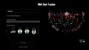
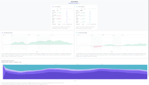
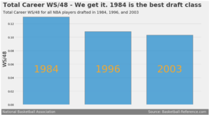
We did basic background research on some existing visualizations or dashboards we could drive inspirations from or make it better. Below are a few visuals we found:
| References to Existing Visualizations | Key Takeaways |
|---|---|
Title: NBA Shot Tracker |
Feedback Clear illustration of insights on player’s field goal percentage Simple and intuitive UI to better engage audiences Too little information, would require more information to better understand individual’s game |
Title: Player Analysis |
Feedback Detailed breakdown of player’s efficiency rate in the 2 key offensive tools Leveraged on time-series data to better understand player’s growth or decline Too little information, would require more information to better understand individual’s game |
Title: Best Draft Class |
Feedback Could have included trend line to predict next round of best draft class There is a lack of filter to show what are the factors being considered in efficiency |
PROPOSED STORYBOARD
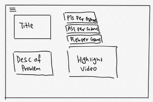
With a clearer idea of what we want after looking at a few visualization examples, we came up with a few storyboard ideas.
| Proposed Storyboard | Description |
|---|---|
|
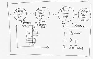
Homepage This page will display a brief overview of our motivation and list down the key areas which the visualisation will address. This provides a first touch point for users and sets the user journey in an organised manner. | |
|
Understanding Efficiency of James Harden The visualization in this page will | |
|
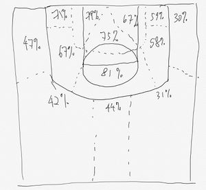
This implements the shooting efficiency of an NBA athlete on the court to measure where does he perform the best in | |
|
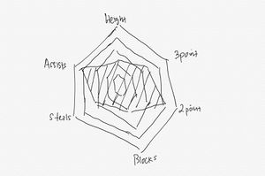
This graph draws inspiration from a ternary graph to implement a rating based on a few factors, such as:
|
CHALLENGES
| Challenges | Mitigation Plan |
|---|---|
|
Refine web scraping techniques to write automated scripts to scrape from NBA web pages |
|
|
|
|
TIMELINE
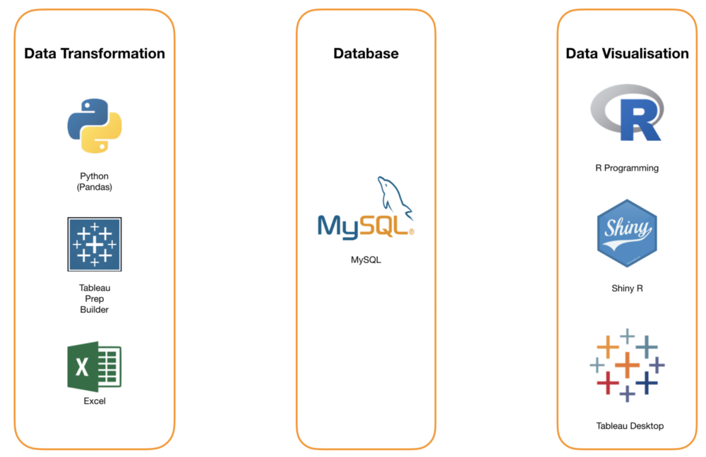
TOOLS/TECHNOLOGIES
COMMENTS
Feel free to leave us some comments so that we can improve!
| No. | Name | Date | Comments |
|---|---|---|---|
| 1. | Insert your name here | Insert date here | Insert comment here |
| 2. | Insert your name here | Insert date here | Insert comment here |
| 3. | Insert your name here | Insert date here | Insert comment here |

