Difference between revisions of "Two Eyes One Pizza"
| (66 intermediate revisions by 2 users not shown) | |||
| Line 3: | Line 3: | ||
<!--Header--> | <!--Header--> | ||
{|style="background-color:#1D1D1D; color:#8b1209; padding: 10 0 10 0;" width="100%" cellspacing="0" cellpadding="0" valign="top" border="0" | | {|style="background-color:#1D1D1D; color:#8b1209; padding: 10 0 10 0;" width="100%" cellspacing="0" cellpadding="0" valign="top" border="0" | | ||
| − | |||
| − | |||
| style="background:none;" width="1%" | | | style="background:none;" width="1%" | | ||
| style="padding:0.2em; font-size:100%; background-color:#8b1209; border-bottom:0px solid #3D9DD7; text-align:center; color:#F5F5F5" width="10%" | | | style="padding:0.2em; font-size:100%; background-color:#8b1209; border-bottom:0px solid #3D9DD7; text-align:center; color:#F5F5F5" width="10%" | | ||
| − | [[ | + | [[Two_Eyes_One_Pizza|<font color="#F5F5F5" size=2 face="Helvetica"><b>PROPOSAL</b></font>]] |
| style="background:none;" width="1%" | | | style="background:none;" width="1%" | | ||
| style="padding:0.2em; font-size:100%; background-color:#1D1D1D; border-bottom:0px solid #3D9DD7; text-align:center; color:#F5F5F5" width="10%" | | | style="padding:0.2em; font-size:100%; background-color:#1D1D1D; border-bottom:0px solid #3D9DD7; text-align:center; color:#F5F5F5" width="10%" | | ||
| − | [[ | + | [[Two_Eyes_One_Pizza_Poster|<font color="#F5F5F5" size=2 face="Helvetica"><b>POSTER</b></font>]] |
| style="background:none;" width="1%" | | | style="background:none;" width="1%" | | ||
| style="padding:0.2em; font-size:100%; background-color:#1D1D1D; border-bottom:0px solid #3D9DD7; text-align:center; color:#F5F5F5" width="10%" | | | style="padding:0.2em; font-size:100%; background-color:#1D1D1D; border-bottom:0px solid #3D9DD7; text-align:center; color:#F5F5F5" width="10%" | | ||
| − | [[ | + | [[Two_Eyes_One_Pizza_Application|<font color="#F5F5F5" size=2 face="Helvetica"><b>APPLICATION</b></font>]] |
| style="background:none;" width="1%" | | | style="background:none;" width="1%" | | ||
| style="padding:0.2em; font-size:100%; background-color:#1D1D1D; border-bottom:0px solid #3D9DD7; text-align:center; color:#F5F5F5" width="10%" | | | style="padding:0.2em; font-size:100%; background-color:#1D1D1D; border-bottom:0px solid #3D9DD7; text-align:center; color:#F5F5F5" width="10%" | | ||
| − | [[ | + | [[Two_Eyes_One_Pizza_Research Paper|<font color="#F5F5F5" size=2 face="Helvetica"><b>RESEARCH PAPER</b></font>]] |
|} | |} | ||
<!--/Header--> | <!--/Header--> | ||
| Line 27: | Line 25: | ||
<br/> | <br/> | ||
| − | ==<div style="background: #8b1209; padding: 15px; line-height: 0.3em; text-indent: 15px; font-size:18px; font-family:Helvetica"><font color= #FFFFFF> | + | ==<div style="background: #8b1209; padding: 15px; line-height: 0.3em; text-indent: 15px; font-size:18px; font-family:Helvetica"><font color= #FFFFFF>Introduction</font></div>== |
<div style="font-family:Helvetica;font-size:16px"> | <div style="font-family:Helvetica;font-size:16px"> | ||
| − | + | International Food Chain (IFC) is a leading brand in its sector, with over 18000 outlets worldwide and an ever-growing presence in the global market. In Taiwan alone, IFC has over 240 branches and are constantly expanding. | |
| − | + | However, as the franchise grows bigger, so does its challenges. One of the challenges involves the lack of a tool to efficiently compare the performance of each chain to one another. | |
| − | |||
| − | |||
| − | |||
| − | |||
| − | + | Leveraging on this fact, our group aims to build a dashboard for IFC that allows for visualization and modeling. We hope to track the performance of each chain in relation to Point-Of-Interests surrounding each chain, uncovering and comprehending phenomena, with the aid of spatial data. | |
| − | |||
| − | |||
| + | This project was made in tandem with: https://wiki.smu.edu.sg/1920t1smt201/G1-Group10 | ||
| − | + | ==<div style="background: #8b1209; padding: 15px; line-height: 0.3em; text-indent: 15px; font-size:18px; font-family:Helvetica"><font color= #FFFFFF>Problem and Motivation</font></div>== | |
| + | <div style="font-family:Helvetica;font-size:16px"> | ||
| + | To build a dashboard that allows for: | ||
| + | * Business profiling of the company’s outlet to determine Points-Of-Interests that can generate insights such as: Highest earning outlets, relative performance of outlets, outlet’s profile patterns and item sales information. | ||
| + | * Creating dynamic visualisations to make informed business decisions, such as determining locations for new outlet openings with matching POIs of high sales outlets | ||
| + | * Digitizing of each chain’s trade and delivery area | ||
| + | * Scalable program to incorporate future data to generate current information (Using data from other cities besides Taiwan) | ||
| + | * Easy and intuitive tool to quickly view information with regards to all branches | ||
| − | ==<div style="background: #8b1209; padding: 15px; line-height: 0.3em; text-indent: 15px; font-size:18px; font-family:Helvetica"><font color= #FFFFFF> | + | ==<div style="background: #8b1209; padding: 15px; line-height: 0.3em; text-indent: 15px; font-size:18px; font-family:Helvetica"><font color= #FFFFFF>Objectives</font></div>== |
<div style="font-family:Helvetica;font-size:16px"> | <div style="font-family:Helvetica;font-size:16px"> | ||
| − | This project | + | This project aims to provide insights into the following: |
| − | |||
| − | + | # Outlets with the highest monthly sales | |
| − | + | # Relative monthly performance of each outlet | |
| − | + | # Each branch geographical information, including the type and number of POI’s in the surroundings | |
| + | # Profiling of similar types of branches | ||
| + | # Improvements for poor performing outlets | ||
| + | # Scalable system to incorporate future data | ||
==<div style="background: #8b1209; padding: 15px; line-height: 0.3em; text-indent: 15px; font-size:18px; font-family:Helvetica"><font color= #FFFFFF>Background Survey of Related Works</font></div>== | ==<div style="background: #8b1209; padding: 15px; line-height: 0.3em; text-indent: 15px; font-size:18px; font-family:Helvetica"><font color= #FFFFFF>Background Survey of Related Works</font></div>== | ||
| + | <div style="font-family:Helvetica;font-size:11px"> | ||
{| class="wikitable" style="background-color:#ffffff;" width="100%" | {| class="wikitable" style="background-color:#ffffff;" width="100%" | ||
|- | |- | ||
| − | ! style="font-weight: bold;background: #000000;color:#fbfcfd;width: | + | ! style="font-weight: bold;background: #000000;color:#fbfcfd;width: 10%;" | Visualizations |
| − | ! style="font-weight: bold;background: #000000;color:#fbfcfd;" | Explaination | + | ! style="font-weight: bold;background: #000000;color:#fbfcfd;width: 10%;" | Explaination |
|- | |- | ||
| − | | [[Image: | + | | [[Image:11.png|300px]] |
<br> | <br> | ||
| − | + | || | |
| − | + | Data source: https://www.researchgate.net/publication/324949619_Visualization_of_Fast_Food_Restaurant_Location_using_Geographical_Information_System<br> | |
| − | + | ||
| + | The visualization provides the buffer polygons, as well as representing population density of the area through colour. By comparing the two, we can conclude whether the center of activity is proportional to the population density in a region. It allows us to perform further exploration to see what spatial information significantly affects the level of activity in a city, such as the availability of points-of-interest. This visualization is great as it allows the viewer to clearly see multiple dimensions dealing with spatial data in an elegant way. | ||
| + | |||
|- | |- | ||
| − | | [[Image: | + | | [[Image:12.png|300px]] |
<br> | <br> | ||
| − | + | || | |
| − | + | Data source: https://www.researchgate.net/publication/324949619_Visualization_of_Fast_Food_Restaurant_Location_using_Geographical_Information_System<br> | |
| − | + | The graph on the left shows the distribution of outlets on the geographical map. The right graph describes the outlets grid distribution, result from grid creation and spatial joint operation. From both figures, they can show the potential tendency of whether the outlets are clustered, and with the number of outlets in each grid. We could use them together to justify and adjust the outlet locations. | |
|- | |- | ||
| − | | [[Image: | + | | [[Image:13.png|300px|]] |
<br> | <br> | ||
| − | + | || | |
| − | + | Data source: https://www.researchgate.net/publication/324949619_Visualization_of_Fast_Food_Restaurant_Location_using_Geographical_Information_System<br> | |
| − | + | This visualization provides a novel way of linking a variable to its geographical location when hovering over the respective area. It would be great in our case, if we were to allow the user to view the corresponding branch through the tooltip, for example profit. | |
|- | |- | ||
| − | | [[Image: | + | | [[Image:14.png|300px]] |
<br> | <br> | ||
| − | + | || | |
| − | + | Data source: https://www.researchgate.net/publication/324949619_Visualization_of_Fast_Food_Restaurant_Location_using_Geographical_Information_System<br> | |
| − | + | This shows kernel density surface, based on the number of fast food restaurants around Jakarta and distribute them smoothly, so it provides average surface estimation. Kernel density estimation allows us to observe both the centrality and agglomeration of existing outlets. This visualization allows us to view multiple dimensions at a time in an effective manner, through the choice of colour and size. | |
| − | |||
| − | |||
| − | |||
| − | |||
| − | |||
| − | |||
|- | |- | ||
| − | + | | [[Image:15.png|300px|]] | |
| − | |||
| − | |||
| − | |||
| − | |||
| − | | [[Image: | ||
<br> | <br> | ||
| − | + | || | |
| − | || | + | Data source: |
| − | + | https://public.tableau.com/profile/mirandali#!/vizhome/Salesforce-SalesPerformance/SalesPerformance<br> | |
| − | + | ||
| − | + | This databoard shows the cumulative sales. We could learn from this and display by outlets to compare the performance by having multiple forms of visualization. We really like the fact that certain key summarizations and variables are displayed on the top, and will consider using this in our project. | |
| − | + | |} </div> | |
| − | |||
| − | |||
| − | |||
| − | |||
| − | <br> | ||
| − | |||
| − | |||
| − | |||
| − | |||
| − | |||
| − | |||
| − | |||
| − | |||
| − | |||
| − | |||
| − | |||
| − | |||
| − | |||
| − | We | ||
| − | |||
| − | |||
| − | |||
| − | |||
| − | |} | ||
| − | </div> | ||
==<div style="background: #8b1209; padding: 15px; line-height: 0.3em; text-indent: 15px; font-size:18px; font-family:Helvetica"><font color= #FFFFFF>Proposed Storyboard</font></div>== | ==<div style="background: #8b1209; padding: 15px; line-height: 0.3em; text-indent: 15px; font-size:18px; font-family:Helvetica"><font color= #FFFFFF>Proposed Storyboard</font></div>== | ||
| − | |||
| − | |||
| − | |||
| − | |||
| − | |||
| − | |||
| − | |||
| − | |||
| − | |||
| − | |||
| − | |||
| − | |||
| − | |||
| − | |||
| − | |||
| − | |||
| − | |||
| − | |||
| − | |||
| − | |||
| − | |||
| − | |||
| − | |||
| − | |||
| − | |||
| − | |||
| − | |||
| − | |||
| − | |||
| − | |||
| − | |||
| − | |||
| − | |||
| − | |||
| − | |||
| − | |||
| − | |||
| − | |||
| − | |||
| − | |||
| − | |||
| − | |||
| − | |||
| − | |||
| − | |||
| − | |||
| − | === | + | ===1. IFC Store Sales Overview=== |
| − | + | Upon entering the application, the user will be greeted with the IFC Stores Sales Overview page. Users will be able to analyse the sales performance of all stores, through a selected | |
| + | period using this page. It will consist of an interactive choropleth map and bar chart. User will also be able to filter the data by Sales by Month and sort the bar chart by ascending or descending sales. | ||
| − | + | [[Image: Dsadas.jpeg |500px|center]] | |
| − | |||
| − | The | + | ===2. Individual IFC Store Information=== |
| − | + | This page allows the user to inspect each individual stores, and view its POI and Sales. It consists of an interactive choropleth map, line chart and data table. The map displays all subzones of the trade area, denoted by the names on the polygon. The line chart shows the total sales for Store X and the median for all stores over time. The line chart is interactive, and mousing over the points bring up the date and sales of the respective stores. The data table shows all POIs located in the trade area of Store X. The table contains an alphabetical search function, as well as the ability to sort by numerical value by clicking on the arrows buttons on the top right. User will also be able to filter by store and POI through a side panel. | |
| − | |||
| − | |||
| − | + | [[Image: Vaidea21.jpg |500px|center]] | |
| − | |||
| − | The | + | ===3. Comparison Between Stores=== |
| − | + | This dashboard allows the user to compare Store X and Store Y to analyse its Points of Interest (POI), Sales and discover the differences between the two stores. It consists of an interactive choropleth map, line chart and data table. The map displays the trade area of Stores X and Y, denoted by the names on the polygon. Clicking on the Pizza Symbol brings up the full name of the store. Clicking on the trade area brings up the total number of selected POIs in the trade area. The line chart shows the total sales for Store X, Y and the median over time. The line chart is interactive, and mousing over the points bring up the date and sales of the respective stores. The data table shows all POIs located in the trade area of Store X,Y. The table contains an alphabetical search function, as well as the ability to sort by numerical value by clicking on the arrows buttons on the top right. | |
| − | |||
| − | |||
| − | |||
| − | + | [[Image: Vaidea22.jpg |500px|center]] | |
| − | |||
| − | ==<div style="background: #8b1209; padding: 15px; line-height: 0.3em; text-indent: 15px; font-size:18px; font-family:Helvetica"><font color= #FFFFFF>Tools | + | ==<div style="background: #8b1209; padding: 15px; line-height: 0.3em; text-indent: 15px; font-size:18px; font-family:Helvetica"><font color= #FFFFFF>Tools and Libraries</font></div>== |
<div style="font-family:Helvetica;font-size:16px"> | <div style="font-family:Helvetica;font-size:16px"> | ||
The following tools and libraries are used in the development of the web-based data visualisation application: | The following tools and libraries are used in the development of the web-based data visualisation application: | ||
| − | [[File: | + | [[File:Data.png|1000px|frameless|center]] |
| + | *QGIS | ||
*Microsoft Excel | *Microsoft Excel | ||
| − | * | + | *R Studio |
| − | * | + | *R Shiny |
| − | |||
| − | |||
| − | |||
*Tableau | *Tableau | ||
| − | * | + | *Adobe Suite |
| + | *Google Drive | ||
| + | |||
</div> | </div> | ||
==<div style="background: #8b1209; padding: 15px; line-height: 0.3em; text-indent: 15px; font-size:18px; font-family:Helvetica"><font color= #FFFFFF>Architectural Diagram</font></div>== | ==<div style="background: #8b1209; padding: 15px; line-height: 0.3em; text-indent: 15px; font-size:18px; font-family:Helvetica"><font color= #FFFFFF>Architectural Diagram</font></div>== | ||
<div style="font-family:Helvetica;font-size:16px"> | <div style="font-family:Helvetica;font-size:16px"> | ||
| − | The | + | The following architectural is used in the implementation of the visualisation tool: |
| − | [[File: | + | The application is deployed through R Shiny with shinyapps.io. |
| + | [[File:User.png|1000px|frameless|center]] | ||
</div> | </div> | ||
==<div style="background: #8b1209; padding: 15px; line-height: 0.3em; text-indent: 15px; font-size:18px; font-family:Helvetica"><font color= #FFFFFF>Datasets</font></div>== | ==<div style="background: #8b1209; padding: 15px; line-height: 0.3em; text-indent: 15px; font-size:18px; font-family:Helvetica"><font color= #FFFFFF>Datasets</font></div>== | ||
<p> | <p> | ||
| − | + | These are the datasets we plan to use: | |
</p> | </p> | ||
{| class="wikitable" style="background-color:#FFFFFF;" width="100%" | {| class="wikitable" style="background-color:#FFFFFF;" width="100%" | ||
| Line 230: | Line 147: | ||
! style="font-weight: bold;background: #000000;color:#fbfcfd;" | Rationale | ! style="font-weight: bold;background: #000000;color:#fbfcfd;" | Rationale | ||
|- | |- | ||
| − | | <center> | + | | <center> Administrative Boundaries, Taiwan </center> || |
| − | * | + | * A dataset containing SHP files of the administrative boundaries of taiwan (county, town, village) |
| + | * Used as a reference to digitize IFC branch trade areas | ||
|- | |- | ||
| − | | <center> | + | | <center> Branch location of IFC, Taiwan </center> || |
| − | * | + | * A dataset containing the geographical information of each individual branch. |
| − | * | + | * Used as the main target of our project |
|- | |- | ||
| − | | <center> | + | | <center> Point of Interests , Taiwan </center> || |
| − | * | + | * A dataset containing each individual Point-Of-Interests in Taiwan (e.g. ATMs, Amusement Parks, Banks) |
| − | * | + | * Used as features for analysis with regards to each branch |
| + | |- | ||
| + | | <center> Outlets Daily Sales Data </center> || | ||
| + | * A dataset containing the daily sales information of each individual branch | ||
| + | * Used to study the sales data along with the profile of each branch to generate yielding patterns (e.g. top and bottom performer) | ||
|- | |- | ||
|} | |} | ||
| − | ==<div style="background: #8b1209; padding: 15px; line-height: 0.3em; text-indent: 15px; font-size:18px; font-family:Helvetica"><font color= #FFFFFF>Technical Challenges</font></div>== | + | ==<div style="background: #8b1209; padding: 15px; line-height: 0.3em; text-indent: 15px; font-size:18px; font-family:Helvetica"><font color= #FFFFFF>Foreseen Technical Challenges</font></div>== |
We encountered the following technical challenges throughout the course of the project. We have indicated our proposed solutions, and the outcomes of the solutions. | We encountered the following technical challenges throughout the course of the project. We have indicated our proposed solutions, and the outcomes of the solutions. | ||
{| class="wikitable" style="background-color:#FFFFFF;" width="100%" | {| class="wikitable" style="background-color:#FFFFFF;" width="100%" | ||
| Line 251: | Line 173: | ||
! style="font-weight: bold;background: #000000;color:#fbfcfd;width: 33%;" | Outcome | ! style="font-weight: bold;background: #000000;color:#fbfcfd;width: 33%;" | Outcome | ||
|- | |- | ||
| − | | <center> Data | + | | <center> Data is already pre-aggregated to display monthly sales </center> |
|| | || | ||
| − | * | + | *The dataset is given directly to us from IFC, and we are unable to change it. Thus, We shall utilize and do our best with the available data. |
|| | || | ||
| − | + | NA | |
|- | |- | ||
| − | | <center> Unfamiliarity in | + | | <center> Unfamiliarity in R Shiny </center> |
|| | || | ||
| − | * | + | * Watching video tutorials about R Shiny |
| − | * Independent learning on | + | * Independent learning on the design and syntax |
| − | * Peer learning and sharing | + | * Peer learning and sharing |
| + | * Using Datacamp as our mentor | ||
|| | || | ||
| − | + | We managed to start using the packages quickly and suit our own project needs. | |
| + | Each of us work on different parts such as setting up, designing, logic and deployment. | ||
| + | This speeds up our project progress. | ||
| + | |||
|- | |- | ||
| <center> Data Cleaning & Transformation Proposed Solution </center> | | <center> Data Cleaning & Transformation Proposed Solution </center> | ||
| Line 270: | Line 196: | ||
|| | || | ||
The adopted process was having clear instructions issued to each member in the team, along with maintaining constant communication with each other. In the event that the dataset is deemed too dirty to be usable, it was dropped along with sourcing for new data that would be a suitable replacement. | The adopted process was having clear instructions issued to each member in the team, along with maintaining constant communication with each other. In the event that the dataset is deemed too dirty to be usable, it was dropped along with sourcing for new data that would be a suitable replacement. | ||
| + | |- | ||
| + | | <center> Lack of geospatial knowledge to understand the dataset initially </center> | ||
| + | || | ||
| + | *Attend SMT201 class to learn more, as well as reading up on resources given by Prof Kam to gain further contextual knowledge | ||
| + | || | ||
| + | NA | ||
| + | |- | ||
| + | | <center> Digitising of trade areas from powerpoint slide to QGIS </center> | ||
| + | || | ||
| + | *The process is manual and we had to put in a lot of effort to convert the drawn polygon to data points in QGIS. | ||
| + | || | ||
| + | The data points can better allow us to generate insights on the profile of each outlet via its trade area. | ||
|- | |- | ||
| <center> Integrating Relevant Data from Multiple Sources Proposed Solution </center> | | <center> Integrating Relevant Data from Multiple Sources Proposed Solution </center> | ||
| − | |||
| − | |||
|| | || | ||
| − | + | *Working together to decide on what data to extract or eliminate | |
| + | || | ||
| + | NA | ||
|- | |- | ||
| <center> Determining the Most Effective Ways in Visualising the Data </center> | | <center> Determining the Most Effective Ways in Visualising the Data </center> | ||
|| | || | ||
| − | * | + | *Gain exposure to various forms of data visualisations - revisit course materials, assess existing libraries to gain inspirations. |
|| | || | ||
| − | + | NA | |
|} | |} | ||
==<div style="background: #8b1209; padding: 15px; line-height: 0.3em; text-indent: 15px; font-size:18px; font-family:Helvetica"><font color= #FFFFFF>Roles & Milestones </font></div>== | ==<div style="background: #8b1209; padding: 15px; line-height: 0.3em; text-indent: 15px; font-size:18px; font-family:Helvetica"><font color= #FFFFFF>Roles & Milestones </font></div>== | ||
| − | * | + | <br/> |
| − | + | *Roles | |
| + | {| class="wikitable" style="background-color:#FFFFFF;" width="100%" | ||
| + | |- | ||
| + | ! style="font-weight: bold;background: #000000;color:#fbfcfd;width: 33%;" | Kelvin Chia Sen Wei | ||
| + | ! style="font-weight: bold;background: #000000;color:#fbfcfd;width: 33%;" | Linus Cheng Xin Wei | ||
| + | ! style="font-weight: bold;background: #000000;color:#fbfcfd;width: 33%;" | Wang Xuze | ||
| + | |- | ||
| + | | <center> | ||
| + | App Developer<br/> | ||
| + | Wiki Writer | ||
| + | </center> | ||
| + | || | ||
| + | <center> | ||
| + | Project Manager<br/> | ||
| + | Design Architect | ||
| + | </center> | ||
| + | || | ||
<center> | <center> | ||
| − | + | Report Writer<br/> | |
| − | + | Poster man | |
| − | + | </center> | |
| − | + | ||
|} | |} | ||
| − | + | ||
| + | |||
| + | *Project Timeline | ||
| + | [[Image: Tl.png |600px|center]] | ||
*Gantt Chart | *Gantt Chart | ||
| − | [[Image: | + | <center> |
| + | [[Image: Gantt.png |1050px]]</center> | ||
==<div style="background: #8b1209; padding: 15px; line-height: 0.3em; text-indent: 15px; font-size:18px; font-family:Helvetica"><font color= #FFFFFF>References</font></div>== | ==<div style="background: #8b1209; padding: 15px; line-height: 0.3em; text-indent: 15px; font-size:18px; font-family:Helvetica"><font color= #FFFFFF>References</font></div>== | ||
| − | * | + | *Tableau: https://www.tableau.com/learn/training |
| − | + | *R Shiny: https://shiny.rstudio.com/tutorial/ | |
| − | * | + | *QGIS: http://www.qgistutorials.com/en/ |
| − | * | ||
| − | ==<div style="background: #8b1209; padding: 15px; line-height: 0.3em; text-indent: 15px; font-size:18px; font-family:Helvetica"><font color= #FFFFFF> | + | ==<div style="background: #8b1209; padding: 15px; line-height: 0.3em; text-indent: 15px; font-size:18px; font-family:Helvetica"><font color= #FFFFFF>List of Proposed Features</font></div>== |
| − | + | ||
| − | + | [[Image: Vaidea33.jpg |500px|center]] | |
| − | |||
| − | |||
| − | |||
| − | |||
| − | |||
| − | |||
==<div style="background: #8b1209; padding: 15px; line-height: 0.3em; text-indent: 15px; font-size:18px; font-family:Helvetica"><font color= #FFFFFF>Comments</font></div>== | ==<div style="background: #8b1209; padding: 15px; line-height: 0.3em; text-indent: 15px; font-size:18px; font-family:Helvetica"><font color= #FFFFFF>Comments</font></div>== | ||
Latest revision as of 01:14, 22 November 2019
Contents
Introduction
International Food Chain (IFC) is a leading brand in its sector, with over 18000 outlets worldwide and an ever-growing presence in the global market. In Taiwan alone, IFC has over 240 branches and are constantly expanding.
However, as the franchise grows bigger, so does its challenges. One of the challenges involves the lack of a tool to efficiently compare the performance of each chain to one another.
Leveraging on this fact, our group aims to build a dashboard for IFC that allows for visualization and modeling. We hope to track the performance of each chain in relation to Point-Of-Interests surrounding each chain, uncovering and comprehending phenomena, with the aid of spatial data.
This project was made in tandem with: https://wiki.smu.edu.sg/1920t1smt201/G1-Group10
Problem and Motivation
To build a dashboard that allows for:
- Business profiling of the company’s outlet to determine Points-Of-Interests that can generate insights such as: Highest earning outlets, relative performance of outlets, outlet’s profile patterns and item sales information.
- Creating dynamic visualisations to make informed business decisions, such as determining locations for new outlet openings with matching POIs of high sales outlets
- Digitizing of each chain’s trade and delivery area
- Scalable program to incorporate future data to generate current information (Using data from other cities besides Taiwan)
- Easy and intuitive tool to quickly view information with regards to all branches
Objectives
This project aims to provide insights into the following:
- Outlets with the highest monthly sales
- Relative monthly performance of each outlet
- Each branch geographical information, including the type and number of POI’s in the surroundings
- Profiling of similar types of branches
- Improvements for poor performing outlets
- Scalable system to incorporate future data
Background Survey of Related Works
| Visualizations | Explaination |
|---|---|
|
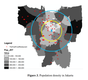
The visualization provides the buffer polygons, as well as representing population density of the area through colour. By comparing the two, we can conclude whether the center of activity is proportional to the population density in a region. It allows us to perform further exploration to see what spatial information significantly affects the level of activity in a city, such as the availability of points-of-interest. This visualization is great as it allows the viewer to clearly see multiple dimensions dealing with spatial data in an elegant way. |
|
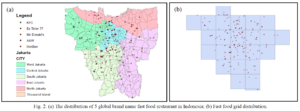
Data source: https://www.researchgate.net/publication/324949619_Visualization_of_Fast_Food_Restaurant_Location_using_Geographical_Information_System |
|
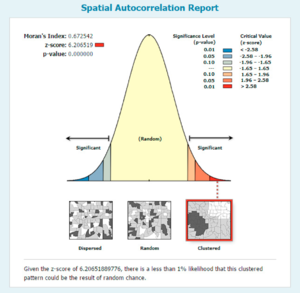
Data source: https://www.researchgate.net/publication/324949619_Visualization_of_Fast_Food_Restaurant_Location_using_Geographical_Information_System |

|
Data source: https://www.researchgate.net/publication/324949619_Visualization_of_Fast_Food_Restaurant_Location_using_Geographical_Information_System |
|
Data source:
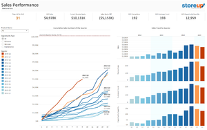
https://public.tableau.com/profile/mirandali#!/vizhome/Salesforce-SalesPerformance/SalesPerformance This databoard shows the cumulative sales. We could learn from this and display by outlets to compare the performance by having multiple forms of visualization. We really like the fact that certain key summarizations and variables are displayed on the top, and will consider using this in our project. |
Proposed Storyboard
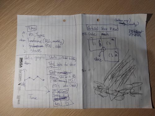
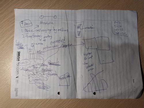
1. IFC Store Sales Overview
Upon entering the application, the user will be greeted with the IFC Stores Sales Overview page. Users will be able to analyse the sales performance of all stores, through a selected period using this page. It will consist of an interactive choropleth map and bar chart. User will also be able to filter the data by Sales by Month and sort the bar chart by ascending or descending sales.
2. Individual IFC Store Information
This page allows the user to inspect each individual stores, and view its POI and Sales. It consists of an interactive choropleth map, line chart and data table. The map displays all subzones of the trade area, denoted by the names on the polygon. The line chart shows the total sales for Store X and the median for all stores over time. The line chart is interactive, and mousing over the points bring up the date and sales of the respective stores. The data table shows all POIs located in the trade area of Store X. The table contains an alphabetical search function, as well as the ability to sort by numerical value by clicking on the arrows buttons on the top right. User will also be able to filter by store and POI through a side panel.
3. Comparison Between Stores
This dashboard allows the user to compare Store X and Store Y to analyse its Points of Interest (POI), Sales and discover the differences between the two stores. It consists of an interactive choropleth map, line chart and data table. The map displays the trade area of Stores X and Y, denoted by the names on the polygon. Clicking on the Pizza Symbol brings up the full name of the store. Clicking on the trade area brings up the total number of selected POIs in the trade area. The line chart shows the total sales for Store X, Y and the median over time. The line chart is interactive, and mousing over the points bring up the date and sales of the respective stores. The data table shows all POIs located in the trade area of Store X,Y. The table contains an alphabetical search function, as well as the ability to sort by numerical value by clicking on the arrows buttons on the top right.
Tools and Libraries
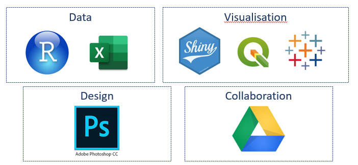
The following tools and libraries are used in the development of the web-based data visualisation application:
- QGIS
- Microsoft Excel
- R Studio
- R Shiny
- Tableau
- Adobe Suite
- Google Drive
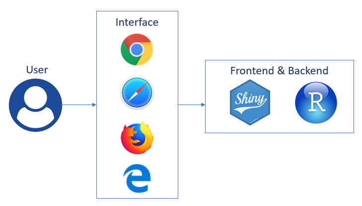
Architectural Diagram
The following architectural is used in the implementation of the visualisation tool: The application is deployed through R Shiny with shinyapps.io.
Datasets
These are the datasets we plan to use:
| Dataset | Rationale |
|---|---|
| |
| |
| |
|
Foreseen Technical Challenges
We encountered the following technical challenges throughout the course of the project. We have indicated our proposed solutions, and the outcomes of the solutions.
| Key Technical Challenges | Proposed Solution | Outcome |
|---|---|---|
|
NA | |
|
We managed to start using the packages quickly and suit our own project needs. Each of us work on different parts such as setting up, designing, logic and deployment. This speeds up our project progress. | |
|
The adopted process was having clear instructions issued to each member in the team, along with maintaining constant communication with each other. In the event that the dataset is deemed too dirty to be usable, it was dropped along with sourcing for new data that would be a suitable replacement. | |
|
NA | |
|
The data points can better allow us to generate insights on the profile of each outlet via its trade area. | |
|
NA | |
|
NA |
Roles & Milestones
- Roles
| Kelvin Chia Sen Wei | Linus Cheng Xin Wei | Wang Xuze |
|---|---|---|
App Developer |
Project Manager |
Report Writer |
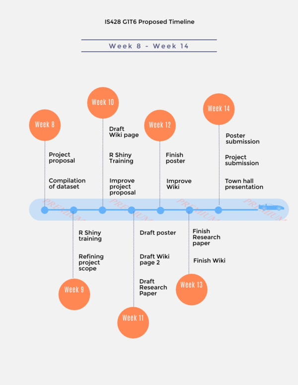
- Project Timeline
- Gantt Chart

References
- Tableau: https://www.tableau.com/learn/training
- R Shiny: https://shiny.rstudio.com/tutorial/
- QGIS: http://www.qgistutorials.com/en/
List of Proposed Features
Comments
Feel free to leave comments / suggestions!
