Difference between revisions of "HappinessWatch: Proposal v3"
| (2 intermediate revisions by the same user not shown) | |||
| Line 169: | Line 169: | ||
==<div style="background: #ef8822; padding: 15px; font-weight: bold; line-height: 0.3em; text-indent: 0px;font-size:20px"><font face="Arial" color=#fbfcfd>PROPOSED STORYBOARD</font></div>== | ==<div style="background: #ef8822; padding: 15px; font-weight: bold; line-height: 0.3em; text-indent: 0px;font-size:20px"><font face="Arial" color=#fbfcfd>PROPOSED STORYBOARD</font></div>== | ||
| − | Our proposed application will consist of | + | Our proposed application will consist of three pages: |
| − | |||
| − | |||
| − | |||
| − | |||
| − | |||
| − | |||
| − | |||
| − | |||
| − | |||
| − | |||
| − | |||
| − | |||
| − | |||
| − | |||
=== OVERVIEW === | === OVERVIEW === | ||
| Line 194: | Line 180: | ||
|- | |- | ||
| | | | ||
| − | [[File: | + | [[File:HW_Overview.jpg|700px|center]] |
|| | || | ||
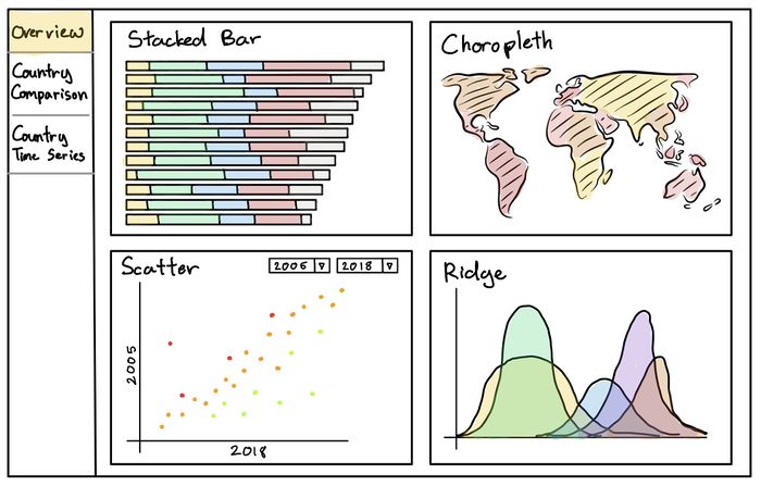
| − | # '''Bar | + | # '''Sorted Stacked Bar''' |
| − | #* The bar | + | #* The Stacked Bar shows the component breakdown of each country's Happiness Index Score. |
| − | #* | + | #* Users can choose to sort the bar by the overall score or individual components |
| − | #* | + | # '''Choropleth Map''' |
| + | #* The Choropleth fills in the world map with varying color intensities based on the Happiness Index Scores. | ||
| + | #* Enables identification of "happy" or "unhappy" clusters/regions. | ||
# '''Scatterplot''' | # '''Scatterplot''' | ||
| − | #* | + | #* Plots the Happiness Index Score changes across two selected years. |
| − | #* | + | #* Upper left and lower right quadrants represent decreases and increases in Happiness Index Scores respectively. |
| + | # '''Ridge''' | ||
| + | #* Visualises the distribution of components contributing to the Happiness Index Scores. | ||
|} | |} | ||
<br/> | <br/> | ||
| − | === | + | === COUNTRY COMPARISON === |
<!-- Table --> | <!-- Table --> | ||
{| class="wikitable" style="background-color:#FFFFFF;" width="100%" | {| class="wikitable" style="background-color:#FFFFFF;" width="100%" | ||
| Line 215: | Line 205: | ||
|- | |- | ||
| | | | ||
| − | [[File: | + | [[File:HW_Comparison.jpg|700px|center]] |
|| | || | ||
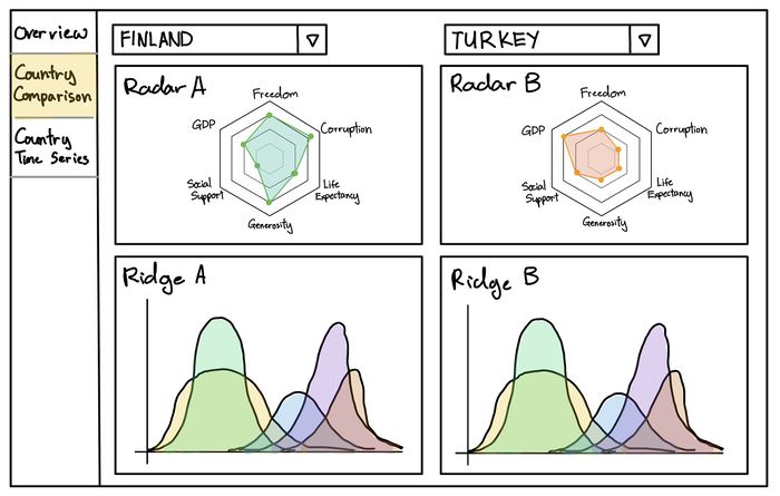
| − | # | + | # '''Radar Chart:''' Component breakdown of the Happiness Index Scores of each selected country. |
| − | + | # '''Ridge Plot:''' Compares the distribution of components contributing to the Happiness Index Score for each selected country. | |
| − | + | ||
| − | # | ||
| − | |||
| − | |||
|} | |} | ||
<br/> | <br/> | ||
| − | === | + | === COUNTRY TIME-SERIES === |
| − | |||
<!-- Table --> | <!-- Table --> | ||
{| class="wikitable" style="background-color:#FFFFFF;" width="100%" | {| class="wikitable" style="background-color:#FFFFFF;" width="100%" | ||
| Line 235: | Line 221: | ||
|- | |- | ||
| | | | ||
| − | [[File: | + | [[File:HW_CountryTS.jpg|700px|center]] |
|| | || | ||
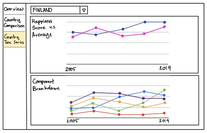
| − | # ''' | + | # '''Comparison Line:''' Compares the selected country's Happiness Index Scores over time to the average score. |
| − | + | # '''Component Breakdown Line:''' Plots the component scores for the selected country over time. | |
| − | |||
| − | # ''' | ||
| − | |||
| − | |||
| − | |||
| − | |||
| − | |||
|} | |} | ||
<br/> | <br/> | ||
Latest revision as of 12:31, 19 November 2019
Version 3
|
Upon exploring the data and consulting Prof. Kam, our team decided to focus on visualising global happiness instead due to data constrains and to prevent making false correlations between suicide rates and happiness scores.
Contents
PROBLEM & MOTIVATION
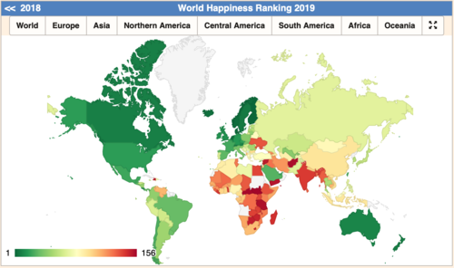
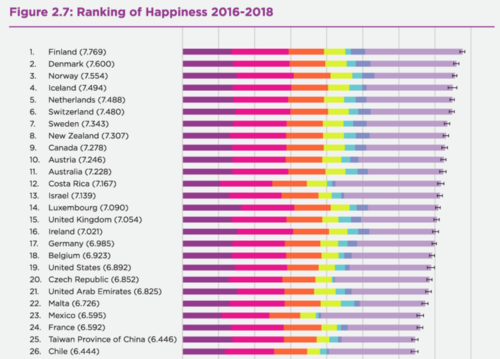
Traditionally, a country’s well-being has been measured on economic variables like GDP or unemployment rate. However, no institution, nation or group of people can really be properly understood without also factoring in a number of other elements. One of these key elements is happiness. What contributes to a country’s happiness? Why are some countries happier than others? Are there any trends or patterns we can discern from the available data? With reference to the World Happiness Report, we attempt to visualize the factors that contribute to a country’s happiness on a global scale.
OBJECTIVES
In this project, we are hope to create a visualization that enables the following:
- Identify regions or countries with the highest happiness scores
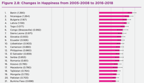
- Visualise the happiness scores over time
- Explore the factors contributing to happiness score
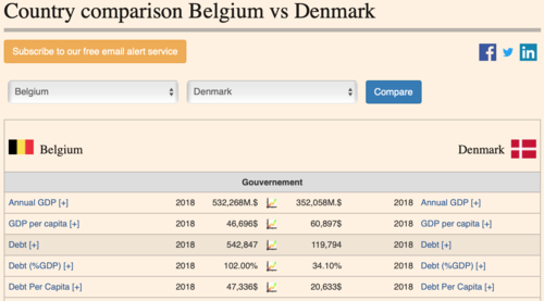
- Comparison of happiness scores and its factors across countries
SELECTED DATASETS
| Dataset/Source | Data Attributes | Why this Dataset? |
|---|---|---|
(https://worldhappiness.report/ed/2019/) |
|
|
RELATED WORKS
| Example | Takeaways |
|---|---|
|
|
|
|
|
|
|
|
|
DESIGN INSPIRATIONS
| Example | Takeaways |
|---|---|
|
|
|
|
|
|
PROPOSED STORYBOARD
Our proposed application will consist of three pages:
OVERVIEW
This page will provide the viewer with an overview of global suicide rates and overall happiness scores.
| Proposed Layout | Description |
|---|---|
|
COUNTRY COMPARISON
| Proposed Layout | Description |
|---|---|
|
COUNTRY TIME-SERIES
| Proposed Layout | Description |
|---|---|
|
PROJECT TIMELINE
KEY CHALLENGES
| Challenge | Mitigation |
|---|---|
|
Inexperienced with Creating and Designing Visualisations |
|
|
Inexperienced with R and R Shiny |
|
|
Limited Access to Sensitive Suicide Data |
|
|
Time and Workload Constrains |
|
REFERENCES
- Semantic Dashboard (https://github.com/Appsilon/semantic.dashboard)
- R Shiny Gallery (http://shiny.rstudio.com/gallery/)
- World Happiness Report (https://worldhappiness.report)
COMMENTS
Feel free to leave us some comments or feedback!
| Name | Comment/Feedback |
|---|---|
|
Your Name |
|
|
Your Name |
|
