Difference between revisions of "IS428 AY2019-20T1 Assign Wang Xuze"
| (20 intermediate revisions by the same user not shown) | |||
| Line 19: | Line 19: | ||
=Motivations= | =Motivations= | ||
| − | # Provide clear overview of the citizen reports to aid decision making | + | # Provide clear overview of the citizen reports to aid decision making. |
| − | # Inform the uncertainty and reliability of the citizen reports | + | # Inform the uncertainty and reliability of the citizen reports. |
| − | # Show how conditions change over time | + | # Show how conditions change over time. |
| − | # Allow effective emergency response to save life | + | # Allow effective emergency response to save life. |
=Data Description= | =Data Description= | ||
| − | The data includes | + | The data includes |
| − | + | <ol><li> A <i>mc1-reports-data.csv</i> file spanning the entire length of the event, containing (categorical) individual reports of shaking/damage by neighborhood over time. It has these fields:<br> | |
| + | <ul><li> time: timestamp of incoming report/record, in the format YYYY-MM-DD hh:mm:ss | ||
| + | <li>location: id of neighborhood where person reporting is feeling the shaking and/or seeing the damage | ||
| + | <li> {shake_intensity, sewer_and_water, power, roads_and_bridges, medical, buildings}: reported categorical value of how violent the shaking was/how bad the damage was (0 - lowest, 10 - highest; missing data allowed) </ul> | ||
| − | + | <li>Two shakemap PNG files which indicate where the corresponding earthquakes' epicenters originate as well as how much shaking can be felt across the city. | |
| − | |||
| − | |||
| − | |||
| − | + | <li>The <i>StHimark.shp</i> provides the geospatial vector data format St. Himark. | |
| − | + | </ol> | |
| − | The StHimark.shp | ||
=Data Preparation= | =Data Preparation= | ||
{| class="wikitable" | {| class="wikitable" | ||
|- | |- | ||
| − | ! | + | ! style="font-weight: bold;background: #536a87;color:#fbfcfd;width: 20%;" | Join the reports data and Shapefile |
|- | |- | ||
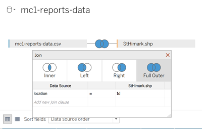
| − | + | | Inside Tableau, import <i>mc1-reports-data.csv</i> and <i>StHimark.shp</i> into Connections. Perform an full order join by using <i>location</i> in csv file and <i>Id</i> in shp file. <br> | |
| − | [[File:Data1-1.png| | + | [[File:Data1-1.png|400px|center|Full outer join]] |
| − | + | This produces the following data columns in Tableau. | |
[[File:Data1-2.png|800px|center|Data columns]] | [[File:Data1-2.png|800px|center|Data columns]] | ||
|} | |} | ||
=Visualisation Techniques= | =Visualisation Techniques= | ||
| + | |||
| + | <b>Online interactive visualization: https://public.tableau.com/profile/wang.xuze#!/vizhome/IS428AY2019-20T1AssignWangXuze/Home?publish=yes </b> | ||
{| class="wikitable" | {| class="wikitable" | ||
| Line 86: | Line 87: | ||
|} | |} | ||
| − | + | =Question Answering= | |
| − | |||
| − | |||
| − | |||
| − | |||
| − | |||
| − | |||
| − | |||
| − | |||
| − | |||
| − | |||
| − | |||
| − | |||
| − | |||
| − | |||
| − | |||
| − | |||
| − | |||
| − | |||
| − | |||
| − | |||
| − | |||
| − | |||
| − | |||
| − | |||
| − | + | <b>Online interactive visualization: https://public.tableau.com/profile/wang.xuze#!/vizhome/IS428AY2019-20T1AssignWangXuze/Home?publish=yes </b> | |
| − | |||
| − | |||
| − | |||
| − | |||
| − | |||
| − | |||
| − | |||
| − | |||
| − | |||
| − | |||
| − | |||
| − | |||
| − | |||
| − | |||
| − | |||
| − | |||
| − | |||
| − | |||
| − | |||
| − | |||
| − | |||
| − | |||
| − | |||
| − | |||
== Task 1== | == Task 1== | ||
| − | <i>Emergency responders will base their initial response on the earthquake shake map. Use visual analytics to determine how their response should change based on damage reports from citizens on the ground. How would you prioritize neighborhoods for response? Which parts of the city are hardest hit?</i> | + | <i><b>Emergency responders will base their initial response on the earthquake shake map. Use visual analytics to determine how their response should change based on damage reports from citizens on the ground. How would you prioritize neighborhoods for response? Which parts of the city are hardest hit?</i></b> |
| − | Given the damage reports by citizens, the emergency responders could change their response accordingly. As far as I am concerned, they should prioritize the neighbourhoods | + | Given the damage reports by citizens, the emergency responders could change their response accordingly. As far as I am concerned, they should prioritize the neighbourhoods when: |
| − | + | <ol> | |
| − | + | <li>The average damage level reported is high</li> | |
| − | + | <li>The number of reports is large</li> | |
| − | + | <li>The damage to important facilities such as medical, roads and bridges, and buildings etc.</li> | |
| − | The rationale is that high level damage is more severe compared to lower damage and requires immediate response. Large number of reports would generally mean a more reliable situation on site; thus, the neighborhood should be quickly attended to. The damage to certain facilities requires more urgent attention such as medical facilities where they could be further damage to the patients | + | <li>The reports of high-level damage are recent</li> </ol> |
| + | |||
| + | The rationale is that high level damage is more severe compared to lower damage and requires immediate response. Large number of reports would generally mean a more reliable situation on site; thus, the neighborhood should be quickly attended to. The damage to certain facilities requires more urgent attention such as medical facilities where they could be further damage to the patients; and roads and bridges where the transportation for rescue is blocked. Last but not least, they should always monitor the most recent reports and attend to those neighborhoods in time. | ||
Therefore, I created visualizations to allow emergency responders to get the information through the following ways: | Therefore, I created visualizations to allow emergency responders to get the information through the following ways: | ||
| Line 155: | Line 110: | ||
! Serial No. !! Observation | ! Serial No. !! Observation | ||
|- | |- | ||
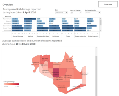
| − | | 1 || This visualization allows emergency responders to view the top damaged neighbourhoods during any hour of any date. The damage level is the average of the reported levels during that hour. As a way for emergency | + | | 1 || This visualization allows emergency responders to view the top damaged neighbourhoods during any hour of any date. The damage level is the average of the reported levels during that hour. <br> As a way for emergency responders to access quickly which are the neighbourhoods that have a general high damage level to all facilities, an overall damage field is included by summing up average damage levels of all categories. <br> A sorting feature is provided for them to sort the neighbourhoods based on the damage level of certain facility if they deem it’s more important to firstly attend to those facilities. (addressed 1, 3 and 4) <br> |
| − | + | They could sort it based on the <b>overall damage</b> during 10th hour on 8th April: | |
| + | [[File:1-1-1.png|800px|center|Sort by overall]] | ||
| + | They could sort it by the facilities that they want to prioritize such as <b>medical</b>: | ||
[[File:Fig. 1-1.png|800px|frameless|centre|alt text]] | [[File:Fig. 1-1.png|800px|frameless|centre|alt text]] | ||
|- | |- | ||
| − | | 2 || This visualization allows emergency responders to view the damaged neighbourhoods during any hour of any date, by different colour intensities representing the average damage level reported, according to the reports from citizens. A show damage for filter is provided so that we can choose which facilities’ damage we want to view. In this case, In Northwest during hour 17 on 6 April, there are 48 reports made, and the average medical damage is 8.5. Thus the responders might want to quickly attend to this neighbourhood first. (address 1, 2, 3, 4) | + | | 2 || This visualization allows emergency responders to view the damaged neighbourhoods during any hour of any date, by different colour intensities representing the average damage level reported, according to the reports from citizens. A show damage for filter is provided so that we can choose which facilities’ damage we want to view. In this case, In Northwest during hour 17 on 6 April, there are 48 reports made, and the average medical damage is 8.5. Thus the responders might want to quickly attend to this neighbourhood first. (address 1, 2, 3, 4) <br> |
[[File:1-2.png|800px|frameless|centre]] | [[File:1-2.png|800px|frameless|centre]] | ||
| − | |||
| − | |||
| − | |||
| − | |||
| − | |||
| − | |||
| − | |||
| − | |||
| − | |||
| − | |||
| − | |||
| − | |||
| − | |||
| − | |||
| − | |||
| − | |||
| − | |||
|} | |} | ||
== Task 2== | == Task 2== | ||
| − | <i>Use visual analytics to show uncertainty in the data. Compare the reliability of neighborhood reports. Which neighborhoods are providing reliable reports? Provide a rationale for your response.</i> | + | <i><b>Use visual analytics to show uncertainty in the data. Compare the reliability of neighborhood reports. Which neighborhoods are providing reliable reports? Provide a rationale for your response.</i></b> |
Since the visualizations prepared for question 1 are mostly using average values, it might be acceptable for emergency responders to gain immediate first-hand insights. However, when we display aggregated data like sum or average, we no longer have any visibility into the variance of the underlying data. Especially that our visualizations are based on crowdsourced data that may lack of reliability and the qualities may vary, since the damage level reports are totally based on citizens’ subjective opinions. The emergency responders need to be fully informed of such uncertainties to access the reliabilities of neighbourhood reports. Therefore, there are uncertainties in the data I would like to address. | Since the visualizations prepared for question 1 are mostly using average values, it might be acceptable for emergency responders to gain immediate first-hand insights. However, when we display aggregated data like sum or average, we no longer have any visibility into the variance of the underlying data. Especially that our visualizations are based on crowdsourced data that may lack of reliability and the qualities may vary, since the damage level reports are totally based on citizens’ subjective opinions. The emergency responders need to be fully informed of such uncertainties to access the reliabilities of neighbourhood reports. Therefore, there are uncertainties in the data I would like to address. | ||
| Line 188: | Line 128: | ||
{| class="wikitable" | {| class="wikitable" | ||
|- | |- | ||
| − | ! Serial No. !! | + | ! Serial No. !! Observation |
|- | |- | ||
| − | | 1 || This is an overall heatmap showing the number of reports made by citizens hourly every day for each of the neighbourhoods. | + | | 1 || This is an overall heatmap showing the number of reports made by citizens hourly every day for each of the neighbourhoods. From this heatmap we can identify the frequency and number of reports made. |
| − | From this heatmap we can identify | ||
What’s more, there’s background knowledge that there are power outages happening in neighbourhoods like Old Town and Southwest due to Power Department’s work. This will cause delays in the receipt of reports. | What’s more, there’s background knowledge that there are power outages happening in neighbourhoods like Old Town and Southwest due to Power Department’s work. This will cause delays in the receipt of reports. | ||
Certain abnormalities on the heatmap can be explained with additional information, such as that during 8th and 9th hours of 8th April, there were 2200 and 1713 reports made but no reports made for the following 15 hours, and sudden surge in report numbers happened during 1st hour of 9th April. This must be because of the power outage. This neighbourhood should be attended because of the significant number of reports made before the power outage happened. | Certain abnormalities on the heatmap can be explained with additional information, such as that during 8th and 9th hours of 8th April, there were 2200 and 1713 reports made but no reports made for the following 15 hours, and sudden surge in report numbers happened during 1st hour of 9th April. This must be because of the power outage. This neighbourhood should be attended because of the significant number of reports made before the power outage happened. | ||
However, information like prolonged period in Scenic Vista without reports made requires more investigation.<br> | However, information like prolonged period in Scenic Vista without reports made requires more investigation.<br> | ||
| − | [[File:2-1.png| | + | [[File:2-1.png|700px|frameless|center|Number of reports heatmap]] |
|- | |- | ||
| − | | 2 || This visualization displays the damage level distribution reports by citizen about different facilities during a certain hour in each neighbourhood. Emergency responders could use this to access how much variations are in the different reports. For example: In Broadview during 14th hour on 6th April, the medical damage reports vary a lot whereas roads and bridges damage reports vary little. | + | | 2 || This visualization displays the damage level distribution reports by citizen about different facilities during a certain hour in each neighbourhood. Emergency responders could use this to access how much variations are in the different reports. <br>For example: In Broadview during 14th hour on 6th April, the medical damage reports vary a lot whereas roads and bridges damage reports vary little. |
| − | [[File:2-2.png| | + | [[File:2-2.png|700px|frameless|center|Hourly report distribution boxplot]] |
|- | |- | ||
| − | | 3 || To | + | | 3 || To access which neighbourhoods are providing reliable reports, I think that the neighbourhoods with higher number of reports and less variation in the data are more reliable. <br> |
| + | Based on these two criteria, this visualization provides the standard deviation of the reported damages about a certain facility (building in this graph). Together with the number of reports during the hour, the emergency responders could decide whether the data is reliable. <br> | ||
| + | For example, In Broadview, the reports during hour 1 with a standard deviation of 3.869 are not reliable compared to those during 9th hour with a standard deviation of 2.429. | ||
| − | [[File:2-3.png| | + | [[File:2-3.png|700px|frameless|center|Standard deviation of reported damages]] |
<br> | <br> | ||
|- | |- | ||
| − | | 4 ||If we look at the entire view, we can see that some neighbourhoods | + | | 4 ||If we look at the entire view with all dates, we can see that some neighbourhoods have reports with small standard deviation mostly (lighter colour) like Broadview and Weston. <br> Whereas some others have more darker colour areas indication less reliable reports with large standard deviation, like Pepper Mill and Safe Town. |
| − | [[File:2-4.png| | + | [[File:2-4.png|700px|frameless|center|Overall standard deviation of reported damages]] |
| Line 216: | Line 157: | ||
== Task 3== | == Task 3== | ||
| − | Describe | + | <b><i>How do conditions change over time? How does uncertainty in change over time? Describe the key changes you see. Limit your response to 500 words and 8 images.</i></b> <br> |
| + | With a time-series data set, we can visualize the changes and look for insights into our data. The changes in our case could be analysed based on: | ||
| + | <ol><li>Change in number of reports </li> | ||
| + | <li>Change in reported damage levels </li></ol> | ||
{| class="wikitable" | {| class="wikitable" | ||
|- | |- | ||
| − | ! | + | ! Serial No. !! Observation |
| − | |||
| − | |||
| − | |||
| − | |||
| − | |||
| − | |||
| − | |||
|- | |- | ||
| − | | | + | | 1 || This visualization presents a line graph showing how the hourly number of reports vary for each neighbourhood. We can filter by neighbourhoods and dates and display only those we want to take a deeper look into. <br> |
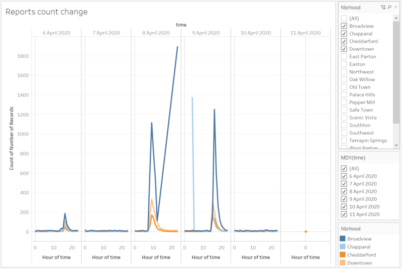
| − | + | This graph shows all neighbourhoods' number of reports change over the period. We can see that, there’s high increase in citizen reports on 8 April when the major quake started, from hour 7 to hour 10, where the number of reports start to decrease. There are occasionally unusual spikes and they are explained by power outage. | |
| − | [[ | + | [[File:3-1.png|800px|center|reports count change]] |
| − | + | Using filter to zoom into one particular neighboorhood can provide us with more detailed information. This graph shows the change in Downtown. We could see that citizens started to report information about fore quakes in hour 14 on 6th April; major quakes in hour 7 on 8th April and after quakes in hour 13 on 9th April. | |
| − | + | [[File:3-1-1.png|800px|center|Downtown]] | |
| − | |||
| − | |||
| − | |||
| − | |||
|- | |- | ||
| − | | | + | | 2 || This visualization presents a line graph showing how the hourly average damage reported varies in a neighbourhood. <br> |
| − | + | For example when we look at Easton, we can see that the damage reported for buildings and power are high since hour 0, whereas the damage for roads and bridges and sewer and water started to increase an hour later. This is probably because that the former can be more directly felt by the shaking of the building, the power outage, but the latter could not be felt after a while. | |
| − | + | [[File:3-2.png|800px|center|Reported damage change]] | |
| − | |||
| − | |||
| − | |||
| − | |||
| − | [[ | ||
| − | |||
| − | |||
| − | |||
| − | |||
|} | |} | ||
| − | + | =Future Improvement= | |
| − | |||
| − | |||
| − | |||
| − | |||
| − | |||
| − | |||
| − | |||
| − | |||
| − | =Improvement= | ||
Given more time, I will improving on the visualizations by including more statistical methods and reasoning to demonstrate the data uncertainty and reliability. I will also work on improving the interface for the emergency responders and provide them with a much easier and clearer view. Nonetheless, through this assignment, I have learned a lot about interpreting the data, visualization techniques and my analytical ability. | Given more time, I will improving on the visualizations by including more statistical methods and reasoning to demonstrate the data uncertainty and reliability. I will also work on improving the interface for the emergency responders and provide them with a much easier and clearer view. Nonetheless, through this assignment, I have learned a lot about interpreting the data, visualization techniques and my analytical ability. | ||
=Visualisation Software= | =Visualisation Software= | ||
| − | To perform the visual analysis, this | + | To perform the visual analysis, this are the softwares I used. |
| − | *Tableau | + | *Tableau Desktop |
| + | *Tableau Public Server (My work: https://public.tableau.com/profile/wang.xuze#!/vizhome/IS428AY2019-20T1AssignWangXuze/Home?publish=yes) | ||
*Excel | *Excel | ||
| − | |||
*R Studio | *R Studio | ||
| − | |||
=References= | =References= | ||
| Line 281: | Line 195: | ||
* How to Creat Heat Map in Tableau | * How to Creat Heat Map in Tableau | ||
https://www.youtube.com/watch?v=Tc8VenUN4n8 | https://www.youtube.com/watch?v=Tc8VenUN4n8 | ||
| − | + | * Analyzing Time Series | |
| + | https://www.youtube.com/watch?v=aaaILjNPHSs | ||
=Comments= | =Comments= | ||
| − | + | I appreciate all suggestions and discussions! | |
| + | Please provide feedback thank you! :) | ||
Latest revision as of 23:58, 13 October 2019
Mini-Challenge 1: Crowdsourcing for Situational Awareness
Contents
Problem Statement
St. Himark has been hit by an earthquake, leaving officials scrambling to determine the extent of the damage and dispatch limited resources to the areas in most need. They quickly receive seismic readings and use those for an initial deployment but realize they need more information to make sure they have a realistic understanding of the true conditions throughout the city.
In a prescient move of community engagement, the city had released a new damage reporting mobile application shortly before the earthquake. This app allows citizens to provide more timely information to the city to help them understand damage and prioritize their response. In this mini-challenge, use app responses in conjunction with shake maps of the earthquake strength to identify areas of concern and advise emergency planners. Note: the shake maps are from April 6 and April 8 respectively.
With emergency services stretched thin, officials are relying on citizens to provide them with much needed information about the effects of the quake to help focus recovery efforts.
By combining seismic readings of the quake, responses from the app, and background knowledge of the city, help the city triage their efforts for rescue and recovery.
Tasks
- Emergency responders will base their initial response on the earthquake shake map. Use visual analytics to determine how their response should change based on damage reports from citizens on the ground. How would you prioritize neighborhoods for response? Which parts of the city are hardest hit? Limit your response to 1000 words and 10 images.
- Use visual analytics to show uncertainty in the data. Compare the reliability of neighborhood reports. Which neighborhoods are providing reliable reports? Provide a rationale for your response. Limit your response to 1000 words and 10 images.
- How do conditions change over time? How does uncertainty in change over time? Describe the key changes you see. Limit your response to 500 words and 8 images.
Motivations
- Provide clear overview of the citizen reports to aid decision making.
- Inform the uncertainty and reliability of the citizen reports.
- Show how conditions change over time.
- Allow effective emergency response to save life.
Data Description
The data includes
- A mc1-reports-data.csv file spanning the entire length of the event, containing (categorical) individual reports of shaking/damage by neighborhood over time. It has these fields:
- time: timestamp of incoming report/record, in the format YYYY-MM-DD hh:mm:ss
- location: id of neighborhood where person reporting is feeling the shaking and/or seeing the damage
- {shake_intensity, sewer_and_water, power, roads_and_bridges, medical, buildings}: reported categorical value of how violent the shaking was/how bad the damage was (0 - lowest, 10 - highest; missing data allowed)
- Two shakemap PNG files which indicate where the corresponding earthquakes' epicenters originate as well as how much shaking can be felt across the city.
- The StHimark.shp provides the geospatial vector data format St. Himark.
Data Preparation
| Join the reports data and Shapefile |
|---|
| Inside Tableau, import mc1-reports-data.csv and StHimark.shp into Connections. Perform an full order join by using location in csv file and Id in shp file. This produces the following data columns in Tableau. |
Visualisation Techniques
Online interactive visualization: https://public.tableau.com/profile/wang.xuze#!/vizhome/IS428AY2019-20T1AssignWangXuze/Home?publish=yes
| Dynamic Sorting |
|---|
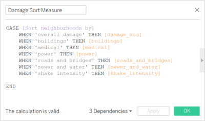
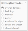
| Description To present the top neighborhoods with severe damages, I sort the damage level according to the facility specified. For example, when user selects shake intensity, the data will be in descending order according to the average damage reported about shake intensity.
|
Technique
|
Question Answering
Online interactive visualization: https://public.tableau.com/profile/wang.xuze#!/vizhome/IS428AY2019-20T1AssignWangXuze/Home?publish=yes
Task 1
Emergency responders will base their initial response on the earthquake shake map. Use visual analytics to determine how their response should change based on damage reports from citizens on the ground. How would you prioritize neighborhoods for response? Which parts of the city are hardest hit?
Given the damage reports by citizens, the emergency responders could change their response accordingly. As far as I am concerned, they should prioritize the neighbourhoods when:
- The average damage level reported is high
- The number of reports is large
- The damage to important facilities such as medical, roads and bridges, and buildings etc.
- The reports of high-level damage are recent
The rationale is that high level damage is more severe compared to lower damage and requires immediate response. Large number of reports would generally mean a more reliable situation on site; thus, the neighborhood should be quickly attended to. The damage to certain facilities requires more urgent attention such as medical facilities where they could be further damage to the patients; and roads and bridges where the transportation for rescue is blocked. Last but not least, they should always monitor the most recent reports and attend to those neighborhoods in time.
Therefore, I created visualizations to allow emergency responders to get the information through the following ways:
| Serial No. | Observation |
|---|---|
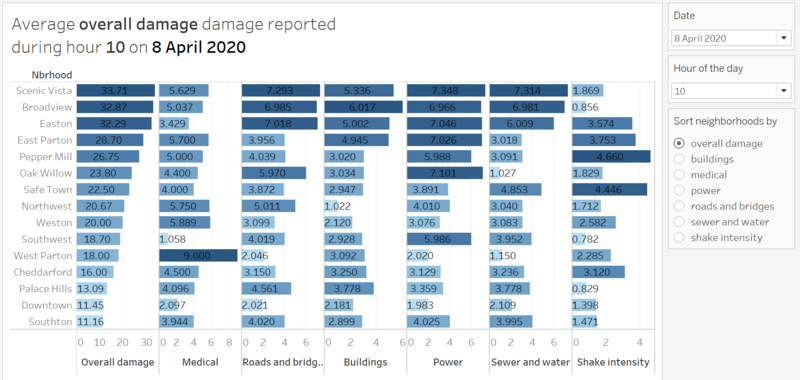
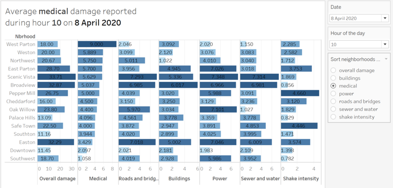
| 1 | This visualization allows emergency responders to view the top damaged neighbourhoods during any hour of any date. The damage level is the average of the reported levels during that hour. As a way for emergency responders to access quickly which are the neighbourhoods that have a general high damage level to all facilities, an overall damage field is included by summing up average damage levels of all categories. A sorting feature is provided for them to sort the neighbourhoods based on the damage level of certain facility if they deem it’s more important to firstly attend to those facilities. (addressed 1, 3 and 4) They could sort it based on the overall damage during 10th hour on 8th April: They could sort it by the facilities that they want to prioritize such as medical: |
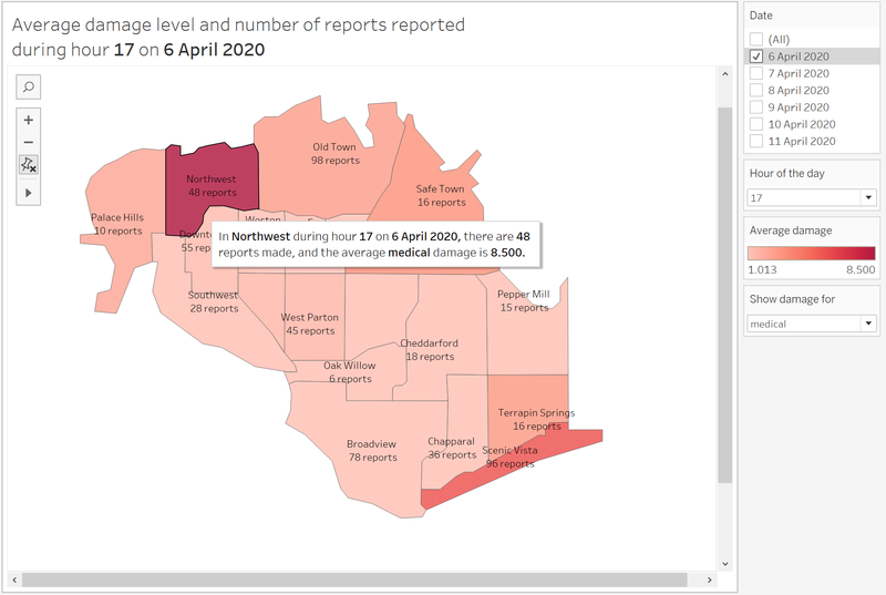
| 2 | This visualization allows emergency responders to view the damaged neighbourhoods during any hour of any date, by different colour intensities representing the average damage level reported, according to the reports from citizens. A show damage for filter is provided so that we can choose which facilities’ damage we want to view. In this case, In Northwest during hour 17 on 6 April, there are 48 reports made, and the average medical damage is 8.5. Thus the responders might want to quickly attend to this neighbourhood first. (address 1, 2, 3, 4) |
Task 2
Use visual analytics to show uncertainty in the data. Compare the reliability of neighborhood reports. Which neighborhoods are providing reliable reports? Provide a rationale for your response.
Since the visualizations prepared for question 1 are mostly using average values, it might be acceptable for emergency responders to gain immediate first-hand insights. However, when we display aggregated data like sum or average, we no longer have any visibility into the variance of the underlying data. Especially that our visualizations are based on crowdsourced data that may lack of reliability and the qualities may vary, since the damage level reports are totally based on citizens’ subjective opinions. The emergency responders need to be fully informed of such uncertainties to access the reliabilities of neighbourhood reports. Therefore, there are uncertainties in the data I would like to address.
These visualizations are provided to understand the uncertainty and reliability of neighbourhood reports:
| Serial No. | Observation |
|---|---|
| 1 | This is an overall heatmap showing the number of reports made by citizens hourly every day for each of the neighbourhoods. From this heatmap we can identify the frequency and number of reports made.
What’s more, there’s background knowledge that there are power outages happening in neighbourhoods like Old Town and Southwest due to Power Department’s work. This will cause delays in the receipt of reports.
Certain abnormalities on the heatmap can be explained with additional information, such as that during 8th and 9th hours of 8th April, there were 2200 and 1713 reports made but no reports made for the following 15 hours, and sudden surge in report numbers happened during 1st hour of 9th April. This must be because of the power outage. This neighbourhood should be attended because of the significant number of reports made before the power outage happened.
However, information like prolonged period in Scenic Vista without reports made requires more investigation. |
| 2 | This visualization displays the damage level distribution reports by citizen about different facilities during a certain hour in each neighbourhood. Emergency responders could use this to access how much variations are in the different reports. For example: In Broadview during 14th hour on 6th April, the medical damage reports vary a lot whereas roads and bridges damage reports vary little. |
| 3 | To access which neighbourhoods are providing reliable reports, I think that the neighbourhoods with higher number of reports and less variation in the data are more reliable. Based on these two criteria, this visualization provides the standard deviation of the reported damages about a certain facility (building in this graph). Together with the number of reports during the hour, the emergency responders could decide whether the data is reliable.
|
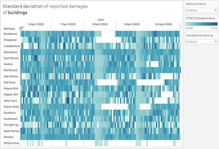
| 4 | If we look at the entire view with all dates, we can see that some neighbourhoods have reports with small standard deviation mostly (lighter colour) like Broadview and Weston. Whereas some others have more darker colour areas indication less reliable reports with large standard deviation, like Pepper Mill and Safe Town.
|
Task 3
How do conditions change over time? How does uncertainty in change over time? Describe the key changes you see. Limit your response to 500 words and 8 images.
With a time-series data set, we can visualize the changes and look for insights into our data. The changes in our case could be analysed based on:
- Change in number of reports
- Change in reported damage levels
| Serial No. | Observation |
|---|---|
| 1 | This visualization presents a line graph showing how the hourly number of reports vary for each neighbourhood. We can filter by neighbourhoods and dates and display only those we want to take a deeper look into. This graph shows all neighbourhoods' number of reports change over the period. We can see that, there’s high increase in citizen reports on 8 April when the major quake started, from hour 7 to hour 10, where the number of reports start to decrease. There are occasionally unusual spikes and they are explained by power outage. Using filter to zoom into one particular neighboorhood can provide us with more detailed information. This graph shows the change in Downtown. We could see that citizens started to report information about fore quakes in hour 14 on 6th April; major quakes in hour 7 on 8th April and after quakes in hour 13 on 9th April. |
| 2 | This visualization presents a line graph showing how the hourly average damage reported varies in a neighbourhood. For example when we look at Easton, we can see that the damage reported for buildings and power are high since hour 0, whereas the damage for roads and bridges and sewer and water started to increase an hour later. This is probably because that the former can be more directly felt by the shaking of the building, the power outage, but the latter could not be felt after a while. |
Future Improvement
Given more time, I will improving on the visualizations by including more statistical methods and reasoning to demonstrate the data uncertainty and reliability. I will also work on improving the interface for the emergency responders and provide them with a much easier and clearer view. Nonetheless, through this assignment, I have learned a lot about interpreting the data, visualization techniques and my analytical ability.
Visualisation Software
To perform the visual analysis, this are the softwares I used.
- Tableau Desktop
- Tableau Public Server (My work: https://public.tableau.com/profile/wang.xuze#!/vizhome/IS428AY2019-20T1AssignWangXuze/Home?publish=yes)
- Excel
- R Studio
References
- Dynamic Sorting with Tableau
https://www.clearlyandsimply.com/clearly_and_simply/2011/11/dynamic-sorting-with-tableau.html
- Using Tableau to Show Variance and Uncertainty
https://www.rittmanmead.com/blog/2017/06/using-tableau-to-show-variance-and-uncertainty/
- How to Creat Heat Map in Tableau
https://www.youtube.com/watch?v=Tc8VenUN4n8
- Analyzing Time Series
https://www.youtube.com/watch?v=aaaILjNPHSs
Comments
I appreciate all suggestions and discussions! Please provide feedback thank you! :)
