Difference between revisions of "IS428 AY2019-20T1 Assign Wang Xuze"
| Line 51: | Line 51: | ||
|} | |} | ||
| − | =Visualisation= | + | =Visualisation Techniques= |
| − | |||
| − | |||
| − | |||
| − | |||
| − | |||
| − | |||
| − | |||
| − | |||
| − | |||
| − | |||
| − | |||
| − | |||
| − | |||
| − | |||
| − | |||
| − | |||
| − | |||
| − | |||
| − | |||
| − | |||
{| class="wikitable" | {| class="wikitable" | ||
|- | |- | ||
| − | ! style="font-weight: bold;background: #536a87;color:#fbfcfd;width: 20%;" | | + | ! style="font-weight: bold;background: #536a87;color:#fbfcfd;width: 20%;" | Dashboard navigations |
|- | |- | ||
| − | | | + | | |
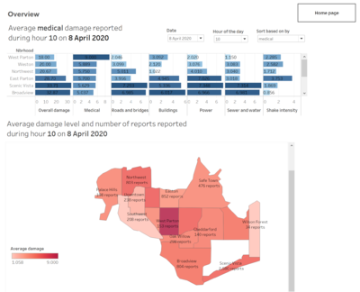
| − | + | The homepage is the landing page you will see when you use this Visualization tool. This homepage makes use of the Tableau Dashboard and its button functions to enable interactivity. <br> | |
| − | + | [[File:Home xuze.png|400px|home page]] | |
| − | + | [[File:Overview xuze.png|400px|frameless|overview]] | |
| − | + | <br> | |
| − | [[ | ||
| − | |||
| − | |||
| − | [[ | ||
| − | < | ||
|} | |} | ||
{| class="wikitable" | {| class="wikitable" | ||
|- | |- | ||
| − | ! style="font-weight: bold;background: #536a87;color:#fbfcfd;width: 20%;" | | + | ! style="font-weight: bold;background: #536a87;color:#fbfcfd;width: 20%;" | Dynamic Sorting |
|- | |- | ||
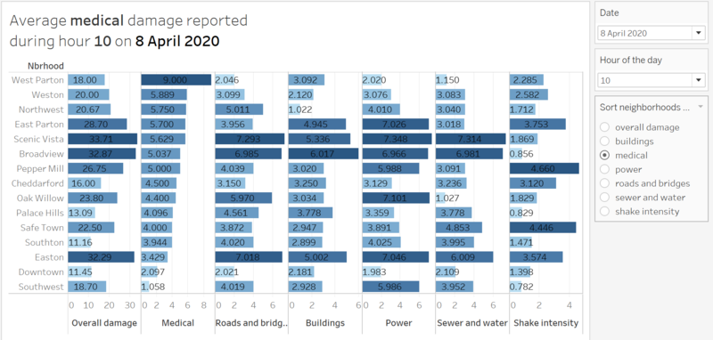
| − | | <b> | + | | <b>Description</b><br> To present the top neighborhoods with severe damages, I sort the damage level according to the facility specified. |
| − | + | For example, when user selects <i>shake intensity</i>, the data will be in descending order according to the average damage reported about shake intensity. | |
| − | + | ||
| − | + | [[File:Sorting xuze.png|600px|center|Dynamic sorting]] | |
| − | + | <br> | |
| − | |||
| − | |||
| − | [[ | ||
| − | |||
|- | |- | ||
| − | | <b> | + | | <b>Technique</b><br> |
<ol> | <ol> | ||
| − | <li> | + | <li> Create a Parameter including the list of values we want the sorting to be based on |
| − | + | [[File:Parameters.png|200px|center|Parameters]] | |
| − | [[ | + | </li> |
| − | <li> | + | <li> Create a Calculation Field matching the parameters with the Measures variables |
| − | + | [[File:Calculation field.png|200px|center|Calculation field]] | |
| − | [[ | + | </li> |
| − | <li> | + | <li> Show Parameter Control in the worksheet and now we are able to sort<br> |
| − | + | [[File:Para sorting.png|200px|center|Para sorting]] | |
| − | [[ | + | </li> |
</ol> | </ol> | ||
| − | |||
| − | |||
| − | |||
| − | |||
| − | |||
| − | |||
| − | |||
|} | |} | ||
| Line 174: | Line 138: | ||
[[Image:Tan Kee Hock MA3 Slide23.JPG|800px|center]]<br> | [[Image:Tan Kee Hock MA3 Slide23.JPG|800px|center]]<br> | ||
|} | |} | ||
| − | |||
=Question Answering= | =Question Answering= | ||
Revision as of 22:11, 13 October 2019
Mini-Challenge 1: Crowdsourcing for Situational Awareness
Contents
Problem Statement
St. Himark has been hit by an earthquake, leaving officials scrambling to determine the extent of the damage and dispatch limited resources to the areas in most need. They quickly receive seismic readings and use those for an initial deployment but realize they need more information to make sure they have a realistic understanding of the true conditions throughout the city.
In a prescient move of community engagement, the city had released a new damage reporting mobile application shortly before the earthquake. This app allows citizens to provide more timely information to the city to help them understand damage and prioritize their response. In this mini-challenge, use app responses in conjunction with shake maps of the earthquake strength to identify areas of concern and advise emergency planners. Note: the shake maps are from April 6 and April 8 respectively.
With emergency services stretched thin, officials are relying on citizens to provide them with much needed information about the effects of the quake to help focus recovery efforts.
By combining seismic readings of the quake, responses from the app, and background knowledge of the city, help the city triage their efforts for rescue and recovery.
Tasks
- Emergency responders will base their initial response on the earthquake shake map. Use visual analytics to determine how their response should change based on damage reports from citizens on the ground. How would you prioritize neighborhoods for response? Which parts of the city are hardest hit? Limit your response to 1000 words and 10 images.
- Use visual analytics to show uncertainty in the data. Compare the reliability of neighborhood reports. Which neighborhoods are providing reliable reports? Provide a rationale for your response. Limit your response to 1000 words and 10 images.
- How do conditions change over time? How does uncertainty in change over time? Describe the key changes you see. Limit your response to 500 words and 8 images.
Motivations
- Provide clear overview of the citizen reports to aid decision making
- Inform the uncertainty and reliability of the citizen reports
- Show how conditions change over time
- Allow effective emergency response to save life
Data Description
The data includes one (CSV) file spanning the entire length of the event, containing (categorical) individual reports of shaking/damage by neighborhood over time. Reports are made by citizens at any time, however, they are only recorded in 5-minute batches/increments due to the server configuration. Furthermore, delays in the receipt of reports may occur during power outages.
Data file mc1-reports-data.csv has these fields:
   - time: timestamp of incoming report/record, in the format YYYY-MM-DD hh:mm:ss
   - location: id of neighborhood where person reporting is feeling the shaking and/or seeing the damage
   - {shake_intensity, sewer_and_water, power, roads_and_bridges, medical, buildings}: reported categorical value of how violent the shaking was/how bad the damage was (0 - lowest, 10 - highest; missing data allowed)
Two shakemap (PNG) files which indicate where the corresponding earthquakes' epicenters originate as well as how much shaking can be felt across the city.
The StHimark.shp shapefile provides the geospatial vector data format St. Himark.
The data will then be visualized using Tableau.
Data Preparation
| Join the reports data and Shapefile | |
|---|---|
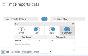
| Steps | Inside Tableau, import mc1-reports-data.csv and StHimark.shp into Connections. Perform an full order join by using location in csv file and Id in shp file.
|
Visualisation Techniques
| Dynamic Sorting |
|---|
| Description To present the top neighborhoods with severe damages, I sort the damage level according to the facility specified. For example, when user selects shake intensity, the data will be in descending order according to the average damage reported about shake intensity.
|
Technique
|
| [Step 2/3] Employee Movement Explorer |
|---|
| Purpose / Description The purpose of this dashboard is visualise the employee proximity card data. The data are given with X,Y coordinates. Thus, we can plot the data on a background image map which is provided in the original dataset. The proximity card data are visualized on the floor map itself. There are modifications to the floor map so that the data can be better visualized. Now that the employee's movements are visualized on an image map, it gives much higher clarity on the employee's movement/activities around the building. |
Interactive Technique
|
| Types of Charts used For this dashboard, much of the data are given based on the location itself. Thus, the data needs to be plotted on an image to effectively show the pattern between the employee's location and the time of the day. This will help to tell us what the employee's movement/activities are like.
The image below is a representative of the type of charts used. It does not represent all the charts that are present in the dashboard. |
| [Step 3] Variable Explorer |
|---|
| Purpose / Description Variable Explorer is to allow the user to further explore the data in more details. In the previous dashboards, especially for the controls, the level of detail is limited so that the analyst can see the bigger picture. In this dashboard, it is designed to empower the analyst to view more about the data and how it changes across floor, zones and time. This is to help the analyst understand how the readings varies across the mentioned building attributes and time. The aim of this dashboard is to focus on just one measurement and understand its pattern/behaviour. |
Interactive Technique
|
| Types of Charts used The data all have one common attribute, which is date/time. Thus, to enable flexibility for the dashboard to handle all of the variable types, the dashboard is fundamentally be required to visualize time-related data. Therefore, the following types of charts are used.
The image below is a representative of the type of charts used. It does not represent all the charts that are present in the dashboard. |
Question Answering
Task 1
Emergency responders will base their initial response on the earthquake shake map. Use visual analytics to determine how their response should change based on damage reports from citizens on the ground. How would you prioritize neighborhoods for response? Which parts of the city are hardest hit?
Given the damage reports by citizens, the emergency responders could change their response accordingly. As far as I am concerned, they should prioritize the neighbourhoods that: 1. The average damage level reported is high 2. The number of reports is large 3. The damage to medical, roads and bridges, and buildings etc. 4. The reports of high-level damage are recent The rationale is that high level damage is more severe compared to lower damage and requires immediate response. Large number of reports would generally mean a more reliable situation on site; thus, the neighborhood should be quickly attended to. The damage to certain facilities requires more urgent attention such as medical facilities where they could be further damage to the patients, and roads and bridges where the transportation for rescue is blocked. Last but not least, they should always monitor the most recent reports and attend to those neighborhoods in time.
Therefore, I created visualizations to allow emergency responders to get the information through the following ways:
| Serial No. | Observation |
|---|---|
| 1 | This visualization allows emergency responders to view the top damaged neighbourhoods during any hour of any date. The damage level is the average of the reported levels during that hour. As a way for emergency responder to access quickly which are the neighbourhoods that have a general high damage level to all facilities, an overall damage field is included by summing up average damage levels of all categories. A sorting feature is provided for them to sort the neighbourhoods based on the damage level of certain facility if they deem it’s more important to firstly attend to those facilities. (addressed 1 and 3) |
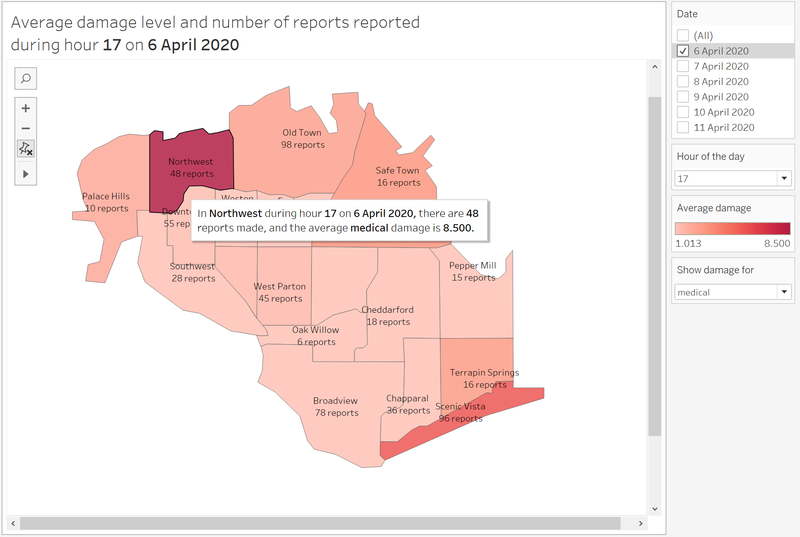
| 2 | This visualization allows emergency responders to view the damaged neighbourhoods during any hour of any date, by different colour intensities representing the average damage level reported, according to the reports from citizens. A show damage for filter is provided so that we can choose which facilities’ damage we want to view. In this case, In Northwest during hour 17 on 6 April, there are 48 reports made, and the average medical damage is 8.5. Thus the responders might want to quickly attend to this neighbourhood first. (address 1, 2, 3, 4) |
| 3 | |
| 4 | |
| 5 | |
| 6 | |
| 7 | |
| 8 | |
| 9 | The offices of the employees are arranged by position. The higher position the employee is, it is likely that his/her office will be at the higher floor. The executive departments are mainly located on the 3rd floor, while people from the facility and security department comes from the 1st and 2nd floor. |
| 10 | Floor 2 is where the bulk of the employees are. Most of the employee's offices are on the 2nd floor. Although their offices are located on the 2nd floor, they still move about the building as frequently. Also, as seen in the floor map and the employee proximity card data, floor 1 is where meetings and front desk offices are located. Thus, the reduced employee presence in floor 1 also suggests that the meeting rooms in floor 1 are likely to be used to host guests/events |
Task 2
Use visual analytics to show uncertainty in the data. Compare the reliability of neighborhood reports. Which neighborhoods are providing reliable reports? Provide a rationale for your response.
Since the visualizations prepared for question 1 are mostly using average values, it might be acceptable for emergency responders to gain immediate first-hand insights. However, when we display aggregated data like sum or average, we no longer have any visibility into the variance of the underlying data. Especially that our visualizations are based on crowdsourced data that may lack of reliability and the qualities may vary, since the damage level reports are totally based on citizens’ subjective opinions. The emergency responders need to be fully informed of such uncertainties to access the reliabilities of neighbourhood reports. Therefore, there are uncertainties in the data I would like to address.
These visualizations are provided to understand the uncertainty and reliability of neighbourhood reports:
| Serial No. | Description and Significance |
|---|---|
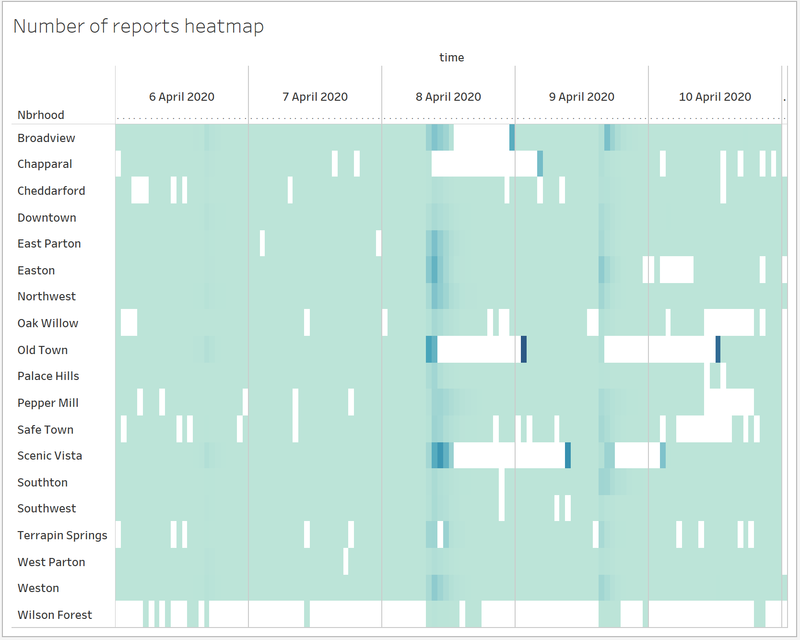
| 1 | This is an overall heatmap showing the number of reports made by citizens hourly every day for each of the neighbourhoods.
From this heatmap we can identify that the reports are not made consistently.
What’s more, there’s background knowledge that there are power outages happening in neighbourhoods like Old Town and Southwest due to Power Department’s work. This will cause delays in the receipt of reports.
Certain abnormalities on the heatmap can be explained with additional information, such as that during 8th and 9th hours of 8th April, there were 2200 and 1713 reports made but no reports made for the following 15 hours, and sudden surge in report numbers happened during 1st hour of 9th April. This must be because of the power outage. This neighbourhood should be attended because of the significant number of reports made before the power outage happened.
However, information like prolonged period in Scenic Vista without reports made requires more investigation. |
| 2 | This visualization displays the damage level distribution reports by citizen about different facilities during a certain hour in each neighbourhood. Emergency responders could use this to access how much variations are in the different reports. For example: In Broadview during 14th hour on 6th April, the medical damage reports vary a lot whereas roads and bridges damage reports vary little. |
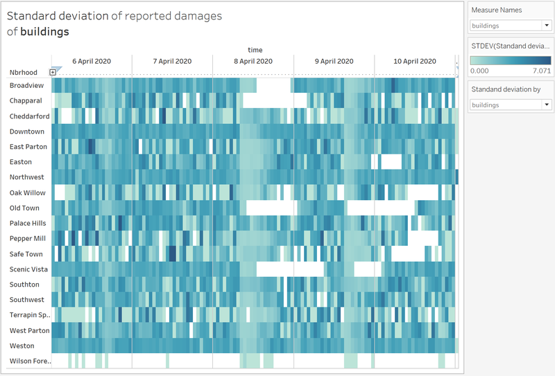
| 3 | To answer Which neighbourhoods are providing reliable reports, I think that the neighbourhoods with many reports and little variation in the data are more reliable. Based on these two criteria, this visualization provides the standard deviation of the reported damages about a certain facility. Together with the number of reports during the hour, the emergency responders could decide whether the data is reliable. For example, In Broadview, the reports during 1th hour with a standard deviation of 3.869 are not reliable compared to those during 9th hour with a standard deviation of 2.429.
|
| 4 | If we look at the entire view, we can see that some neighbourhoods generally have reports with small standard deviation (lighter colour) like Broadview and Weston. Whereas some others have more darker colour areas indication less reliable reports with large standard deviation, like Pepper Mill and Safe Town.
|
Task 3
Describe up to ten notable anomalies or unusual events you see in the data. Prioritize those issues that are most likely to represent a danger or a serious issue for building operations.
| Priority | Measurement Category | Description and Significance |
|---|---|---|
| 1 | Hazium Concentration | Hazium is a recently discovered and possibly dangerous chemical. It poses health hazards to the employees whom inhales it. There are spikes in Hazium concentration especially on 3rd (Friday) and 11th (Saturday) June. What is more surprising is that, one of the areas with high concentration is coming from office 3000(CEO's office). Signifiance As mentioned in the background text, hazium is a dangerous chemical. High concentration of haizum is likely to pose health issues to employees. No one can explain the effects of hazium, but it was concluded to likely be a dangerous chemical to employee. Therefore, it is crucial for the company to look for the root course and address it. |
| 2 | Return Outlet CO2 Concentration | This reading tells us the CO2 concentration within the building. The healthy co2 concentration ranges from 250ppm to 1000pm. However on 2 conservative days (6th and 8th of June), the CO2 concentration spike above 1800 ppm. Signifiance High concentration of CO2 within the building would post health hazard to the employee. PPM reading above 1000, the employees would experience drowsiness. As it reaches above 2000, employees will experience headaches, sleepiness and stagnant, stale, stuffy air. Poor concentration, loss of attention, increased heart rate and slight nausea. It is vital for the company to look investigate the high CO2 concentration. |
| 3 | Thermostat Setting | This finding is as per one which was mentioned in above in Task #2, the malfunction of this Thermostat would be devastating. Signifiance The thermostat is responsible for regulating and maintain the internal temperature of the building. You can effectively say that, the readings from the thermostat would control the temperature of the building. There have been instances of it peaking up. The high temperature may potentially cause health hazard for the employee |
| 4 | VAV_SYS Supply Fan Outlet Mass Flow Rate | This reading tells us the total rate of air delivered by the HVAC system fan to the zone it serves. The data collected in the month of June is not showing consistent results. The readings do tally with the VAV_Sys Supply Fan Outlet:Power. The readings intensify in 2 particular periods, 7th-8th June and 10th-13th June. During 7th-8th June (Tuesday to Wednesday), the reading intensifies in the early hours and late night. This is an abnormal phenomenon. This is telling us that more air is being delivered by the HVAC system fan when there is no supposed employee during this period. The second period, 10th-13th June, shows intensified readings consistently from 10th June evening to 13th June Morning (Friday to Monday).
This reading is important because it will indicate the overall system health of the HVAC fans. It tells us if the HVAC fans are working harder. It also indicates if the HVAC system's ability to maintain the building's internal temperature/ventilation. |
| 5 | Deli-Fan Power | This reading tells us the power used by the deli exhaust fan. There are some suspicious data points with regards to the use of Deli-Fan. The fan usage seems to be consistently high during a Sunday(5th and 12th June). The readings do not seem to tally with the increased human activities during the weekday. The inconsistent readings do not seem to establish any form of correlation with the human activity. But rather, the pattern of seem to be established by other unknown factors. |
| 6 | VAV_SYS Heating Coil Power | There is completely 0 power used for the heating coil. This is entirely not possible as the HVAC system seem to be working properly. Thus, there is very little prove that the Heating Coil is broken/faulty. Signifiance |
| 7 | VAV_SYS Supply Fan:Fan Power | The system supply fan consumes more power on the weekend (both Saturday and Sunday). This is highly unusual as there is lower employee activity within the building. Most of the power comes from the fans in level 3. On Saturday it is a half day, but on Sunday only those who are on shift would be in the building. Therefore, on Sunday, there would be close to zero human activity. Signifiance The supply fan is responsible for circulating the air within the HVAC system. In this case, the unnecessary power consumed by the fan would incur additional cost to the company. Not only that, it is a waste of energy. |
Conclusion
There are many interesting findings which do not reflect the energy efficiency ability which the builders had claimed to be. The new building does not seem to be as energy-efficient as what was previously advertised. As for the occurrence of Hazium, it is postulated to be caused by the employee themselves. The evidence points towards a deliberate attack towards the CEO himself. As Hazium is a newly discovered chemical, its potential impact on the employees is unknown. Many cautious steps should be taken when investigating the Hazium outbreak. Evident suggest that the culprit seem to be an employee from level 3!
Main Link
One tough assignment down, one more project to remaining - https://public.tableau.com/views/MA_3_Final/Home?:embed=y&:display_count=yes
Backup Link
This is one tough assignment,I need more backup link - https://public.tableau.com/views/MA_3_0/Home?:embed=y&:display_count=yes
Improvement
Given more time, I will improving on the visualizations by including more statistical methods and reasoning to demonstrate the data uncertainty and reliability. I will also work on improving the interface for the emergency responders and provide them with a much easier and clearer view. Nonetheless, through this assignment, I have learned a lot about interpreting the data, visualization techniques and my analytical ability.
Visualisation Software
To perform the visual analysis, this is a list of the software which I used.
- Tableau
- Excel
- Chrome
- R Studio
References
- Dynamic Sorting with Tableau
https://www.clearlyandsimply.com/clearly_and_simply/2011/11/dynamic-sorting-with-tableau.html
- Using Tableau to Show Variance and Uncertainty
https://www.rittmanmead.com/blog/2017/06/using-tableau-to-show-variance-and-uncertainty/
- How to Creat Heat Map in Tableau
https://www.youtube.com/watch?v=Tc8VenUN4n8
Comments
Do provide me your feedback!:)
