Difference between revisions of "IS428-AY2019-20T1 Climate Vizards: Proposal"

From Visual Analytics for Business Intelligence
Jump to navigation Jump to search
Line 58: Line 58:
 
|}
 
|}
 
</div>
 
</div>
<br/>


== Problem & Motivation ==
 
== Problem & Motivation ==

Revision as of 19:38, 13 October 2019

Group1logo.jpg

Climate Vizards

Team

Proposal

Poster

Application

Research Paper

Problem & Motivation

Data Analysis & Transformation

Background Survey

Brainstorming & Storyboard

Tools & Technology

Others


Problem & Motivation

Meteorological Service Singapore's website, weather.gov.sg, has a lot of data but the website does not make use of the huge volume of it properly in a sense that the viewers do not understand the visualisations at the first sight. The data can be better utilised if the visualisation techniques were to be improved. We, the Climate Vizards, aim to improve the visualisations on the website so that Singapore's historical weather data can be viewed at higher ease for those who might be concerned with it.

Evaluation of current visualisations


Data Type Current Visualisation Limitations
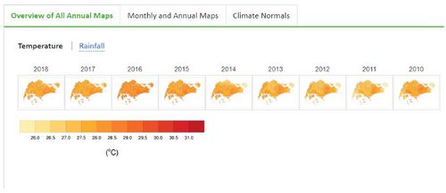
Yearly Temperature
Yearlytemp.jpg
  • Cannot visualise the individual map in detail due to the small frame used to show each yearly temperature
  • No zoom in/out function, restricting viewer's interaction with the visualisation
  • No meaningful values shown, which disallows viewers from getting insightful information
  • Difficult to spot a trend in temperature changes over the past few decades
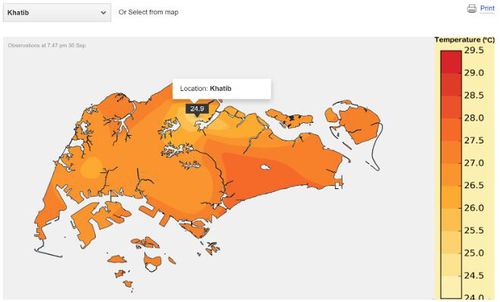
Monthly Temperature
Monthlytemp.jpg
  • Selected location is not highlighted
  • Presence of uncertainties as the varying confidence level of the areas surrounding the selected location's temperature is not being shown
  • Misleading graph title “Mean Daily Temperature” when there is no “Day” input for the user
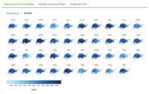
Yearly Rainfall
Yearlyrain.jpg
  • Cannot visualise the individual map in detail due to the small frame used to show each yearly rainfall level
  • No zoom in/out function, restricting viewer's interaction with the visualisation
  • Hard to sieve out useful information such as the year with highest rainfall, or the trend in rainfall level across the years
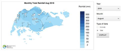
Monthly Rainfall
Monthlyrain.jpg
  • Selected location is not highlighted
  • Presence of uncertainties as the varying confidence level of the areas surrounding the selected location's rainfall is not being shown
  • No pre-defined definition of "Anomaly" which might not be a familiar concept to some users