Difference between revisions of "IS428 AY2019-20T1 Assign Tommy Johnson"
| Line 58: | Line 58: | ||
# Change the format of the timestamp to custom date Month/Date/Year with Date Part option <br/>[[File:CustomDate.PNG|200px|center]] | # Change the format of the timestamp to custom date Month/Date/Year with Date Part option <br/>[[File:CustomDate.PNG|200px|center]] | ||
|- | |- | ||
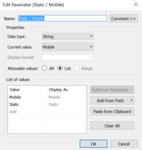
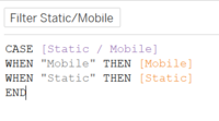
| − | | <center>'''Filter | + | | <center>'''Filter the sensor type Static/Mobile a single selection drop down list''' <br>[[File:SensorType.PNG|200px|center]]</center> |
| − | || <center>To allow analysts to | + | || <center>To allow analysts to visualize the radiation level focusing on the type of sensors (Static/Mobile) that they want. This will also enhance the navigation between the two sensors</center> |
| − | |||
|| | || | ||
| − | # | + | # Create a parameter for the sensor type <br/>[[File:SensorTypeParameter.PNG|200px|center]] |
| + | # Create a calculated field to filter the type. Then, put it at the Filter section <br/>[[File:SensorTypeFilter.PNG|200px|center]] | ||
|- | |- | ||
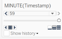
| − | | <center>''' | + | | <center>'''Animate the timestamp in minutes''' <br>[[File:TimestampAnimation.PNG|200px|center]]</center> |
| − | || <center>To allow for | + | || <center>To allow for greater analysis and aesthetics of the data. Analysts will be able to view the changes of radiation level and identify the highest / lowest level at a particular time clearly.</center> |
| − | |||
|| | || | ||
| − | + | # Put the Timestamp in Pages section of the Tableau | |
| − | # Put the | + | # Change the format of the timestamp to minutes |
| − | # | ||
| − | |||
| − | |||
|} | |} | ||
Revision as of 17:11, 28 September 2019
Contents
Problem & Motivation
One of St. Himark’s largest employers is the Always Safe nuclear power plant. The pride of the city, it produces power for St. Himark’s needs and exports the excess to the mainland providing a steady revenue stream. However, the plant was not compliant with international standards when it was constructed and is now aging. As part of its outreach to the broader community, Always Safe agreed to provide funding for a set of carefully calibrated professional radiation monitors at fixed locations throughout the city. Additionally, a group of citizen scientists led by the members of the Himark Science Society started an education initiative to build and deploy lower cost homemade sensors, which people can attach to their cars. The sensors upload data to the web by connecting through the user’s cell phone. The goal of the project was to engage the community and demonstrate that the nuclear plant’s operations were not significantly changing the region’s natural background levels of radiation.
When an earthquake strikes St. Himark, the nuclear power plant suffers damage resulting in a leak of radioactive contamination. Further, a coolant leak sprayed employees’ cars and contaminated them at varying levels. Now, the city’s government and emergency management officials are trying to understand if there is a risk to the public while also responding to other emerging crises related to the earthquake as well as satisfying the public’s concern over radiation.
With the data visualization, it would help analyse:
- The radiation level for both static and mobile sensor over time
- Identify observations and anomalies to the existing data available
- Identify contaminated areas and cars so that evacuation can be done efficiently and quickly
Dataset Analysis & Transformation Process
Before moving on to the analysis, it is essential to clean and transform the raw data so that I can bring value to the analysis. In the zipped file, I am given 3 raw data sets namely:
- MobileSensorReadings.csv - contains the sensor readings of different mobile sensor Ids over a period of time and its locations
- StaticSensorReadings.csv - contains the sensor readings of different static sensor Ids over a period of time
- StaticSensorLocations.csv - contains the different static sensor Ids with its locations
I will be using Tableau Prep to clean and transform the data. It is a new feature provided by the Tableau. The following section will explain step by step on how I prepare the data sets.
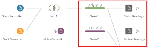
1. Combine the Static sensor readings and locations
The first step is to combine the two csv files of static into one. This is to create a tidier data (Tall and skinny structure). I use Join to combine the columns from two different files into one.
2. Create a calculated field for Static and Mobile sensor Ids
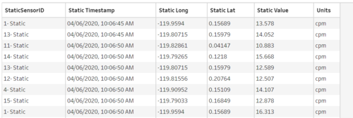
The next step is to concatenate "- Static" or "- Mobile" at the back of the sensor Ids with the [Sensor-id] + "- Mobile" or [Sensor-id] + "- Static" calculated fields. This is because I realize that the static sensor Ids have the same Id number although they are referring to different records. Hence, this is done to avoid confusion at the later part. The final output will be as follow.
Static Sensor
Mobile Sensor
3. Combine the static and mobile sensor data into one
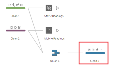
The last step is to combine the static and mobile sensor data into 1 file. This will be the working file that I am going to use in Tableau. I use Union because I am just going to append more rows. After that, I will still need to clean the data to remove any duplicate columns so that all columns are arranged.
The final Workflow will look like this:
Interactive Visualization
The interactive visualization can be accessed here:
To enhance the visualization of the data, implementing interactive elements would help users in analyzing the data intuitively. The following elements are used throughout the dashboards.
| Interactive Features | Rationale | Brief Implementation Steps |
|---|---|---|
| ||
| ||
|
Interesting Observation and Anomalies
Visualize radiation measurements over time from both static and mobile sensors.
To visualize the radiation level for both static and mobile sensors, I am using a map chart. From the chart, user can interactively

