Difference between revisions of "Dashboard"
Jump to navigation
Jump to search
| Line 38: | Line 38: | ||
==Sensor Analysis== | ==Sensor Analysis== | ||
| + | [[File:33.png|frameless|upright=3]]] | ||
| + | |||
This page shows the analysis by both static and mobile sensors. The top of the page consist of 2 buttons: | This page shows the analysis by both static and mobile sensors. The top of the page consist of 2 buttons: | ||
#<b>Home</b> -> Navigates to homepage | #<b>Home</b> -> Navigates to homepage | ||
#<b>Neighbourhood</b> -> Navigates to Neighbourhood Analysis page | #<b>Neighbourhood</b> -> Navigates to Neighbourhood Analysis page | ||
| + | |||
| + | There are 5 different filters: | ||
| + | # <b>Timestamp</b> -> Drag the slider to obtain the preferrred range of dates for analysis | ||
| + | # <b>Sensor id</b> -> Includes both static and moobile sensor ids to filter from | ||
| + | # <b>Sensor Type</b> -> Filter by Mobile, Static or All | ||
| + | # <b>Neighbourhood</b> -> Filter by St.Himark's neighbourhoods | ||
| + | # <b>Value</b> -> Drag the slider to obtain analysis on sensor ids with value more than value on the slider. | ||
There are a total of 3 charts: | There are a total of 3 charts: | ||
| Line 47: | Line 56: | ||
| − | == | + | |
| + | ==Neighbourhood Analysis== | ||
| + | [[File:N.png|Frameless|upright=3]] | ||
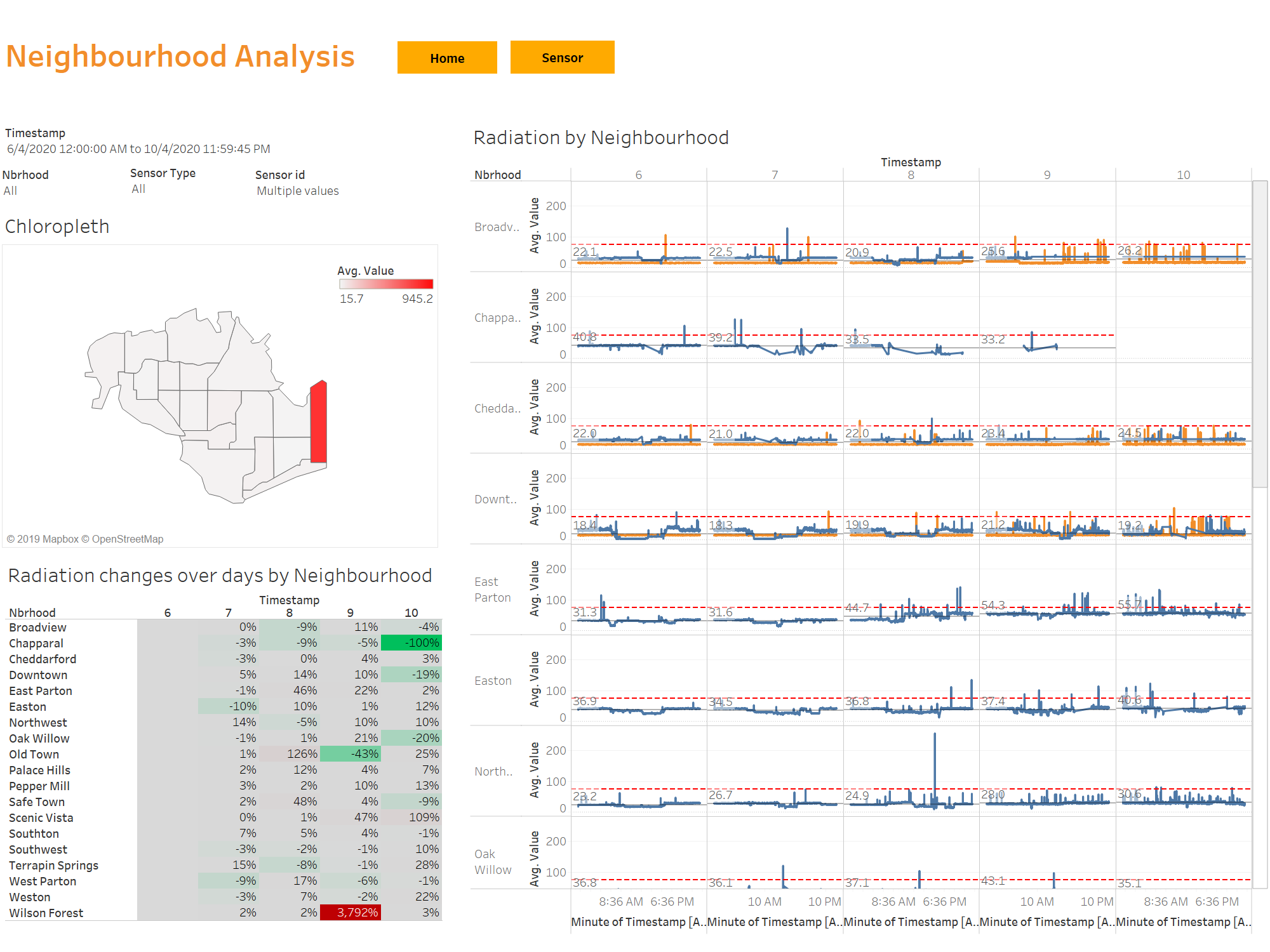
#<b>Average radiation across Neighbourhoods</b> -> Shows the average radiation for each Neighbourhood on the polygon map. The higher the value, the darker the red. | #<b>Average radiation across Neighbourhoods</b> -> Shows the average radiation for each Neighbourhood on the polygon map. The higher the value, the darker the red. | ||
#<b>Radiation changes over days by Neighbourhood</b>->Shows the percentage int the growth of the radiation readings as compared to the previous day. If there is an increase in the percentage, the data cell wiill be highlighted in red. If there is a decrease, it will be reflected in green. Else, if there is not much growth, it will be grey colour. | #<b>Radiation changes over days by Neighbourhood</b>->Shows the percentage int the growth of the radiation readings as compared to the previous day. If there is an increase in the percentage, the data cell wiill be highlighted in red. If there is a decrease, it will be reflected in green. Else, if there is not much growth, it will be grey colour. | ||
#<b>Radiation by Neighbourhood</b> -> Shows the average radiation level by mobile and static sensors over days and hours by Neighbourhood. | #<b>Radiation by Neighbourhood</b> -> Shows the average radiation level by mobile and static sensors over days and hours by Neighbourhood. | ||
| + | |||
| + | [[File:22.png|frameless|upright=3]]<br> | ||
| + | There are 4 filters: Timestamp range, Neighbourhood, Sensor Type and Sensor id. Users can toggle but click on the respective drop down box and check the values of their choices or drag the slider for the timestamp. | ||
Revision as of 02:00, 13 October 2019
|
|
|
|
|
Dashboard
Homepage
This is the homepage of the dashboard that shows an overview of what this dashboard is analyzing. There are 2 main tabs to analyze:
- Sensor Analysis
- Neighbourhood Analysis
Sensor Analysis
This page shows the analysis by both static and mobile sensors. The top of the page consist of 2 buttons:
- Home -> Navigates to homepage
- Neighbourhood -> Navigates to Neighbourhood Analysis page
There are 5 different filters:
- Timestamp -> Drag the slider to obtain the preferrred range of dates for analysis
- Sensor id -> Includes both static and moobile sensor ids to filter from
- Sensor Type -> Filter by Mobile, Static or All
- Neighbourhood -> Filter by St.Himark's neighbourhoods
- Value -> Drag the slider to obtain analysis on sensor ids with value more than value on the slider.
There are a total of 3 charts:
- Radiation across Neighbourhoods -> shows the movement of each sensor id on St. Hilmark map throughout the period that is being filtered. The sensor ids are being represented by different colours.
- Radiation by Sensor id -> Shows the radiation level if each sensor id taken at each timestamp over days and hours.
Neighbourhood Analysis
- Average radiation across Neighbourhoods -> Shows the average radiation for each Neighbourhood on the polygon map. The higher the value, the darker the red.
- Radiation changes over days by Neighbourhood->Shows the percentage int the growth of the radiation readings as compared to the previous day. If there is an increase in the percentage, the data cell wiill be highlighted in red. If there is a decrease, it will be reflected in green. Else, if there is not much growth, it will be grey colour.
- Radiation by Neighbourhood -> Shows the average radiation level by mobile and static sensors over days and hours by Neighbourhood.

There are 4 filters: Timestamp range, Neighbourhood, Sensor Type and Sensor id. Users can toggle but click on the respective drop down box and check the values of their choices or drag the slider for the timestamp.


