Difference between revisions of "IS428 2019-1920 T1 Assign LeeSunho Interactive Visualization"
| Line 84: | Line 84: | ||
; | ; | ||
| − | ==<font color="#008000">Taks | + | ==<font color="#008000">Taks Two</font>== |
<font size="3"><font color="#8FBC8F">How do conditions change over time? How does uncertainty in change over time? Describe the key changes you see. Limit your response to 500 words and 8 images.</font></font></b> | <font size="3"><font color="#8FBC8F">How do conditions change over time? How does uncertainty in change over time? Describe the key changes you see. Limit your response to 500 words and 8 images.</font></font></b> | ||
| Line 101: | Line 101: | ||
</tr> | </tr> | ||
<tr> | <tr> | ||
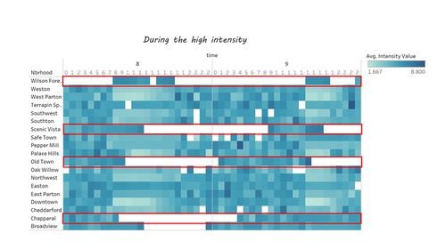
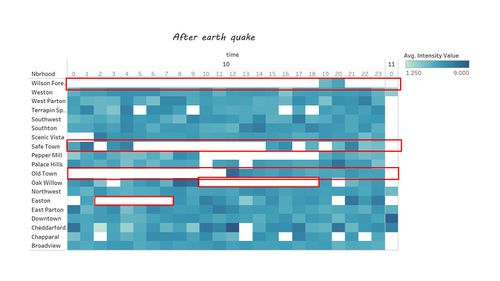
| − | <td><b><font color="#008000"> 1. | + | <td><b><font color="#008000"> 1.Heatmap </font</b> |
<br> | <br> | ||
| Line 108: | Line 108: | ||
</td> | </td> | ||
<td> | <td> | ||
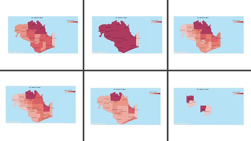
| − | [[File: | + | During the major intensity |
| + | |||
| + | [[File:question2_peakheat.jpg|500px|center]] | ||
| + | |||
| + | After the major intensity | ||
| + | |||
| + | [[File:Afterheat question2.jpg|500px|center]] | ||
| + | |||
</tr> | </tr> | ||
<tr> | <tr> | ||
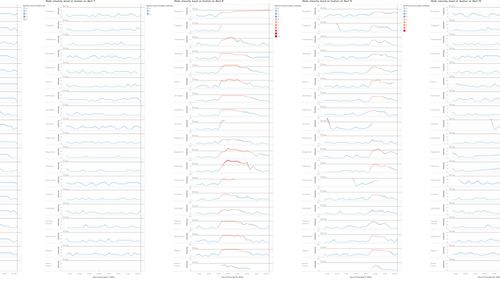
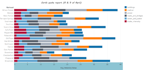
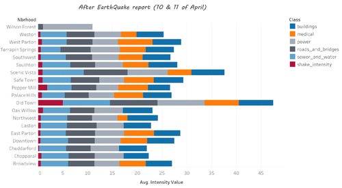
| − | <td><b> <font color="#008000">2. | + | <td><b> <font color="#008000">2.Bar Chart</font </b> |
<br> | <br> | ||
| Line 118: | Line 125: | ||
</td> | </td> | ||
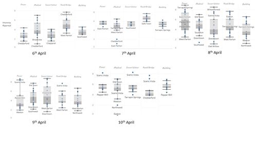
| − | <td>[[File: | + | <td>During the major intensity |
| + | [[File:Question2 Peak comparison.png|500px|center]] | ||
| + | |||
| + | After the major intensity | ||
| + | [[File:Question 2 nonePeak comparison.png|500px|center]] | ||
| + | </td> | ||
</tr> | </tr> | ||
<tr> | <tr> | ||
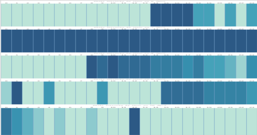
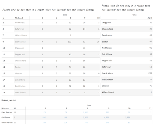
| − | <td><b> <font color="#008000">3. | + | <td><b> <font color="#008000">3.Data Table</font</b> |
<br> | <br> | ||
| Line 134: | Line 146: | ||
</td> | </td> | ||
<td> | <td> | ||
| − | [[File: | + | [[File:Question2 Non reliable report.png|500px|center]] |
</tr> | </tr> | ||
Revision as of 05:05, 12 October 2019
Taks oneEmergency responders will base their initial response on the earthquake shake map. Use visual analytics to determine how their response should change based on damage reports from citizens on the ground. How would you prioritize neighborhoods for response? Which parts of the city are hardest hit? Limit your response to 1000 words and 10 images.
hi
|
